flex
layout을 잡을때 사용한다.
container에 적용되는 속성이 있고 item에 적용되는 속성이 있다
container와 그 안을 구성할 item이 존재할때 display: flex 속성을 사용해 layout배치를 할 수 있다.
flex의 속성또한 다양한데, 그 중 direction 을 사용하면 수직, 수평을 오름차순 또는 내림차순으로 정렬할 수 있다.
<style>
    .container{
        background-color: powderblue;
        height: 200px;
        display: flex;
        flex-direction: column;
    }
    .item{
        background-color: tomato;
        color: white;
        border: 1px solid white;
    }
</style>
</head>
<body>
    <div class="container">
        <div class="item">1</div>
        <div class="item">2</div>
        <div class="item">3</div>
        <div class="item">4</div>
        <div class="item">5</div>
    </div>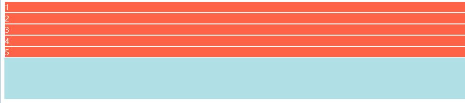
-grow & shrink
flex-grow: 기본값은 0이다.
flex-grow:1로 설정하면 1~5item이 공평하게 여백을 나누어 갖는다.
만약 2번 item이 많은 여백을 갖기를 원한다면 2번 아이템의 flex-grow:2로 설정하면 된다.
<style>
    .container{
        background-color: powderblue;
        height: 200px;
        display: flex;
        flex-direction: row;
    }
    .item{
        background-color: tomato;
        color: white;
        border: 1px solid white;
        flex-grow:1;
    }
    .item:nth-child(2){
        /* flex-basis: 200px; */
        flex-grow: 2;
    }
</style>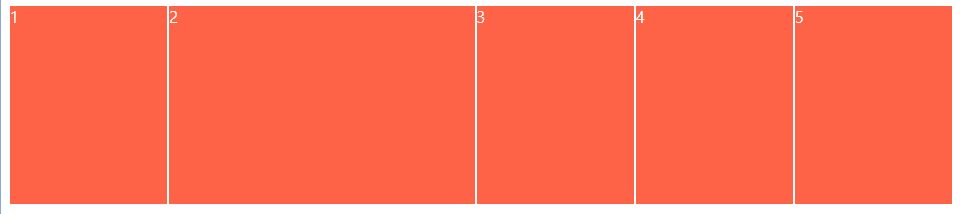
flex-shrink는 차지한 공간이 줄어들지 않는 기능이다. 특정한 아이템이 basis값을 가지고 있을때, 예를들어
flex-basis:100px;이런 경우
flex-shrink:0 을 주면,
flex-basis:100px;
flex-shrink:0;
화면의 크기를 줄여도 칸의 크기는 줄어들지 않는다.
-Holy Grail Layout (성배레이아웃)
holy grail layout은 다음 그림과 같다.
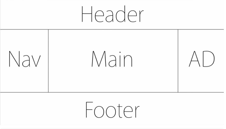
화면의 크기가 작아짐에 따라서 Main의 크기가 작아지는 레이아웃이다.
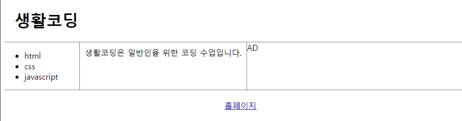
<body>
    <div class="container">
        <header>
            <h1>생활코딩</h1>
        </header>
        <section class="content">
            <nav>
                <ul>
                    <li>html</li>
                    <li>css</li>
                    <li>javascript</li>
                </ul>
            </nav>
            <main>
                생활코딩은 일반인을 위한 코딩 수업입니다.
            </main>
            <aside>
                <!-- 광고와같이 안중요한부분을 주로 넣음 -->
                AD
            </aside>
        </section>
        <footer>
            <a
            href= "https://opentutorials.org/course/1">홈페이지</a>
        </footer>
    </div>
</body>
이러한 바디 구성을 통해 제작할 수 있다.
스타일의 경우
<style>
        .container{
            display: flex;
            flex-direction: column;
        }
        header{
            border-bottom: 1px solid gray;
            padding-left: 20px;
        }
        footer{
            border-top: 1px solid gray;
            padding: 20px;
            text-align: center;
        }
        .content{
            display: flex;
        }
        .content nav{
            border-right: 1px solid gray;
        }
        .content aside{
            border-left: 1px solid gray;
        }
        nav,aside{
            flex-basis: 150px;
        }
        main{
            padding: 10px;
        }
    </style>
이런식으로 padding과 flex를 사용하여 레이아웃을 만질 수 있고
flex-shrink를 사용한다면 창이 작아질때 Nav와 Aside가 줄어들지, Main이 줄어들지 선택할 수 있다.
-기타속성들
<container 적용 속성>
- flex-wrap: 기본값은 nowrap. 만약 컨테이너보다 아이템이 크다면 줄바꿈이 되어 내려가는 속성.
- align-items:기본값은 stretch. 컨테이너에 아이템이 들어갈때 컨테이너만큼 높이가 올라감.
display:flex;
align-tiems:center;
와 같이 사용하면 화면 가운데로 레이아웃 조정이 가능함.
- order: 먼저 출력되는 우선순위를 정할 수 있다.
main{
order:-1
}
와 같이하면 다른것을 수정하지 않고도 main이 먼저오게 할 수 있다.