20201021 CSS Effect
질문 주셨던거 심심해서 사실 내꺼 하기 너무 힘들어서 호다닥 뚝딱뚝딱 만들어봤던 간단한 Css effect!!!
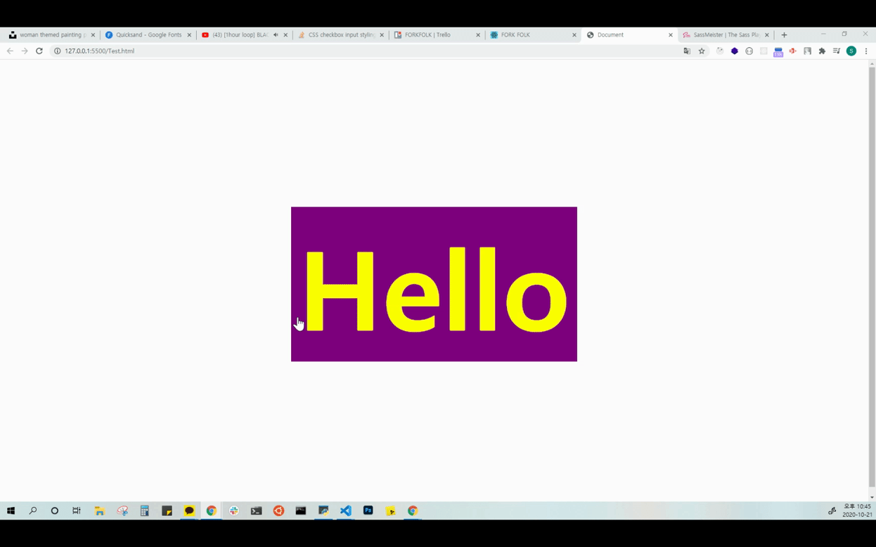
보라색 노랑색 조합이 굉장히 귀여웠다 :D
=> 코드
<!DOCTYPE html>
<html lang="en">
  <head>
    <meta charset="UTF-8" />
    <meta name="viewport" content="width=device-width, initial-scale=1.0" />
    <title>Document</title>
    <style>
      .Test {
        font-size: 240px;
        display: flex;
        justify-content: center;
        align-items: center;
        height: 100vh;
      }
      .Test span {
        display: inline-block;
        padding: 10px 15px;
        position: relative;
        font-weight: bold;
        cursor: pointer;
      }
      .Test span:hover {
        color: yellow;
      }
      .Test span:hover:after {
        width: 100%;
      }
      .Test span::after {
        background-color: purple;
        display: block;
        content: "";
        position: absolute;
        width: 0;
        height: 100%;
        top: 0;
        left: 0;
        z-index: -1;
        transition: 0.5s ease;
      }
    </style>
  </head>
  <body>
    <div class="Test">
      <span>Hello</span>
    </div>
  </body>
</html>
:after, :before 사용시 주의 할 점
=> 이미지 태그에서는 before, after를 사용할 수 없었다. 따라서 이미지에 사용하기 위해선 이미지를 감싸는 태그에 줘야한다!

개발하는 반숙계란 / 하고싶은 공부를 합니다. 목적은 흥미입니다.
최고!!!