CSS : Cascading Style Sheet의 약자로 작성된 HTML에 스타일을 적용하기 위해 만들어진 마크업 언어이다.

html에 스타일을 적용시키기 위한 CSS에는 여러가지 property들이 있는데 그 중에 "position"을 열심히 뽀개보도록 하자.
Position
The position property specifies the type of positioning method used for an element (static, relative, absolute, fixed, or sticky).
w3school 에서는 position에 대해 다음과 같이 정의한다. method를 포지셔닝 하기 위해 사용하는 property로 static, relative 등의 value들이 존재하는데, 그 중에서도 "relartive","absolute","fixed"에 대해 알아보고자 한다.
relative
w3school에서는 relative에 대해 다음과 같이 설명한다.
The element is positioned relative to its normal position, so "left:20px" adds 20 pixels to the element's LEFT position
어떤 한 요소가 relative로 포지셔닝 되어있다면, left top right bottom을 이용해 해당 요소를 위치시킬 수 있다. 하지만..! 여기에는 숨겨져있는 특징이 하나 더 존재했으니..!!!
absolute에서 이어 설명하겠으니 Keep goingoingoing!
absolute
The element is positioned relative to its first positioned (not static) ancestor element
position: absolute; 를 이용하면 해당 요소를 원하는 위치로 이동시킬 수 있다.
여기서 position relative의 숨겨진 기능이 나타난다.
position absolute를 가진 자식 요소는 "부모 요소가 position: relative;를 가지고 있을 경우" 해당 부모 요소를 기준으로 위치가 움직이게 된다.
예를 들어,
* html
<div class="parentBox">
  <div class="babyBox"></div>
</div>

* css
.parentBox {
  position: relative;
 }
.babyBox {
  position: absolute;
  top: 50px;
 }
다음과 같은 마크업이 있다고 가정해보자. 과연 babyBox는 어디에 존재하게 될까?
웹의 가장 최상단에서 50px이 떨어진 곳이 아닌, parentBox의 가장 윗쪽에서 50px 떨어진 곳에 위치하게 된다.
따라서, absolute를 사용 할 경우에는 꼭! 기준점을 잡아줘야만 한다.
그렇지 않으면 가장 최상단으로 호로로!!! 사라져버릴지도 모르니까.
이렇게 위치를 잡아주는 absolute는 그럼 위치를 옮겨주는 것 말고 다른 속성은 없을까???
아-니 있다. 바로 영역의 넓이이다.
위의 코드를 잘 살펴보자. div는 블록 요소이니까.. babyBox도 width를 100% 를 가지겠지? 라고 생각 할 수 있다. 본인도 처음 css를 학습할 때 그런 생각을 했었다.
하지만 absolute로 포지션을 지정해주는 순간, 해당 요소는 display: inline; 처럼 컨텐츠의 영역만큼이 곧 넓이가 되어버린다.
포지션을 absolute로 줬더니 갑자기 영역이 사라져버렸다면, width 와 height에 설정값이 존재하는지 꼭! 확인해주는 것이 좋다. (스스로 제일 실수 많이 했던 부분이기도 하다)
fixed
The element is positioned relative to the browser window
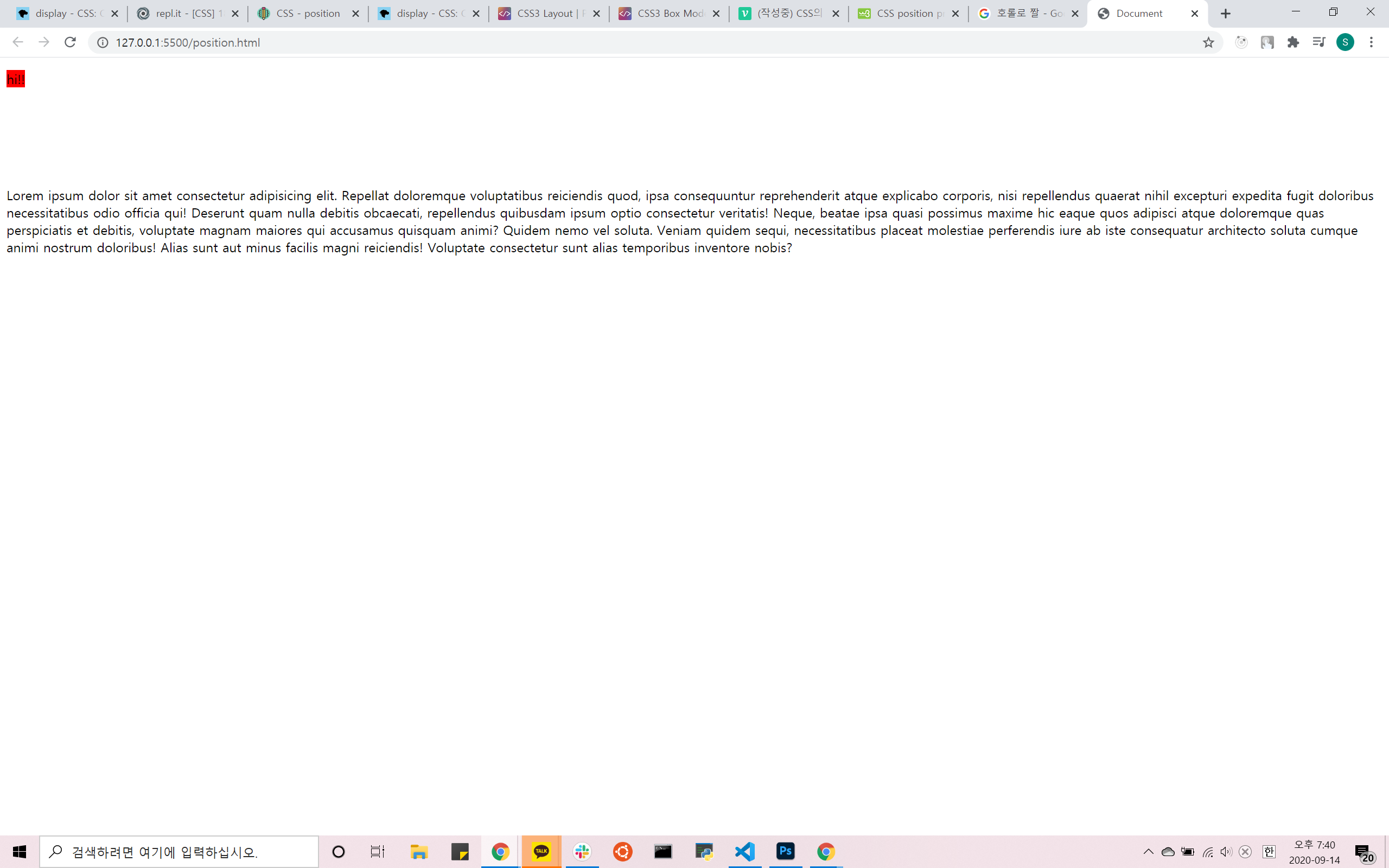
position: fixed; 를 설정해주면 꼭 그 만큼의 영역에서 절대! 움직이지 않는다.
browser display를 기준으로 삼는다.
사이트의 맨 위 헤더 영역을 생각해보면 이해하기가 쉬울 것이다.
아무리 스크롤을 내려도 맨 위에서 절대 움직이지 않는 헤더 영역도 position: fixed;를 이용해 구현 가능하다.
 ]
]
<!DOCTYPE html>
<html lang="en">
  <head>
    <meta charset="UTF-8" />
    <meta name="viewport" content="width=device-width, initial-scale=1.0" />
    <title>Document</title>
    <style>
      div {
        top: 150px;
        position: relative;
      }
      span {
        position: fixed;
        top: 15px;
        background-color: #f00;
      }
    </style>
  </head>
  <body>
    <div>
      <span>hi!!</span>
      Lorem ipsum dolor sit amet consectetur adipisicing elit. Repellat
      doloremque voluptatibus reiciendis quod, ipsa consequuntur reprehenderit
      atque explicabo corporis, nisi repellendus quaerat nihil excepturi
      expedita fugit doloribus necessitatibus odio officia qui! Deserunt quam
      nulla debitis obcaecati, repellendus quibusdam ipsum optio consectetur
      veritatis! Neque, beatae ipsa quasi possimus maxime hic eaque quos
      adipisci atque doloremque quas perspiciatis et debitis, voluptate magnam
      maiores qui accusamus quisquam animi? Quidem nemo vel soluta. Veniam
      quidem sequi, necessitatibus placeat molestiae perferendis iure ab iste
      consequatur architecto soluta cumque animi nostrum doloribus! Alias sunt
      aut minus facilis magni reiciendis! Voluptate consectetur sunt alias
      temporibus inventore nobis?
    </div>
  </body>
</html>
마지막으로 정리 해보자
relative: 내가 기준이야!! 기준점!!!
absolute: 나 다른 사람 말고 relative만 봐.
fixed: 나는 다 모르겠고 걍 무조건 그 위치에만 있을래.
이 외에도 display의 종류에는 static, flex, grid 등 굉장히 다양한 property value가 존재한다.
하지만 특히 위 세가지가 가장 많이 쓰였던 만큼 꼭 꼭 잘 이해하고있으면
절-대 손해보는 일 없을 것이다 :D