Line Chart
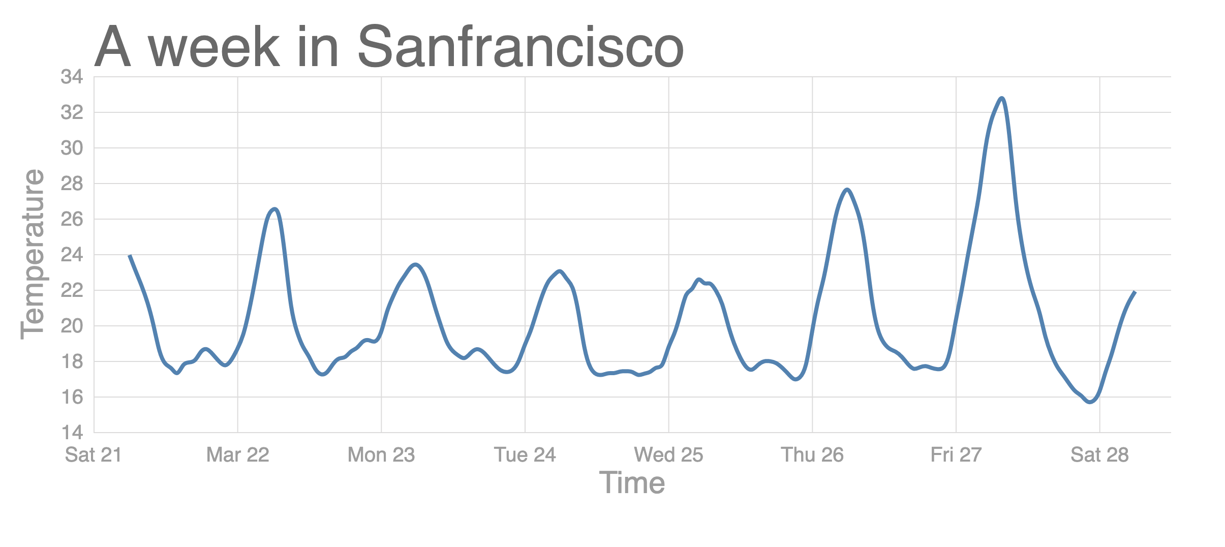
- xAxis의 시간(timestamp)을 나타내기 위해서
scaleTime()을 사용한다. - yAxis의 온도를 낮은 순서부터 높은 순서(아래에서 위)로 나타내기 위해서
.range([innerHeight, 0])로 바꾼다. - Line을 그리기 위해서
line()함수와,path를 사용한다. - Smooth한 라인을 그리기 위해서
curve(curveBasis)를 사용한다. dattribute는path의 경로를 설정한다.
import {
  csv,
  select,
  scaleLinear,
  axisLeft,
  axisBottom,
  extent,
  scaleTime,
  line,
  curveBasis,
} from 'd3';

const svg = select('div').append('svg').attr('width', 1200).attr('height', 500);

const width = +svg.attr('width');
const height = +svg.attr('height');

const render = data => {
  const title = 'A week in Sanfrancisco';
  const xValue = d => d.timestamp;
  const xAxisLabel = 'Time';

  const yValue = d => d.temperature;
  const yAxisLabel = 'Temperature';
  const margin = {
    top: 80,
    right: 40,
    left: 100,
    bottom: 70,
  };
  const innerWidth = width - margin.right - margin.left;
  const innerHeight = height - margin.top - margin.bottom;
  const circleRadius = 10;

  const xScale = scaleTime() // (*)
    .domain(extent(data, xValue))
    .range([0, innerWidth])
    .nice();

  const yScale = scaleLinear()
    .domain(extent(data, yValue))
    .range([innerHeight, 0]) // (*)
    .nice();

  // Add margins
  const g = svg
    .append('g')
    .attr('transform', `translate(${margin.left}, ${margin.top})`);

   // Style axis
  const xAixs = axisBottom(xScale).tickSize(-innerHeight).tickPadding(15);
  const yAxis = axisLeft(yScale).tickSize(-innerWidth).tickPadding(10);

  // Add axis and label
  const yAxisG = g.append('g').call(yAxis);

  yAxisG.selectAll('.domain').remove();
  yAxisG
    .append('text')
    .attr('class', 'axis-label')
    .attr('y', -50)
    .attr('x', -innerHeight / 2)
    .attr('fill', 'black')
    .attr('transform', `rotate(-90)`)
    .attr('text-anchor', `middle`)
    .text(yAxisLabel);

  const xAxisG = g
    .append('g')
    .call(xAixs)
    .attr('transform', `translate(0, ${innerHeight})`);

  xAxisG.select('.domain').remove();
  xAxisG
    .append('text')
    .attr('class', 'axis-label')
    .attr('y', 60)
    .attr('x', innerWidth / 2)
    .attr('fill', 'black')
    .text(xAxisLabel);

  // Add a title
  g.append('text').attr('class', 'title').attr('y', -10).text(title);

  // Create lines
  const lineGenerator = line()
    .x(d => xScale(xValue(d)))
    .y(d => yScale(yValue(d)))
    .curve(curveBasis); // (*)

  g.append('path').attr('class', 'line-path').attr('d', lineGenerator(data));
};

// Represent a data table
csv('https://vizhub.com/curran/datasets/temperature-in-san-francisco.csv')
  .then(data => {
    data.forEach(d => {
      d.temperature = +d.temperature;
      d.timestamp = new Date(d.timestamp);
    });
    render(data);
  })
  .catch(error => console.log(error));
css
.line-path {
  fill: none;
  stroke: steelblue;
}
Hello World.