display: flex; - 기본적으로 가로 정렬
container를 위한 속성
flex-direction item의 주 축(방향) 설정
flex-wrap item의 줄 바꿈 설정
flex-flow flex-direction과 flex-wrap의 단축속성
justify-content 주 축의 정렬 방법을 설정 (수평, 가로 기준)
align-content 교차 축의 정렬 방법을 설정 (수직, 세로 기준)
align-items 교차 축의 정렬 방법을 설정 (수직, 세로 방향 기준)
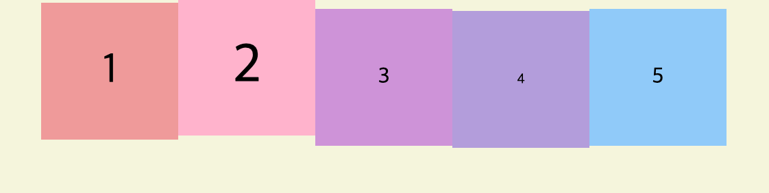
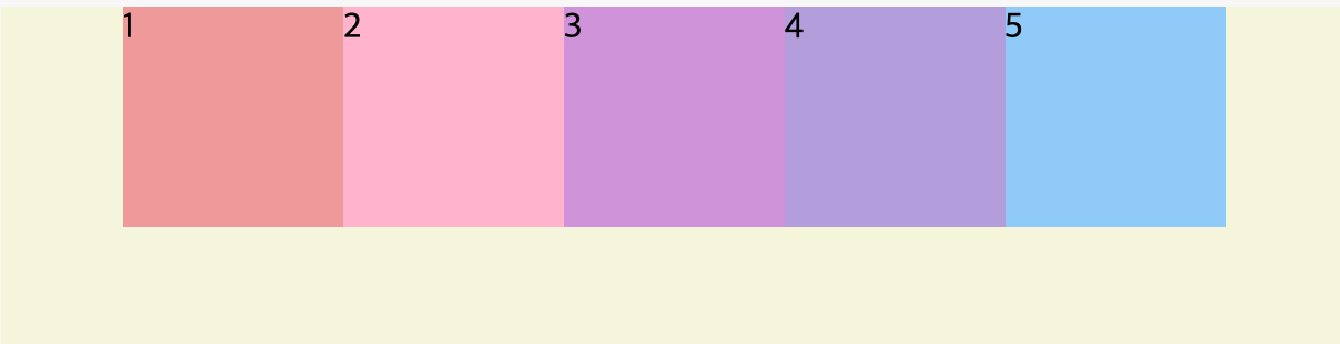
display: flex;
기본적으로 가로 정렬을 한다.
HTML 코드
<div class="container">
  <div class="item item1">1</div>
  <div class="item item2">2</div>
  <div class="item item3">3</div>
  <div class="item item4">4</div>
  <div class="item item5">5</div>
  <div class="item item6">6</div>
  <div class="item item7">7</div>
  <div class="item item8">8</div>
  <div class="item item9">9</div>
  <div class="item item10">10</div>
</div>
CSS 코드 - 01
(기타 스타일 생략)
.container {
background: beige;
height: 100vh;
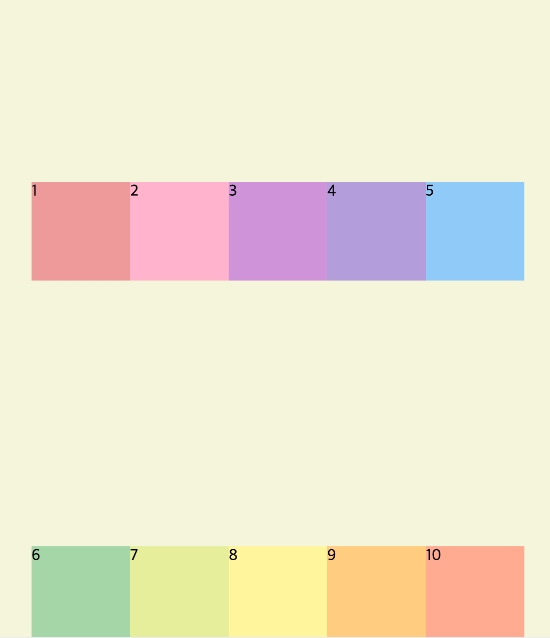
display: flex;
flex-direction: row;
/* flex는 기본적으로 가로정렬이라 direction이 없어도 아래처럼 정렬될 것이다. */
flex-wrap: nowrap;
/* wrap으로 값을 변경하면 item들이 아래로 줄바꿈 되어 정렬된다. */
}결과
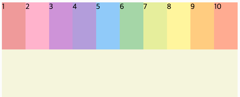
flex-direction
row: item을 가로로 정렬 (기본값)(수평으로 왼쪽에서 오른쪽으로)
row-reverse: item을 row의 반대로 정렬
column: item을 세로로 정렬 (수직으로 위에서 아래로)
column-reverse: item을 column의 반대로 정렬
flex-wrap
nowrap: 모든 item을 한 줄에 묶지 않음 (한 줄에 정렬)
wrap: item을 여러 줄로 묶음
wrap-reverse: item을 wrap의 역 방향으로 묶음
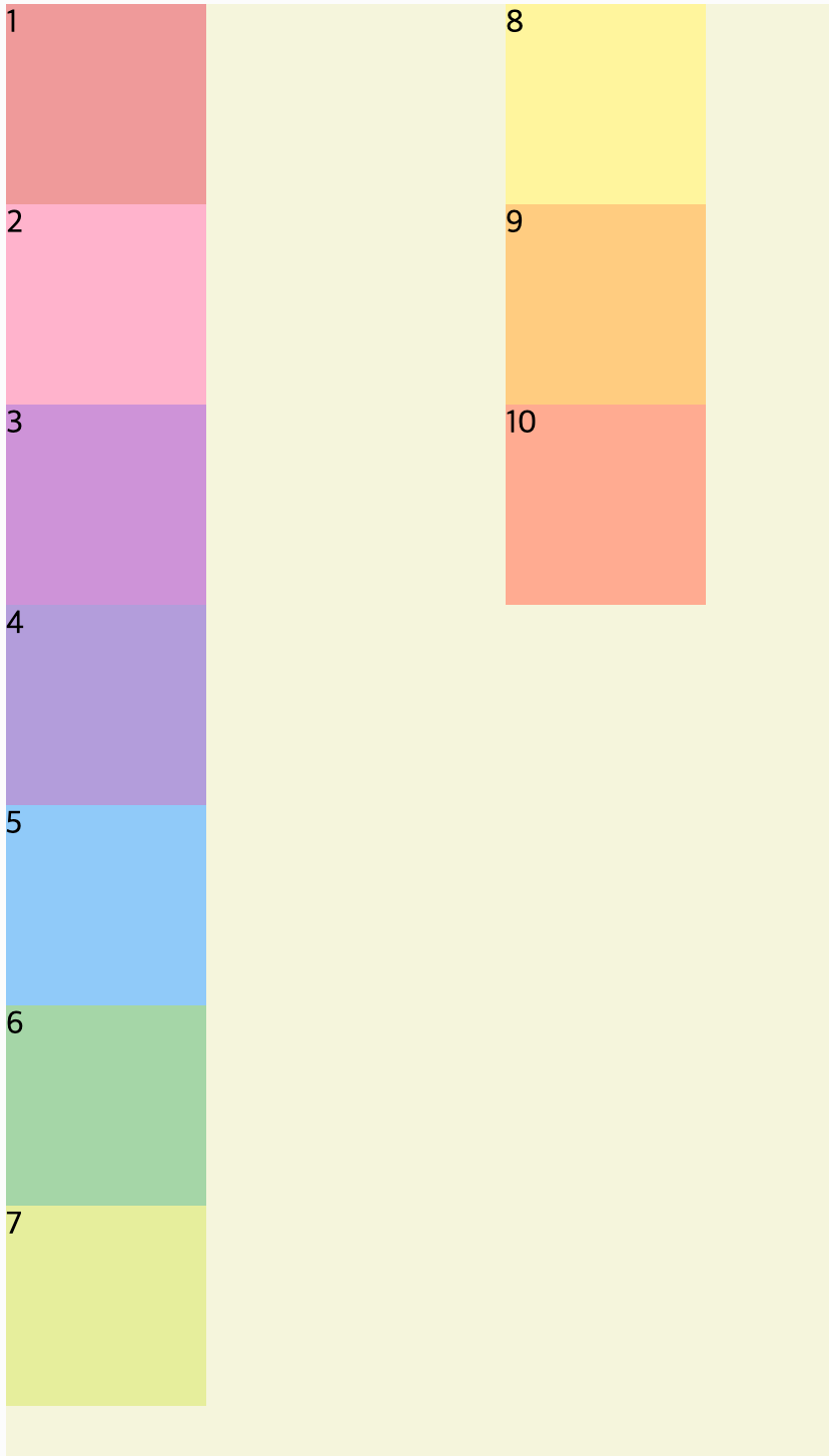
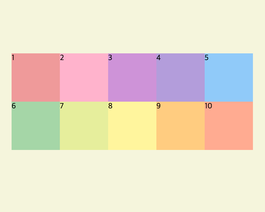
CSS 코드 - 02
(flex-flow를 이용한 스타일)
.container {
  background: beige;
  height: 100vh;
  display: flex;
  flex-flow: column wrap;
  /* flex-direction의 값이 column이 되고, flex-wrap의 값이 wrap이 된다. */
}
결과
CSS 코드 - 03
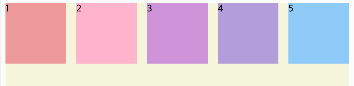
justify-content
item 5개 주석처리
.container {
  background: beige;
  height: 100vh;
  display: flex;
  justify-content: center;
}
결과
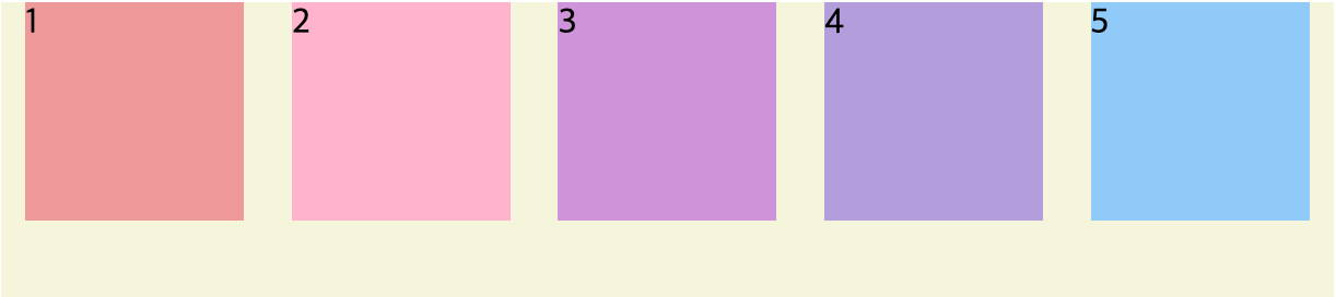
justify-content
가로를 기준으로 정렬한다.
flex-start: item을 왼쪽부터 오른쪽으로 정렬 (기본값)
flex-end: item을 오른쪽에서 왼쪽으로 정렬
center: item을 수평을 기준으로 가운데 정렬
space-between: 시작 item은 왼쪽 시작점에 마지막 item은 오른쪽 끝점에 정렬되고 나머지 item들은 사이에 고르게 정렬 (아래참고)
space-around: item을 균등한 여백을 포함하여 정렬
CSS 코드 - 04
align-content 부모 요소에 높이값을 지정해야 한다.
❗️ flex-wrap 속성을 통해 item이 여러 줄이고 여백이 있을 경우만 사용가능
❗️ 기본 속성인 stretch를 제외하고 justify-content 와 값이 비슷함
.container {
  background: beige;
  height: 100vh;
  display: flex;
  flex-flow: row wrap;
  justify-content: center;
  align-content: center;
}
결과
CSS 코드 - 05
align-items
❗️ item이 한 줄일 경우에 많이 사용
❗️ item이 flex-wrap을 통해 여러 줄(2줄 이상)일 경우에는 align-content 속성이 우선이다.
❗️ align-items를 사용하려면 align-content 속성을 기본값(stretch)으로 설정해야 한다.
.container {
  background: beige;
  height: 100vh;
  display: flex;
  flex-flow: row wrap;
  justify-content: center;
  align-items: flex-end;
}
결과
flex-flow로 wrap 값이 적용되어 2줄이 되었고, align-content의 기본 값인 stretch가 적용되어 위 아래로 늘어졌다.
align-items: baseline;
아무리 다르게 값을 줘도 flex-start와 어떤 차이가 있는지 몰라서 검색 끝에 알게 되었다.
문자의 아래, 밑변(?)을 기준으로 정렬한다.
.container {
  background: beige;
  height: 100vh;
  display: flex;
  flex-flow: row nowrap;
  justify-content: center;
  align-items: baseline;
}