Codecademy - Make a website
1. display
display: block;: 요소가 줄을 다 차지함display: inline;: 요소 폭만큼 줄을 차지함
- 네비게이션 바 리스트에 쓰면 가로 정렬됨 (만들 때 써보자)display: flex;: flexible box (수평에 좋음)
item을 담고있는 container
display는 container에 영향을 주는 것이지 item에 주는 것 아님
-flex-wrap: wrap: item들이 페이지 밖으로 나가지 않도록 함
-justify-content: center;: item 정렬
.parent {
  display: flex;
  flex-wrap: wrap;
  justify-content: center;
}
📖 Bootstrap
웹사이트를 쉽게 만들 수 있게 도와주는 HTML, CSS, JS 프레임워크
1. 사용법
<link rel="stylesheet" href="https://maxcdn.bootstrapcdn.com/bootstrap/3.3.6/css/bootstrap.min.css"/>index.html 에 위 코드 추가
2. Grid
Bootstrap에서는 12개의 column가진 grid 제공
(출처 - codecademy)
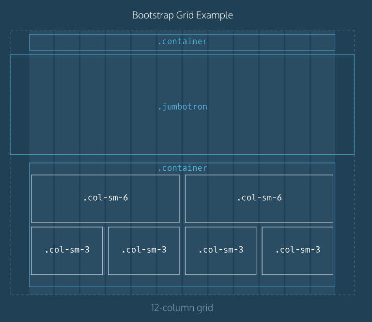
<div class="container">: 얘에 의해 폭 자동조정됨
-"container": 고정폭 레이아웃
-"container-fluid": 좌우로 꽉 찬 레이아웃<div class="row">: 이 안의 태그들이 자동으로 가로나 세로로 정렬할 준비를 함
3. header, nav
4. jumbotron
중요 정보 담기 위한 큰 박스
<div class="jumbotron">
    <div class="container">
    </div>
</div>
"jumbotron well": 윤곽이 뚜렷하게 됨
5. col-xx-yy
container -> row 안에 영역 나누기 위해 씀
- xx : 디바이스 종류
- lg : PC, 태블릿
- md : 태블릿
- sm : 태블릿
- xs : 스마트폰 - yy : row에 차지하는 비중 (1~12)
6. footer
7. button
<a class="btn btn-primary" href="#" role="button">more</a>-
btn-primary 대신 아래 7가지 가능 (버튼 색상)
btn-default
btn-primary
btn-success
btn-info
btn-warningg
btn-danger
btn-link -
btn-primary 자리 다음에
active: 버튼 활성화
disabled: 버튼 비활성화