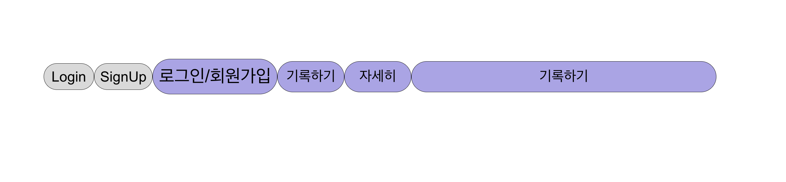
위 사진처럼, 각각의 버튼마다 효과를 주고 싶다면?

우선 Button 컴포넌트를 만들자
button.js


import React from "react";
import styled from "styled-components";
// 여기 props로 해당 style 속성들을 내려주면 된다.
const Button = ({
  borderRadious,
  background,
  color,
  children,
  width,
  height,
  fontsize,
}) => {
  return (
    // 여기 밑에도 똑같이 내려주면 된다.
    <ButtonComponent
      borderRadious={borderRadious}
      fontsize={fontsize}
      height={height}
      width={width}
      color={color}
      background={background}
    >
      {children}
    </ButtonComponent>
  );
};

// 우선 첫번째로 아래 내용 처럼 기본 버튼의 디자인을 || 우측에 적어주자.
const ButtonComponent = styled.button`
  border: 0.5px solid black;
  border-radius: ${(props) => props.borderRadious || "15px"};
  font-size: ${(props) => props.fontsize || "16px"};
  width: ${(props) => props.width || "60px"};
  height: ${(props) => props.height || "30px"};
  color: ${(props) => props.color || "black"};
  background-color: ${(props) => props.background || "#D9D9D9"};
`;

export default Button;
App.js

import "./App.css";
import Button from "./Button";
import styled from "styled-components";
function App() {
  return (
    <ButtonComponent>
      <Button>Login</Button>
    // 아까 props로 받아왔던 속성에서 style 값만 변경을 하면 된다.
      <Button width="70px" height="30px">
        SignUp
      </Button>
      <Button
        fontsize="20px"
        color="black"
        background="#ABA4E9"
        width="150px"
        height="40px"
        borderRadious="27px"
      >
        로그인/회원가입
      </Button>
      <Button
        fontsize="16px"
        color="black"
        background="#ABA4E9"
        width="80px"
        height="35px"
        borderRadious="17.5px"
      >
        기록하기
      </Button>
      <Button
        fontsize="16px"
        color="black"
        background="#ABA4E9"
        width="80px"
        height="35px"
        borderRadious="17.5px"
      >
        자세히
      </Button>
      <Button
        fontsize="16px"
        color="black"
        background="#ABA4E9"
        width="368px"
        height="35px"
        borderRadious="17.5px"
      >
        기록하기
      </Button>
    </ButtonComponent>
  );
}