
데이터로부터 인사이트를 도출하는 과정에 있어 시각화는 필수 과정이다.
EDA와 더불어 BI Tool을 활용한 시각화로 인사이트를 도출해보는 경험은 데이터사이언티스트로서 필수 과정.
✅ Visualization
seaborn 라이브러리를 위주로 진행할 시각화 실습!
그동안 matplotlib, seaborn 라이브러리를 공모전들을 통해 접해보았기에 바로 코드로 구현해보고자 한다.# seaborn은 matplotlib 기반으로 생성. 그래프에 요소 추가 가능 import seaborn as sns # 꺾은선 그래프 sns.lineplot(x=[1, 3, 2, 4], y=[4, 3, 2, 1]) # 막대 그래프 sns.barplot(x=[1,2,3,4],y=[0.7,0.2,0.1,0.05]) # 시각화 용 그래프 위해 라이브러리, 폰트 준비 import matplotlib.pyplot as plt from matplotlib import font_manager, rc import matplotlib.pyplot as plt import seaborn as sns # 한글 출력 시 폰트 깨짐 방지 font_name = font_manager.FontProperties(fname="c:/Windows/Fonts/malgun.ttf").get_name() rc('font', family=font_name) # - 출력 시 폰트 깨짐 방지 matplotlib.rcParams['axes.unicode_minus'] = False # 크기를 (20, 10)으로 지정 plt.figure(figsize = (20, 10)) sns.barplot(x=[1,2,3,4],y=[0.7,0.2,0.1,0.05]) # 그래프 제목 추가 plt.title('Bar Plot') # 각 축의 범례 설정 plt.xlabel('X축') plt.ylabel('Y축') # x축 y축 범례 설정 plt.xlim(1, 4) plt.ylim(0, 3) # show로 완성한 plt 그래프 보기 plt.show()
✍️ Exercise (기상청 데이터 가져오기)
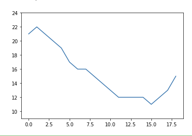
기상청 사이트 'https://www.weather.go.kr/w/weather/forecast/short-term.do'를 참고하여 1시간 단위 온도를 시각화하는 실습!
바로 코드로 살펴보면 다음과 같다.
# 스크래핑에 필요한 라이브러리
from selenium import webdriver
from selenium.webdriver import ActionChains
from webdriver_manager.chrome import ChromeDriverManager
from selenium.webdriver.common.actions.action_builder import ActionBuilder
from selenium.webdriver import Keys, ActionChains
from selenium.webdriver.chrome.service import Service
from selenium.webdriver.common.by import By

# driver를 이용해 기상청 날씨 데이터 가져오기 (동적 웹사이트 - wait 적용)
from selenium.webdriver.support.ui import WebDriverWait
with webdriver.Chrome(service=Service(ChromeDriverManager().install())) as driver:
    driver.get('https://www.weather.go.kr/w/weather/forecast/short-term.do')
    driver.implicitly_wait(10)
    temps = (driver.find_element(By.ID, "my-tchart").text)
    temps = [int(i) for i in temps.replace('℃', '').split('\n')]

# 받아온 데이터로 온도 시각화
import matplotlib.pyplot as plt
plt.ylim(min(temps)-2, max(temps)+2)
sns.lineplot(
    x = [i for i in range(len(temps))],
    y = temps
)
# 결과
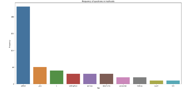
✍️ Exercise 2 (Hashcode 사이트 시각화)
이번 실습은 해시코드 사이트에 올라온 다양한 질문의 태그들의 빈도가 가장 높은 상위 10개를 내림차순으로 시각화 하는 방법.
바로 코드로 구현해보면 다음과 같다.# User-agent 추가 user_agent = {"User-Agent": "Mozilla/5.0 (Macintosh; Intel Mac OS X 10_15_4) AppleWebKit/537.36 (KHTML, like Gecko) Chrome/83.0.4103.97 Safari/537.36"} # 라이브러리 호출 import requests from bs4 import BeautifulSoup import time # 빈도수 체크 dic 생성 frequency = {} # url 불러오고 html 코드 가져오기 for i in range(1, 11): res = requests.get('https://hashcode.co.kr') soup = BeautifulSoup(res.text, 'html.parser') # 1. ul 태그 모두 찾고 li 태그의 text 추출하기 ul_tags = soup.find_all('ul', 'question-tags') for ul in ul_tags: li_tags = ul.find_all('li') for li in li_tags: tag = li.text.strip() if tag not in frequency: frequency[tag] = 1 else: frequency[tag] += 1 time.sleep(0.5) # Counter를 사용해 가장 빈도가 높은 value들을 추출합니다. from collections import Counter counter = Counter(frequency) # 가장 많이 사용된 key 여러개 출력 가능 counter.most_common(10) # figure, xlabel, ylabel, title을 적절하게 설정해서 시각화를 완성해봅시다. import matplotlib.pyplot as plt x = [element[0] for element in counter.most_common(10)] y = [element[1] for element in counter.most_common(10)] plt.figure(figsize = (20, 10)) plt.title('Frequency of questions in Hashcode') plt.xlabel('Tag') plt.ylabel('Frequency') sns.barplot(x=x, y=y) plt.show() # 결과
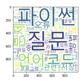
✅ WordCloud
워드 클라우드란, 단어 기반 시각화 기법으로 가장 많이 사용된, 빈도 가 높은 단어에 한해 글씨를 크게, 색감을 다르게 조정하여 인사이트를 얻을 수 있는 기법이다.
코드로 이를 구현하면 다음과 같다.# Pagination이 되어있는 질문 리스트의 제목을 모두 가져와 리스트 questions에 저장해봅시다. # https://hashcode.co.kr/?page={i} # 과도한 요청을 방지하기 위해 0.5초마다 요청을 보내봅시다. import requests from bs4 import BeautifulSoup import time questions = [] for i in range(1, 6): res = requests.get('https://hashcode.co.kr/?page={}'.format(i), {'User-Agent':user_agent}) soup = BeautifulSoup(res.text, 'html.parser') parsed_datas = soup.find_all("li", 'question-list-item') for data in parsed_datas: questions.append(data.h4.text.strip()) time.sleep(0.5) # 시각화에 쓰이는 라이브러리 import matplotlib.pyplot as plt from wordcloud import WordCloud # 횟수를 기반으로 딕셔너리 생성 from collections import Counter # 문장에서 명사를 추출하는 형태소 분석 라이브러리 from konlpy.tag import Hannanum # Hannanum 객체를 생성한 후, .nouns()를 통해 명사를 추출합니다. words = [] hannanum = Hannanum() for question in questions: nouns = hannanum.nouns(question) words += nouns # counter를 이용해 각 단어의 개수를 세줍니다. counter = Counter(words) counter.most_common(19) # WordCloud를 이용해 텍스트 구름을 만들어봅시다. wordcloud = WordCloud( font_path = 'malgun', background_color='white', height = 1000, width = 1000 ) img = wordcloud.generate_from_frequencies(counter) plt.imshow(img) # 결과
🎇 정리
본인 User-agent 확인 사이트
: https://www.whatismybrowser.com/detect/what-is-my-user-agent/기존 matplotlib, seaborn을 활용하여 데이터 분석 프로젝트를 진행하며 EDA를 많이 찍어본 경험이 있어 그런지 수월한 편이었다❗
워드클라우드의 경우 Hannanum 객체를 사욯하며 진행하는 것은 처음해보았는데 기존 방식보다 수월했던 것 같다. 기존에 내가 경험했던 워드클라우드 역시 dic, list 자료구조를 활용하여 Counter를 찍는 방식을 사용하거나 내림차순 정렬로 진행했는데, 이번 학습도 같은 방식을 사용하였다.
아무래도 빈도수 기준으로 진행하다보니 방식이 다 비슷하다고 생각이 들었다.