CSS 애니메이션 1일차
기본 태그들
transform
transform: rotate(45deg) 시계방향으로 45도 회전
transform: scale(2,3) 가로 두배, 세로 세배
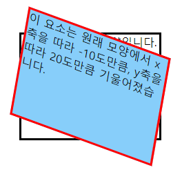
transform: skew(-10deg, 20deg) x축을 따라 -10도 기울이기, y축을 따라 20도 기울이기
skewX, skewY로 한 축만 기울일 수도 있다.
transform: translate(100px, 300px) x축으로 100px, y축으로 300px 평행이동
(출처 : w3schools)
transform 태그는 각 익스플로러의 특전 버전 이상에서 적용되므로
하위 버전에서도 적용될려면
-webkit-transform: rotate(10deg);
-moz-transform: rotate(10deg);
-ms-transform: rotate(10deg);
-o-transform: rotate(10deg);
으로 프로그램에 맞는 접두어를 붙여줘야 한다.
animation
animation-name: *** 애니메이션 이름을 만든다. 클래스 이름을 만들어 옵션을 부여하는것과 유사.
animation-duration: 1.5s; 애니메이션 효과가 진행되는 시간
animation-timing-function: linear; 처음부터 끝까지 일정한 속도.
오늘 쓴 것은 linear 뿐이지만 다음과 같이 다른 옵션도 있다.
ease : 기본값으로, 애니메이션 효과가 천천히 시작되어, 그다음에는 빨라지고, 마지막에는 다시 느려진다.
ease-in : 애니메이션 효과가 천천히 시작된다.
ease-out : 애니메이션 효과가 천천히 끝난다.
ease-in-out : 애니메이션 효과가 천천히 시작되어, 천천히 끝난다.
cubic-bezier(n,n,n,n) : 애니메이션 효과가 사용자가 정의한 cubic-bezier 함수에 따라 진행된다.
animation-iteration-count: infinite; 애니메이션 반복 횟수. 정수나 infinite(무한)을 사용한다.
animation-direction: alternate; 애니메이션 진행 방향. alternate은 정방향, reverse는 역방향이다.
keyframes
모양/형태에 관련된 대부분의 옵션을 사용할 수 있다.
@keyframes animation-name2 {
  from {
	width: 300px;
	height: 300px;
	background-color: yellow;
  }
  to {
	width: 600px;
	height: 600px;
	background-color: red;
  }
}
@keyframes animation-name2 {
  0% {transform:translate(0px, 0px) scale(1) rotateX(0deg) rotateY(0deg) rotateZ(0deg) translate(-50%, -50%);}
  100% {transform:translate(713px, 35.5px) scale(1) rotateX(0deg) rotateY(0deg) rotateZ(134deg) translate(-50%, -50%);}
}from과 to는 애니메이션 시작 상태와 끝 상태이며 0%와 100%로 대체할 수도 있다. %로 대체 할 경우, 1~99의 중간 과정을 정할 수도 있어 대부분 %로 만드는 듯 하다.
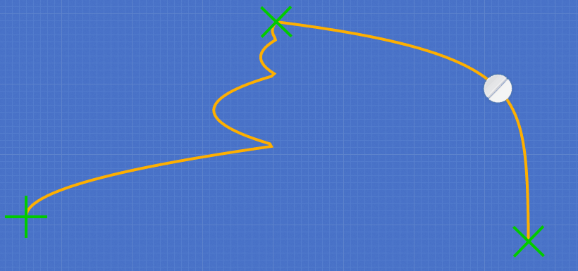
animation + keyframes 예시
stylie 에서 동선에 따른 animation 와 keyframes의 CSS 코드를 바로 출력해 볼수도 있다.
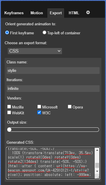
.stylie {
  animation-name: stylie-keyframes;
  animation-duration: 2000ms;
  animation-delay: 0ms;
  animation-fill-mode: forwards;
  animation-timing-function: linear;
  animation-iteration-count: infinite;
  transform-origin: 0 0;
}
@keyframes stylie-keyframes {
  0% {transform:translate(0px, 0px) scale(1) rotateX(0deg) rotateY(0deg) rotateZ(0deg) translate(-50%, -50%);}
  50% {transform:translate(355px, -276.5px) scale(1) rotateX(0deg) rotateY(0deg) rotateZ(134deg) translate(-50%, -50%);}
  100% {transform:translate(713px, 35.5px) scale(1) rotateX(0deg) rotateY(0deg) rotateZ(134deg) translate(-50%, -50%);}
}
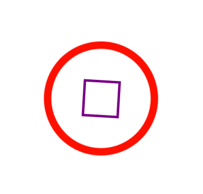
회전 예제
(html)
<div class="outer-border">
	<div class="inner-border"></div>
</div>
(css)
.outer-border {
	display: flex;
	justify-content: center;
	align-items: center;
	width: 200px;
	height: 200px;
	border: solid 15px red;
	border-radius: 50%;
	margin: 0 auto;
	margin-top: 200px;
	animation: outerBorder 2s infinite;
}
@keyframes outerBorder {
	0%{ border-color: red; transform: scale(1.0);}
	25%{ border-color: yellow; transform: scale(1.2);}
	50%{ border-color: blue; transform: scale(1.3);}
	75%{ border-color: green; transform: scale(1.2);}
	100%{ border-color: pink; transform: scale(1.0);}
}
.inner-border {
	box-sizing: border-box;
	width: 75px;
	height: 75px;
	border: 5px solid purple;
	animation: innerBorder 2s infinite alternate;
}
@keyframes innerBorder{
	0%{ transform: rotate(0deg);}
	25%{ border-color: blue; border-width: 10px;}
	50%{ border-color: yellow; border-width: 20px;}
	75%{ border-color: green; border-width: 40px;}
	100%{ border-color: gray; transform: rotate(360deg); border-width: 5px;}
}
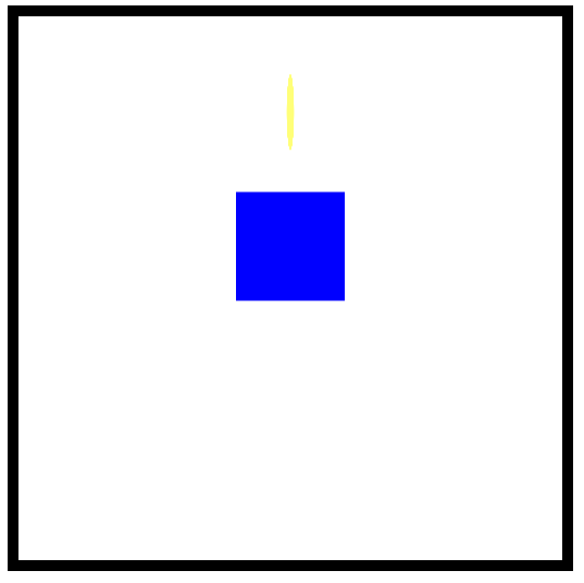
마리오 코인 예제
(html)
<div class="mario-container">
	<div class="mario-coin"></div>
	<div class="mario-box"></div>
</div>
(css)
.mario-container{
	position: relative;
	width: 500px;
	height: 500px;
	border: solid 10px black;
	margin: 0 auto;
	margin-top: 200px;
}
.mario-container .mario-coin{
	positon: relative;
	width: 70px;
	height: 70px;
	background-color: yellow;
	border-radius: 50%;
	margin: 0 auto;
	margin-top: 100px;
	animation: jumpcoin 0.8s linear infinite ;
}
@keyframes jumpcoin{
	0% {
		transform: translateY(0);
		opacity: 1;
	}
	50% {
		transform: translateY(-100px) rotateY(180deg);
		opacity: 0;
	}
	100% {
		transform: translateY(-100px) rotateY(360deg);
		opacity: 0;
	}
}
.mario-container .mario-box{
	width: 100px;
	height: 100px;
	background-color: blue;
	margin: 0 auto;
	animation: jumpbox 0.5s linear infinite alternate;
}
@keyframes jumpbox{
	0% { transform: translateY(0px); }
	50% { transform: translateY(-10px);  }
	100% { transform: translateY(0px);  }
}
이미지 확대 예제
(html)
<div class="hover-image">
	<img src="https://images.template.net/wp-content/uploads/2015/08/Extraordinary-Beach-Background-Free-Download.png">
	<div class="image-info">
		<h2>Title</h2>
		<p>Parapragh</p>
	</div>
</div>
(css)
.hover-image {
	overflow: hidden;
	position: relative;
	width: 400px;
	border: solid 10px #000000;
}
.hover-image img{
	width: 100%;
	vertical-align: middle;
	transition: transform 1s linear;
}
.hover-image:hover img{
	transform: scale(1.3);
}
.hover-image .image-info {
	box-sizing: border-box;
	position: absolute;
	width: 100%;
	background-color: rgba(0, 0, 0, 0.5);
	padding: 20px;
	left: 0;
	bottom: -85px;
	transition: bottom 0.3s linear;
}
.hover-image:hover .image-info {
	bottom: 0;
}
.hover-image .image-info h2,
.hover-image .image-info p{
	margin: 0;
	padding: 0;
	color: #ffffff;
}
.hover-image .image-info h2{
	font-size: 20px;
}
.hover-image .image-info p {
	font-size: 15px;
}
참고 사이트 정리
Devoth‘s HEX 2 RGBA Color Calculator
rgba 태그로 색을 결정할 때 유용한 사이트.
stylie
레이아웃의 동선을 짜고 그에 따른 애니메이션 태그를 쉽게 출력해주는 사이트.
w3schools
기본 태그들의 개념을 설명해주는 사이트.
학습 소감
코드를 하나하나 살펴보면 모두 익숙한 코드지만, 모아놓고 보면 어렵다. 코드를 작성할 땐 영상을 쉬이 따라가며 만들었는데, 다 만들고 난 뒤에 다시 보니 그 과정이 잘 생각나지 않을 정도. 좀 더 많은 예제와 연습이 필요할 것 같다.
진행한 코드 링크
오늘 진행한 자세한 코드는 내 github 링크 에 업로드 되었다.