어제 로그인 페이지에 이어 오늘은 집사진이라는 상세페이지를 구현 했습니다.
틱히 어려웠던 점은 오른쪽에 있는 4개의 버튼들의 위치를 레이아웃하는것이 힘들었습니다.
return (
<PicTotal>
<PicPadding>
<PicTop>
<CardWidth>
<CardTop>
<DetailTag>
<DetailTagText>
<TagTextButton>모던스타일</TagTextButton>
<TagTextButton>아파트</TagTextButton>
</DetailTagText>
</DetailTag>
<CardPics>
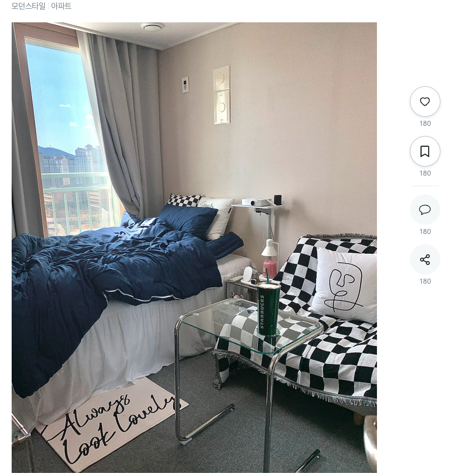
<CardPic src="https://image.ohou.se/i/bucketplace-v2-development/uploads/cards/snapshots/164890162254034673.jpeg?w=1440" />
</CardPics>
</CardTop>
<CustomHr2 />
<div>
<CommentDiv>
<CommentText>
댓글
<CommentNumber>
46
</CommentNumber>
</CommentText>
<CommentButDiv6>
<CommentButDiv5>
<CommentEmoticon>
<CommentEmoticonPic src="https://image.ohou.se/i/bucketplace-v2-development/uploads/cards/snapshots/164890162254034673.jpeg?w=1440" />
</CommentEmoticon>
<CommentButDiv4>
<CommentButDiv3>
<CommentButDiv2>
<CommentLine contenteditable="true" data-placeholder="칭찬과 격려의 댓글은 작성자에게 큰 힘이 됩니다:)" size='44' isEmpty={isEmpty} onInput={handleChange}>
</CommentLine>
<CommentButDiv>
<CommentBtn>
입력
</CommentBtn>
</CommentButDiv>
</CommentButDiv2>
</CommentButDiv3>
</CommentButDiv4>
</CommentButDiv5>
</CommentButDiv6>
</CommentDiv>
</div>
</CardWidth>
<SideButtonPosition>
<SideButtonSticky>
<SideButtonControl>
<SideButtonBox>
<SideButton>
<SideButtonSpan onClick={handleHeartClick}>
<SideButtonHeart >
{isFilledHeart ? <AiFillHeart color = "#43C5F0"size={23}/> : <AiOutlineHeart size={23}/>}
</SideButtonHeart>
</SideButtonSpan>
<SideButtonSpanNumber>
180
</SideButtonSpanNumber>
</SideButton>
<SideButton>
<SideButtonSpan onClick={handleBookClick}>
<SideButtonHeart>
{isFilledBook ? <FaBookmark color = "#43C5F0"size={23}/> : <FaRegBookmark size={23}/>}
</SideButtonHeart>
</SideButtonSpan>
<SideButtonSpanNumber>
180
</SideButtonSpanNumber>
</SideButton>
<CustomHr />
<SideButton>
<SideButtonSpanLow>
<SideButtonHeart>
<SlBubble size={23}/>
</SideButtonHeart>
</SideButtonSpanLow>
<SideButtonSpanNumber>
180
</SideButtonSpanNumber>
</SideButton>
<SideButton>
<SideButtonSpanLow>
<SideButtonHeart>
<FiShare2 size={23}/>
</SideButtonHeart>
</SideButtonSpanLow>
<SideButtonSpanNumber>
180
</SideButtonSpanNumber>
</SideButton>
</SideButtonBox>
</SideButtonControl>
</SideButtonSticky>
</SideButtonPosition>
</PicTop>
</PicPadding>
</PicTotal>
)
}그리고 엄청난 양의 Div지옥
CSS는 생각대로 잘될때는 너무나 재미있지만 하나가 틀어지면 레이아웃이 산으로 가는 현상은
끊었던 담배를 생각나게 합니다.
그래도 재밌어 ㅋㅋ

𝙸 𝚊𝚖 𝚊 𝚌𝚞𝚛𝚒𝚘𝚞𝚜 𝚍𝚎𝚟𝚎𝚕𝚘𝚙𝚎𝚛 𝚠𝚑𝚘 𝚎𝚗𝚓𝚘𝚢𝚜 𝚍𝚎𝚏𝚒𝚗𝚒𝚗𝚐 𝚊 𝚙𝚛𝚘𝚋𝚕𝚎𝚖. 🇰🇷👩🏻💻
좋은 글 감사합니다.