디자인시스템 개발
Select 컴포넌트를 만들어보자
- 어떤 형태의 인터페이스로 사용할 것인가? (사용자관점)
- Native select, option태그와 같은 형태의 인터페이스로 고려해보자 (mdn)
<Select onChange={onChange}>
  <Option value="dog">Dog</Option>
  <Option value="cat">Cat</Option>
  <Option value="parrot">Parrot</Option>
</Select>
-
추상화 가능한 부분으로 잘게 분리해보자
-
컴포넌트
- Dropdown - Trigger, Modal
- Trigger를 클릭했을때 Modal의 영역이 띄어진다
- Floating에 대한 구현을 컴포넌트화 시킬 수 있다
- Tooltip, Select, Float Menu 등에서 재사용 할 수 있다
-
Hook
- DataList
- List 형태의 Data
- 그중 단수, 복수개가 선택될 수 있다
- Select-Option, Checkbox-list에서도 사용할 수 있다
(이번 Select개발에서는 사용하지 않았다)
- DataList
-
export const useDataSelect = ({ dataList }) => {
  const [selectedData, setSelectedData] = useState([])

  const addItem = () => {}

  const removeItem = () => {}

  return {
    selectedData,
    addItem,
    removeItem
  }
}
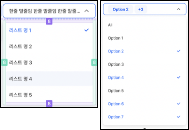
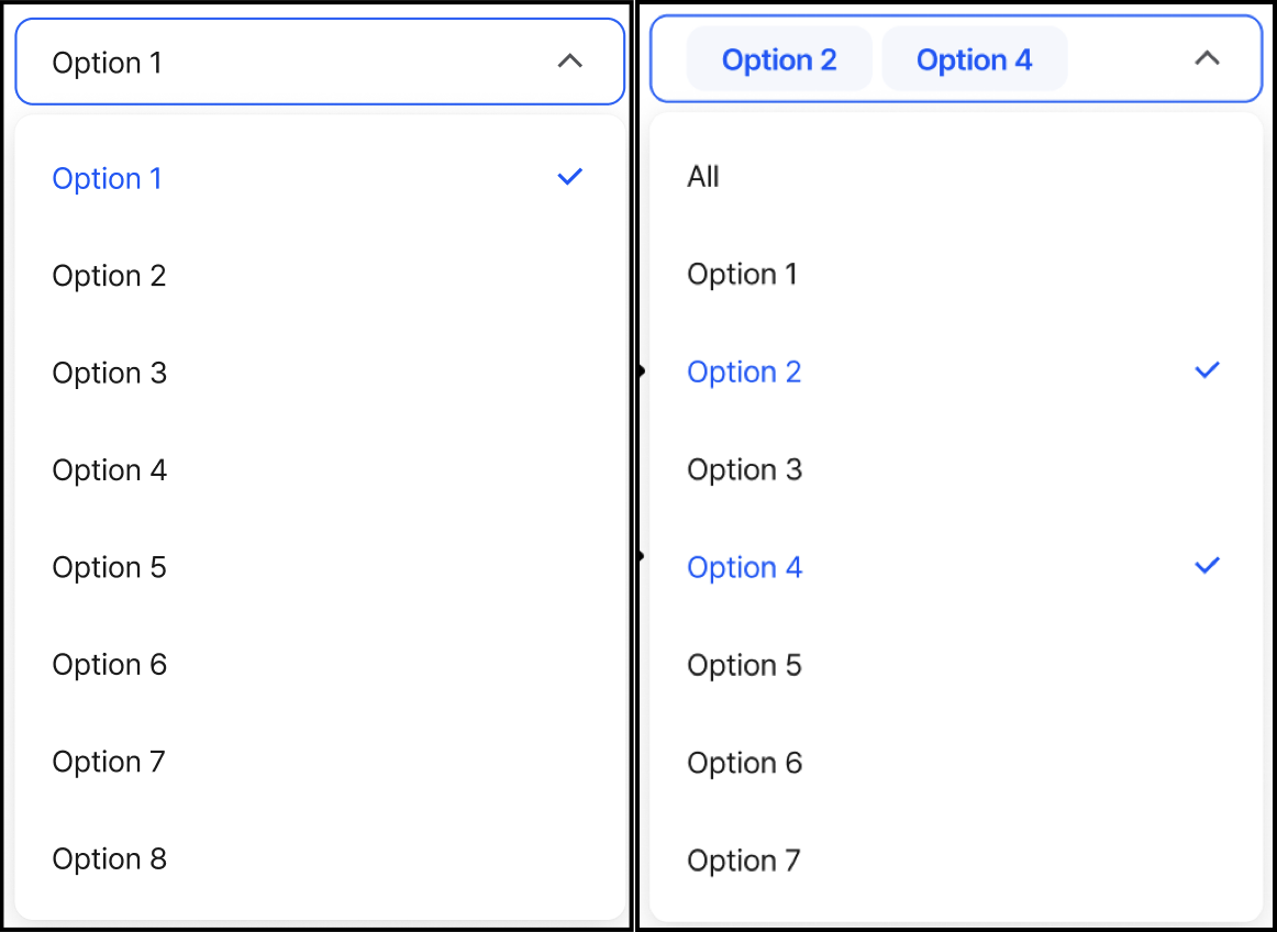
사용자관점에서 Select인터페이스를 먼저 정의하자
<Select onChange={onChange} type="single">
<Option value="dog">Dog</Option>
<Option value="cat">Cat</Option>
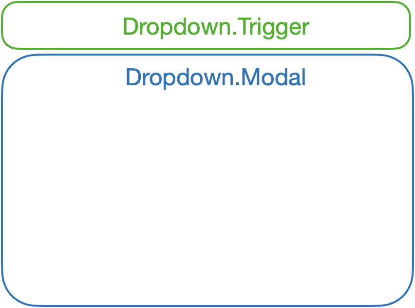
</Select>Native Select Option과 같은 인터페이스로 정의했고, =Select, Option 컴포넌트를 구성하기 전에 Dropdown.Trigger, Dropdown.Modal을 먼저 설계해보자
Dropdown 컴포넌트는 Dropdown.Trigger, Dropdown.Modal로 구성하거나 prop로 자식 컴포넌트를 전달할 수 있다
props로 자식 컴포넌트를 전달하여 만드는 방식으로 진행해보자
//	Dropdown.tsx


import { useState } from 'react'

const Dropdown = ({ triggerComponent, modalComponent }: any) => {
  const [isShow, setIsShow] = useState(false)

  const handleTriggerClick = () => {
    setIsShow(!isShow)
  }

  return (
    <div>
      <Trigger triggerComponent={triggerComponent} onClick={handleTriggerClick}></Trigger>
      <Modal modalComponent={modalComponent} isShow={isShow}></Modal>
    </div>
  )
}

const Trigger = ({ triggerComponent, onClick }: any) => {
  return <div onClick={onClick}>{triggerComponent}</div>
}

const Modal = ({ isShow, modalComponent }: any) => {
  return <div>{isShow && <div>{modalComponent}</div>}</div>
}

export { Dropdown }
코드를 설명하자면 Dropdown컴포넌트는 Trigger Modal로 구성되어 있다
Trigger여부에 대한 상태를 Dropdown컴포넌트에서 관리하고, props로 Modal에게 전달해준다.
return (
  <div>
    <Trigger triggerComponent={triggerComponent} onClick={handleTriggerClick}></Trigger> // <-- triggerComponent 전달
    <Modal modalComponent={modalComponent} isShow={isShow}></Modal>	//	<-- modalComponent 전달
  </div>
)
여기에 추가로 floating을 관리할 수 있는 패키지인 @floating-ui/react를 사용할 수 있다 (적용은 추후에..)
Option 컴포넌트는 props로 받은 value, selectedItems, onSelectItem 이벤트를 바인딩해주는 역할만 한다
//	Option.tsx

const Option = ({ value, children, onSelectItem, selectedItems }: any) => {
  const OptionStyle = css`
    display: flex;
    justify-content: space-between;
    padding: 8px;
    &:hover {
      background-color: #f4f7fd;
    }
  `

  return (
    <div css={OptionStyle} onClick={event => onSelectItem({ event, value })}>
      <span>{children}</span>
      {selectedItems.includes(value) && <span>v</span>}
    </div>
  )
}
Select컴포넌트는 여러개의 Option컴포넌트를 전달받게 되는데, 렌더링 함수에 {children}을 써도 상관없지만, props를 전달하기 위해서는 {children} 변환이 필요하다.
이 때 React.Children을 사용해 map