기본 문법
fig = px.그래프종류(data_frame=데이터, x=X축 컬럼, y=Y축 컬럼, color=범례 컬럼, title=제목,
                 labels=dict(X축 컬럼=X축 라벨, Y축 컬럼=Y축 라벨),
                 width=그래프 가로길이, height=그래프 세로길이, text_auto=True/False)
fig.show()
산점도
px.scatter(data_frame=데이터, x= , y= , color=색, trendline='ols')
# trendline은 추세선 추가
facet_col: column 지정해서 분할
fig = px.scatter(data_frame=penguins, x='bill_length_mm', y='bill_depth_mm', color='sex', trendline='ols', facet_col='island',
                 color_discrete_sequence=px.colors.qualitative.Set2, template='plotly_white')
fig.show()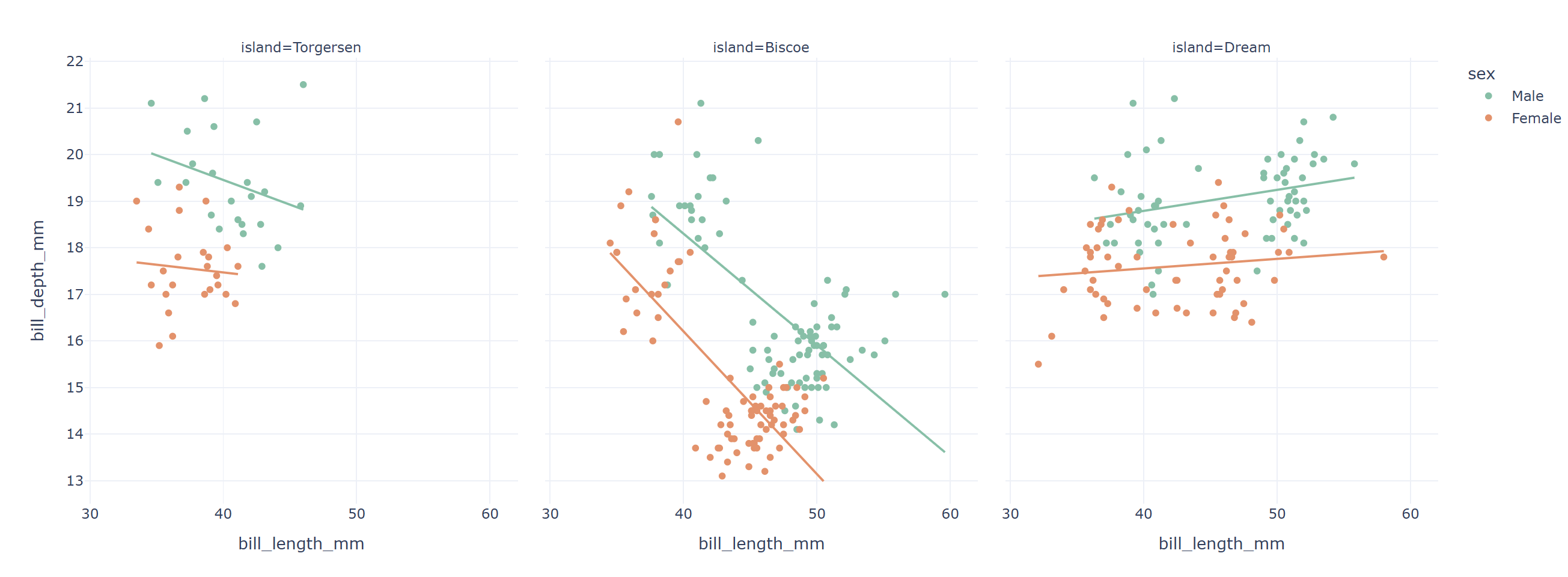
히스토그램
px.histogram(data_frame=데이터, x= , y= , color=색)
fig = px.histogram(data_frame=penguins, x='flipper_length_mm', color_discrete_sequence=px.colors.qualitative.Set2, template='plotly_white')
fig.show()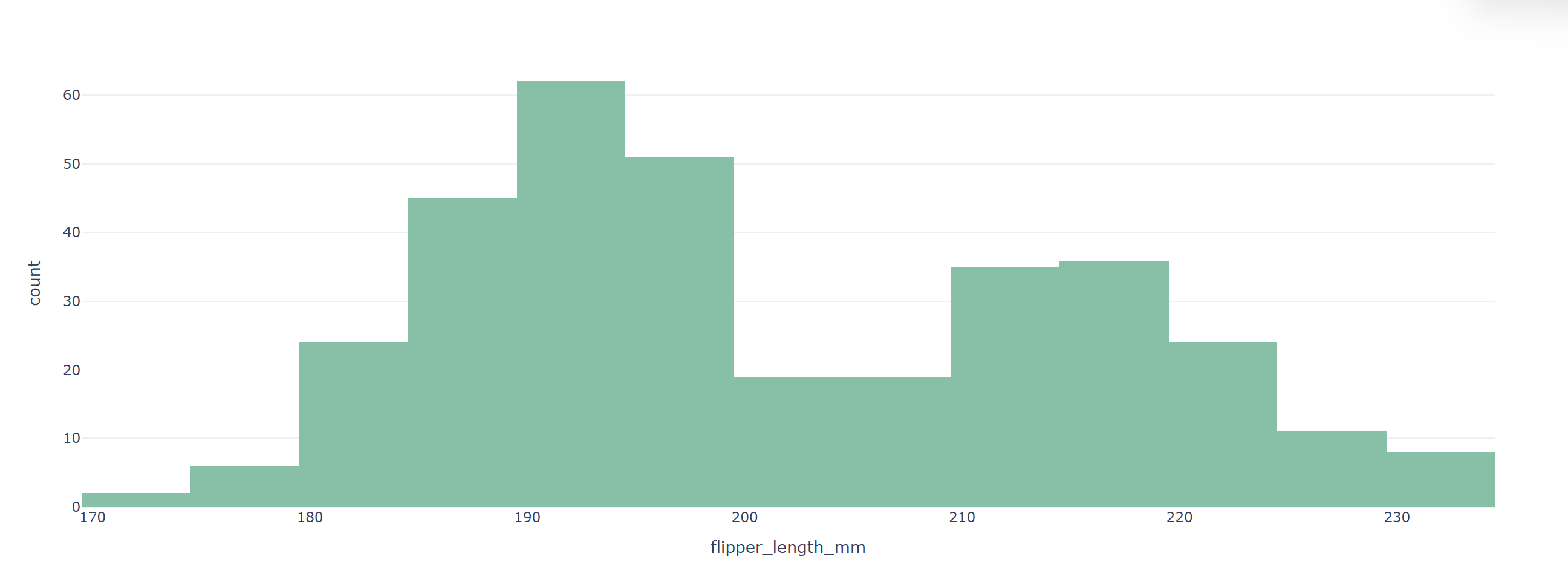
상자 그림
px.box(data_frame=데이터, x= , y= , color=색)
fig = px.box(data_frame=penguins, x='body_mass_g', y='species', color='sex',
             color_discrete_sequence=px.colors.qualitative.Set2, template='plotly_white')
fig.show()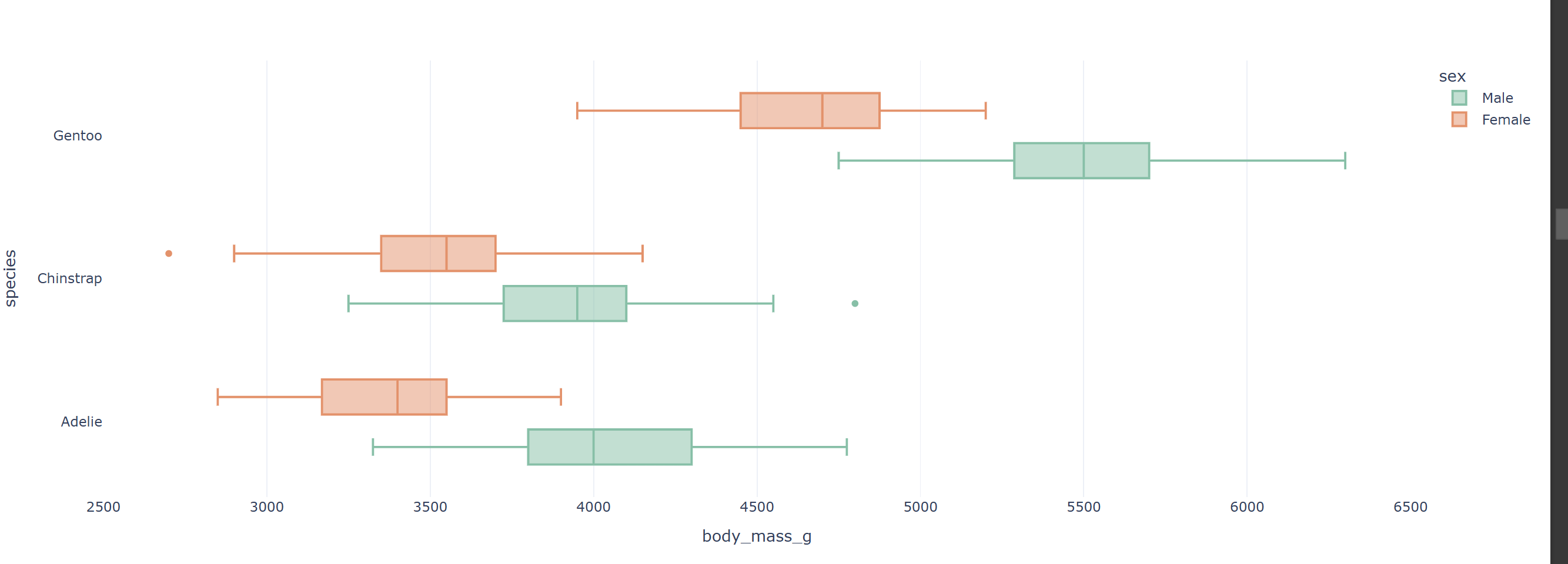
막대 그래프
px.bar(data_frame=데이터, x= , y= , color=색, barmode='group')
# 쌓아서 올리지 않으면 barmode='group'을 추가
barmode 없는 경우
fig = px.bar(data_frame=titanic_groupby, x='class', y='survived', color='sex',
             color_discrete_sequence=px.colors.qualitative.Set2, template='plotly_white')
fig.show()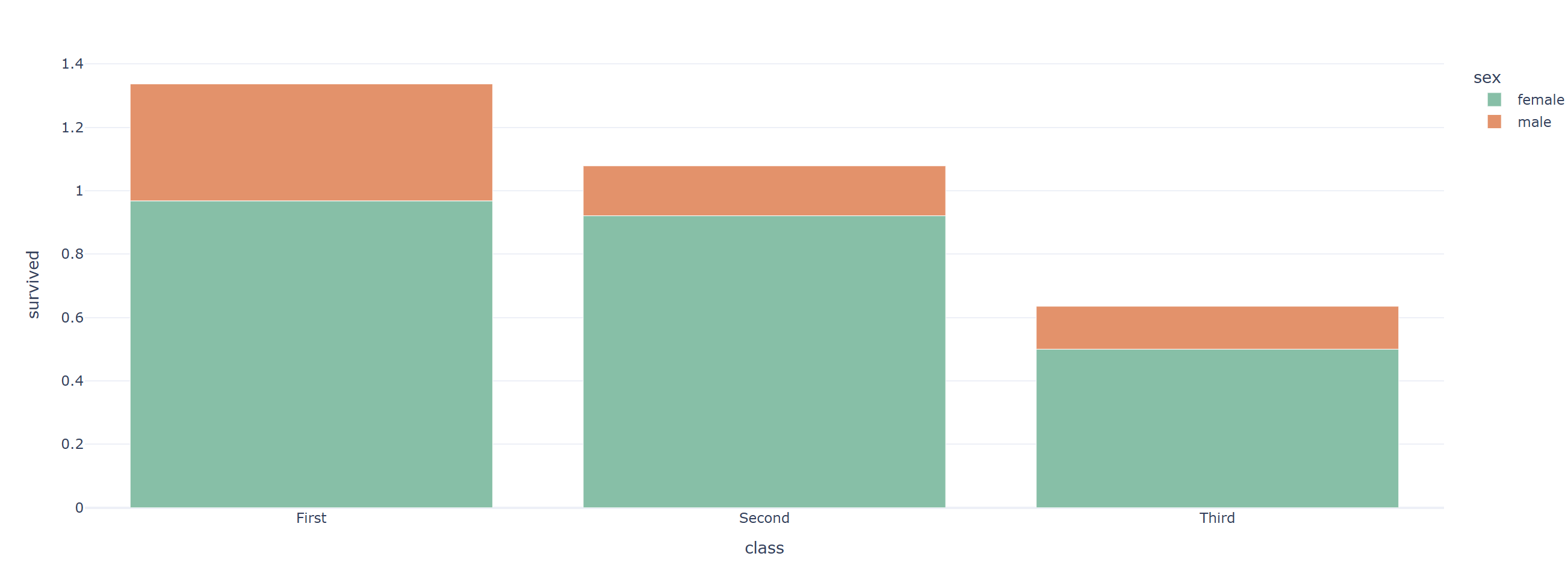
barmode='group' 지정한 경우
fig = px.bar(data_frame=titanic_groupby, x='class', y='survived', color='sex', barmode='group', text_auto='.2f',
             color_discrete_sequence=px.colors.qualitative.Set2, template='plotly_white')
fig.show()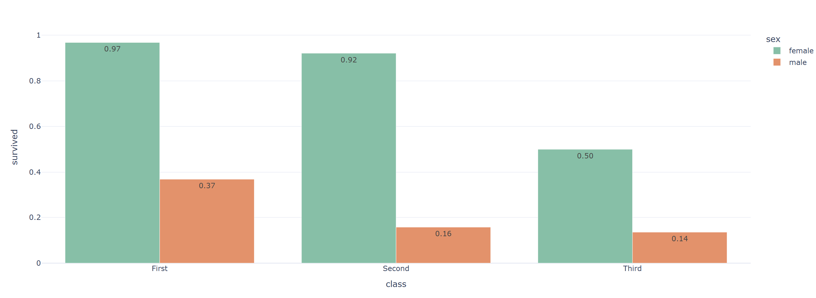
선 그래프
px.line(data_frame=데이터, x= , y= , color=색)
fig = px.line(data_frame=flights, x="year", y="passengers", color='month'
, color_discrete_sequence=px.colors.qualitative.Set2, template='plotly_white')
fig.show()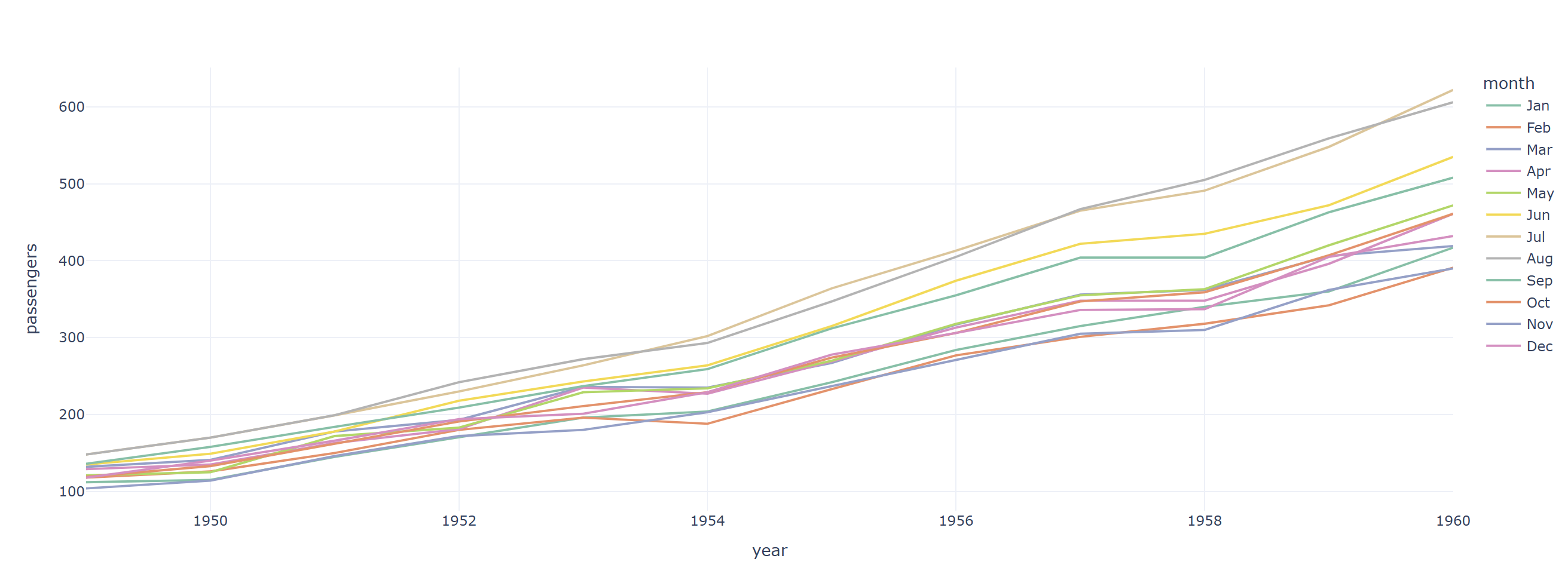
히트맵
px.imshow(데이터, text_auto=텍스트포맷, color_continuous_scale=컬러맵)
fig = px.imshow(titanic_pivot, text_auto='.2f', color_continuous_scale='Purples')
fig.show()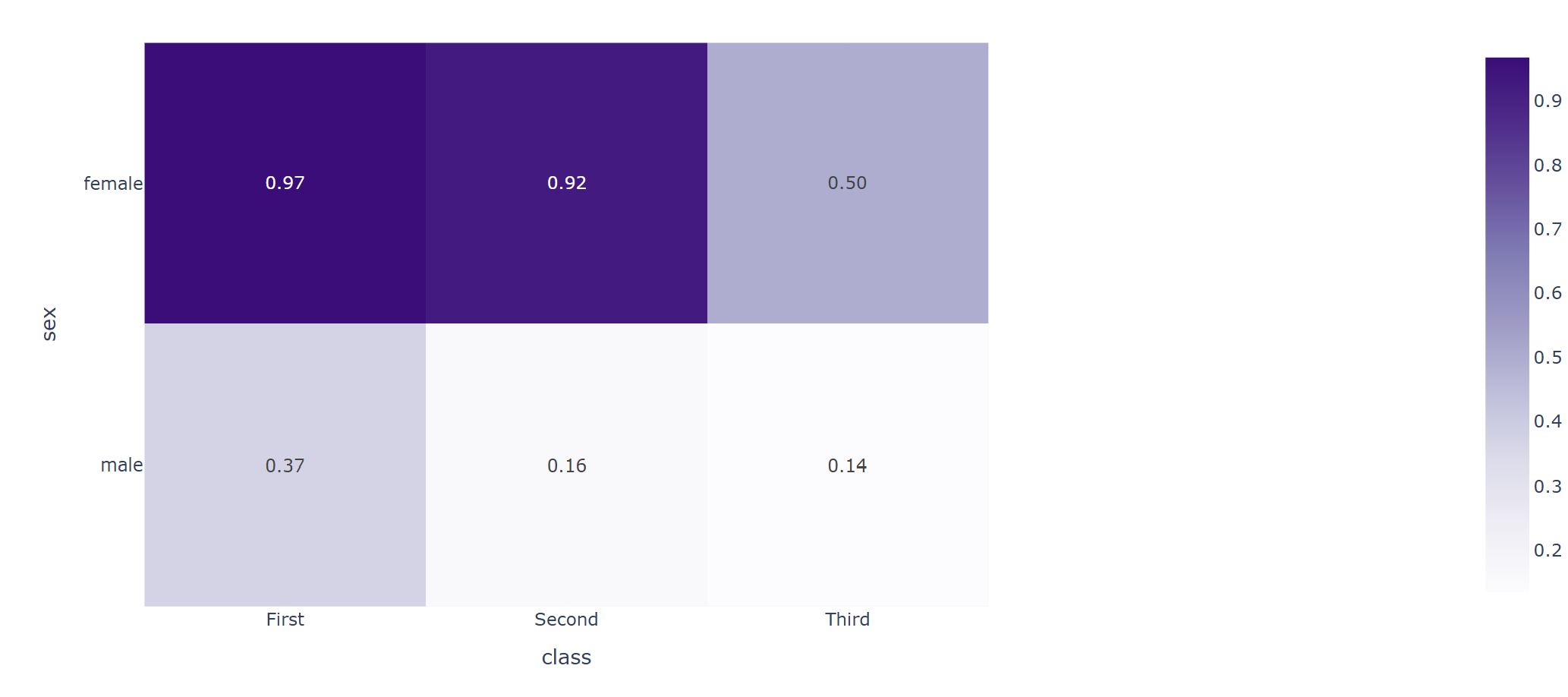
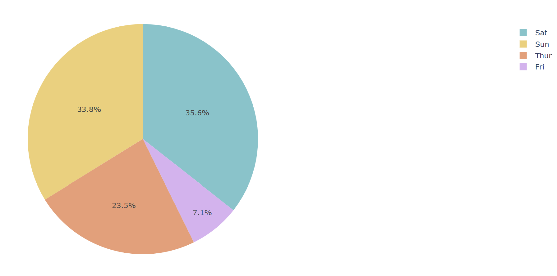
파이차트
px.pie(data_frame=데이터, values=값, name=라벨)
fig = px.pie(df, values='tip', names='day', color_discrete_sequence=px.colors.qualitative.Pastel)
fig.show()