프로젝트에서 사용했던 plotly의 graph objects를 정리해보겠다
기본 문법
import plotly.graph_objects as go

# Figure 객체 생성
fig = go.Figure()

# Trace(데이터) 추가
fig.add_trace(go.Scatter(x=[1, 2, 3], y=[4, 1, 2], mode='lines+markers', name='Sample'))

# 레이아웃 설정
fig.update_layout(title='Sample Plot', xaxis_title='X Axis', yaxis_title='Y Axis')

fig.show()
주요 구성 요소
Trace(데이터 시각화 요소)
go.Scatter(): 선 그래프, 산점도
go.Bar(): 막대 그래프
go.Pie(): 파이 차트
go.Box(): 박스 플롯
go.Heatmap(): 히트맵
Figure(그래프 객체)
fig = go.Figure(): 빈 Figure 객체 생성
fig.add_trace(go.Scatter(...)): 데이터 추가
Layout(레이아웃 설정)
fig.update_layout(title='그래프 제목', xaxis_title='x축 제목', yaxis_title='y축 제목')
fig.update_xaxes(title_text='x축 제목')
fig.update_yaxes(title_text='y축 제목')
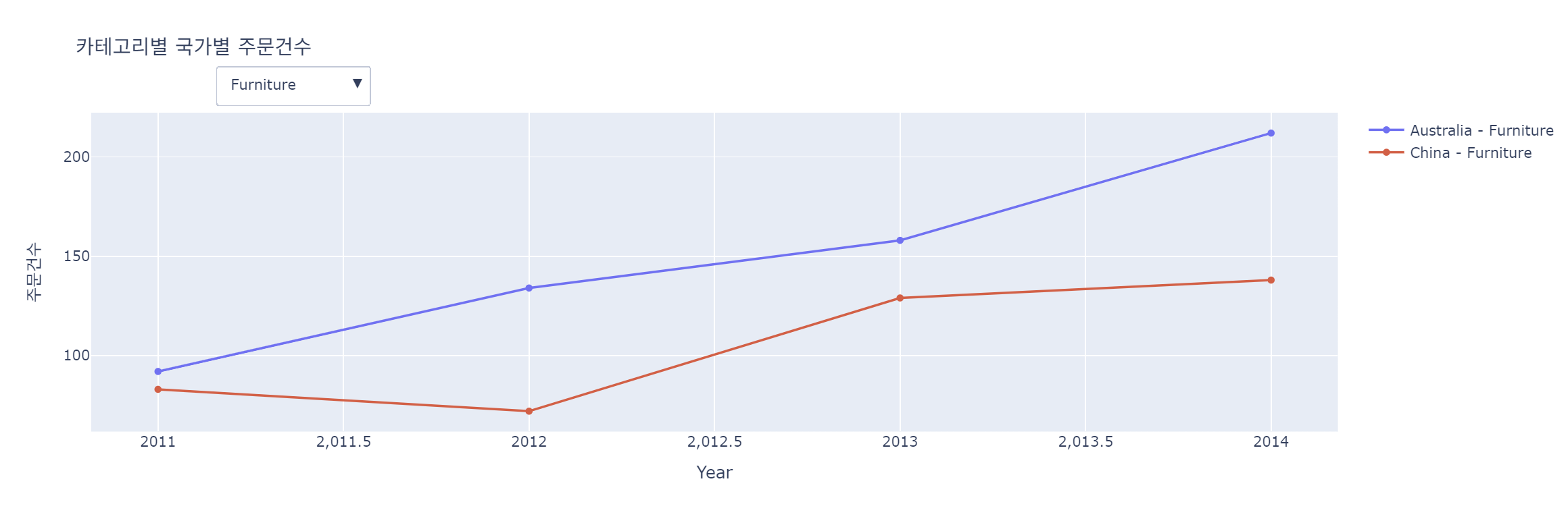
프로젝트 시각화 코드
카테고리별 국가별 주문 건수
각 카테고리와 국가에 대해 그래프 추가
fig = go.Figure()

categories = size_df['Category'].unique()
countries = size_df['Country'].unique()

for category in categories:
    for country in countries:
        category_data = size_df[(size_df['Category'] == category) & (size_df['Country'] == country)]
        fig.add_trace(go.Scatter(
            x=category_data['year'],
            y=category_data['주문건수'],
            mode='lines+markers',
            name=f"{country} - {category}",
            visible=(category == categories[0])
        ))
fig.add_trace(go.Scatter(...))
-> 각 국가 및 카테고리에 대한 라인 그래프
-> name=f'{country} - {category}로 각 그래프의 이름을 설정하여 그래프 레전드에 표시
-> visible=(category == categories[0])로 첫 번째 카테고리의 그래프만 처음에 보이게 설정
드롭다운 버튼 생성: 각 카테고리마다 버튼을 생성해 선택하면 해당 카테고리만 볼 수 있도록 설정
dropdown_buttons = [
    {"label": category, "method": "update", "args": [{"visible": [category == cat for cat in categories for _ in countries]},
                                                    {"title": f"{category} 카테고리별 국가별 주문건수"}]}
    for category in categories
]label: 드롭다운에 표시될 텍스트
method: 'update': 버튼 클릭 시 그래프를 업데이트 하도록 설정
args - visible: 각 카테고리의 국가별 주문 건수 그래프 중 해당 카테고리에 해당하는 것만 보이게 설정
args - title: 드롭다운 메뉴에서 카테고리를 선택할 때마다 그래프의 제목을 변경
레이아웃 및 드롭다운 메뉴 설정
fig.update_layout(
    updatemenus=[{
        "buttons": dropdown_buttons,
        "direction": "down",
        "showactive": True,
        "x": 0.1,
        "xanchor": "left",
        "y": 1.15,
        "yanchor": "top",
    }],
    title="카테고리별 국가별 주문 건수",
    xaxis_title="Year",
    yaxis_title="주문건수"
)

fig.show()updatemenus: 드롭다운 메뉴를 레이아웃에 추가
- buttons: 앞서 만든 드롭다운 버튼을 설정
- direction: 'down': 드롭다운 버튼이 아래로 펼쳐지도록 설정
- showactive: True: 현재 선택된 버튼이 활성화되어 표시
- x, xanchor, y, yanchor: 드롭다운 버튼의 위치를 정한다(여기서는 그래프 위쪽에 배치하도록 설정)
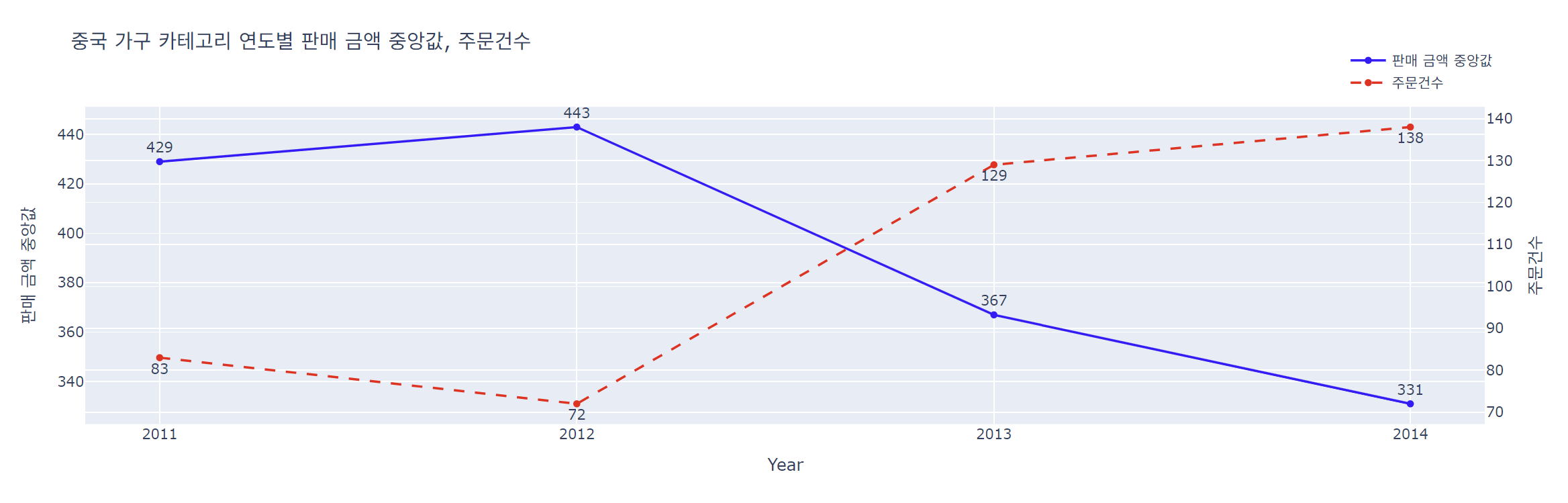
중앙값 주문 건수 비교
첫 번째 트레이스: 판매 금액 중앙값
fig.add_trace(go.Scatter(
    x=ch_furniture["year"],
    y=ch_furniture["sales median"],
    text=ch_furniture['sales median'],
    textposition='top center',
    mode="lines+markers+text",
    name="판매 금액 중앙값",
    line=dict(color="blue", width=2)
))text=: 각 데이터 포인트 위에 판매 금액 중앙값을 표시
mode='lines+marker+text': 데이터 포인트를 선과 마커로 표시하며 텍스트도 표시
line=dict(color='blue', width=2): 선의 색상을 파란색으로, 두께는 2로 설정
두 번째 트레이스: 주문 건수
fig.add_trace(go.Scatter(
    x=ch_furniture["year"],
    y=ch_furniture["amount"],
    mode="lines+markers+text",
    text=ch_furniture['amount'],
    textposition='bottom center',
    name="주문건수",
    line=dict(color="red", width=2, dash="dash"),
    yaxis="y2"
))yaxis='y2': 이 트레이스는 두 번째 y축(y2)에 배치되어 판매 금액의 중앙값과 주문 건수를 각각 다른 y축에 표시하도록 설정
레이아웃 설정
fig.update_layout(
    title="중국 가구 카테고리 연도별 판매 금액 중앙값, 주문건수",
    xaxis_title="Year",
    yaxis=dict(title="판매 금액 중앙값"),
    yaxis2=dict(title="주문건수", overlaying="y", side="right"),
    xaxis=dict(tickmode="linear", dtick=1),
    legend=dict(x=0.9, y=1.2)
)
fig.show()
yaxis2=dict(title='주문 건수'...): 두 번째 y축을 추가하여
- overlaying='y': 첫 번째 y축과 겹쳐서 표시되도록 설정
- side='right': 두 번째 y축을 오른쪽에 배치
xaxis=dict(tickmode='linear', dtick=1): x축의 눈금은 선형으로 설정, 각 눈금 간 간격을 1년으로 설정