
2023.02.10
Styled Components
1. CSS-in-Js란?
(1) css-in-js란 무엇인가?
CSS-in-JS방식이란, 단어 그대로 자바스크립트 코드로 CSS 코드를 작성하여 컴포넌트를 꾸미는 방식이다. 순수한 CSS코드를 자바스크립트를 이용해서 CSS코드를 만들어내는 것. CSS-in-JS 방식을 사용하기 위해 새로운 패키지를 사용할 것이다.
(2) styled-components 란 무엇인가?
styled-components는 리액트에서 CSS-in-JS 방식으로 컴포넌트를 꾸밀수 있게 도와주는 패키지이다.
2. styled-components 준비하기
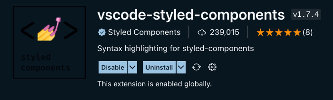
(1) VScode 플러그인 설치
vscode 플러그인을 설치해준다.
(2) yarn 에서 styled-components 설치하기
vscode 터미널에서 아래 명령어를 입력해 설치
yarn add styled-components3. styled-components 사용하기
(1) 기본적인 사용법 알아보기
SC의 기본적인 원리는 꾸미고자 하는 컴포넌트를 SC의 방식대로 먼저 만들고, 그 안에 스타일 코드를 작성하는 방식으로 진행한다.
// src/App.js

import React from "react";
// styled-components에서 styled 라는 키워드를 import 합니다.
import styled from "styled-components";

// styled키워드를 사용해서 styled-components 방식대로 컴포넌트를 만듭니다.
const StBox = styled.div`
	// 그리고 이 안에 스타일 코드를 작성합니다. 스타일 코드는 우리가 알고 있는 css와 동일합니다.
  width: 100px;
  height: 100px;
  border: 1px solid red;
  margin: 20px;
`;

const App = () => {
	// 그리고 우리가 만든 styled-components를 JSX에서 html 태그를 사용하듯이 사용합니다.
  return <StBox>박스</StBox>;
};

export default App;
가장 핵심이 되는 코드는 const StBox = styled.div``; 이 부분이다. '' 은 따옴표가 아니라 '백틱' 이라는 문자이다.
styled. 뒤에는 html의 태그가 들어간다. 아래 처럼 내가 원하는 html 태그를 사용해서 styled-components를 만들 수 있다.
div ➡️ styled.div
span ➡️ styled.span
button ➡️ styled.button
(2) 조건부 스타일링이란?
classname을 사용해서 구현하기는 조금 까다로운 조건부 스타일링을 styled-components를 이용하면 간편하게 할 수 있다. CSS-in-JS 방식의 강점은 바로 스타일 코드를 JS코드 작성하듯이 스타일 코드를 작성할 수 있다는 점이다.
// src/App.js

import React from "react";
import styled from "styled-components";

// 1. styled-components를 만들었다.
const StBox = styled.div`
  width: 100px;
  height: 100px;
  border: 1px solid ${(props) => props.borderColor}; // 4.부모 컴포넌트에서 보낸 props를 받아 사용한다.
  margin: 20px;
`;

const App = () => {
  return (
    <div>
			{/* 2. 그리고 위에서 만든 styled-components를 사용했다. */}
			{/* 3. 그리고 props를 통해 borderColor라는 값을 전달했다. */}
      <StBox borderColor="red">빨간 박스</StBox>
      <StBox borderColor="green">초록 박스</StBox>
      <StBox borderColor="blue">파랑 박스</StBox>
    </div>
  );
};

export default App;
좀더 응용한다면 이렇게도 가능하다.
// src/App.js

import React from "react";
import styled from "styled-components";

const StContainer = styled.div`
  display: flex;
`;

const StBox = styled.div`
  width: 100px;
  height: 100px;
  border: 1px solid ${(props) => props.borderColor};
  margin: 20px;
`;
// 박스의 색을 배열에 담습니다.
const boxList = ["red", "green", "blue"];

// 색을 넣으면, 이름을 반환해주는 함수를 만듭니다.
const getBoxName = (color) => {
  switch (color) {
    case "red":
      return "빨간 박스";
    case "green":
      return "초록 박스";
    case "blue":
      return "파란 박스";
    default:
      return "검정 박스";
   }
};
const App = () => {
  return (
    <StContainer>
			{/* map을 이용해서 StBox를 반복하여 화면에 그립니다. */}
      {boxList.map((box) => (
        <StBox borderColor={box}>{getBoxName(box)}</StBox>
      ))}
    </StContainer>
  );
};

export default App;
4. GlobalStyles(전역 스타일링)
(1) 전역 스타일링이란?
프로젝트를 아우르는, 공통적으로 들어가야 할 스타일을 적용해야 할때 사용한다. 그럴 경우 ‘전역적으로(globally)’ 스타일을 지정하는 것을 전역 스타일링 이라고 한다.
(2) 컴포넌트 단위 스타일링
import styled from "styled-components";

function TestPage(props) {
  return (
    <Wrapper>
      <Title>{props.title}</Title>
      <Contents>{props.contents}</Contents>
    </Wrapper>
  );
}

const Title = styled.h1`
  font-family: "Helvetica", "Arial", sans-serif;
  line-height: 1.5;
  font-size: 1.5rem;
  margin: 0;
  margin-bottom: 8px;
`;

const Contents = styled.p`
  margin: 0;
  font-family: "Helvetica", "Arial", sans-serif;
  line-height: 1.5;
  font-size: 1rem;
`;

const Wrapper = styled.div`
  border: 1px solid black;
  border-radius: 8px;
  padding: 20px;
  margin: 16px auto;
  max-width: 400px;
`;

export default TestPage;
<h1>, <p>, <div> 태그는 각각 <Title />, <Contents />, <Wrapper />에서 새롭게 스타일링 되었는데, 규모가 좀 큰 프로젝트라고 한다면 공통적으로 적용되는 스타일링 부분은 빼줄 필요가 있다.
글꼴(font)와 line-height를 공통 요소라 가정하고 GlobalStyles을 적용해보자.
(3) GlobalStyles 적용
GlobalStyle.jsx
import { createGlobalStyle } from "styled-components";

const GlobalStyle = createGlobalStyle`
  body {
    font-family: "Helvetica", "Arial", sans-serif;
    line-height: 1.5;
  }
`;

export default GlobalStyle;
App.jsx
import GlobalStyle from "./GlobalStyle";
import BlogPost from "./BlogPost";

function App() {
	const title = '전역 스타일링 제목입니다.';
	const contents = '전역 스타일링 내용입니다.';
  return (
    <>
      <GlobalStyle />
      <BlogPost title={title} contents={contents} />
    </>
  );
}

export default App;
5. Sass 소개, Nesting
(1) Sass(Syntactically Awesome Style Sheets)란?
CSS를 전통적인 방법보다 효율적으로 사용하기 위해 만들어진 언어이다. 코드의 재사용성을 높이고, 가독성 또한 향상시켜줄 수 있는 방법인데, 어떻게 사용하는지만 알아보자.
(2) Sass 특징 및 예시 소개
변수를 사용할 수 있다.
$color: #4287f5;
$borderRadius: 10rem;

div {
	background: $color;
	border-radius: $borderRadius;
}
중첩할 수 있다(Nesting)
label {
      padding: 3% 0px;
      width: 100%;
      cursor: pointer;
      color: $colorPoint;

      &:hover {
        color: white;
        background-color: $color;
      }
}
다른 style 파일을 import 할 수 있다.
// colors
$color1: #ed5b46;
$color2: #f26671;
$color3: #f28585;
$color4: #feac97;
//style.scss
@import "common.scss";
.box {
background-color: $color3;
}6. css reset
(1) css reset이란?
브라우저는 기본적으로 default style을 제공한다. margin이나 글자의 크기 같은 경우인데, 웹브라우저마다 조금씩 다른default style을 제공하기때문에 이를 초기화하고 내가 설정한대로 표현되는것이 중요하다.
(2) CSS 초기화하기
reset.css
html, body, div, span, applet, object, iframe,
h1, h2, h3, h4, h5, h6, p, blockquote, pre,
a, abbr, acronym, address, big, cite, code,
del, dfn, em, img, ins, kbd, q, s, samp,
small, strike, strong, sub, sup, tt, var,
b, u, i, center,
dl, dt, dd, ol, ul, li,
fieldset, form, label, legend,
table, caption, tbody, tfoot, thead, tr, th, td,
article, aside, canvas, details, embed,
figure, figcaption, footer, header, hgroup,
menu, nav, output, ruby, section, summary,
time, mark, audio, video {
	margin: 0;
	padding: 0;
	border: 0;
	font-size: 100%;
	font: inherit;
	vertical-align: baseline;
}
/* HTML5 display-role reset for older browsers */
article, aside, details, figcaption, figure,
footer, header, hgroup, menu, nav, section {
	display: block;
}
body {
	line-height: 1;
}
ol, ul {
	list-style: none;
}
blockquote, q {
	quotes: none;
}
blockquote:before, blockquote:after,
q:before, q:after {
	content: '';
	content: none;
}
table {
	border-collapse: collapse;
	border-spacing: 0;
}
index.html
<!DOCTYPE html>
<html lang="en">
  <head>
    <meta charset="UTF-8" />
    <meta http-equiv="X-UA-Compatible" content="IE=edge" />
    <meta name="viewport" content="width=device-width, initial-scale=1.0" />
    <title>Document</title>
    <link rel="stylesheet" href="./reset.css" />
  </head>
  <body>
    <span>Default Style을 테스트 해 봅니다.</span>
    <h1>이건 h1 태그에요</h1>
    <p>이건 p 태그에요</p>
  </body>
</html>