✅혼자 공부하는 데이터 분석 with 파이썬
진도: Chapter 05
기본미션: p.314의 손코딩(맷플롯립에서 bar()함수로 막대 그래프 그리기)을 코랩에서 그래프 출력하고 화면 캡처하기
선택미션: p. 316의 손코딩(텍스트 정렬, 막대 조절 및 색상 바꾸기)을 코랩에서 출력하고 화면 캡처하기
1) 기본미션: p.314의 그래프 출력하고 화면 캡처
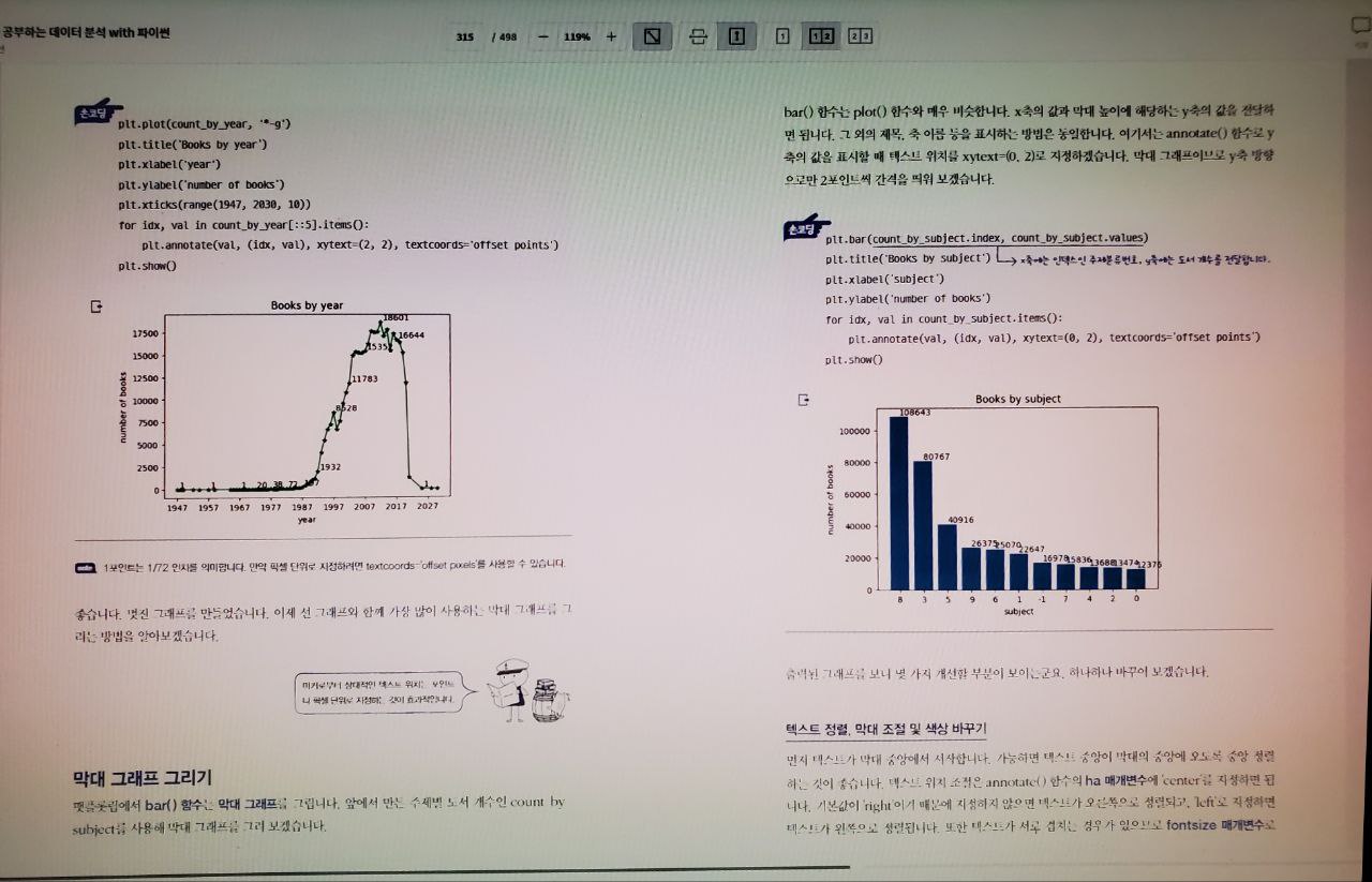
plt.plot(count_by_year, '*-g')
plt.title('Books by year')
plt.xlabel('year')
plt.ylabel('number of books')
plt.xticks(range(1947, 2030, 10))
for idx, val in count_by_year[::5].items():
    plt.annotate(val, (idx, val), xytext=(2, 2), textcoords='offset points')
plt.show()
그래프 [Matplotlib markers] 참조하자(https://matplotlib.org/stable/api/markers_api.html)
2) 선택미션: p.316의 그래프 출력하고 화면 캡처
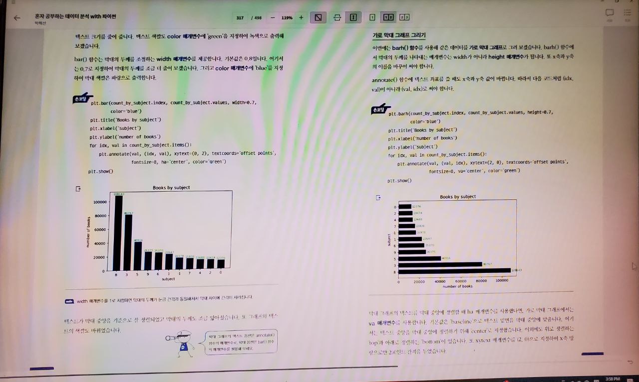
plt.bar(count_by_subject.index, count_by_subject.values, width=0.7, color='blue')
plt.title('Books by subject')
plt.xlabel('subject')
plt.ylabel('number of books')
for idx, val in count_by_subject.items():
    plt.annotate(val, (idx, val), xytext=(0, 2), textcoords='offset points',
                 fontsize=8, ha='center', color='green')
plt.show()
🙋♂️Q&A: 박해선 저자님의 혼공분석 github
💻유튜브 강의: 👉전체 강의 목록
혼공학습단 페이스북
더 나은 세상은 가능하다를 믿고 실천하는 활동가