Flutter 공식문서정리
1.hello world
import 'package:flutter/material.dart';

void main() {
  runApp(
    Center(
      child: Text(
        'Hello, world!',
        textDirection: TextDirection.ltr,
      ),
    ),
  );
}
runApp()함수는 widget을 가져와 widget tree의 root로 만들어줍니다.
위의 예시에서, widget tree는 center위젯과 center위젯의 자식인 text위젯 두개로 구성됩니다.
프레임워크는 강제로 root widget이 화면 최상단에 위치하도록 합니다.
즉 화면 중앙에 ''hello, world!"가 표시됩니다. 이경우 텍스트의 방향을 지정해야하는데, MaterialApp widget사용 시 에는 자동 처리 됩니다.
앱을 작성 시 일반적으로 위젯이 상태관리를 하는지 여부에 따라 statelessWidget또는 하위 클레스인 새로운 widget을 작성합니다.
statefullWidget의 주요작업은 하위 단계의 위젯을 설명하는 build() 함수를 구현(implement)하는 것입니다.
RenderObject 프레임워크는 프로세스가 완료될 때 까지 밑바닥에 있는 위젯까지 실행하며, 위젯의 형태를 연산하고, 렌더링합니다.
2.기본 widget
text
text를 사용하면 스타일이 지정된 text를 사용할 수 있습니다.
Row,column
Row와 Column은 가로(row)와 세로(column) 방향으로 flex한 레이아웃을 만들 수있습니다. flexbox 기반으로 만들어 졌습니다.
Container
Container는 직사각형 요소를 만들 수있습니다.(html의 div) boxDecoratior옵션으로 배경, 테두리 또는 그림자 같은 스타일을 지정 할 수있습니다.
다음은 위의 widget과 기타 widget을 사용한 간단한 예제입니다.
import 'package:flutter/material.dart';
class MyAppBar extends StatelessWidget {
MyAppBar({this.title});
// Fields in a Widget subclass are always marked "final".
final Widget title;
Widget build(BuildContext context) {
return Container(
height: 56.0, // in logical pixels
padding: const EdgeInsets.symmetric(horizontal: 8.0),
decoration: BoxDecoration(color: Colors.blue[500]),
// Row is a horizontal, linear layout.
child: Row(
// <Widget> is the type of items in the list.
children: <Widget>[
IconButton(
icon: Icon(Icons.menu),
tooltip: 'Navigation menu',
onPressed: null, // null disables the button
),
// Expanded expands its child to fill the available space.
Expanded(
child: title,
),
IconButton(
icon: Icon(Icons.search),
tooltip: 'Search',
onPressed: null,
),
],
),
);
}
}
class MyScaffold extends StatelessWidget {
Widget build(BuildContext context) {
// Material is a conceptual piece of paper on which the UI appears.
return Material(
// Column is a vertical, linear layout.
child: Column(
children: <Widget>[
MyAppBar(
title: Text(
'Example title',
style: Theme.of(context).primaryTextTheme.title,
),
),
Expanded(
child: Center(
child: Text('Hello, world!'),
),
),
],
),
);
}
}
void main() {
runApp(MaterialApp(
title: 'My app', // used by the OS task switcher
home: MyScaffold(),
));
}(코드가 좀 오래된건지 ide가 군데군데 에러 or 경고 띄움)
pubspec.yaml파일에 uses-material-design: true가 설정되어 있어야 미리 구성된material icon을 사용할 수 있습니다.
 # pubspec.yaml
name: my_app
...,
flutter:
  uses-material-design: true
수정한 코드
import 'package:flutter/material.dart';
void main() {
runApp(const MyApp());
}
class MyApp extends StatelessWidget{
const MyApp({super.key});
Widget build(BuildContext context){
return const MaterialApp(title: 'myApp',home: MyScaffold());
}
}
class MyAppBar extends StatelessWidget {
const MyAppBar({super.key,required this.title});
// Fields in a Widget subclass are always marked "final".
final Widget title;
Widget build(BuildContext context) {
return Container(
height: 120.0, // in logical pixels
padding: const EdgeInsets.symmetric(horizontal: 8.0),
decoration: BoxDecoration(color: Colors.blue[500]),
// Row is a horizontal, linear layout.
child: Row(
// <Widget> is the type of items in the list.
children: <Widget>[
const IconButton(
icon: Icon(Icons.menu),
tooltip: 'Navigation menu',
onPressed: null, // null disables the button
),
// Expanded expands its child to fill the available space.
Expanded(
child: title,
),
const IconButton(
icon: Icon(Icons.search),
tooltip: 'Search',
onPressed: null,
),
],
),
);
}
}
class MyScaffold extends StatelessWidget {
const MyScaffold({super.key});
Widget build(BuildContext context) {
// Material is a conceptual piece of paper on which the UI appears.
return Material(
// Column is a vertical, linear layout.
child: Column(
children: <Widget>[
MyAppBar(
title: Text(
'Example title',
style: Theme.of(context).primaryTextTheme.titleMedium,
),
),
const Expanded(
child: Center(
child: Text('Hello, world!'),
),
),
],
),
);
}
}
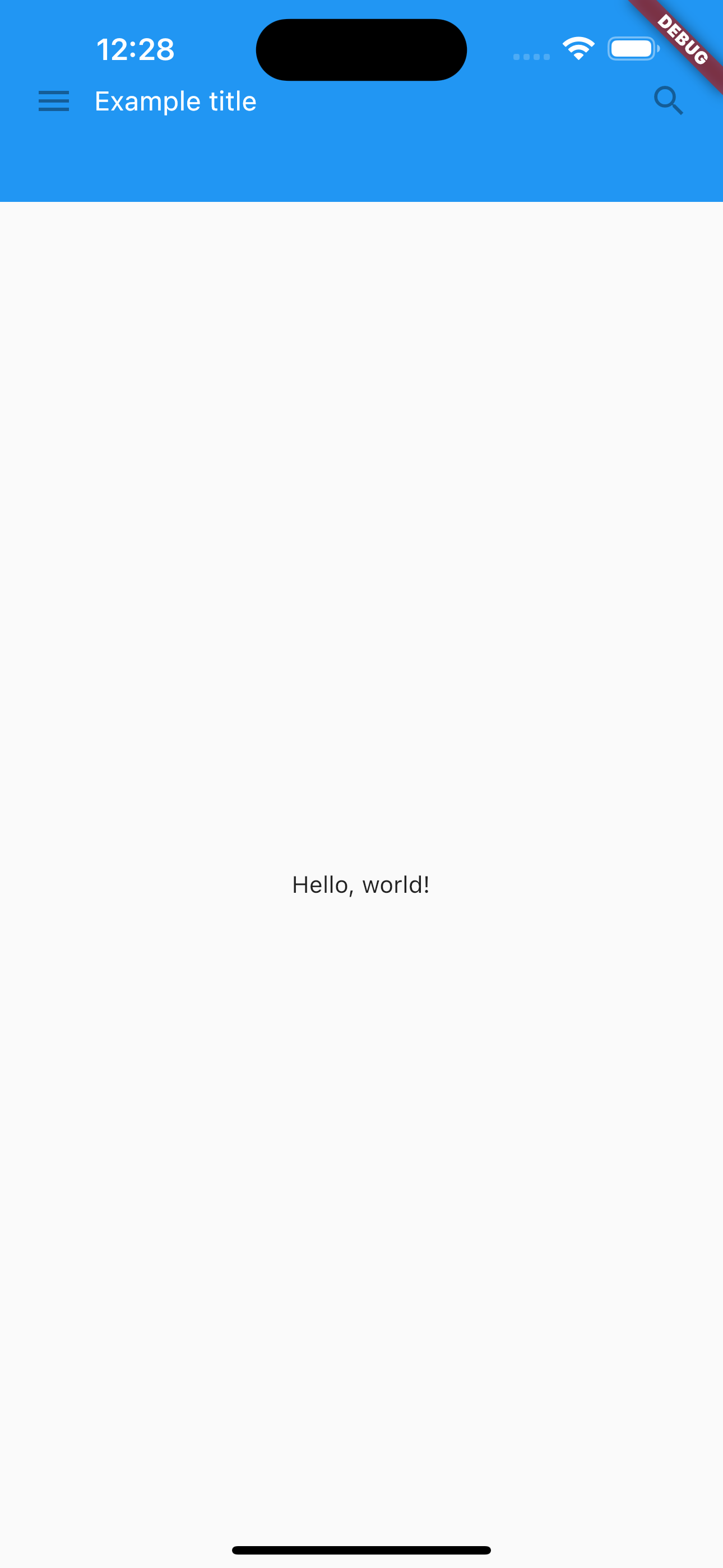
원본과 똑같이 동작하긴 하지만, MyApp의 build 밑 height는 56 => 120으로 수정했습니다. (아이폰 14 pro max 기준) 상단바를 가려버리는 이슈가 있음
실제 화면