Jetpack Compose로 자동 슬라이딩 배너 만들기
1. 사용할 요소들
-
HorizontalPager: 좌우 스와이프가 가능한 페이지 컨테이너로, 여러 페이지를 가로로 넘길 수 있음. LazyRow와 유사하지만 페이지 단위로 스크롤됨. -
PagerState: 현재 페이지 인덱스 및 스크롤 상태를 관리하는 객체. rememberPagerState()를 사용하여 상태를 유지할 수 있음. -
LaunchedEffect: 자동 슬라이딩을 위한 코루틴 실행기
2. 배너 데이터 모델 만들기
data class BannerItem(
val title: String,
val description: String,
val backgroundColor: Color
)
// 샘플 데이터
val bannerItems = listOf(
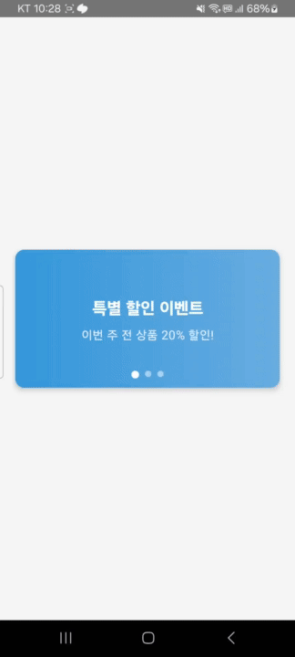
BannerItem(
title = "특별 할인 이벤트",
description = "이번 주 전 상품 20% 할인!",
backgroundColor = Color(0xFF3498DB)
),
// 다른 배너 아이템들...
)3. 애니메이션이 있는 자동 슬라이딩 배너 만들기
@OptIn(ExperimentalFoundationApi::class)
@Composable
fun AutoSlidingBanner(
    modifier: Modifier = Modifier,
    autoSlideDuration: Long = 3000 // 3초마다 슬라이드
) {
    val pagerState = rememberPagerState()
    var currentPage by remember { mutableStateOf(0) }

    // 자동 슬라이드 애니메이션 효과
    LaunchedEffect(Unit) {
        while(true) {
            delay(autoSlideDuration)
            val nextPage = (currentPage + 1) % bannerItems.size
            // 여기서 애니메이션 발생!
            pagerState.animateScrollToPage(nextPage)
            currentPage = nextPage
        }
    }

    // 페이저의 현재 페이지 추적
    LaunchedEffect(pagerState.currentPage) {
        currentPage = pagerState.currentPage
    }

    Box(modifier = modifier.height(180.dp).fillMaxWidth()) {
        // 배너 컨텐츠
        HorizontalPager(
            pageCount = bannerItems.size,
            state = pagerState,
            modifier = Modifier.fillMaxSize()
        ) { page ->
            BannerCard(bannerItems[page])
        }

        // 인디케이터 (하단 점)
        Row(
            modifier = Modifier
                .align(Alignment.BottomCenter)
                .padding(bottom = 12.dp),
            horizontalArrangement = Arrangement.Center
        ) {
            repeat(bannerItems.size) { index ->
                val isSelected = index == currentPage
                Box(
                    modifier = Modifier
                        .padding(horizontal = 4.dp)
                        .size(if (isSelected) 10.dp else 8.dp)
                        .clip(CircleShape)
                        .background(
                            if (isSelected) Color.White else Color.White.copy(alpha = 0.5f)
                        )
                )
            }
        }
    }
}
4. 애니메이션 이해하기
자동 슬라이딩 애니메이션
LaunchedEffect(Unit) {
    while(true) {
        delay(autoSlideDuration)
        val nextPage = (currentPage + 1) % bannerItems.size
        // 핵심 애니메이션 코드!
        pagerState.animateScrollToPage(nextPage)
        currentPage = nextPage
    }
}
이 코드에서 pagerState.animateScrollToPage(nextPage)가 실제로 애니메이션을 처리하는 부분이다. 이 함수의 역할은 다음과 같다.
- 현재 페이지에서 다음 페이지로 부드럽게 스크롤한다.
- 기본적으로 스프링 애니메이션을 사용한다.
- 사용자가 스크롤하는 것과 같은 자연스러운 움직임을 만든다.
LaunchedEffect의 역할
LaunchedEffect는 Compose의 부수 효과(side effect)를 처리한다. 여기서는 두 가지 용도로 사용된다.
- 자동 슬라이딩을 위한 무한 루프 실행
- 페이저 상태 변경 감지 및 현재 페이지 업데이트
인디케이터 애니메이션
인디케이터(하단 점)은 현재 페이지가 바뀔 때마다 크기가 변하는 간단한 애니메이션을 가진다.
.size(if (isSelected) 10.dp else 8.dp)5. 배너 카드 디자인하기
@Composable
fun BannerCard(banner: BannerItem) {
    Card(
        modifier = Modifier
            .fillMaxSize()
            .padding(horizontal = 4.dp),
        shape = RoundedCornerShape(12.dp),
        elevation = CardDefaults.cardElevation(defaultElevation = 4.dp)
    ) {
        Box(
            modifier = Modifier
                .fillMaxSize()
                .background(
                    brush = Brush.horizontalGradient(
                        colors = listOf(
                            banner.backgroundColor,
                            banner.backgroundColor.copy(alpha = 0.7f)
                        )
                    )
                ),
            contentAlignment = Alignment.Center
        ) {
            // 배너 내용 (텍스트 등)
            Column(/* ... */) {
                Text(
                    text = banner.title,
                    fontSize = 22.sp,
                    fontWeight = FontWeight.Bold,
                    color = Color.White,
                    textAlign = TextAlign.Center
                )

                Spacer(modifier = Modifier.height(8.dp))

                Text(
                    text = banner.description,
                    fontSize = 16.sp,
                    color = Color.White.copy(alpha = 0.9f),
                    textAlign = TextAlign.Center
                )
            }
        }
    }
}
핵심 요약
pagerState.animateScrollToPage(nextPage)를 사용하면 부드러운 페이지 전환이 가능하다.- 현재 페이지 상태(
pagerState.currentPage)를 추적하여 UI 요소(인디케이터)와 동기화할 수 있다. Brush.horizontalGradient를 이용해 배경에 자연스러운 색상 변화를 줄 수 있다.LaunchedEffect(Unit)을 사용하면 특정 주기로 애니메이션 실행이 가능하다.
코드
class MainActivity : ComponentActivity() {
    override fun onCreate(savedInstanceState: Bundle?) {
        super.onCreate(savedInstanceState)
        setContent {
            MaterialTheme {
                Surface(
                    modifier = Modifier.fillMaxSize(),
                    color = Color(0xFFF5F5F5)
                ) {
                    Column(
                        modifier = Modifier
                            .fillMaxSize()
                            .padding(16.dp),
                        horizontalAlignment = Alignment.CenterHorizontally,
                        verticalArrangement = Arrangement.Center
                    ) {
                        AutoSlidingBanner()
                    }
                }
            }
        }
    }
}

// 배너 아이템 데이터 클래스
data class BannerItem(
    val title: String,
    val description: String,
    val backgroundColor: Color
)

// 배너 데이터
val bannerItems = listOf(
    BannerItem(
        title = "특별 할인 이벤트",
        description = "이번 주 전 상품 20% 할인!",
        backgroundColor = Color(0xFF3498DB)
    ),
    BannerItem(
        title = "신규 회원 혜택",
        description = "가입 즉시 5,000포인트 지급",
        backgroundColor = Color(0xFF9B59B6)
    ),
    BannerItem(
        title = "여름 시즌 기획전",
        description = "무더위를 이길 시원한 상품 모음",
        backgroundColor = Color(0xFF2ECC71)
    )
)

@OptIn(ExperimentalFoundationApi::class)
@Composable
fun AutoSlidingBanner(
    modifier: Modifier = Modifier,
    autoSlideDuration: Long = 3000 // 3초마다 슬라이드
) {
    val pagerState = rememberPagerState()
    var currentPage by remember { mutableStateOf(0) }

    // 자동 슬라이드 효과
    LaunchedEffect(Unit) {
        while(true) {
            delay(autoSlideDuration)
            val nextPage = (currentPage + 1) % bannerItems.size
            pagerState.animateScrollToPage(nextPage)
            currentPage = nextPage
        }
    }

    // 페이저의 현재 페이지 추적
    LaunchedEffect(pagerState.currentPage) {
        currentPage = pagerState.currentPage
    }

    Box(
        modifier = modifier
            .height(180.dp)
            .fillMaxWidth()
    ) {
        // 배너 컨텐츠
        HorizontalPager(
            pageCount = bannerItems.size,
            state = pagerState,
            modifier = Modifier.fillMaxSize()
        ) { page ->
            BannerCard(bannerItems[page])
        }

        // 인디케이터 (하단 점)
        Row(
            modifier = Modifier
                .align(Alignment.BottomCenter)
                .padding(bottom = 12.dp),
            horizontalArrangement = Arrangement.Center
        ) {
            repeat(bannerItems.size) { index ->
                val isSelected = index == currentPage
                Box(
                    modifier = Modifier
                        .padding(horizontal = 4.dp)
                        .size(if (isSelected) 10.dp else 8.dp)
                        .clip(CircleShape)
                        .background(
                            if (isSelected) Color.White else Color.White.copy(alpha = 0.5f)
                        )
                )
            }
        }
    }
}

@Composable
fun BannerCard(banner: BannerItem) {
    Card(
        modifier = Modifier
            .fillMaxSize()
            .padding(horizontal = 4.dp),
        shape = RoundedCornerShape(12.dp),
        elevation = CardDefaults.cardElevation(defaultElevation = 4.dp)
    ) {
        Box(
            modifier = Modifier
                .fillMaxSize()
                .background(
                    brush = Brush.horizontalGradient(
                        colors = listOf(
                            banner.backgroundColor,
                            banner.backgroundColor.copy(alpha = 0.7f)
                        )
                    )
                ),
            contentAlignment = Alignment.Center
        ) {
            Column(
                modifier = Modifier
                    .fillMaxWidth()
                    .padding(16.dp),
                horizontalAlignment = Alignment.CenterHorizontally
            ) {
                Text(
                    text = banner.title,
                    fontSize = 22.sp,
                    fontWeight = FontWeight.Bold,
                    color = Color.White,
                    textAlign = TextAlign.Center
                )

                Spacer(modifier = Modifier.height(8.dp))

                Text(
                    text = banner.description,
                    fontSize = 16.sp,
                    color = Color.White.copy(alpha = 0.9f),
                    textAlign = TextAlign.Center
                )
            }
        }
    }
}

화려한 외면이 아닌 단단한 내면