💗 Transform
- 사용하는 방법 : 단순하게 변형시킬 수 있다.
transform: 변형 함수- 2차원 변형이 있고, 3차원 변형이 있다.
- 2차원 변형 : translate, scale, rotate, skew
- 3차원 변형 : translate3d, scale3d, skew3d, rotate3d - perspective(길이)를 이용하면 원근감을 줄 수 있다.
✔ rotate - (2 Dimension) 회전하기.
#box1:hover {
        transform: rotate(
          -40deg
        ); /* - 이면 왼쪽으로 40도 돈다는 것을 의미한다. */
      }
-를 붙이면 왼쪽으로 돈다는 의미이다.
양수이면 오른쪽으로 돈다.
✔ translate - 위치 변경하기.
   #box2:hover {
        transform: translate(10px, 20px);
      }
translate(x축으로 움직이는 크기, y축으로 움직이는 크기)를 의미한다.
✔ scale - 크기 조정하기.
#box3:hover {
        transform: scale(1.1);
      }
1.1배 크기를 키우겠다는 의미이다.
✔ rotate - (3 Dimension) 회전하기.
      .origin {
        perspective: 300px; /* 부모 태그 */
      }

      #img:hover {
        transform: rotateX(50deg); /* 3차원 + perspective 원근감을 주기. */
      }
원근감을 이용하기 위해서, perspective를 이용한다. perspective는 이용하고자 하는 태그의 부모 태그에 이용해야 원하는 모양으로 등장할 수 있다.
✔ skew - 모양 왜곡하기.
     #box4:hover {
        transform: skew(-25deg, -15deg); /* - 이면 왼쪽으로 왜곡시키기. */
      }
      /* skew를 이용하면 도형을 사용하지 않고, 직접 만들 수 있다. */
-를 붙이면 왼쪽으로 모양을 왜곡한다는 의미이다.
skew를 이용하면 평행사변형 등 우리가 원하는 이미지를 직접 만들어낼 수 있다.
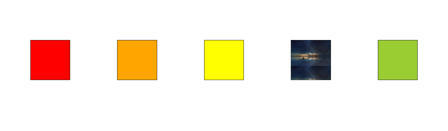
✔ 최종 코드
<!DOCTYPE html>
<html lang="ko">
  <head>
    <meta charset="UTF-8" />
    <meta http-equiv="X-UA-Compatible" content="IE=edge" />
    <meta name="viewport" content="width=device-width, initial-scale=1.0" />
    <title>Transform</title>
    <style>
      html body {
        display: flex;
        flex-direction: row;
        justify-content: center;
        height: 100vh;
        align-items: center;
      }

      div {
        margin: 8px 60px;
      }

      #box1 {
        background-color: red;
        border: 1px solid black;
        width: 100px;
        height: 100px;
      }

      #box2 {
        background-color: orange;
        border: 1px solid black;
        width: 100px;
        height: 100px;
      }

      #box3 {
        background-color: yellow;
        border: 1px solid black;
        width: 100px;
        height: 100px;
      }

      #img {
        background: url("ocean.jpg");
        background-size: contain;
        border: 1px solid black;
        width: 100px;
        height: 100px;
      }

      #box1:hover {
        transform: rotate(
          -40deg
        ); /* - 이면 왼쪽으로 40도 돈다는 것을 의미한다. */
      }

      #box2:hover {
        transform: translate(10px, 20px);
      }

      #box3:hover {
        transform: scale(1.1);
      }

      #box4 {
        background-color: yellowgreen;
        border: 1px solid black;
        width: 100px;
        height: 100px;
      }

      .origin {
        perspective: 300px;
      }

      #img:hover {
        transform: rotateX(50deg); /* 3차원 + perspective 원근감을 주기. */
      }

      #box4:hover {
        transform: skew(-25deg, -15deg); /* - 이면 왼쪽으로 왜곡시키기. */
      }
      /* skew를 이용하면 도형을 사용하지 않고, 직접 만들 수 있다. */
    </style>
  </head>
  <body>
    <div id="box1"></div>
    <div id="box2"></div>
    <div id="box3"></div>
    <span class="origin">
      <!-- 부모 태그에 perspective 설정해서 원근감을 주기. -->
      <div id="img"></div>
    </span>
    <div id="box4"></div>
  </body>
</html>

알고리즘과 데이터 과학과 웹 개발을 공부하는 대학생