Portal은 부모 컴포넌트의 DOM 계층 구조 바깥에 있는 DOM 노드로 렌더링하는 방법을 제공합니다. 즉 리액트 프로젝트에서 컴포넌트를 렌더링하게 될 때, 컴포넌트를 어디에 렌더링 시킬지 DOM을 사전에 선택하여 부모 컴포넌트의 바깥에 렌더링 할 수 있게 해주는 기능입니다.
ReactDOM.createPortal(children, container)첫 번째 인자(children): 엘리먼트, 문자열, 혹은 fragment와 같은 어떤 종류이든 렌더링할 수 있는 React 컴포넌트
두 번째 인자(container): DOM 엘리먼트
Portal을 사용하면 DOM의 계층구조 시스템에 의존하지 않고 컴포넌트를 렌더링 할 수 있습니다.
대표적인 예로 모달이나 팝업은 부모 컴포넌트의 CSS에 의존해 번거로운 후처리를 해줘야합니다.
이러한 상황에서 Portal을 사용하면 부모 컴포넌트 외부에 렌더링 할 수 있기 때문에 CSS를 비교적 손쉽게 관리 할 수 있습니다.
먼저 간단하게 모달을 작성해보겠습니다.
Modal.tsx
import { ReactNode, PropsWithChildren } from "react";
import styled from "@emotion/styled";

interface Props {
  show: boolean;
  onClose: () => void;
}

export const Modal = ({ show, children, onClose }: PropsWithChildren<Props>) => {
  if (!show) {
    return null;
  }
  return <BackDrop onClick={onClose}>{children}</BackDrop>;
};


const BackDrop = styled.div`
  width: 100vw;
  height: 100vh;
  position: fixed;
  top: 0;
  left: 0;
  background-color: rgba(0, 0, 0, 0.4);
  transition: opacity 0.2s;
  display: flex;
  align-items: center;
  justify-content: center;
  z-index: 100;
`;
ModalContent.tsx
import { ReactNode } from "react";
import styled from "@emotion/styled";

interface Props {
  title: ReactNode;
  content: ReactNode;
}

export const ModalContent = ({ title, content }: Props) => (
  <Wrapper>
    <Header>{title}</Header>
    <Content>{content}</Content>
  </Wrapper>
);

const Wrapper = styled.div`
  min-width: 300px;
  min-height: 200px;
  border-radius: 10px;
  padding: 10px;
  background-color: #fff;
`;

const Header = styled.h1``;

const Content = styled.div`
  width: 100%;
  height: 100%;
`;
ModalContainer.tsx
import { useState } from "react";
import { Modal, ModalContent } from "./component";

export const ModalContainer = () => {
  const [openModal, setOpenModal] = useState<boolean>(false);
  return (
    <>
      <button onClick={() => setOpenModal(true)}>
        Modal
      </button>
      <Modal
        show={openModal}
        onClose={() => setOpenModal(false)}
      >
        <ModalContent title="Modal" content="portal을 사용한 모달입니다." />
      </Modal>
    </>
  );
};
App.tsx
import React from "react";
import styled from "@emotion/styled";
import { ModalContainer } from "./portal/modal-container";

const App = () => (
  <Wrap >
    <ModalContainer />
  </Wrap>
);

export default App;

const Wrap = styled.div`
  display: flex;
  align-items: center;
  justify-content: center;
  width: 100vw;
  height: 100vh;
  color: #61dafb;
`;

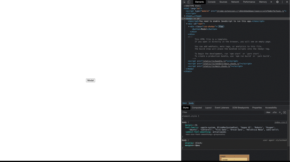
portal을 사용하지 않고 modal을 만들면 위와 같은 결과가 나타나게 됩니다.
Modal 컴포넌트가 App컴포넌트 내부에 렌더링 되면서 App Component의 style을 그대로 상속받게 됩니다.
이번엔 Portal을 이용해 원하는 곳에 DOM을 삽입해보겠습니다.
PortalWrap.tsx
import { useMemo, useEffect, PropsWithChildren } from "react";
import { createPortal } from "react-dom";

export const PortalWrap = ({ children }: PropsWithChildren) => {
  const mountRoot= useMemo(() => document.createElement("div"), []);
  useEffect(() => {
    mountRoot.id = "portal-wrap";
    document.body.appendChild(mountRoot);
    return () => mountRoot.remove();
  }, [mountRoot]);
  return createPortal(<>{children}</>, mountRoot);
};
Modal.tsx
import { PropsWithChildren } from "react";
import styled from "@emotion/styled";

import { PortalWrap } from "./portal-wrap";

interface Props {
  show: boolean;
  onClose: () => void;
}

export const Modal = ({ show, children, onClose }: PropsWithChildren<Props>) => {
  if (!show) {
    return null;
  }
  return (
    <PortalWrap>
      <BackDrop onClick={onClose}>{children}</BackDrop>
    </PortalWrap>
  );
};

const BackDrop = styled.div`
  width: 100vw;
  height: 100vh;
  position: fixed;
  top: 0;
  left: 0;
  background-color: rgba(0, 0, 0, 0.4);
  transition: opacity 0.2s;
  display: flex;
  align-items: center;
  justify-content: center;
`;
body태그 아래에 Modal이 렌더링 되면서 부모 컴포넌트의 style을 상속받지 않았고 z-index를 따로 관리하지 않아도 되게 되었습니다.
이벤트 버블링
Portal은 DOM 트리의 어느 위치에나 있을 수 있으므로 이벤트 전파가 DOM 트리구조에 맞춰 발생하는 것처럼 오해할 수 있습니다.
하지만 Portal의 이벤트는 DOM 트리와 무관하게 React 트리구조에 맞춰 작동합니다.
즉, Portal에서 실행된 이벤트는 DOM 트리의 다른 위치에 있더라도 포함하는 React 트리의 조상으로 전파됩니다.
import { PropsWithChildren, MouseEvent } from "react";

const Portal = () => React.DOM.createPortal(/* ... */)

const App = () => {
  // button에서 발생한 이벤트
  const handleClick = (e: MouseEvent) => {
    console.log(e) // button
  }
  return (
    <div className="App" onClick={handleClick}>
      App
      <Portal>
        <button>Button</button>
      </Portal>
    </div>
  )
}
정리
- Portal을 이용해 원하는 위치에 컴포넌트를 렌더링 할 수 있고 부모 컴포넌트의 스타일 속성으로부터 자유로워질 수 있습니다.
- 이벤트 버블링은 DOM 트리와 달리 React 트리 구조를 따르기 때문에 주의해야합니다.
참조