스캐폴드 위젯
스캐폴드(Scaffold) 는 앱 화면의 골격을 제공하는 위젯이다.
스캐폴드 구성

- appBar: 앱 상단 구성
- body: 앱 본문 구성
- floatingActionButton: 화면에서 떠 있는 듯한 둥근 버튼 구성
- drawer: 가로로 열리는 콘텐츠 구성
- bottomNavigationBar: 화면 하단의 버튼 구성
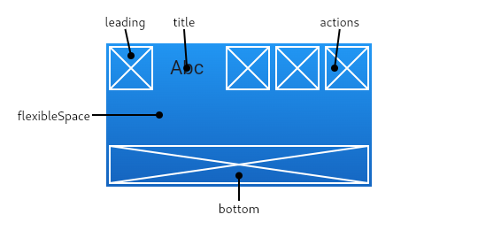
앱바 - appBar
- leading: 왼쪽에 출력할 위젯
- title: 타이틀 위젯
- actions: 오른쪽에 사용자 이벤트를 위한 위젯들
- bottom: 앱바 하단을 구성하기 위한 위젯
- flexibleSpace: 앱바 상단과 하단 사이의 여백을 구성하기 위한 위젯
앱바 출력하기

import 'package:flutter/material.dart';
void main() {
runApp(const ch13_4());
}
class ch13_4 extends StatelessWidget {
const ch13_4({super.key});
Widget build(BuildContext context) {
return MaterialApp(
debugShowCheckedModeBanner: false,
home: Scaffold(
appBar: AppBar(
bottom: PreferredSize( //앱바가 출력되는 화면 크기
preferredSize: const Size.fromHeight(48),
child: Theme(
data: Theme.of(context).copyWith(shadowColor: Colors.white),
child: Container(
height: 48,
alignment: Alignment.center,
child: const Text('AppBar Bottom Text'),
),
),
),
flexibleSpace: Container(
decoration: const BoxDecoration(
image: DecorationImage(
image: AssetImage('images/Ralo.png'), fit: BoxFit.fill),
),
),
title: const Text(
'AppBar Title',
),
actions: <Widget>[
IconButton(
icon: const Icon(Icons.add_alert),
onPressed: () {},
),
IconButton(
icon: const Icon(Icons.phone),
onPressed: () {},
),
],
),
),
);
}
}
하단 내비게이션 바 - bottomNavigationBar
bottomNavigationBar는 스캐폴드 하단에 화면 전환 버튼을 설정하는 속성이며 보통은 BottomNavigationBar위젯으로 구성한다.
- icon, label: 속성으로 아이콘 이미지와 문자열 지정한다.
- BottomNavigationBarType.shifting: 하단 내비게이션 바 버튼 클릭 시 색상 변경한다.
- BottomNavigationBarType.fixed: 하단 내비게이션 바 버튼 클릭 시 색상 고정한다.
- 버튼의 색상은 selectedItemColor 속성으로 지정한다.
드로어 - drawer
drawer는 화면에 보이지 않다가 왼쪽이나 오른쪽에서 밀면 나타나는 드로어를 설정하는 속성이다.
- 기본은 왼쪽에 있지만 오른쪽에 설정 -> endDrawer 이용한다.
스캐폴드 활용하기 예제


import 'package:flutter/material.dart';
void main() {
runApp(const ch13_4());
}
class ch13_4 extends StatefulWidget {
MyAppState createState() => MyAppState();
const ch13_4({super.key});
}
class MyAppState extends State<ch13_4> {
int _selectedIndex = 0;
final List<Widget> _widgetOptions = <Widget>[
const Text(
'First Screen',
style: TextStyle(fontSize: 25, fontWeight: FontWeight.bold),
),
const Text(
'Second Screen',
style: TextStyle(fontSize: 25, fontWeight: FontWeight.bold),
),
const Text(
'Third Screen',
style: TextStyle(fontSize: 25, fontWeight: FontWeight.bold),
),
const Text(
'Fourth Screen',
style: TextStyle(fontSize: 25, fontWeight: FontWeight.bold),
),
];
void _onItemTapped(int index) {
setState(() {
_selectedIndex = index;
});
}
Widget build(BuildContext context) {
return MaterialApp(
debugShowCheckedModeBanner: false,
home: Scaffold(
appBar: AppBar(
bottom: PreferredSize(
preferredSize: const Size.fromHeight(48),
child: Theme(
data: Theme.of(context).copyWith(shadowColor: Colors.white),
child: Container(
height: 48,
alignment: Alignment.center,
child: const Text('AppBar Bottom Text'),
),
),
),
flexibleSpace: Container(
decoration: const BoxDecoration(
image: DecorationImage(
image: AssetImage('images/Ralo.png'), fit: BoxFit.fill),
),
),
title: const Text(
'AppBar Title',
),
actions: <Widget>[
IconButton(
icon: const Icon(Icons.add_alert),
onPressed: () {},
),
IconButton(
icon: const Icon(Icons.phone),
onPressed: () {},
),
],
),
drawer: Drawer(
child: ListView(
padding: EdgeInsets.zero,
children: <Widget>[
const DrawerHeader(
decoration: BoxDecoration(
color: Colors.blue,
),
child: Text('Drawer Header'),
),
ListTile(
title: const Text('Item 1'),
onTap: () {},
),
ListTile(title: const Text('Item 2'), onTap: () {}),
],
),
),
body: Center(
child: _widgetOptions.elementAt(
_selectedIndex,
),
),
floatingActionButton: FloatingActionButton(
onPressed: () {},
child: const Icon(Icons.add),
),
bottomNavigationBar: BottomNavigationBar(
type: BottomNavigationBarType.shifting,
items: const <BottomNavigationBarItem>[
BottomNavigationBarItem(
icon: Icon(Icons.home),
label: 'First',
backgroundColor: Colors.green,
),
BottomNavigationBarItem(
icon: Icon(Icons.business),
label: 'Second',
backgroundColor: Colors.red,
),
BottomNavigationBarItem(
icon: Icon(Icons.school),
label: 'Third',
backgroundColor: Colors.purple,
),
BottomNavigationBarItem(
icon: Icon(Icons.home),
label: 'Fourth',
backgroundColor: Colors.pink,
),
],
currentIndex: _selectedIndex,
selectedItemColor: Colors.amber[800],
onTap: _onItemTapped,
),
),
);
}
}
