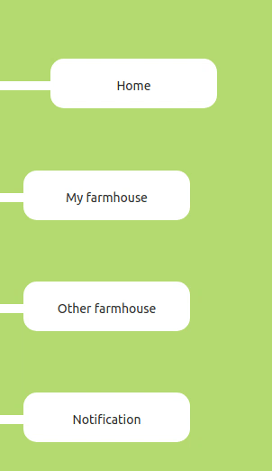
컴포넌트 구조
<Tap name="HOME" selected={page}>
    <span />
    <Link href="/">
        <div>Home</div>
    </Link>
</Tap>
CSS
const Tap = styled.div<{ selected?: string; name?: string }>`
    // border: 1px solid black;
    position: relative;
    span {
        position: absolute;
        top: 25px;
        background-color: white;
        width: 185px;
        height: 10px;
        z-index: -1;
    }
    div {
        // border: 1px solid black;
        margin-left: 30px;
        background-color: white;
        width: 185px;
        height: 55px;
        border-radius: 15px;
        text-align: center;
        line-height: 60px;
        transform: ${(props) => props.selected === props.name && 'translateX(30px)'};
        cursor: pointer;
        &:hover {
            transform: translateX(30px);
            transition: all 0.6s ease-in-out;
        }
    }
`;- Tap 컴포넌트를 relative로 둔다
- span 태그로 흰색 줄을 만든 뒤 position을 absolute로 하고 z-index을 낮춘다
- div 태그로 모양을 만든 뒤 margin을 주어 적절한 곳에 배치한다.
- hover옵션으로 0.6초에 걸쳐 x축 방향으로 30px만큼 이동시킨다.
- 현재 페이지에 해당하는 경우(props로 검사) transform으로 x축으로 30px만큼 이동시켜둔다.

JS개발자