.gif)
컴포넌트 구조
const Header = () => {
const [menuToogle,setMenuToogle] = useState(false)
const handleMenuToogle = () => {
setMenuToogle((prev)=>!prev)
}
return (
<Navbar>
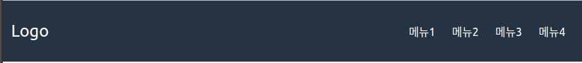
<div className="logo">
Logo
</div>
<ul className={`menu ${menuToogle ? "show" : "hidden"}`}>
<li><a href="#">메뉴1</a></li>
<li><a href="#">메뉴2</a></li>
<li><a href="#">메뉴3</a></li>
<li><a href="#">메뉴4</a></li>
</ul>
<a href="#" className="toogleBtn" onClick={handleMenuToogle}><i className="fas fa-bars"></i></a>
</Navbar>
)
}CSS
const Navbar = styled.nav`
  display: flex;
  justify-content: space-between;
  align-items: center;
  background-color: #263343;
  padding: 8px 12px;
  color: white;

  .logo{
    font-size: 24px;
  }

  .menu{
    display: flex;
    list-style: none;
    li{
      padding: 8px 12px;
      &:hover{
        background-color: #d49466;
        border-radius: 4px;
      }
    }
  }
  .toogleBtn{
      display: none;
    }

  @media screen and (max-width: 768px){
    flex-direction: column;
    align-items: flex-start;
    .menu{
      width: 100%;
      flex-direction: column;
      padding-left: 0;
      li {
        width: 100%;
        text-align: center;
      }
    }
    .show{
      display: flex;
    }
    .hidden{
      display: none;
    }
    .toogleBtn{
      display: block;
      position: absolute;
      font-size: 24px;
      right: 32px;
    }
  }
`
데스크톱 화면일때 토글버튼은 display:none으로 제거한다.
모바일 화면일때 display:block으로 토글 버튼을 살린후 useState를 사용하여 메뉴에 show또는hidden클래스를 넘겨 토글 기능을 구현한다.

JS개발자