1. The Adaptive Model
Adaptive
어떤 기기에서든 잘 맞도록 content 를 조정할 수 있음을 의미
iOS 의 Adaptive Model
변경 사항에 따라 컨텐츠를 재배열하고 크기를 조정하는 간단하고 동적인 방법을 제공

Adpative Interface 를 만들기 위한 중요한 도구로는 제약을 설정하여 동적으로 크기와 위치를 조정하는 Auto Layout, 중요한 구성 요소로는 Traits 이 있다.
1.1 Traits 의 역할
Constraint 만으로는 레이아웃을 관리하기 충분하지 않을 때 Traits을 이용할 수 있다.
아래는 UITraitCollection 의 주요 프로퍼티이다.
horizontalSizeClass
인터페이스의 width 를 의미
일반적으로 대략적인 레이아웃을 결정하는데 사용
ex) Split VC 같은 경우 horizontally regular 일 때 Master - Detail 을 모두 볼 수 있지만 compact 일 때는 하나의 VC 만 보여줄 수 있다.
verticalSizeClass
인터페이스의 height 를 의미
displayScale
1.0 은 non-retina,
2.0 이상부터 retina 디스플레이를 의미
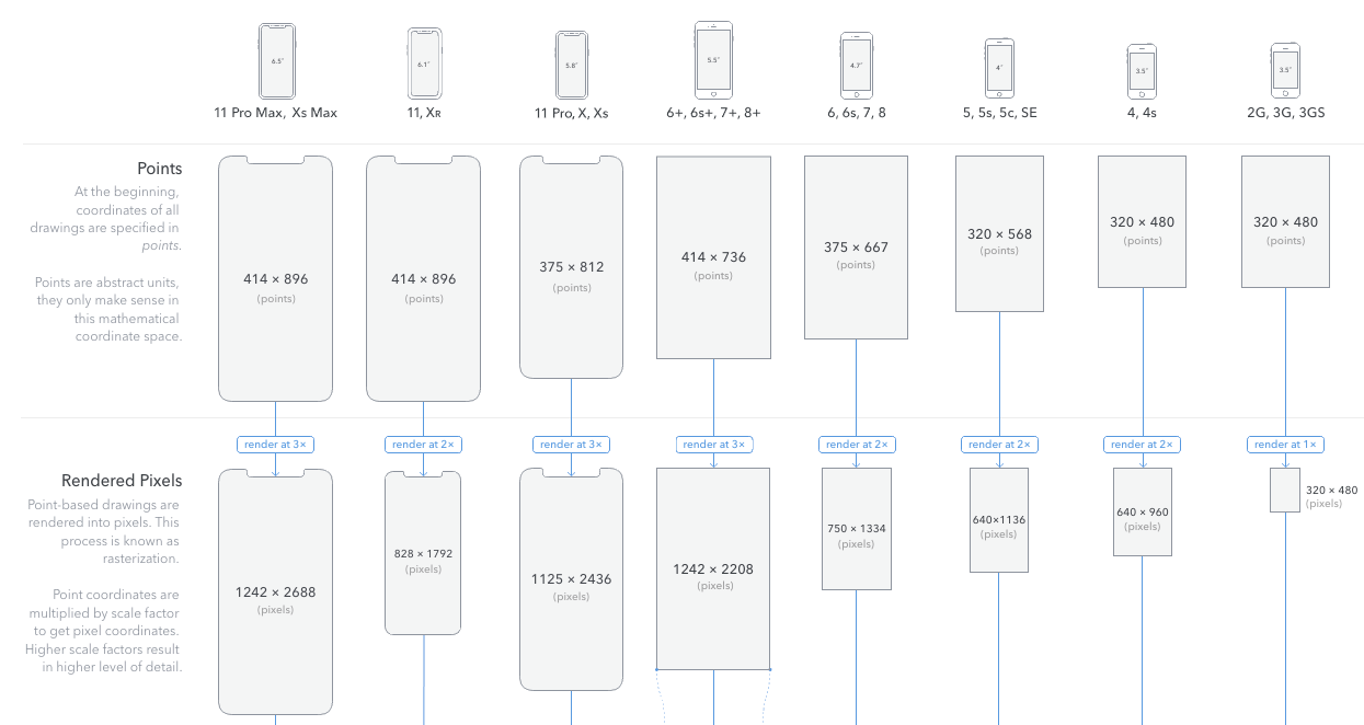
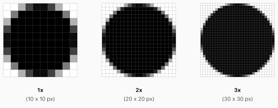
iOS 에서 화면에 content 를 배치하기 위해 사용하는 좌표 시스템은 point 에 기반한다. 그리고 이 point 는 display 의 pixel 에 매핑된다. point : pixel 간의 관계는 1x 에서는 1:1, 2x 에서는 1:2, 3x 에서는 1:3 이다.
참고
Apple HIG - Image Size and Resolution
The Ultimate Guide To iPhone Resolutions
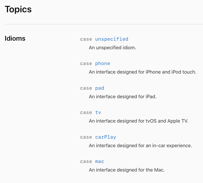
userInterfaceIdiom
앱이 실행되는 기기의 종류를 식별할 수 있음
- UIUserInterfaceIdiom (enum 타입)
extension UIDevice {
    public var isiPhone: Bool {
      if UIDevice.current.userInterfaceIdiom == .pad {
          return true
      }
      return false
    }
    public var isiPad: Bool {
        if UIDevice.current.userInterfaceIdiom == .pad {
            return true
        }
        return false
    }
}
문서에서는 되도록 이 특성을 이용(iphone, ipad 인지 구별)하여 레이아웃을 결정하기보다는
horizontal, vertical size class 를 활용하라고 기술하고 있는데,size class 에 대응하게 되면 같은 iphone 임에도 + (6+, 7+), pro max 같이 landscape 모드에서 regular size class 를 가지고 있는 경우 더 많은 컨텐츠를 제공할 수 있기 때문에 이렇게 권장하는 것이 아닐까 싶습니다.
하지만 상용화된 앱들을 보면 대부분 애플에서 권장하는 바와 다르게 size class 보다는 iphone, ipad 인지를 구별하여 구현하는 것으로 보입니다.
각 기기들의 size class 는 HIG 문서에서 확인할 수 있습니다.
HIG - adaptivity-and-layout
userInterfaceStyle
라이트모드, 다크모드에 대해 판별할 수 있게 해주는 프로퍼티
다크모드 알아보기
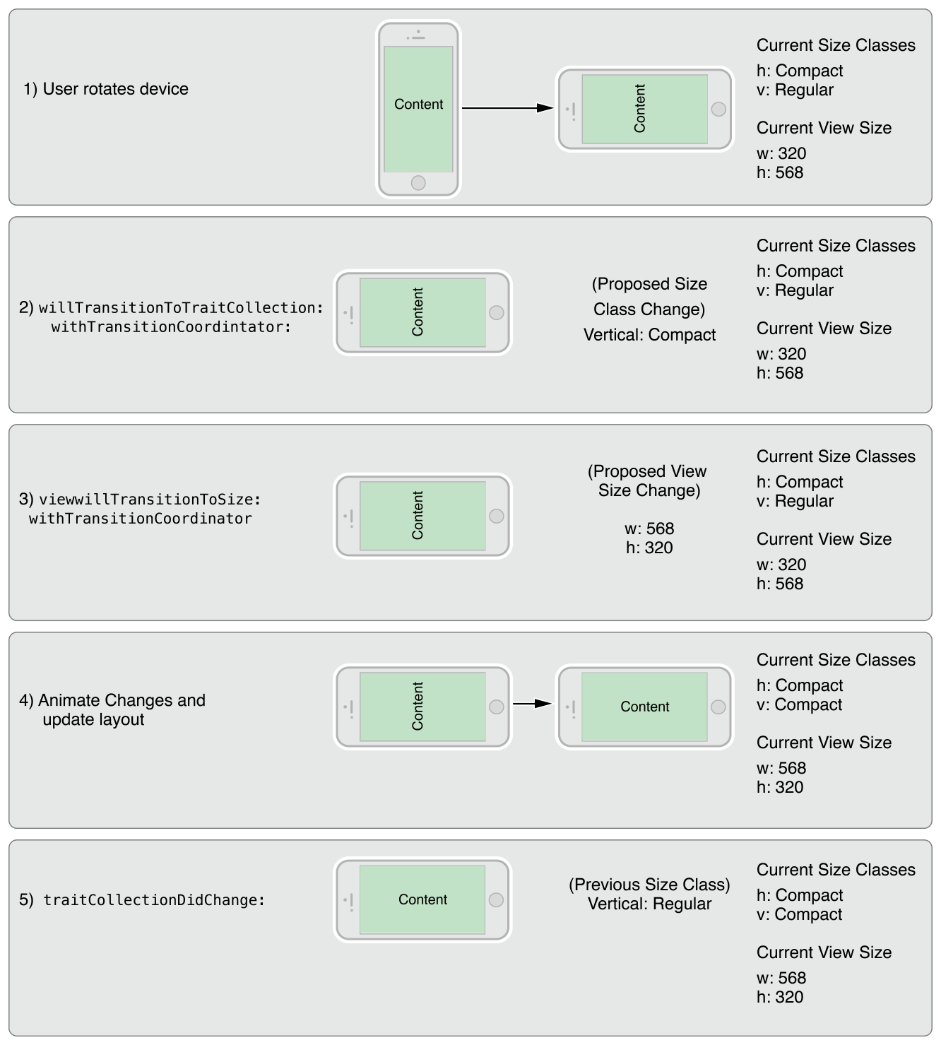
1.2 Traits 및 size 변경이 발생하는 경우
- Device rotation 으로 인해 VC 의 vertical, horizontal size class 변경
- Container VC의 vertical, horizontal size class 변경
- Container VC에 의해 Child VC 의 vertical, horizontal size class 명시적 변경
(출처: https://hcn1519.github.io/articles/2020-03/ios_darkmode)
UITraitCollection 은 앱 실행 시 한 개만 존재하는 것이 아니라 각 VC, View 마다 존재한다.
예를 들어 iphone에서 rotation 발생 시, window 는 자신의 size class 를 갱신하고 그 정보를 VC 계층 구조 아래로 전파한다. 따라서 각 계층 구조의 VC 에서 아래와 같은 메서드를 통해 변경사항을 확인할 수 있다.
- func willTransition(to newCollection:, with coordinator:)
traits 변화에 대한 정보를 VC 에게 알림
그리고 coordinator 를 이용하여 변경한 사항들을 animate 한다.
여기서 coordinator 란 custom transition 에서 다뤘던 내용으로, animator 객체의 animation 블럭에서 다루지 않는 애니메이션을 추가하고 싶은 경우 사용할 수 있는 객체이다.
    override func willTransition(to newCollection: UITraitCollection, with coordinator: UIViewControllerTransitionCoordinator) {
        super.willTransition(to: newCollection, with: coordinator)

        coordinator.animate(alongsideTransition: { _ in
            if newCollection.horizontalSizeClass == .compact {
                // compact 환경에서 변경 사항
            } else {
               // regular 환경에서 변경 사항
            }
        }
}- func viewWillTransition(to size:, with coordinator: )
크기 변화에 대한 정보를 VC에게 알림
Auto layout 만으로 원하는 모양을 얻기 충분하지 않은 경우 추가적인 레이아웃을 설정하는데 사용할 수 있음rotation 뿐 아니라
parent VC 에 의해 Child VC 의 크기가 조정된 경우
Presentation Controller 에 의해 Presented VC 의 크기가 변경된 경우 호출
-> (Custom Presentation 의 frameOfPresentedViewInContainerView 참고)
override func viewWillTransition(to size: CGSize, with coordinator: UIViewControllerTransitionCoordinator) {
super.viewWillTransition(to: size, with: coordinator)
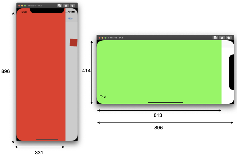
print(size) // (414.0, 896.0)
print(self.view.frame.size) // (813.0, 414.0)
coordinator.animate(alongsideTransition: { (context: UIViewControllerTransitionCoordinatorContext) in
print(self.view.frame.size) // (331.0, 896.0)
}) { (context: UIViewControllerTransitionCoordinatorContext) in
print(self.view.frame.size) // (331.0, 896.0)
}
}Custom Presentation 에서 사용한 예제로 테스트한 결과 발견한 특이한 점으로는,
size 는 현재 VC 의 view 의 크기가 아니라 Container view 의 크기에 대한 값을 제공합니다. 일반적으로 Container View 는 화면 전체를 꽉 채우므로 위 예제에서 회전되고 난 후 화면 전체에 대한 size 값이 나옵니다.
view.frame.size 은
animate 블럭에 들어가기 전에는 화면 회전이 되기 전의 현재 VC 의 view 의 크기,
블럭에 들어가고 난 후에는 화면 회전이 된 후의 현재 VC 의 view 의 크기를 출력합니다.
- 회전을 감지하기 위한 메서드로 1번 vs 2번 ❓
아이폰에서 rotation 하는 경우 size class 가 변경되기 때문에 willTransition 이 호출되지만
아이패드의 경우 rotation 을 해도 size class 에 변화가 없기 때문에 size 변화에 대응하는 메서드인 2번 메서드(viewWillTransition)를 이용하여 화면 회전을 감지하고 알맞은 처리를 해주는 것이 일반적인 것 같습니다.
- func traitCollectionDidChange(_ previousTraitCollection:)
traits 이 변했음을 각 VC 에게 알림.
trait collection 의 변경에 대응하여 사용하는 가장 주요한 메서드로 1, 2번 메서드와 달리 VC 뿐만 아니라 View 에서도 호출할 수 있음
    override func traitCollectionDidChange(_ previousTraitCollection: UITraitCollection?) {
        super.traitCollectionDidChange(previousTraitCollection)

        guard previousTraitCollection?.horizontalSizeClass != traitCollection.horizontalSizeClass else {
            return
        }

        switch traitCollection.horizontalSizeClass {
        case .compact:
            print("compact")
        case .regular:
            print("regular")
        case .unspecified:
            print("unspecified")
        }
    }
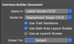
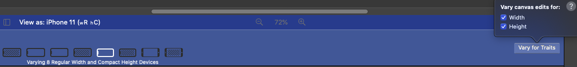
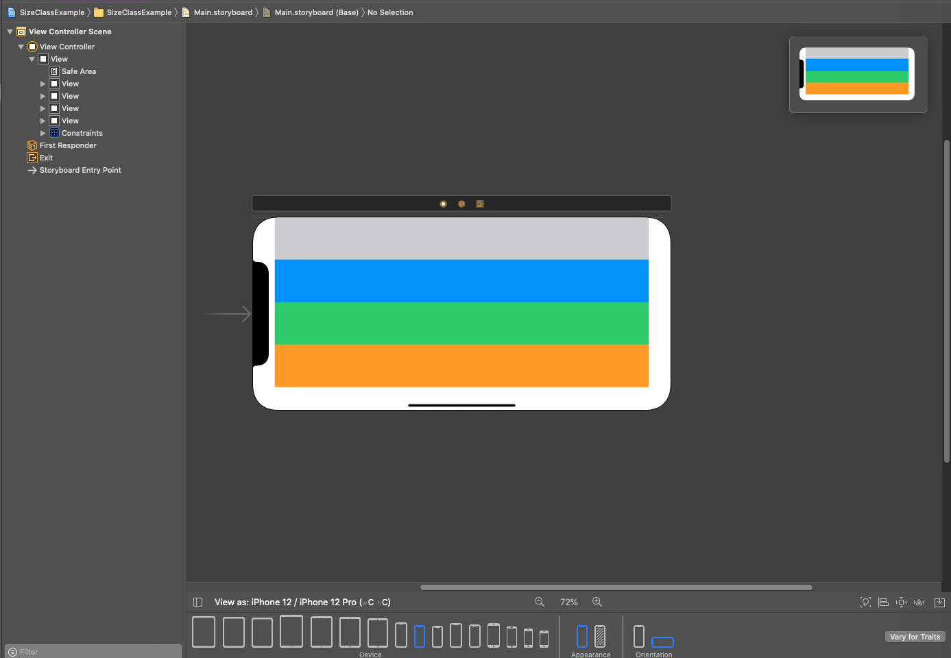
2. 인터페이스 빌더를 이용하여 size class 에 대응
use Trait Variations 체크
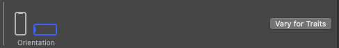
landscape 모드 선택
landscape 모드를 선택하면 보이는 기기명(iPhone11) 옆의 wR hC 는 regular width, compact height 를 의미
vary for Traits 에서 width 를 선택하면 width 가 regular 인 모든 기기에 대응하여,
height 를 선택하면 height 가 compact 인 모든 기기에 대응하여 Constraint 를 설정하는 것
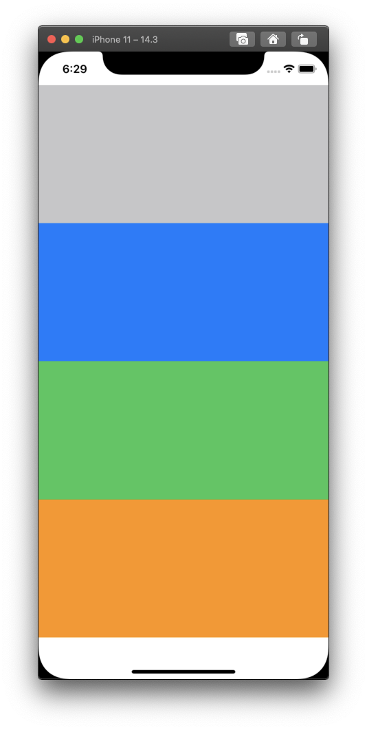
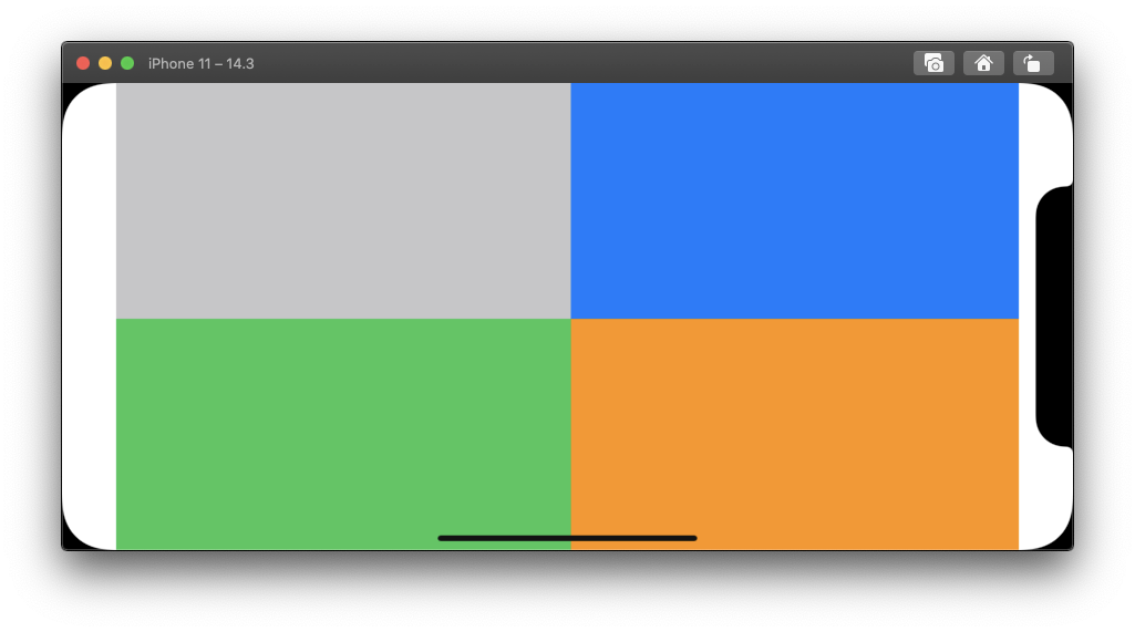
위의 예시는 portrait, landscape 에서 각각 다른 constraint 를 적용한 모습
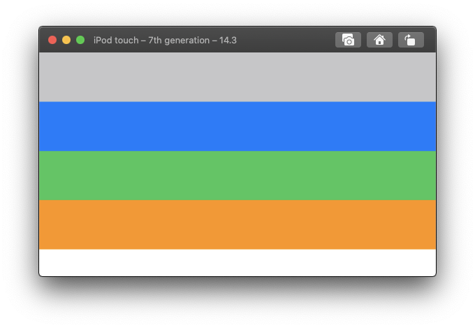
예시로 만든 프로젝트의 경우 landscape 모드에서 wR hC 환경에서 Constraint 를 적용하였으므로 아래의 예시에서 볼 수 있는 것 처럼 아이팟 터치 같이 landscape 모드에서 width 가 compact 인 디바이스에서는 적용되지 않는다. 아이폰 12도 landscape 모드에서 width 가 compact 이므로 마찬가지로 적용되지 않는다.
3. Child VC 의 Traits 변경하기
Child VC 는 Parent VC 의 trait collection 을 받는데, 상황에 따라 Parent VC 와 다른 trait collection 을 가져야 할 경우가 있을 수 있다.
예를 들어 regular 환경에서 Child VC 는 compact 환경으로 표현하고 싶은 경우가 있을 수 있다.
import UIKit

class ViewController: UIViewController {

    private var childVC: ChildVC?

    override func viewDidLoad() {
        super.viewDidLoad()

        let horizontalTrait = UITraitCollection(horizontalSizeClass: .compact)
        let verticalTrait = UITraitCollection(verticalSizeClass: .compact)
        let trait = UITraitCollection(traitsFrom: [horizontalTrait, verticalTrait])

        setOverrideTraitCollection(trait, forChild: childVC!)
    }

    override func prepare(for segue: UIStoryboardSegue, sender: Any?) {
        super.prepare(for: segue, sender: sender)

        childVC = segue.destination as? ChildVC
    }
}


class ChildVC: UIViewController {

    override func willTransition(to newCollection: UITraitCollection, with coordinator: UIViewControllerTransitionCoordinator) {
        super.willTransition(to: newCollection, with: coordinator)

        print(newCollection.horizontalSizeClass.rawValue) // compact
        print(newCollection.verticalSizeClass.rawValue)   // compact
    }
}