기본적인 화면 작업을 시작하기 전에 우리가 사용하는 tailwind를 vscode에서 더 쉽게 사용해주는 플러그인이 있으니 먼저 설치 하고 시작하는 것을 추천한다!
설치가 완료됬으면 기본 화면 작업을 시작해보자!
(Spotify 만들기 시리즈는 화면 구성보다는 기능구현과 API 활용에 초점을 두고 있으므로 HTML, css 작업은 중요한 부분 몇가지만 다룰 예정이다. 참고~)
1. components 만들기
components/SideBar.tsx
"use client";

import { ReactNode } from "react";

interface SideBarProps {
  children: ReactNode;
}
const SideBar: React.FC<SideBarProps> = ({ children }) => {
  return <div>{children}</div>;
};

export default SideBar;
SideBar 컴포넌트를 만들어 layout.tsx에 {children}을 받는 부분을 감싸주었다.
app/layout.tsx
export default function RootLayout({
  children,
}: Readonly<{
  children: React.ReactNode;
}>) {
  return (
    <html lang="en">
      <body className={font.className}>
        <SideBar>{children}</SideBar>
      </body>
    </html>
  );
}
SideBar 컴포넌트는 client compoent이다.
server component는 client component의 자식이 될 수 없지만, children을 사용하면 가능하다. SideBar의 childeren으로 전달되는 component가 sever component이더라도 사용이 가능하다는 뜻이다.
2. Interface 적용하기
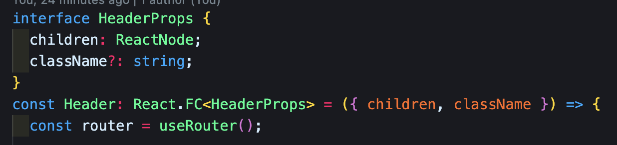
강의를 보다보면 작업자가 모든 Interface를 React.FC 형식으로 적용시키는 것을 볼 수 있다.
마침 실무 코드리뷰에서 children을 props로 받는 컴포넌트가 아니라면 React.FC 형태를 지양해야한다고 피드백을 받은 적이 있어서 수정을 했던 것이 생각났다. 왜 지양해야하는 것일까?
React.FC를 지양해야 하는 이유
첫번째. children
React.FC를 사용을 하면 props에 기본적으로 children이 들어가 있다.
const App: React.FC = () => {
  return <div>hi</div>;
};

const Example = () => {
  <App>
    <div>Unwanted children</div>
  </App>;
};
위 컴포넌트에서 children을 props로 전달받고 있지 않음에도 Example에서 children을 넘겨주고 있으며, 이는 런타임 에러가 발생하지 않는다.
이는 FC를 사용하지 않는다면 잡아낼 수 있다.
물론 FC를 사용해서 children을 작성하지 않아도 되는 편리함이 있을 수도 있으나, 언제든 children 타입 지정없이 전달이 가능하기 때문에 타입이 명확하지 않으므로 단점이라고 할 수 있다.
두번째. 제네릭 문법
타입스크립트의 제네릭 문법을 지원하지 않는다.
// 제네릭 컴포넌트 작성
type GenericComponentProps<T> = {
  prop: T;
  callback: (t: T) => void;
};

const GenericComponent = <T>(props: GenericComponentProps<T>) => {
  /*...*/
};
위와 같은 형태는 React.FC에서는 허용되지 않는다.
const GenericComponent: React.FC</* ??? */> = <T>(props: GenericComponentProps<T>) => {/*...*/}세번째. 코드가 더 길어진다.
FC 사용 O
const Header: React.FC<HeaderProps> = ({ children, className }) => {}
FC 사용 X
const Header = ({ children, className }: HeaderProps) => {}이러한 React.FC의 단점을 인지하고 상황에 맞는 타입지정 방식을 사용하는 것이 좋을 것 같다.
3. Tailwind로 반응형 컴포넌트 만들기
components/Header.tsx
<div
      className={twMerge(
        `h-fit bg-gradient-to-b from-emerald-800 p-6`,
        className
      )}
    >
      <div className="w-full mb-4 flex item-center justify-between">
        <div className="hidden md:flex gap-x-2 items-center">
          <button className="rounded-full bg-black flex items-center justify-center hover:opacity-75 transition">
            <RxCaretLeft className="text-white" size={35} />
          </button>
          <button className="rounded-full bg-black flex items-center justify-center hover:opacity-75 transition">
            <RxCaretRight className="text-white" size={35} />
          </button>
        </div>
        <div className="flex md:hidden gap-x-2 items-center">
          <button className="rounded-full p-2 bg-white flex items-center justify-center hover:opacity-75 transition">
            <HiHome className="text-black" size={20} />
          </button>
          <button className="rounded-full p-2 bg-white flex items-center justify-center hover:opacity-75 transition">
            <BiSearch className="text-black" size={20} />
          </button>
        </div>
        <div className="flex justify-between items-center gap-x-4">
          <>
            <div>
              <Button className="bg-transparent text-neutral-300 font-medium">
                Sing up
              </Button>
            </div>
            <div>
              <Button className="bg-white px-6 py-2">Log in</Button>
            </div>
          </>
        </div>
      </div>
      {children}
    </div>
Header.tsx 에서 작업한 내용을 살펴보자.
- 'hidden md:flex' 클래스를 가진 영역은 화면 크기가 medium(md) 이상일 때 해당 요소를 숨긴다. 즉, 화면이 medium 크기 이상일 때에만 해당 요소가 보이는 것이다.
- 'flex md:hidden' 클래스를 가진 영역은 화면 크기가 medium(md) 미만일 때 해당 요소를 flex로 표시한다. 즉, 화면이 medium 크기 미만일 때에만 해당 요소가 flex로 동작한다.
따라서 위 코드에서 화면이 medium 이상일 때는 RxCaretLeft와 RxCaretRight 아이콘이 화면에 보이고, medium 미만일 때는 HiHome와 BiSearch 아이콘이 화면에 노출되게 된다.
tailwind를 사용하면 생각보다 더 간단하게 반응형을 구현할 수 있었다. tailwind 처음써보는 나는 굉장히 신기했음...
이렇게 레이아웃 구현하는 내용 중 몇가지만 정리해보았다. Spotify가 레이아웃이 단순한 편이라 css가 익숙하지 않은 사람이라도 어렵지 않게 할 수 있을 것 같다.
tailwind가 좋긴한데... 아직 익숙하지가 않아서 사용할때마다 찾아봐야하고 클래스만 봐서는 어떤 css를 나타낸건지 한번에 파악하기가 어려워 시간이 좀 걸리는 것 같다. 그래도 익숙해지면 호다닥 하기엔 확실히 편할듯!