🐧애니메이션 관련 스타일 속성
📌animation-name : 박스모델에 적용될 애니메이션의 이름을 속성값으로 설정
animation-name: myani;📌animation-duration : 박스모델에 적용될 애니메이션의 지속시간을 속성값으로 설정
animation-duration: 5s;📌animation-iteration-count : 박스모델에 적용될 애니메이션의 반복횟수를 속성값으로 설정
◈ 속성값 : 정수값 또는 infinite
/*animation-iteration-count: 3;*/
animation-iteration-count: infinite;
📌animation-direction : 박스모델에 적용될 애니메이션의 진행방향을 속성값으로 설정
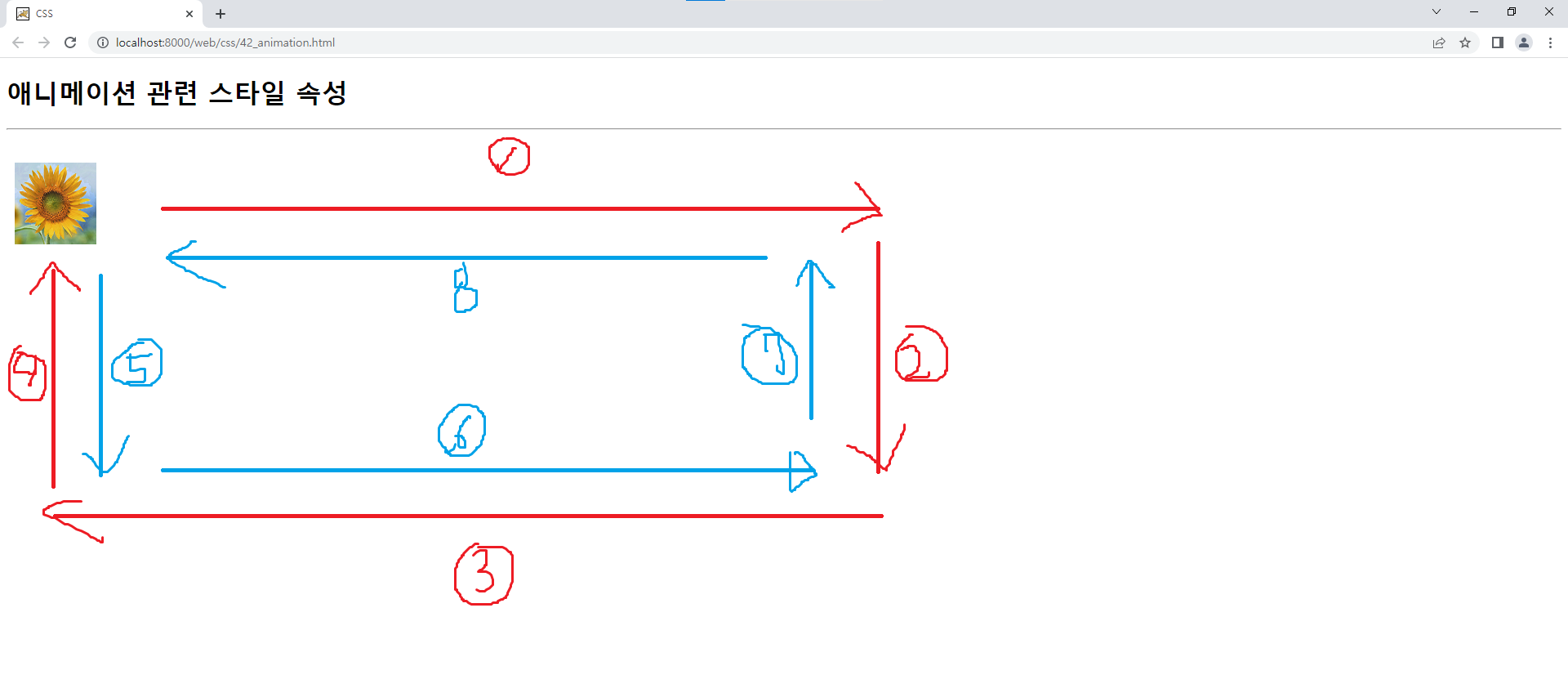
◈속성값 : normal(기본 : 순방향), reverse(역방향), alternate(순방향 <-> 역방향),
alternate-reverse(역방향 <-> 순방향)animation-direction: alternate;
📌@keyframes : 애니메이션의 이름과 상태에 따른 스타일 변화를 정의하기 위한 시스템 속성
→ 상태(백분율 또는 키워드 - from, to)에 따른 CSS 스타일을 작성하여 애니메이션 효과 제공
→ 시작상태(from)와 종료상태(to)를 포함하여 2개 이상의 상태 작성/* 시작상태 */ /* from { top: 0; left: 10px; background: url("images/f1.png") no-repeat center; } */ /* 종료상태 */ /* to { top: 0; left: 600px; background: url("images/f2.png") no-repeat center; } */ 0% { top: 0; left: 10px; background: url("images/f1.png") no-repeat center; } 25% { top: 0; left: 600px; background: url("images/f2.png") no-repeat center; } 50% { top: 300px; left: 600px; background: url("images/f1.png") no-repeat center; } 75% { top: 300px; left: 10px; background: url("images/f2.png") no-repeat center; } 100% { top: 0; left: 10px; background: url("images/f1.png") no-repeat center; } }
📃42_animation.html
<!DOCTYPE html>
<html>
<head>
<meta charset="UTF-8">
<title>CSS</title>
<style type="text/css">
#ani {
	width: 100px;
	height: 100px;
	position: relative;
	/*
	left: 10px;
	background: url("images/f1.png") no-repeat center;\
	*/
	/* animation-name : 박스모델에 적용될 애니메이션의 이름을 속성값으로 설정 */
	animation-name: myani;
	/* animation-duration : 박스모델에 적용될 애니메이션의 지속시간을 속성값으로 설정 */
	animation-duration: 5s;
	/* animation-iteration-count : 박스모델에 적용될 애니메이션의 반복횟수를 속성값으로 설정 */
	/* 속성값 : 정수값 또는 infinite */
	/*animation-iteration-count: 3;*/
	animation-iteration-count: infinite;
	/* animation-direction : 박스모델에 적용될 애니메이션의 진행방향을 속성값으로 설정 */
	/* 속성값 : normal(기본 : 순방향), reverse(역방향), alternate(순방향 <-> 역방향), alternate-reverse(역방향 <-> 순방향) */
	animation-direction: alternate;
}
/* @keyframes : 애니메이션의 이름과 상태에 따른 스타일 변화를 정의하기 위한 시스템 속성 */
/* → 상태(백분율 또는 키워드 - from, to)에 따른 CSS 스타일을 작성하여 애니메이션 효과 제공 */
/* → 시작상태(from)와 종료상태(to)를 포함하여 2개 이상의 상태 작성 */
@keyframes myani {
	/* 시작상태 */
	/*
	from {
		top: 0;
		left: 10px;
		background: url("images/f1.png") no-repeat center;
	}
	*/
	/* 종료상태 */
	/*
	to {
		top: 0;
		left: 600px;
		background: url("images/f2.png") no-repeat center;
	}
	*/
	0% {
		top: 0;
		left: 10px;
		background: url("images/f1.png") no-repeat center;
	}
	25% {
		top: 0;
		left: 600px;
		background: url("images/f2.png") no-repeat center;
	}
	50% {
		top: 300px;
		left: 600px;
		background: url("images/f1.png") no-repeat center;
	}
	75% {
		top: 300px;
		left: 10px;
		background: url("images/f2.png") no-repeat center;
	}
	100% {
		top: 0;
		left: 10px;
		background: url("images/f1.png") no-repeat center;
	}
}
</style>
</head>
<body>
	<h1>애니메이션 관련 스타일 속성</h1>
	<hr>
	<div id="ani"></div>
</body>
</html>