
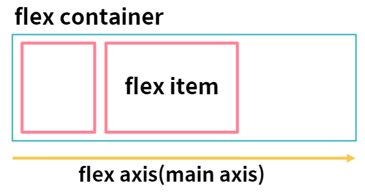
CSS FlexBox Model
HTML element를 하나의 상자로 간주하고, 그 안에서 어떻게 내부 item을 배열할 것인가를 스타일 하는 모델, 1차원의 레이아웃을 디자인하는 데 사용된다.
- Flex container - Flexbox 아이템을 담는 컨테이너
- Flex Item - 컨테이너 안에 담긴 아이템
- Flex axis - flex 아이템의 방향을 결정하는 축
CSS FlexBox properties - container
- flex-direction - row, column 등의 방향을 결정
- justify-content - main axis에서의 정렬을 결정
- align-items - cross axis에서의 정렬을 결정
- flex-wrap - flex container가 내부 item의 width를 합친 것보다 작아질 때, 어떻게 정렬할 것인지를 결정
CSS FlexBox properties - item
- flex-grow - flex container가 커질 때 item이 얼마만큼 늘어날 것인지를 결정
- flex-shrink - flex container가 줄어들 때 item이 얼마만큼 줄어들 것인지를 결정
- flex-basis - 기준점이 되는 item의 크기
- justify-self - 한 아이템을 main-axis에 따라 어떻게 정렬할 것인지를 걸정
- order - flex container에서 item의 순서를 결정
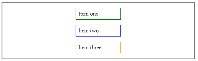
FlexBox Ex
container{
	display: flex;
    flex-direction: column;
    align-items: center;
}
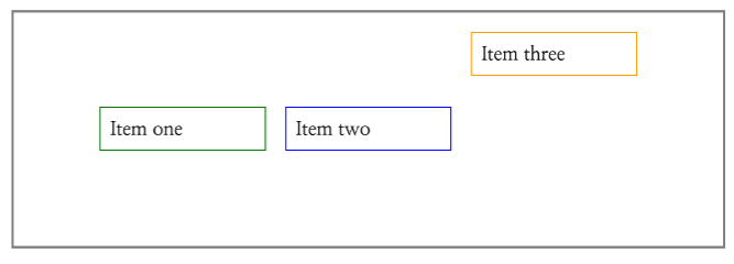
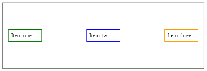
container{
	display: flex;
    justify-content: center;
    align-items: center;
}

.three{
	align-self: flex-start;
}
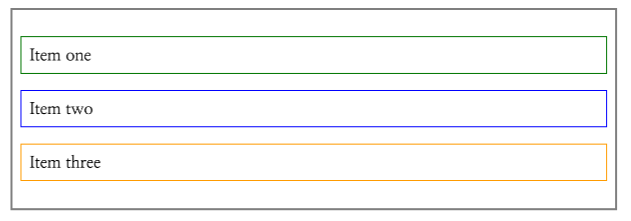
.container {
	flex-direction: column;
    justify-content: center;
}

.item{
	width: 100%;
}
.container{
	display: flex;
    justif-content: space-between;
    align-items: center;
}
.container{
display: flex;
align-items: center;
}
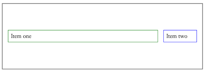
.one{
flex: 1;
}
.two{
flex: 0 0 120px;
}
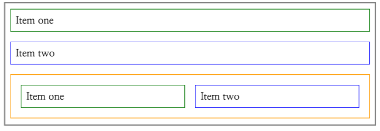
.container{
	display: flex;
    flex-direction: column;
}

wrapper {
	width: 100%;
}

.three{
	display: flex;
}

.four, .five{
	flex: 1;
}
styled-components
자바스크립트 파일 안에 스타일을 정의하고, React 컴포넌트처럼 활용한다. 자바스크립트 코드와 긴밀히 연계하여 다양한 코드를 작성할 수 있다. 별도의 CSS 파일을 만들지 않고 하나의 파일 안에 스타일을 관리하고 싶을 때 유리하며 스타일 코드와 컴포넌트 코드 간의 결합을 나누고 싶을 때 사용하기 좋다.
tagged template literal이라는 문법을 활용하며 CSS코드에 post-css, minification, Sass 적용, CSS코드가 볓지지 않게 클래스 이름 자체가 hash처리 되어 있다.
function Sample(){
	return (
    	<Container>
        	<Button>Submit</Button>
        </Conatiner>
    )
}

const Container = styled.div`
	width: 400px;
    height: 400px;
`

const Button = styled.button`
	background: oranged;
    padding: 12px 40px
`
styled-components Ex
function Sample() {
	const [clicked, setClicked] = useState(false);

    return(
    	<Container>
        	<Button onClick={() => setClicked((bool) => !bool)} clicked={clicked}>
            submit
            </Button>
        </Container>
    )
}

const Button = styled.button`
	background: ${({clciked}) => (clicked ? "oranged" : "lavender")};
    color: ${({clciked}) => (clicked ? "lavender" : "oranged")};
    padding: 12px 40px;
    border: none;
`;
해당 코드는 styled-components에 React 문법을 적용한 코드이다. 버튼에 useState를 줘서 상태에 대한 값을 주고 그 값에 따른 버튼에 색상이 바뀌는 코드다. CSS에 자바스크립트 문법을 적용해서 더 간단하게 코드를 구현 할 수 있는 것이 styled-components에 장점임을 보여주고 있다.
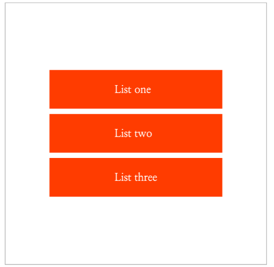
function Sample() {
	return (
    	<List>
        	<ListItem>List One</ListItem>
            <ListItem>List Two</ListItem>
            <ListItem>List Three</ListItem>
        </List>
    )
}

const List = styled.ul`
	display:flex;
    flex-direction: column;
`;

const ListItem = styled.li`
	padding: 20px 100px;
    background: oranged;
    color: white;

    & + &{
    	margin-top: 8px;
    }
`;

나의 코딩 일기