Login Form
이번에 할 웹 기능은
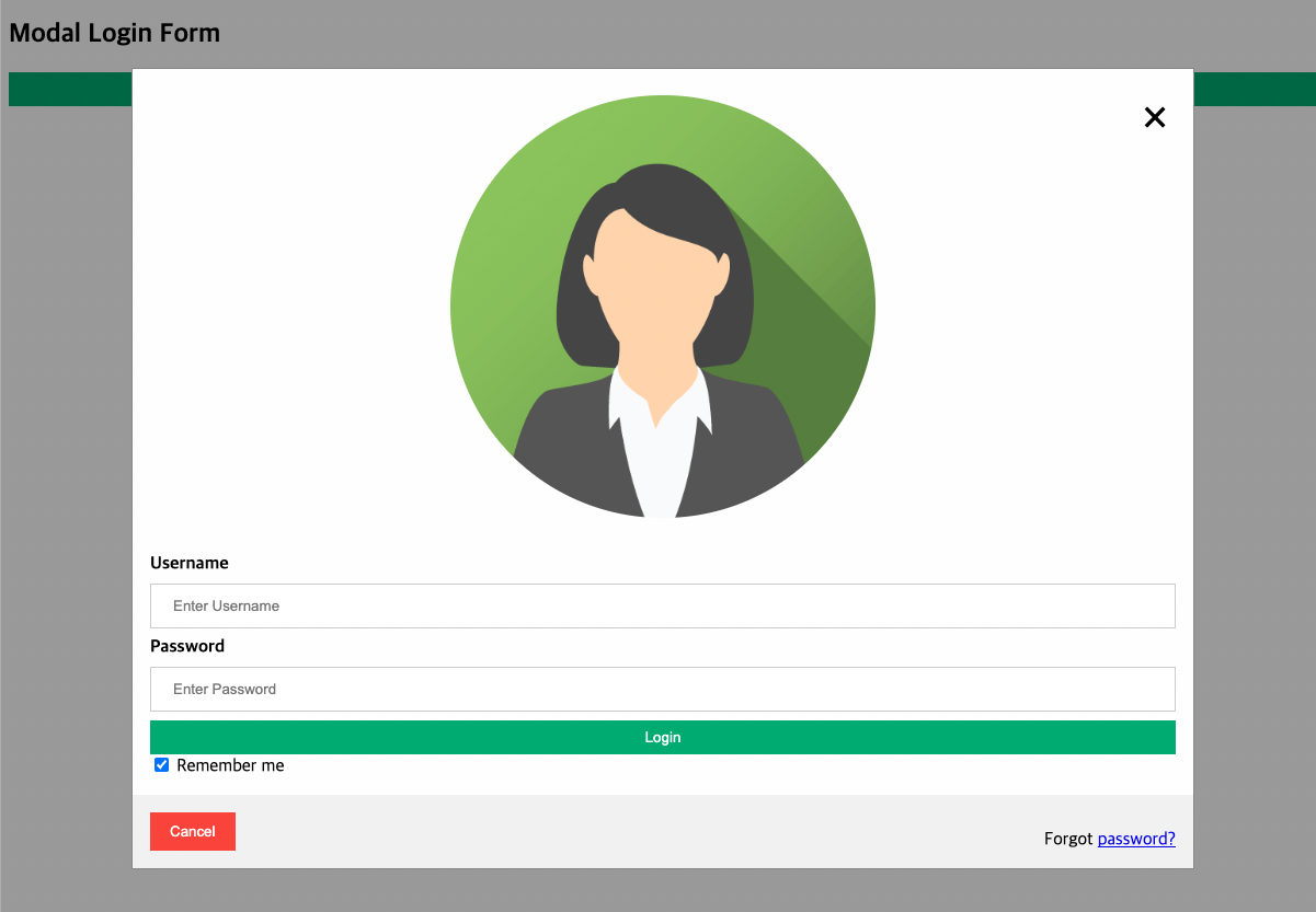
Login 버튼 클릭 시, Login Form Modal 팝업이 뜨는 기능
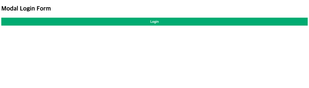
첫 페이지
Login 버튼 클릭
HTML
<h2>Modal Login Form</h2>
<!-- Button to open the modal login form -->
<button onclick="document.getElementById('id01').style.display='block'">Login</button>
<!-- The Modal -->
<div id="id01" class="modal">
<!-- Modal Content -->
<form class="modal-content animate" action="action_page.php" method="post">
<div class="imgcontainer">
<span onclick="document.getElementById('id01').style.display='none'" class="close" title="Close Modal">×</span>
<img src="Login Form_img/img_avatar2.png" alt="Avatar" class="avatar">
</div>
<div class="container">
<label for="uname"><b>Username</b></label>
<input type="text" placeholder="Enter Username" name="uname" required>
<label for="psw"><b>Password</b></label>
<input type="password" placeholder="Enter Password" name="psw" required>
<button type="submit">Login</button>
<label>
<input type="checkbox" checked="checked" name="remember"> Remember me</label>
</div>
<div class="container" style="background-color:#f1f1f1">
<button type="button" class="cancelbtn">Cancel</button>
<span class="psw">Forgot <a href="#">password?</a></span>
</div>
</form>
</div>간단하게 Login Form Modal 영역에 대해서
Login Form 클릭 전에
<div id="id01" class="modal"> 에 대한 css의 dispaly 를 초기화 값 none 처리가 되어 있고,
클릭 시에는 <div id="id01" class="modal"> 에 대한 css의 dispaly가 block 처리되서, 해당 되는 Login Form 영역이 화면에 나오게 된다.
CSS
/* Bordered form */
  form {
    border: 3px solid #f1f1f1;
  }

  /* Full-width inputs */
  input[type=text], input[type=password] {
    width: 100%;
    padding: 12px 20px;
    margin: 8px 0;
    display: inline-block;
    border: 1px solid #ccc;
    box-sizing: border-box;
  }

  /* Set a style for all buttons */
  button {
    background-color: #04AA6D;
    color: white;
    padding: 8px 0;
    border: none;
    cursor: pointer;
    width: 100%;
  }

  /* Add a hover effect for buttons */
  button:hover {
    opacity: 0.8;
  }

  /* Extra style for the cancel button (red) */
  .cancelbtn {
    width: auto;
    padding: 10px 18px;
    background-color: #f44336;
  }

  /* Center the avatar image inside this container */
  .imgcontainer {
    text-align : center;
    margin: 24px 0 12px 0;
    position: relative;
  }

  /* Avatar image */
  img.avatar {
    width: 40%;
    border-radius: 50%;
  }

  /* Add padding to containers */
  .container {
    padding: 16px;
  }

  /* The "Forgot password" text */
  span.psw {
    float: right;
    padding-top: 16px;
  }

  /* The Modal (background) */
  .modal {
    display: none; /* Hidden by default */
    position: fixed; /* Stay in place */
    z-index: 1; /* Sit on top */
    left: 0;
    top: 0;
    width: 100%; /* Full width */
    height: 100%; /* Full height */
    overflow: auto; /* Enable scroll if needed */
    background-color: rgb(0,0,0); /* Fallback color */
    background-color: rgba(0,0,0,0.4); /* Black w/ opacity */
    padding-top: 60px;
  }

  /* Modal Content/Box */
  .modal-content {
  background-color: #fefefe;
  margin: 5px auto; /* 15% from the top and centered */
  border: 1px solid #888;
  width: 80%; /* Could be more or less, depending on screen size */
}

  /* The Close Button */
  .close {
    /* Position it in the top right corner outside of the modal */
    position: absolute;
    right: 25px;
    top: 0;
    color: #000;
    font-size: 35px;
    font-weight: bold;
  }

  /* Close button on hover */
  .close:hover, .close:focus {
    color: red;
    cursor: pointer;
  }

  /* Add Zoom Animation */
  .animate {
    -webkit-animation: animatezoom 0.6s;
    animation: animatezoom 0.6s
  }

  @-webkit-keyframes animatezoom {
    from {-webkit-animation: scale(0)}
    to {-webkit-transform: scale(1)}
  }

  @keyframes animatezoom {
    from {transform: scale(0)}
    to {transform: scale(1)}
  }

   /* Change styles for span and cancel button on extra small screens */
   @media screen and (max-width: 300px) {
    span.psw {
      display: block;
      float: none;
    }
    .cancelbtn {
      width: 100%;
    }
  }
중점적으로 봐야할 부분은 따로 스크립트를 작성하지 않아도 animate 효과를 주는 영역과 .modal 영역이 가장 중요하다.
HTML에서 form 요소에 animate 효과를 주고,
<div id="id01" class="modal"> 영역에는 JavaScript 에 따라 display none or block 처리하는 것이다.
JavaScript
 window.onclick = function(event) {
      if (event.target == modal) {
        modal.style.display = "none";
      }
    }
회고
CSS 부분에서는
animate 부분이 정확히 어떻게 동작하는지 아직 파악이 안되서 조금 더 확인해봐야할 거 같고,
JS 부분에서는
function(event) 에서의 인자 event가 내부에서 어떻게 움직이는지, 확인해야할 거 같다.
이 회고 부분은 내일 Login Form 내용을 확인하면서 다시 업로드할 예정이다.

3년간 웹/앱, 자동제어 QA 🔜 개발자로 전향하여 현재 교육 회사에서 백엔드 개발자로 근무 중입니다.(LinkedIn : https://www.linkedin.com/in/dohyoung-kim-5ab09214b)