들어가며
애플리케이션을 개발할 때, 사용자가 기다려야 하는 작업이 있을 때 진행 상황을 시각적으로 보여주는 것이 매우 중요합니다. 이때 Progress Indicator를 사용하면 사용자에게 현재 작업이 진행 중임을 알리고, 그 상태를 쉽게 파악할 수 있게 해줍니다.
이번 포스팅에서는 Flutter에서 제공하는 여러 가지 Progress Indicator의 종류, 사용 방법, 각 파라미터에 대한 설명과 함께 예제 코드도 소개해드리겠습니다. 또한, Progress Indicator를 어떤 상황에서 사용하는 것이 적절한지에 대해서도 알아보겠습니다.
Flutter에서 제공하는 Progress Indicator의 종류
1.CircularProgressIndicator
- 작업의 전체 진행률을 알 수 없는 경우 사용합니다. 서버로부터 데이터를 불러올때 얼마나 오래 걸릴지 모를 때 사용합니다.
2.LinearProgressIndicator
- 작업의 전체 진행률을 알 수 있는 경우 사용됩니다. 파일 다운로드가 70% 완료된 경우 이를 시각적으로 표시 할 수 있습니다.
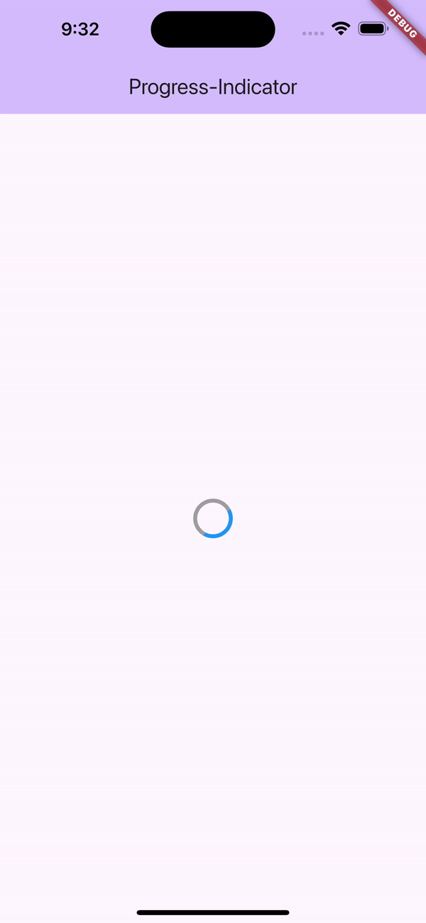
CircularProgressIndicator 예제
  @override
  Widget build(BuildContext context) {
    return Scaffold(
      appBar: AppBar(
        backgroundColor: Theme.of(context).colorScheme.inversePrimary,
        title: Text(widget.title),
      ),
      body: const Center(
        child: CircularProgressIndicator(
          color: Colors.grey,
          backgroundColor: Colors.blue,
          strokeWidth: 5,
        ),
      ),
    );
  }
- value: 진행률을 나타내는 값으로, 0.0에서 1.0 사이의 값을 설정합니다. 설정하지 않으면 비정량적 모드로 동작합니다.
- backgroundColor: 진행되지 않은 부분의 색상을 지정할 수 있습니다.
- valueColor: 진행된 부분의 색상을 지정할 수 있습니다.
- strokeWidth: 원형 선의 두께를 지정할 수 있습니다.
LinearProgressIndicator 예제
  @override
  Widget build(BuildContext context) {
    return Scaffold(
      appBar: AppBar(
        backgroundColor: Theme.of(context).colorScheme.inversePrimary,
        title: Text(widget.title),
      ),
      body: const Center(
        child: LinearProgressIndicator(
          value: 0.7, // 70% 진행률
          color: Colors.red,
          backgroundColor: Colors.blue,
        ),
      ),
    );
  }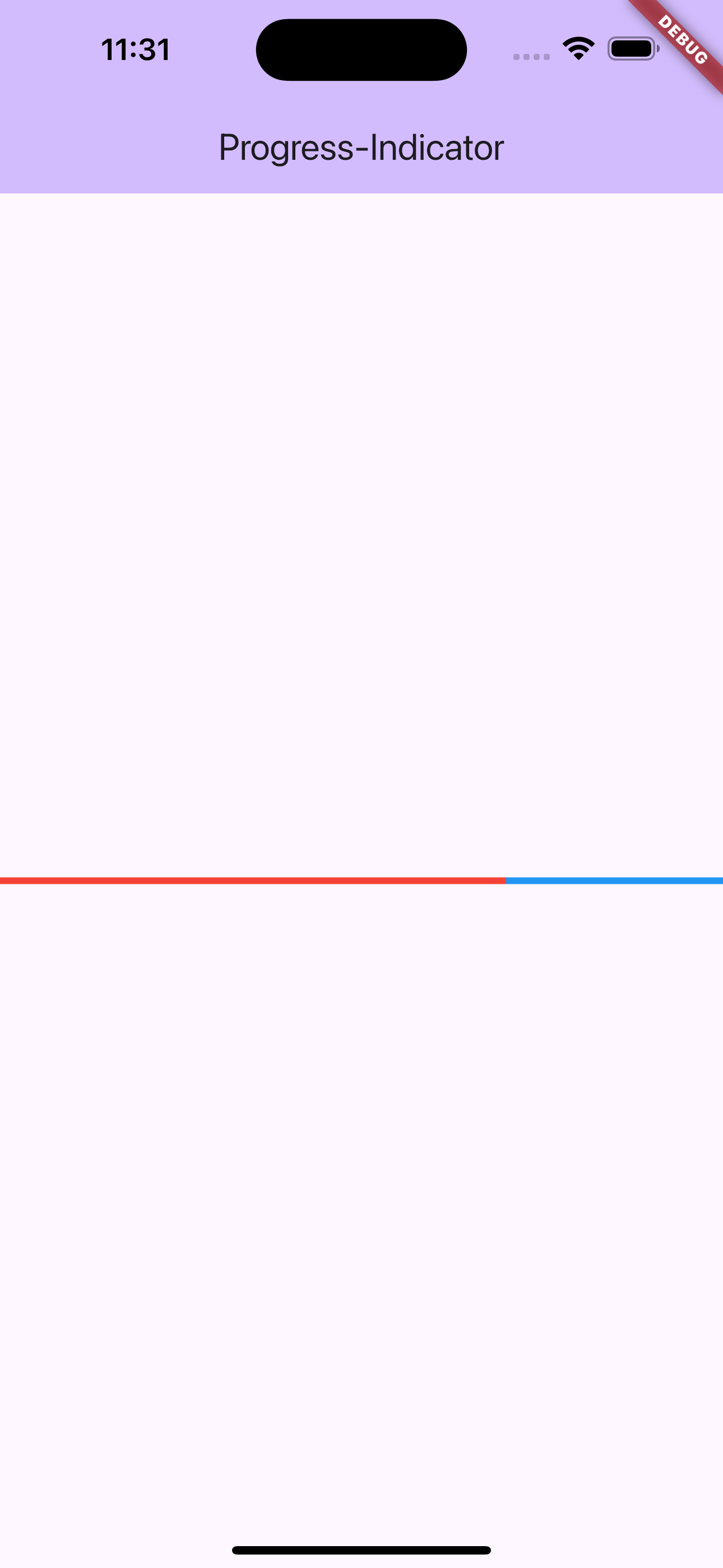
- value: 진행률을 나타내는 값으로, 0.0은 0%를, 1.0은 100%를 의미합니다. 설정하지 않으면 비정량적 모드로 동작합니다.
- backgroundColor: 진행되지 않은 부분의 색상을 지정할 수 있습니다.
- valueColor: 진행된 부분의 색상을 지정할 수 있습니다.
응용
if (isLoading) {
      return Platform.isAndroid
          ? Center(
              child: SizedBox(
                  height: indicatorSize,
                  width: indicatorSize,
                  child: CircularProgressIndicator(
                    strokeWidth: 3,
                    color: AppColors.primaryColor,
                  )))
          :  Center(
              child: SizedBox(
                  height: indicatorSize,
                  width: indicatorSize,
                  child: const CupertinoActivityIndicator(radius: 15)),
            );
    } else if (isError) {
isLoading이 true일 때, Android에서는 CircularProgressIndicator를, iOS에서는 CupertinoActivityIndicator를 중앙에 표시합니다. Android와 iOS에서 각기 다른 스타일의 로딩 인디케이터를 보여주는 것입니다.
정리하며
- 파일 업로드/다운로드
사용자가 파일을 업로드하거나 다운로드할 때 진행 상황을 시각적으로 표시해줍니다. - 데이터 로딩
서버에서 데이터를 가져오는 동안 로딩 상태를 표시하여 사용자가 기다리고 있음을 인식시킵니다. - 복잡한 계산 작업
계산 작업이 오래 걸릴 경우, 작업이 진행 중임을 알려주기 위해 사용됩니다. - 사용자 피드백 제공
비정량적 Progress Indicator를 사용하여 사용자가 어떤 작업이 백그라운드에서 처리 중임을 알 수 있게 해줍니다.
개인적으로 프로젝트 만들떄 주로 사용하는 애니메이션 로딩 패키지입니다.

Android, Flutter 앱 개발