
프로젝트 목표
- 신용카드 사용자 데이터를 보고 사용자의 대금 연체 정도를 예측하는 모델을 위한 데이터분석
- 사용자별 신용등급은 credit이라는 feature로 0,1,2 세단계의 등급이 존재하며 사용자의 데이터를 보고나서 이 credit등급을 예측하여 대금 연체 정도를 예측한다.(0일수록 신용이 높다.)

데이터 살펴보기
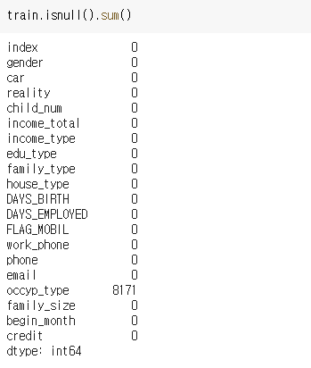
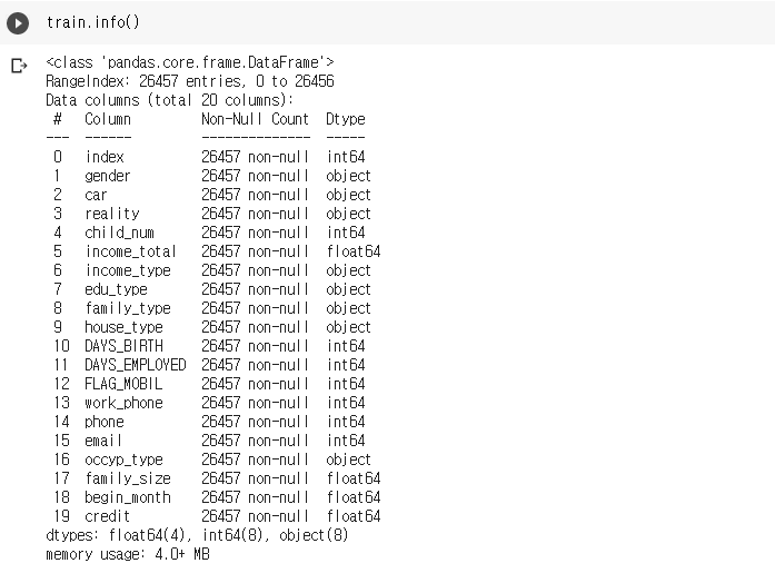
EDA는 기본적으로 데이터의 크기와 결측치, 통계량, column별 타입 등을 확인한다.
import missingno as msno
msno.bar(df=train.iloc[:,:], color=(0.1,0.6,0.8))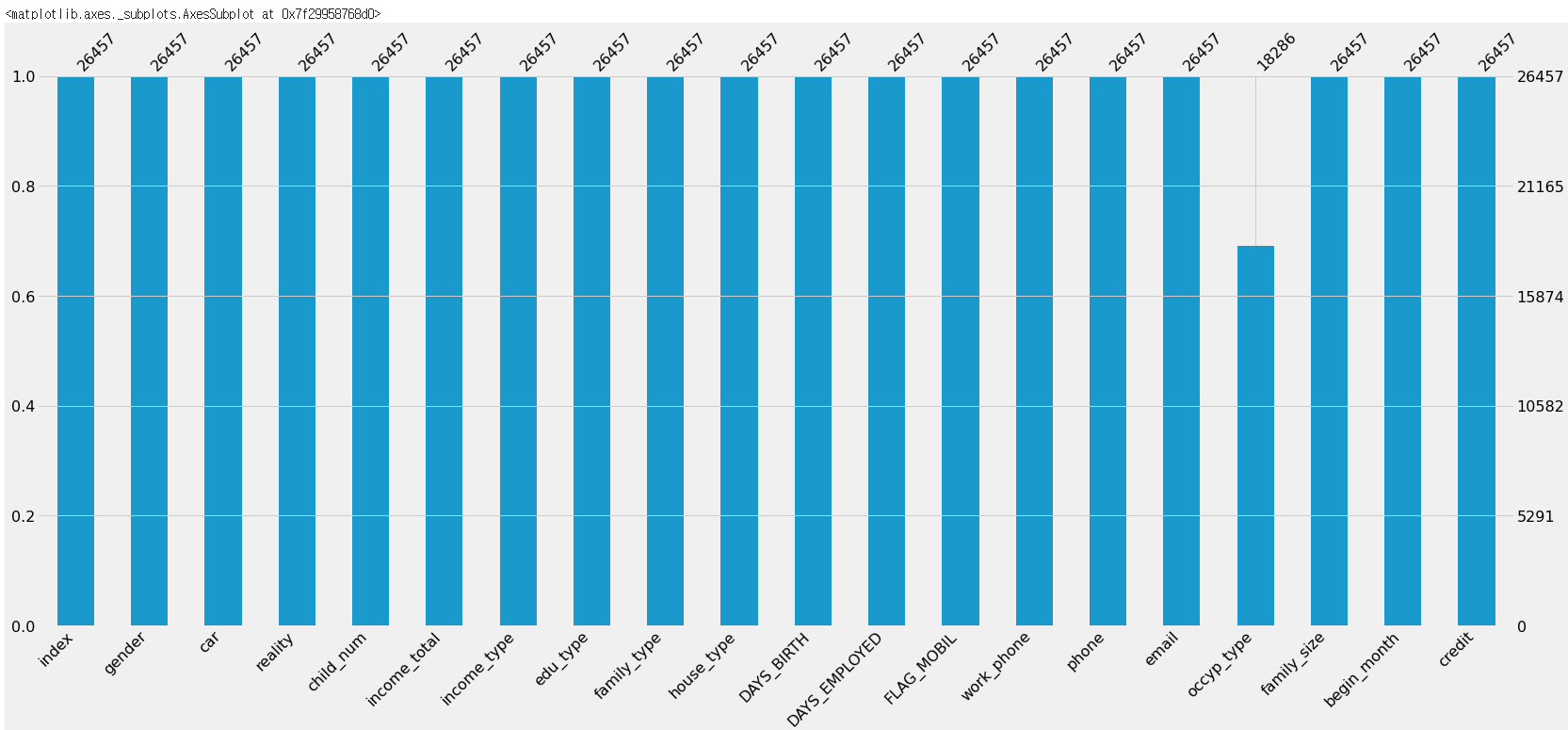
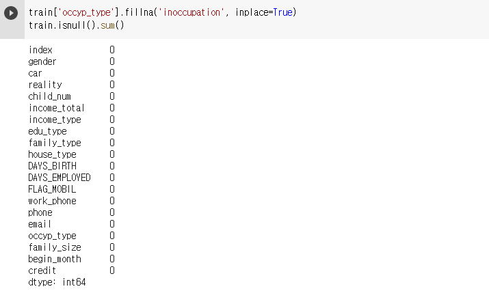
- 결측치는 occyp_type에만 8171개가 존재하는 것을 알 수 있다. 사용자가 어떤 직업을 가지고 있는지를 뜻하는 feature이므로 이 결측치는 무직을 나타낸다고 볼 수 있다. 무직을 뜻하는 inoccupation으로 바꿔주도록 하겠다.
데이터 세부정보 확인 및 가공
train.descrihbe()
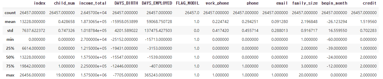
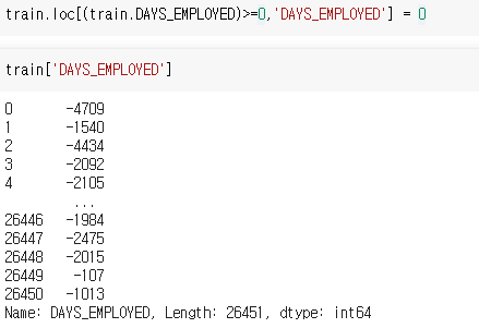
- FLAG_MOBIL은 값이 모두 1이고 DAYS_EMPLOYED는 업무시작일을 뜻하는데 4분위가 모두 음수임에도 최대값은 365243이라는 큰 양수값이다, 이를 일하고 있지 않다고 대회측에서 공지해 주었으므로 0으로 바꾸어 주도록 하겠다.
마찬가지로 값들이 음수로 되어있는 DAYS_BIRTH나 begin_month에서도 값이 0보다 큰 이상치가 존재하는지 확인할 필요가 있어보인다.
또 다른 특이점으론 자식수인 child_num과 가족크기인 family_size에서도 맥스값이 19,20으로 비현실적이게 큰 것이 눈에 띈다.
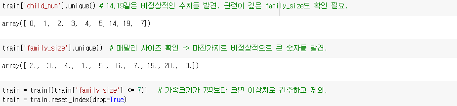

- 음수로 된 수치를 가지고 있는 feature에서 양수값이 존재하는지 확인.
train[train['begin_month']>0]
train[train['DAYS_BIRTH']>0]- DAYS_EMPLOYED에 존재하는 양수값은 결국 일을 한지 0일 되었다고 할 수 있으므로 0이라고 바꾸어주도록 하겠다.
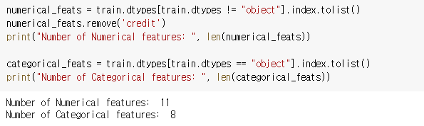
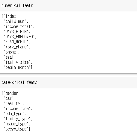
Numeric, Category 컬럼 분류
- 각 feature별로 Numeric인지 Category한지 구분해두면 데이터를 이해하기도 쉽고 나중에 가공할 때도 편리하게 사용할 수 있다.
시각화하여 분석하기
- 신용등급을 나타내는 credit은 0,1,2 세가지 등급으로 구분되며 그 비율을 확인한다.
    plt.subplots(figsize = (8,8))
    plt.pie(train['credit'].value_counts(),labels =   train['credit'].value_counts().index,
        autopct="%.2f%%", shadow = True, startangle=90) # 비율 시작이 12시부터 시작.
    plt.title('신용 등급 비율',size=20)
    plt.show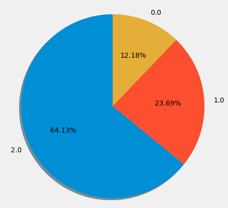
categorical한 feature와 비교하여 credit 등급별로 상관성을 시각화 하기 위한 cat_plot 정의
train_0 = train[train['credit']==0.0]
train_1 = train[train['credit']==1.0]
train_2 = train[train['credit']==2.0]

def cat_plot(column):
  f, ax = plt.subplots(1,3, figsize=(16,6))

  sns.countplot(x = column,
                data = train_0,
                ax = ax[0],
                order = train_0[column].value_counts().index)
  ax[0].tick_params(labelsize=12)
  ax[0].set_title('credit = 0')
  ax[0].set_ylabel('count')
  ax[0].tick_params(rotation=50)

  sns.countplot(x = column,
                data = train_1,
                ax = ax[1],
                order = train_1[column].value_counts().index
                )
  ax[1].tick_params(labelsize=12)
  ax[1].set_title('credit = 1')
  ax[1].set_ylabel('count')
  ax[1].tick_params(rotation=50)

  sns.countplot(x = column,
                data = train_2,
                ax = ax[2],
                order = train_2[column].value_counts().index)
  ax[2].tick_params(labelsize=12)
  ax[2].set_title('credit = 2')
  ax[2].set_ylabel('count')
  ax[2].tick_params(rotation=50)
  plt.subplots_adjust(wspace=0.3, hspace=0.3)
plt.show()-
gender라는 성별을 구분하는 feature로 시각화하기
cat_plot("gender") # 남,여 성별로 비교.
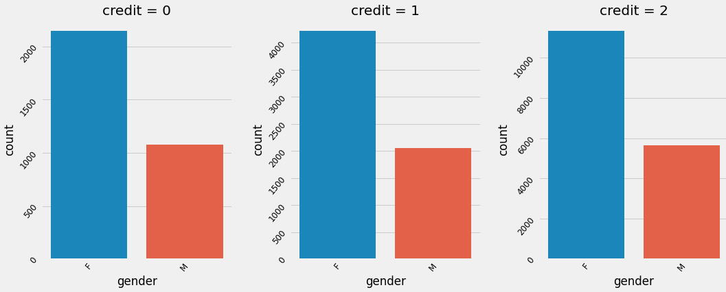
여성사용자들이 많으며 credit별로 큰 차이는 존재하지 않는다. 다른 feature에서도 credit별 크게 유의미한 차이는 없는 것으로 확인된다.
-
credit별 직업분포.
f, ax = plt.subplots(1, 3, figsize=(16,6))
sns.countplot(y = 'occyp_type', data = train_0, order = train_0['occyp_type'].value_counts().index, ax=ax[0])
sns.countplot(y = 'occyp_type', data = train_1, order = train_1['occyp_type'].value_counts().index, ax=ax[1])
sns.countplot(y = 'occyp_type', data = train_2, order = train_2['occyp_type'].value_counts().index, ax=ax[2])
plt.subplots_adjust(wspace=0.5, hspace=0.3)
plt.show()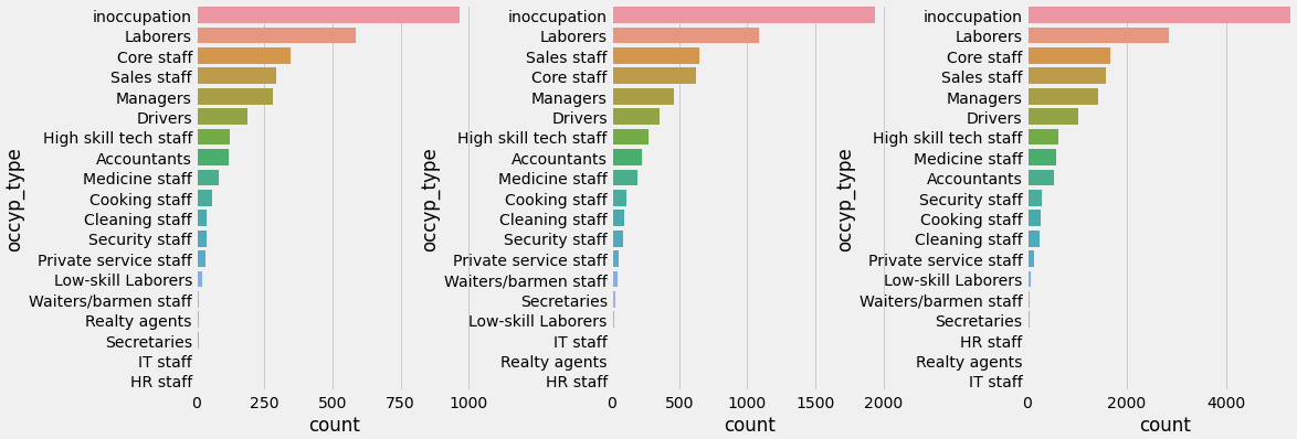
credit별로 숫자에 약간의 차이가 있을뿐 직업 분포는 비슷하다.
Numerical 그래프 함수 정의
def num_plot(column):
  fig, axes = plt.subplots(1, 3, figsize=(16,6))

  sns.distplot(train_0[column],
               ax = axes[0])
  axes[0].tick_params(labelsize=12)
  axes[0].set_title('credit = 0')
  axes[0].set_ylabel('count')

  sns.distplot(train_1[column],
               ax = axes[1])
  axes[1].tick_params(labelsize=12)
  axes[1].set_title('credit = 1')
  axes[1].set_ylabel('count')

  sns.distplot(train_2[column],
               ax = axes[2])
  axes[2].tick_params(labelsize=12)
  axes[2].set_title('credit = 2')
  axes[2].set_ylabel('count')
  plt.subplots_adjust(wspace=0.3, hspace=0.3)
num_plot('child_num') #아이들의 숫자를 나타내는 child_num을 credit별로 비교
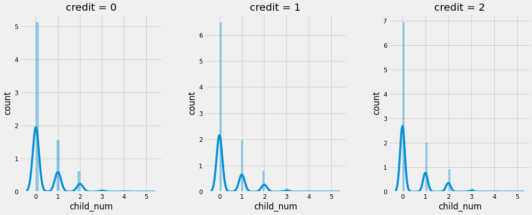
마찬가지로 credit 등급별로 비슷한 양상을 보이고 있다.
히트맵으로 상관관계 확인하기.
categorical feature들을 제외하고 credit만 원핫인코딩으로 0,1,2로 구분한 뒤에 히트맵으로 상관관계를 확인하겠다.
trains = train # heatmap에 사용할 목적으로 새로운 train생성
drop_list=['gender','car','reality','income_type','edu_type','family_type','house_type','occyp_type']

category_cols = ['credit']
trains = pd.get_dummies(trains, category_cols)

plt.figure(figsize=(10,10))    # 도표 크기 설정
sns.heatmap(data = trains.corr(), annot=True, cmap='bwr',fmt = '.2f')
plt.show()
색깔이 빨간색이나 파란색으로 짙을 수록 관련성이 깊고 숫자는 0에 가까울 수록 관련이 적고 0에서 멀어질수록 관련이 깊음을 의미한다. 음수인 경우에는 상반되는 관계라고 보면 된다.
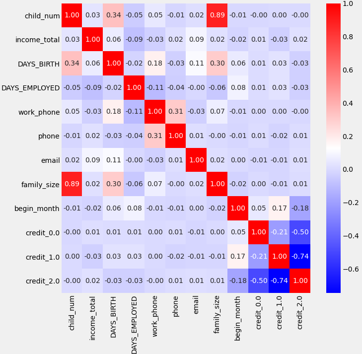
- begin_month가 그나마 credit과 가장 높은 연관성을 가지는 것을 알 수 있다. 실제로 신용등급을 높이는데는 꾸준히 카드를 사용하는게 중요하다. credit 0일때 상관도가 더 낮은것은 단순히 오래 사용했다면 credit 1까지는 가능하지만 그 이상은 단순히 오래 사용한 것만으로는 부족하기 때문인 것으로 보인다.

데이터분석 입문가