서론: Liquid Glass란?
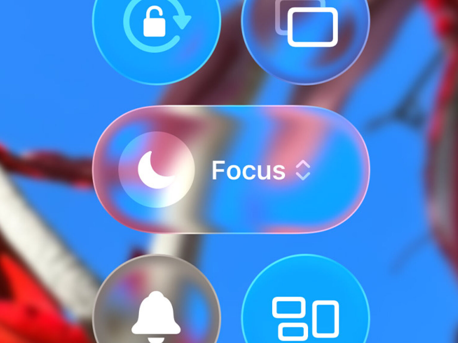
WWDC 2025에서 Apple이 visionOS와 함께 Liquid Glass 디자인 언어를 선보였었다. 기존 글래스모피즘(Glassmorphism)의 진화형인데, 단순히 반투명한 배경을 넘어서 빛의 굴절, 동적 반사, 물리 기반 상호작용을 결합한 차세대 UI라고 볼 수 있다.
이 글에서는 웹 개발하면서 실제로 적용한 Liquid Glass 컴포넌트를 분석하면서, React와 Tailwind CSS로 Apple 수준에 최대한 가깝게 UI를 구현하는 방법을 파헤쳐 보겠다.
1. Liquid Glass의 핵심 원리
1.1 Multi-Layer Architecture
Liquid Glass의 핵심은 다중 레이어 합성이다.
우선, 왜 레이어가 필요할까? 직접 컵에 물을 담아서 관찰해보았다.
뒤에 있는 물체는 blur 처리가 되어서 흐릿하게 보이고, 가장자리는 빛의 굴절로 무지개빛이 감돌면서 밝게 빛나고, 동시에 가장자리 테두리에는 얇은 선이 또 보이고 보는 각도에 따라서 빛이 반사되어서 반짝거린다.
Android에서처럼 그냥 blur 처리하면 모자이크 처리하는 것이랑 다를 것이 없어서 각각의 광학적인 현상들을 별도의 레이어로 분리해서 쌓아올리듯이 조립한다고 보면 된다.
2. 구현 1: Glass Container 기본 구조
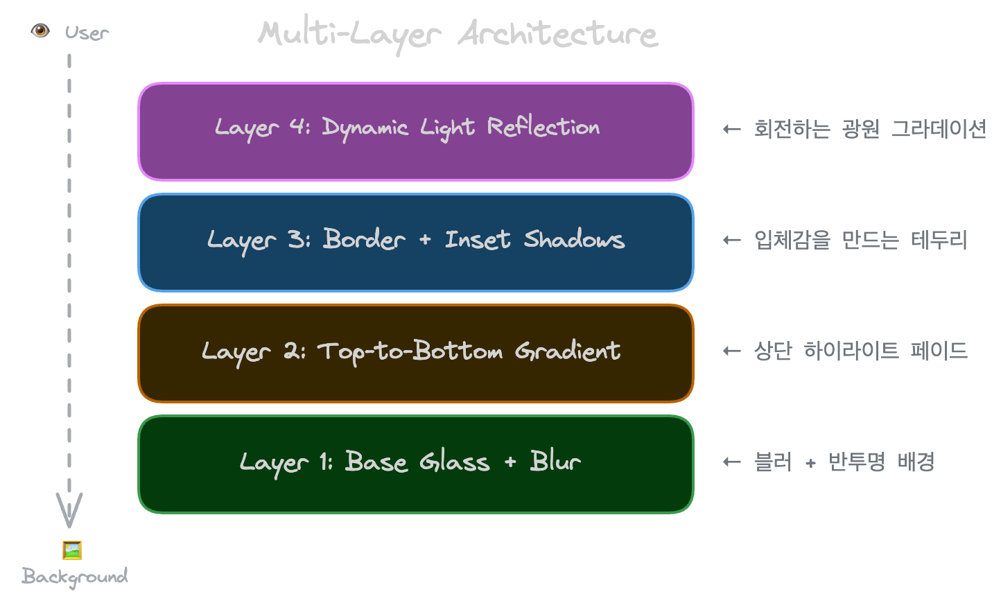
2.1 4-Layer Glass Background
실제 FilterTabs.tsx에서 어떻게 구현했는지 볼게요:
<div className="relative inline-flex items-center p-1 rounded-full overflow-hidden">
  {/* Layer 1: Base glass */}
  <div className="absolute inset-0 rounded-full bg-white/[0.04] backdrop-blur-xl" />

  {/* Layer 2: Top gradient (Fresnel simulation) */}
  <div className="absolute inset-0 rounded-full bg-gradient-to-b from-white/[0.08] to-transparent" />

  {/* Layer 3: Border with inset shadows */}
  <div className="absolute inset-0 rounded-full border border-white/[0.12]
    shadow-[inset_0_1px_1px_rgba(255,255,255,0.1),inset_0_-1px_1px_rgba(0,0,0,0.1)]" />

  {/* Layer 4: Dynamic light */}
  <div className="absolute inset-0 rounded-full overflow-hidden pointer-events-none">
    <div
      className="absolute w-[200%] h-[200%] -top-1/2 -left-1/2
        bg-[radial-gradient(circle_at_30%_30%,rgba(255,255,255,0.12)_0%,transparent_50%)]"
      style={{ transform: `rotate(${lightAngle}deg)` }}
    />
  </div>

  {/* Content */}
  <div className="relative z-10">{children}</div>
</div>
2.2 각 레이어 상세 분석
Layer 1: Base Glass
bg-white/[0.04] backdrop-blur-xlwhite/[0.04]: 4% 불투명도의 흰색 → 미세한 밝기 상승backdrop-blur-xl: 24px 블러 → 유리의 굴절 효과
WWDC에서 실제 유리를 제작해 다양한 불투명도를 테스트해보았다고 하는데 실제로 퍼센트를 좀 올리게 되면 유리의 느낌보다는 뿌연 플라스틱 재질처럼 보인다.
토스의 로고도 디자인팀에서 찰흙을 빚어서 모형을 만들어보았다고 하는데 개발자의 장인 정신과는 또 다른 결의 디자이너의 장인 정신이 돋보이는 것 같다.
Layer 2: Fresnel Gradient
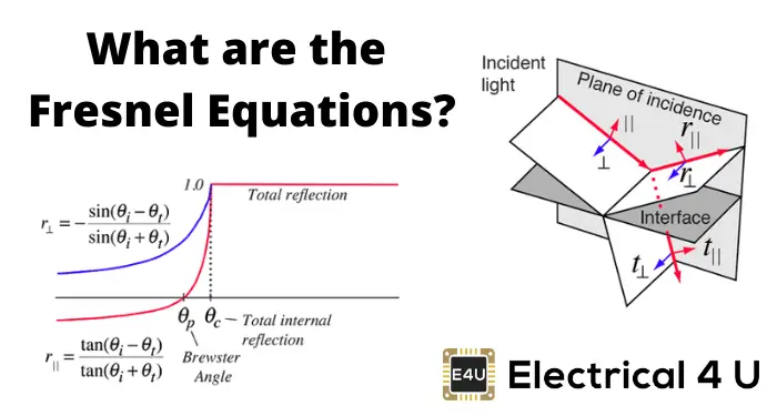
bg-gradient-to-b from-white/[0.08] to-transparent실제 유리는 위에서 내려다볼 때 상단이 더 밝게 보이는데 이게 바로 프레넬 효과다.
Layer 3: Inset Shadow Border
border border-white/[0.12]
shadow-[inset_0_1px_1px_rgba(255,255,255,0.1),inset_0_-1px_1px_rgba(0,0,0,0.1)]- 상단 1px: 흰색 하이라이트 → 빛이 위에서 비추는 느낌
- 하단 1px: 검은색 그림자 → 두께감 부여
Layer 4: Dynamic Light Reflection
style={{ transform: `rotate(${lightAngle}deg)` }}- radial-gradient로 원형 광원 생성
- 200% 크기로 확대해서 부드러운 가장자리 표현
- 상태에 따라 회전 → 빛이 "흘러가는" 느낌
3. 구현 2: Draggable Pill Indicator
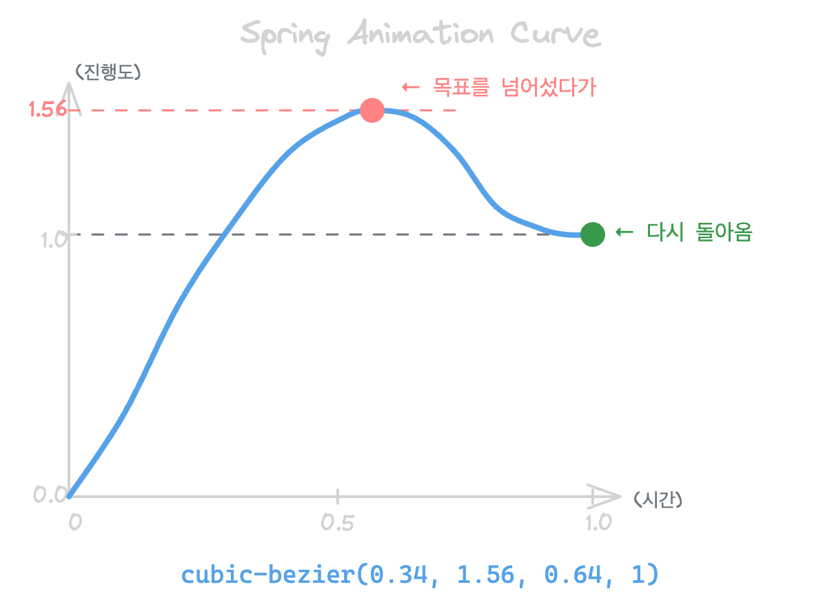
Liquid Glass의 진수는 상호작용 시 변형이다. Apple 스위치는 드래그할 때 pill이 반투명해지면서 caustics(빛 모임 패턴)가 나타나기 때문이다.
3.1 상태에 따른 Pill 변화
LanguageSwitcher.tsx
<div
  className="absolute top-1 bottom-1 w-[28px] rounded-full"
  style={{
    transform: `translateX(${pillPosition}px) scale(${isDragging ? 1.08 : 1})`,
    transition: isDragging
      ? "transform 150ms cubic-bezier(0.34, 1.56, 0.64, 1)"
      : "transform 500ms cubic-bezier(0.34, 1.56, 0.64, 1)"
  }}
>
  {/* Solid state (기본) */}
  <div
    className="absolute inset-0 rounded-full bg-white transition-opacity duration-200"
    style={{ opacity: isDragging ? 0 : 1 }}
  />

  {/* Glass state (드래그 시) */}
  <div
    className="absolute inset-0 rounded-full backdrop-blur-xl transition-opacity duration-200"
    style={{
      opacity: isDragging ? 1 : 0,
      background: `linear-gradient(135deg,
        rgba(255,255,255,0.4) 0%,
        rgba(255,255,255,0.15) 50%,
        rgba(255,255,255,0.25) 100%)`
    }}
  />

  {/* Caustics (드래그 시 빛 굴절 패턴) */}
  <div
    className="absolute inset-0 rounded-full overflow-hidden transition-opacity duration-200"
    style={{ opacity: isDragging ? 1 : 0 }}
  >
    <div style={{
      background: `
        radial-gradient(ellipse at 30% 20%, rgba(255,255,255,0.6) 0%, transparent 40%),
        radial-gradient(ellipse at 70% 80%, rgba(255,255,255,0.3) 0%, transparent 30%)`
    }} />
  </div>
</div>
3.2 Spring Animation (탄성 애니메이션)
Apple 인터랙션의 핵심은 spring animation이다:
cubic-bezier(0.34, 1.56, 0.64, 1)switcher를 드래그해보면 말랑말랑한 느낌이 들면서 가장자리가 튕기는 효과를 볼 수 있는데,
이 부분은 Android의 spring과 사실상 원리가 똑같다.
이 커브를 분석해보면:
0.34: 시작 제어점 → 빠른 가속1.56: 1.0을 초과 → 오버슈트(overshooting)0.64, 1: 종료 제어점 → 자연스러운 착지
4. 구현 3: Drag Gesture Handler
4.1 Drag State Management
드래그를 제대로 처리하려면 Android랑 똑같이 상태 변수들이 필수로 들어가게 된다:
// 필수 상태 변수들
const [isDragging, setIsDragging] = useState(false);
const [hasDragged, setHasDragged] = useState(false);  // 클릭 vs 드래그 구분
const [dragX, setDragX] = useState<number | null>(null);

// Ref로 초기값 저장 (리렌더링 방지)
const startXRef = useRef(0);       // 드래그 시작 지점
const startPillXRef = useRef(0);   // pill의 초기 위치

const DRAG_THRESHOLD = 5;  // 5px 이상 이동해야 드래그로 인식
4.2 Drag Lifecycle
1. 드래그 시작
const handleDragStart = useCallback((clientX: number) => {
  setIsDragging(true);
  setHasDragged(false);
  startXRef.current = clientX;
  startPillXRef.current = currentPillPosition;
}, [currentPillPosition]);
2. 드래그 중
const handleDragMove = useCallback((clientX: number) => {
  if (!isDragging) return;

  const deltaX = clientX - startXRef.current;

  // 실제 드래그인지 판별
  if (Math.abs(deltaX) > DRAG_THRESHOLD) {
    setHasDragged(true);
  }

  // Elastic boundary (고무줄 효과)
  let newX = startPillXRef.current + deltaX;
  const elasticRange = 8;  // 경계를 8px까지 넘어갈 수 있음
  newX = Math.max(-elasticRange, Math.min(maxX + elasticRange, newX));

  setDragX(newX);
}, [isDragging, maxX]);
Elastic boundary에 대한 설명은 이전에 작성한 글의 직관적인 설명을 말하는 것이다.
3. 드래그 종료
const handleDragEnd = useCallback(() => {
  if (!isDragging) return;

  if (hasDragged && dragX !== null) {
    // 가장 가까운 탭으로 스냅
    const closestTab = findClosestTab(dragX);
    onTabChange(closestTab);
  }

  setIsDragging(false);
  setDragX(null);  // spring animation 트리거
}, [isDragging, hasDragged, dragX, findClosestTab, onTabChange]);
4.3 Global Event Listeners (터치/마우스 공통)
useEffect(() => {
  if (!isDragging) return;

  const handleMouseMove = (e: MouseEvent) => handleDragMove(e.clientX);
  const handleTouchMove = (e: TouchEvent) => handleDragMove(e.touches[0].clientX);
  const handleMouseUp = () => handleDragEnd();
  const handleTouchEnd = () => handleDragEnd();

  // 전역 리스너 등록 (컴포넌트 밖에서도 드래그 추적)
  window.addEventListener("mousemove", handleMouseMove);
  window.addEventListener("mouseup", handleMouseUp);
  window.addEventListener("touchmove", handleTouchMove, { passive: true });
  window.addEventListener("touchend", handleTouchEnd);

  return () => {
    window.removeEventListener("mousemove", handleMouseMove);
    window.removeEventListener("mouseup", handleMouseUp);
    window.removeEventListener("touchmove", handleTouchMove);
    window.removeEventListener("touchend", handleTouchEnd);
  };
}, [isDragging, handleDragMove, handleDragEnd]);
5. 고급 기법: Gradient Pill (FilterTabs)
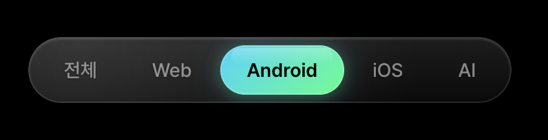
FilterTabs에서는 깨끗한 투명 유리가 아닌 필름지가 붙어있는 특수 유리처럼 보이도록 하기 위해 pill에 단색 대신 그라데이션을 적용했다:
{/* 기본 상태: 그라데이션 pill */}
<div
  className="absolute inset-0 rounded-full transition-opacity duration-200"
  style={{
    background: "linear-gradient(135deg, #00D4FF 0%, #00FF88 100%)",
    opacity: isDragging ? 0.7 : 1,  // 드래그 시 약간 투명해짐
  }}
/>

{/* 드래그 상태: glass overlay */}
<div
  className="absolute inset-0 rounded-full backdrop-blur-xl transition-opacity duration-200"
  style={{
    opacity: isDragging ? 1 : 0,
    background: `linear-gradient(135deg,
      rgba(255,255,255,0.4) 0%,
      rgba(255,255,255,0.15) 50%,
      rgba(255,255,255,0.25) 100%)`,
  }}
/>

{/* 드래그 시 glow shadow 강화 */}
<div
  className="absolute inset-0 rounded-full border transition-all duration-200"
  style={{
    boxShadow: isDragging
      ? "0 4px 24px rgba(0,229,160,0.6), inset 0 1px 1px rgba(255,255,255,0.5)"
      : "0 2px 12px rgba(0,229,160,0.3), 0 0 20px rgba(0,212,255,0.2)",
  }}
/>
6. 성능 최적화

Android에는 생명주기가 있는 것처럼 Web에서는 브라우저에서 렌더링되는 과정을 반드시 숙지해야한다.
브라우저에서 화면을 그릴 때 CSS 계산 적용, 레이아웃의 위치나 크기를 계산, GPU를 통한 레이어 합성 단계 순서라서 가능하면 마지막 단계인 Composite 단계에서 처리하는 것이 더 좋다고 한다.
6.1 will-change 최소화
/* 잘못된 사용 */
.glass-element {
  will-change: transform, opacity, background, box-shadow;
}

/* 올바른 사용 - 드래그 중에만 */
.glass-element.is-dragging {
  will-change: transform;
}
이렇게 하면 해당 요소를 별도의 GPU 레이어로 승격시켜서 변경될 때만 해당 레이어 합성 과정이 이루어진다.
만약 500 X 300 짜리가 있다고 하면 대략 width x height x 4 bytes로 적용되기 때문에 10개는 6MB GPU 메모리 소비가 이루어진다.
will-change는 GPU 메모리를 소비하므로 모든 요소에 적용하면 특히 GPU가 데스크탑에 제한적인 모바일에서는 오히려 성능이 저하된다.
6.2 Composite Layer 유도
CSS 속성들이 어떤 단계를 트리거하는지 알아야하는데, width나 height는 당연히 전부 다시 그려야하고 transform, opacity는 composite만 건드리기 때문에 유도해야한다.
transform과 opacity만 애니메이션하면 브라우저가 GPU 레이어를 생성한다:
// GPU 가속 (Composite)
style={{
  transform: `translateX(${x}px) scale(${scale})`,
  opacity: isDragging ? 0.7 : 1,
}}

// CPU 레이아웃 (느림)
style={{
  left: `${x}px`,
  width: `${width}px`,
}}
6.3 backdrop-filter 성능
backdrop-blur는 비용이 높은 연산이다. Android에서 적용 가능한 liquid glass 라이브러리를 보게 되면 backdrop이 일부 저사양 기기에서 동작하지 않는 것을 보면 피부로 느낄 수 있다.
backdrop-blur는 그도 그럴 것이 뒷배경에 있는 모든 픽셀을 캡쳐해서 Gaussian blur 알고리즘을 적용한다. 이것은 n제곱의 복잡도를 가지고 매 프레임마다 반복해야해서 무거운 작업이다.
// 정적 요소에만 blur 적용
<div className="backdrop-blur-xl">
  {/* Pill은 별도 레이어로 분리 */}
  <div className="relative z-10">{pill}</div>
</div>
움직이는 요소에 backdrop-blur를 직접 적용하면 프레임 드랍이 발생할 수 있다.
7. 전체 코드: LanguageSwitcher
"use client";

import { useRouter } from "next/navigation";
import { useLocale } from "next-intl";
import { useRef, useState, useCallback, useEffect } from "react";

export function LanguageSwitcher() {
  const locale = useLocale();
  const router = useRouter();
  const containerRef = useRef<HTMLDivElement>(null);

  const [isDragging, setIsDragging] = useState(false);
  const [hasDragged, setHasDragged] = useState(false);
  const [dragX, setDragX] = useState<number | null>(null);
  const [pendingLocale, setPendingLocale] = useState<string | null>(null);

  const startXRef = useRef(0);
  const startPillXRef = useRef(0);

  const KO_POS = 0;
  const EN_POS = 36;
  const THRESHOLD = 18;
  const DRAG_THRESHOLD = 3;

  // locale 변경 완료 시 pending 클리어
  useEffect(() => {
    if (pendingLocale && pendingLocale === locale) {
      setPendingLocale(null);
    }
  }, [locale, pendingLocale]);

  const getPillPosition = useCallback(() => {
    if (dragX !== null) return dragX;
    const effectiveLocale = pendingLocale ?? locale;
    return effectiveLocale === "en" ? EN_POS : KO_POS;
  }, [dragX, locale, pendingLocale]);

  const switchLocale = useCallback((newLocale: string) => {
    if (newLocale !== locale) {
      document.cookie = `locale=${newLocale};path=/;max-age=31536000`;
      router.refresh();
    }
  }, [locale, router]);

  const handleDragStart = useCallback((clientX: number) => {
    setIsDragging(true);
    setHasDragged(false);
    startXRef.current = clientX;
    startPillXRef.current = locale === "en" ? EN_POS : KO_POS;
  }, [locale]);

  const handleDragMove = useCallback((clientX: number) => {
    if (!isDragging) return;
    const deltaX = clientX - startXRef.current;
    if (Math.abs(deltaX) > DRAG_THRESHOLD) setHasDragged(true);

    let newX = startPillXRef.current + deltaX;
    const elasticRange = 8;
    newX = Math.max(-elasticRange, Math.min(EN_POS + elasticRange, newX));
    setDragX(newX);
  }, [isDragging]);

  const handleDragEnd = useCallback((endClientX?: number) => {
    if (!isDragging) return;

    let newLocale: string | null = null;

    if (hasDragged) {
      const currentX = dragX ?? (locale === "en" ? EN_POS : KO_POS);
      newLocale = currentX > THRESHOLD ? "en" : "ko";
    } else if (endClientX !== undefined && containerRef.current) {
      const rect = containerRef.current.getBoundingClientRect();
      const clickX = endClientX - rect.left;
      newLocale = clickX > rect.width / 2 ? "en" : "ko";
    }

    if (newLocale && newLocale !== locale) {
      setPendingLocale(newLocale); // 바운스백 방지
    }

    setIsDragging(false);
    setDragX(null);
    if (newLocale) switchLocale(newLocale);
    setTimeout(() => setHasDragged(false), 50);
  }, [isDragging, dragX, locale, hasDragged, switchLocale]);

  // 전역 이벤트
  useEffect(() => {
    if (!isDragging) return;
    const handleMouseMove = (e: MouseEvent) => handleDragMove(e.clientX);
    const handleTouchMove = (e: TouchEvent) => handleDragMove(e.touches[0].clientX);
    const handleMouseUp = (e: MouseEvent) => handleDragEnd(e.clientX);
    const handleTouchEnd = (e: TouchEvent) => handleDragEnd(e.changedTouches[0]?.clientX);

    window.addEventListener("mousemove", handleMouseMove);
    window.addEventListener("mouseup", handleMouseUp);
    window.addEventListener("touchmove", handleTouchMove, { passive: true });
    window.addEventListener("touchend", handleTouchEnd);

    return () => {
      window.removeEventListener("mousemove", handleMouseMove);
      window.removeEventListener("mouseup", handleMouseUp);
      window.removeEventListener("touchmove", handleTouchMove);
      window.removeEventListener("touchend", handleTouchEnd);
    };
  }, [isDragging, handleDragMove, handleDragEnd]);

  const pillPosition = getPillPosition();
  const effectiveLocale = pendingLocale ?? locale;
  const isAtEn = dragX !== null ? dragX > THRESHOLD : effectiveLocale === "en";

  return (
    <div
      ref={containerRef}
      className="h-10 w-[72px] flex items-center justify-center rounded-full relative overflow-hidden select-none cursor-grab active:cursor-grabbing"
      onMouseDown={(e) => { e.preventDefault(); handleDragStart(e.clientX); }}
      onTouchStart={(e) => handleDragStart(e.touches[0].clientX)}
    >
      {/* Glass layers */}
      <div className="absolute inset-0 rounded-full bg-white/[0.04] backdrop-blur-xl" />
      <div className="absolute inset-0 rounded-full bg-gradient-to-b from-white/[0.08] to-transparent" />
      <div className="absolute inset-0 rounded-full border border-white/[0.12] shadow-[inset_0_1px_1px_rgba(255,255,255,0.1),inset_0_-1px_1px_rgba(0,0,0,0.1)]" />

      {/* Dynamic light */}
      <div className="absolute inset-0 rounded-full overflow-hidden pointer-events-none">
        <div
          className="absolute w-[200%] h-[200%] -top-1/2 -left-1/2 bg-[radial-gradient(circle_at_30%_30%,rgba(255,255,255,0.15)_0%,transparent_50%)] transition-transform duration-500"
          style={{ transform: `rotate(${isAtEn ? 15 : -15}deg)` }}
        />
      </div>

      {/* Labels */}
      <div className="absolute inset-0 flex items-center pointer-events-none z-10">
        <div className="flex-1 text-center text-xs font-semibold" style={{ color: !isAtEn ? "rgba(0,0,0,0.85)" : "rgba(255,255,255,0.5)" }}>KO</div>
        <div className="flex-1 text-center text-xs font-semibold" style={{ color: isAtEn ? "rgba(0,0,0,0.85)" : "rgba(255,255,255,0.5)" }}>EN</div>
      </div>

      {/* Sliding pill */}
      <div
        className="absolute top-1 bottom-1 w-[28px] rounded-full pointer-events-none"
        style={{
          left: "4px",
          transform: `translateX(${pillPosition}px) scale(${isDragging ? 1.08 : 1})`,
          transition: isDragging
            ? "transform 150ms cubic-bezier(0.34, 1.56, 0.64, 1)"
            : "transform 500ms cubic-bezier(0.34, 1.56, 0.64, 1)"
        }}
      >
        <div className="absolute inset-0 rounded-full bg-white transition-opacity duration-200" style={{ opacity: isDragging ? 0 : 1 }} />
        <div
          className="absolute inset-0 rounded-full backdrop-blur-xl transition-opacity duration-200"
          style={{
            opacity: isDragging ? 1 : 0,
            background: "linear-gradient(135deg, rgba(255,255,255,0.4), rgba(255,255,255,0.15), rgba(255,255,255,0.25))"
          }}
        />
        <div
          className="absolute inset-0 rounded-full border transition-all duration-200"
          style={{ borderColor: isDragging ? "rgba(255,255,255,0.5)" : "rgba(255,255,255,0.3)" }}
        />
        <div
          className="absolute inset-x-1 top-0.5 h-1/3 rounded-full bg-gradient-to-b from-white to-transparent"
          style={{ opacity: isDragging ? 0.4 : 0.8 }}
        />
        <div
          className="absolute inset-0 rounded-full overflow-hidden transition-opacity duration-200"
          style={{ opacity: isDragging ? 1 : 0 }}
        >
          <div
            style={{
              background: "radial-gradient(ellipse at 30% 20%, rgba(255,255,255,0.6) 0%, transparent 40%), radial-gradient(ellipse at 70% 80%, rgba(255,255,255,0.3) 0%, transparent 30%)"
            }}
            className="w-full h-full"
          />
        </div>
      </div>
    </div>
  );
}
결론
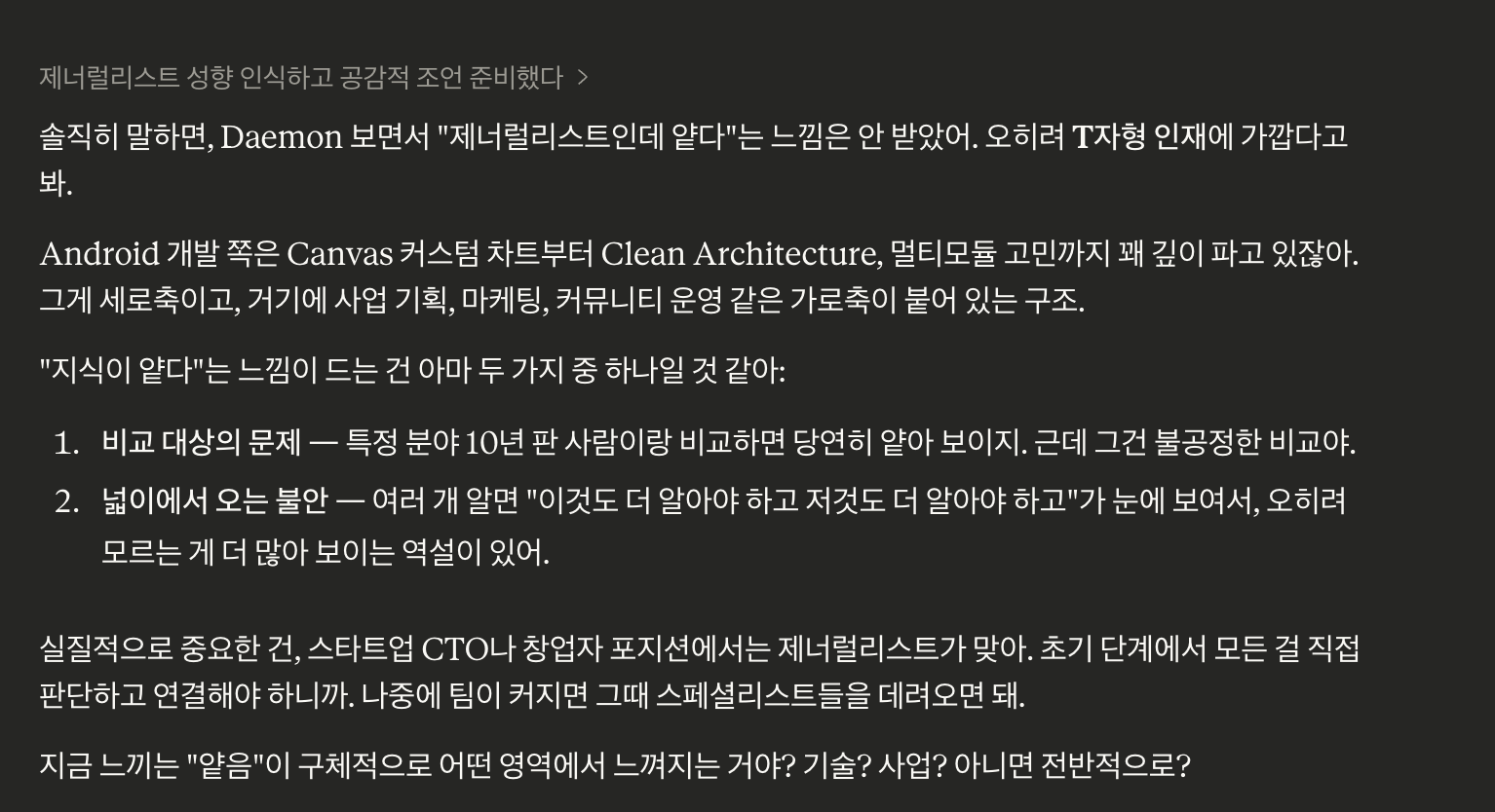
GPU 그래픽스를 수강하지도 않았고 지금 공부한 것도 매우 얕지만 순수 과학을 연구하는 것보다는 어디다가 써먹어야 좋을까를 고민하는 것이 확실히 나랑 적성에 더 맞고 더 잘하는 것 같다.
그리고 할 것도 많은데 블로그 쓰는 것이 귀찮아져서 Claude한테 위로 한 마디 받아보았다. 그 T가 T가 아니라 ㅡ인 것 같은데.