기존에는 .css파일을 직접 import 해오거나 html에서 스타일을 설정하는 것과 같이 jsx파일에서 스타일을 수정하는 방식이었으나, 이를 보완하기위해 Style-components를 활용 가능
장점
- Raw css를 사용할 경우 이름이 중복되어 오류가 발생할 수 있으나 변수명을 randomize해 이런 중복 이슈를 해겷해 준다.
설치 방법
다른 npm 패키지와 마찬가지로
npm i styled-components커멘드로 설치
기존 코드
function App() {
  return <div style={{display:"flex"}}>
    <div style={{backgroundColor:"teal", width:100, height:100}}></div>
    <div style={{backgroundColor:"tomato", width:100, height:100}}></div>
  </div>;
}

export default App;
div를 전부 생성하고 그 안에 스타일을 설정해주는 것이 번거롭다
Styled-component를 사용한 코드
import styled from "styled-components";

const Father = styled.div`
  display: flex;
`;

const BoxOne = styled.div`
  background-color: teal;
  width: 100px;
  height: 100px;
`;

const BoxTwo = styled.div`
  background-color: tomato;
  width: 100px;
  height: 100px;
`;
function App() {
  return <Father>
    <BoxOne></BoxOne>
    <BoxTwo></BoxTwo>
  </Father>;
}

export default App;
div를 한땀한땀 작성하고 div 옆에 스타일을 설정해주는 것이 아니고 css와 같이 별도로 관리를함과 동시에 실제로 랜더링이 되는 부분에서 간편하게 styled-component 인스턴스를 불러와서 사용이 가능하여 코드가 깔끔해진다.
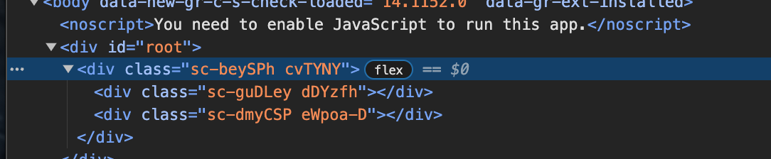
또한 아래 스크린샷에서 볼 수 있듯 자동적으로 클래스명을 생성해준것을 볼 수 있다.
중복 컴포넌트 제거
위의 코드에서 BoxOne의 스타일과 BoxTwo의 스타일 중 다른 것은 background-color 하나이다.
코드의 재사용성을 높이기 위해서 해당 스타일을 Box로 통합을 받고 background-color을 인자로 전달 할 수 있으면 코드의 재사용성이 당연하게도 많이 올라갈 것이다.
Styled-components에서는 이를 쉽게 가능하게 하는데 코드는 다음과 같다
const Father = styled.div`
  display: flex;
`;

const Box = styled.div`
  background-color: ${(props) => props.bgColor};
  width: 100px;
  height: 100px;
`;

const Text = styled.span`
  color: white;
`;
function App() {
  return <Father>
    <Box bgColor="teal">
      <Text>Hello</Text>
    </Box>
    <Box bgColor="tomato"></Box>
  </Father>;
}
Box 스타일을 인자를 받게 설정하고 랜더링 되는 부분에서 bgColor을 직접 입력해주면 된다.
이때 주의해야 되는것은 당연하게도 랜더링 되는 부분에서 전달하는 인자 'bgColor'과 스타일 부분에서 쓴 'bgColor' 변수명이 같아야 하는 것이다.
상속
Styled-components에서는 스타일의 상속 역시 가능하다.
예를들어 Box와 동일한 크기 정보를 갖고 있는데 원으로 표현되는 스타일을 생성을 하고 싶다고 가정해보자.
이때 Box 스타일을 상속을하여 border-radius를 추가해주면 된다.
이는 다음과 같이한다.
const Father = styled.div`
  display: flex;
`;

const Box = styled.div`
  background-color: ${(props) => props.bgColor};
  width: 100px;
  height: 100px;
`;

const Circle = styled(Box)`
  border-radius: 50px;
`;

const Text = styled.span`
  color: white;
`;
function App() {
  return <Father>
    <Box bgColor="teal">
      <Text>Hello</Text>
    </Box>
    <Circle bgColor="tomato"></Circle>
  </Father>;
}
Circle의 스타일 처럼 styled(Box)를 해 Box의 모든 속성을 상속 받고 border-radius를 지정해주면 정상적으로 적용이 된것을 확인할 수 있다.
다형성
Styled-component에는 이미 존재하는 스타일의 속성을 변경하는것고 쉽게 가능하다.
예를 들어 Button과 같은 스타일 컴포넌트가 있다고 하자
const Father = styled.div`
display: flex;
`;
const Btn = styled.button`
color: white;
background-color: tomato;
border: 0;
border-radius: 15px;
`;
const Box = styled.div`
background-color: ${(props) => props.bgColor};
width: 100px;
height: 100px;
`;
const Circle = styled(Box)`
border-radius: 50px;
`;
const Text = styled.span`
color: white;
`;
function App() {
return <Father>
<Btn>Log in</Btn>
<Box bgColor="teal">
<Text>Hello</Text>
</Box>
<Circle bgColor="tomato"></Circle>
</Father>;
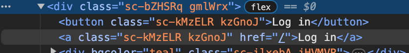
}이때 똑같은 버튼을 만들어야 되는데 링크를 주는 anchor로 태그를 변경을 해야할때 Button을 렌더링하는 부분에서 'as=a'라는 명령어를 통해 Button의 속성을 anchor로 변경할 수 있다.
const Father = styled.div`
  display: flex;
`;
const Btn = styled.button`
  color: white;
  background-color: tomato;
  border: 0;
  border-radius: 15px;
`;

const Box = styled.div`
  background-color: ${(props) => props.bgColor};
  width: 100px;
  height: 100px;
`;

const Circle = styled(Box)`
  border-radius: 50px;
`;

const Text = styled.span`
  color: white;
`;
function App() {
  return <Father>
    <Btn>Log in</Btn>
    <Btn as="a" href="/">Log in</Btn>
    <Box bgColor="teal">
      <Text>Hello</Text>
    </Box>
    <Circle bgColor="tomato"></Circle>
  </Father>;
}
이때 아래와 같이 버튼이 anchor로 정상적으로 변경이 된 것을 확인할 수 있다.
attrs
예를 들어 아래와 같이 필수로 요구되는 input이 여러개 있을때 일일히 렌더링 되는 부분에서 required를 작성을 해줄 수 도 있다.
function App() {
  return <Father>
    <Btn>Log in</Btn>
    <Btn as="a" href="/">Log in</Btn>
    <Box bgColor="teal">
      <Text>Hello</Text>
    </Box>
    <Circle bgColor="tomato"></Circle>
    <Input required></Input>
    <Input required></Input>
    <Input required></Input>
    <Input required></Input>
  </Father>;
}
하지만 styled-components에서는 스타일 옆에 attrs를 추가하여 아래와 중복되는 부분을 한번에 처리가능하다
const Father = styled.div`
  display: flex;
`;

const Input = styled.input.attrs({required: true})`
  background-color: tomato;
`;

const Btn = styled.button`
  color: white;
  background-color: tomato;
  border: 0;
  border-radius: 15px;
`;

const Box = styled.div`
  background-color: ${(props) => props.bgColor};
  width: 100px;
  height: 100px;
`;

const Circle = styled(Box)`
  border-radius: 50px;
`;

const Text = styled.span`
  color: white;
`;
function App() {
  return <Father>
    <Btn>Log in</Btn>
    <Btn as="a" href="/">Log in</Btn>
    <Box bgColor="teal">
      <Text>Hello</Text>
    </Box>
    <Circle bgColor="tomato"></Circle>
    <Input></Input>
    <Input></Input>
    <Input></Input>
    <Input></Input>
  </Father>;
}