Flutter의 코드 기본 구성
MaterialApp
import 'package:flutter/material.dart';
void main() => runApp(const MyApp());
class MyApp extends StatelessWidget {
const MyApp({super.key});
Widget build(BuildContext context) {
return MaterialApp(
title: 'Flutter Demo',
theme: ThemeData(
//기본 색상
primarySwatch: Colors.blue,
),
home: const MyCard(),
);
}
}Scaffold
class MyCard extends StatelessWidget {
const MyCard({super.key});
Widget build(BuildContext context) {
//Scaffold : 앱 화면에 다양한 요소를 배치하고 그릴 수 있는 빈 도화지 개념
return Scaffold(
appBar: AppBar(
title: const Text(
'BBANTO',
style: TextStyle(color: Colors.white),
),
backgroundColor: Colors.red,
centerTitle: true,
),
);
}
}AppBar
AppBar에 아이콘 추가하기
appBar: AppBar(
        leading: IconButton(
          icon: const Icon(Icons.menu),
          onPressed: () {
            print('menu is cliked');
          },
        ),
        actions: <Widget>[
          IconButton(
            icon: const Icon(Icons.shopping_cart),
            onPressed: () {
              print('Shopping is cliked');
            },
          ),
          IconButton(
            icon: const Icon(Icons.search),
            onPressed: () {
              print('Search is cliked');
            },
          ),
        ],
    )
)
AppBar에 Drawer 메뉴 만들기
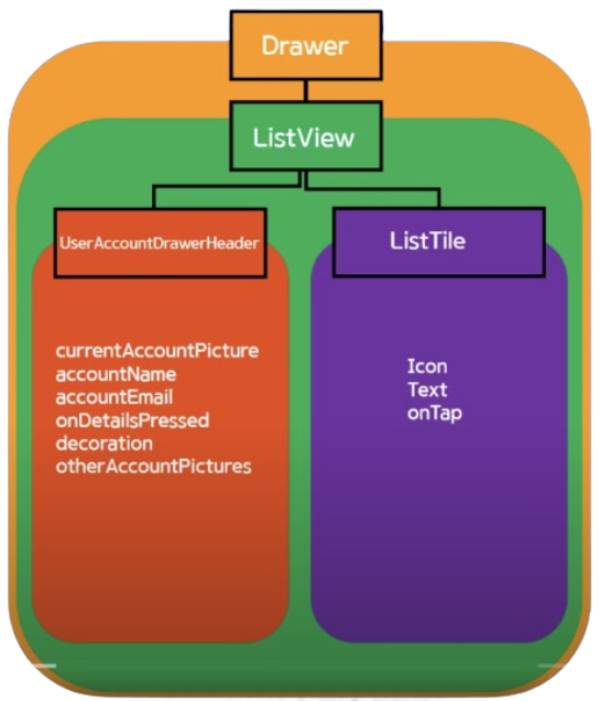
- Drawer 메뉴에는 Listview 사용하여 복수의 위젯을 children 속성을 통해 호출 (listTile)
drawer: Drawer(
  child: ListView(
    padding: EdgeInsets.zero,
    children: <Widget>[
      UserAccountsDrawerHeader(
        //계정 이미지
        currentAccountPicture: const CircleAvatar(
          backgroundImage: AssetImage('assets/picapica.png'),
          backgroundColor: Colors.white,
        ),
        //계정 이름
        accountName: const Text('채승민'),
        //계정 email
        accountEmail: const Text('sm.chae@co.kr'),
        //상세 보기 arrow
        onDetailsPressed: () {
          print('detail is pressed');
        },
        //계정 박스 custom
        decoration: BoxDecoration(
            color: Colors.blue[200],
            //아래쪽 radius
            borderRadius: const BorderRadius.only(
                bottomLeft: Radius.circular(40.0),
                bottomRight: Radius.circular(40.0))),
      ),
      ListTile(
      	//메뉴 타일 아이콘 설정
        leading: const Icon(
           Icons.home,
           color: Colors.black,
        ),
        //메뉴 타일 이름 설정
        title: const Text('Home'),
        //클릭 이벤트
        onTap: () {
           print('Home is clicked');
        },
        //우측 아이콘 추가
        trailing: Icon(Icons.add),
      )
    ],
  ),
),
글자 색 변경
appBar: AppBar(
	Text('data', style : TextStyle(color: Colors.white))
)
중앙 정렬
appBar: AppBar(
	centerTitle : true
)
AppBar의 입체감
appBar: AppBar(
	elevation : 0.0
)
배경 색 옵션
appBar: AppBar(
	backgroundColor: Colors.blue //[500] 등으로 세부 색 조정 가능
)
Body
Padding
- Padding( padding: EdgeInsets.fromLTRB(30.0, 40.0, 30.0, 40.0) )
가로축 중앙 정렬
const Center(
        child: Column(
          children: <Widget>[
            Text("Hello"),
            Text("Hello"),
            Text("Hello"),
          ])
세로 축 중앙 정렬
const Center(
        child: Column(
          //세로 축 중앙 정렬
          mainAxisAlignment: MainAxisAlignment.center,
          children: <Widget>[
            Text("Hello"),
            Text("Hello"),
            Text("Hello"),
          ])
Body안의 Text 사이 세로 축 공간 만들기
//height, weight 속성 존재
SizedBox(
	height: 10.0,
)
Body안의 글자 정렬
child: Column(
	//시작 정렬
	crossAxisAlignment: CrossAxisAlignment.start
)
Container
//SafeArea 공간 밖으로 못 나가게 설정
body: SafeArea(
  child: Container(
    color: Colors.red,
    width: 100,
    height: 100,
    margin: const EdgeInsets.all(20.0),
    child: const Text('Hello'),
  ),
Button
ButtonBar 사용하기
- 버튼 가로 정렬
ButtonBar(
	//중앙 정렬
	alignment: MainAxisAlignment.center,
    //패딩 설정
    buttonPadding: EdgeInsets.all(20),
	children: [
    	TextButton(
        	onPressed:() {},
            child:
        ),
        ElevatedButton(
        	onPressed:() {},
            child:
        )
    ],
)
Text Button
TextButton(
  onPressed: () {
    print('TextButton');
  },
  style: TextButton.styleFrom(backgroundColor: Colors.blueGrey),
  child: const Text(
    'Text Button',
    style: TextStyle(fontSize: 10.0, color: Colors.white),
  ),
),
Text Button _icon과 함께 사용
TextButton.icon(
  onPressed: () {
    print('TextButton');
  },
  icon: const Icon(
    Icons.home,
    size: 30.0,
    color: Colors.black87,
  ),
  label: const Text(
    'GO to home',
    style: TextStyle(color: Colors.blue),
  ),
  style: TextButton.styleFrom(),
),
Elevated Button
ElevatedButton(
  onPressed: () {
    print('ElevatedButton');
  },
  style: ElevatedButton.styleFrom(
      //버튼 배경 색 변경
      backgroundColor: Colors.orangeAccent,
      //버튼 모양 변경
      shape: RoundedRectangleBorder(
          borderRadius: BorderRadius.circular(10.0)),
      //그림자 변경
      elevation: 0.0),
  child: const Text(
    'Elevated Button',
    style: TextStyle(fontSize: 15.0, color: Colors.white),
  ),
),
Outliend Button
OutlinedButton(
  onPressed: () {
    print('OutlinedButton');
  },
  style: OutlinedButton.styleFrom(
      backgroundColor: Colors.green,
      side: const BorderSide(
          //외곽선 색 변경
          color: Colors.black87,
          //외곽선 두께 변경
          width: 2.0),
      elevation: 0.0),
  child: const Text(
    'Elevated Button',
    style: TextStyle(fontSize: 15.0, color: Colors.white),
  ),
),
버튼 배경 색 변경하기
1) MaterialStateProperty 사용
child: TextButton(
  onPressed: () {
  },
  style: ButtonStyle(
      backgroundColor: MaterialStateProperty.all<Color>(Colors.blue)),
  child: const Text('My Button'),
),
2) styleFrom 사용
child: TextButton(
  onPressed: () {
  },
  style: FilledButton.styleFrom(
    backgroundColor: Colors.black),
  child: const Text('My Button'),
),
SnackBar & Toast
SnackBar CSS
TextButton(
  onPressed: () {
	ScaffoldMessenger.of(context).showSnackBar(
    const SnackBar(
  		content: Text('Hello',
  		//글자 위치
  		textAlign: TextAlign.center,
  		//글자색 변경
  		style: TextStyle(
    	color: Colors.white
    	),
  	),
  	//배경색 변경
  	backgroundColor: Colors.teal,
  	//메시지 표시 시간
  	duration: Duration(microseconds: 1000),
    //행동
    action: SnackBarAction(
    	label: 'Undo',
        onPressed(){}
	));
),
Toast css
TextButton(
  onPressed: () {
    flutterToast();
  },
  style: ButtonStyle(
      backgroundColor:
          MaterialStateProperty.all<Color>(Colors.blue)),
  child: const Text(
    'My Toast Button',
    style: TextStyle(color: Colors.white),
  ),
),
flutterToast 라이브러리 사용.
void flutterToast() {
  Fluttertoast.showToast(
      msg: 'Flutter',
      gravity: ToastGravity.BOTTOM,
      backgroundColor: Colors.redAccent,
      fontSize: 20.0,
      textColor: Colors.white,
      toastLength: Toast.LENGTH_SHORT);
}
Text
글자 색
Text(
	"Name",
	style: TextStyle(color: Colors.white)
)
철자 간격 조정
Text(
	"Name",
	style: TextStyle(letterSpacing: 2.0)
)
글자 크기 조정
Text(
	"Name",
	style: TextStyle(fontSize: 28.0)
)
글자 굵기 조정
Text(
	"Name",
	style: TextStyle(fontWeight: FontWeight.bold)
)
화면 이동 (Navigator)
push 사용(MaterialPageRoute)
onPressed: () {
	Navigator.push(
    context,
    MaterialPageRoute(builder: (context) => const Grade()),
    ))
}
언제 Route의 호출이 일어나는가에 따라 Route가 빌드하는 과정 중에 다른 context를 사용하게 될 수 있고 자칫 잘못된 context를 전달해 에러를 발생시킬 수 있기 때문에 builder 사용. 일종의 안전 장치
pop 사용
onPressed: () {
	Navigator.pop(context);
}
pushNamed 사용
Widget build(BuildContext context){
	return MaterialApp(
    	initialRoute: '/',
        route: {
        	'/' : (context) => const ScreenA(),
            '/b' : (context) => const ScreenB(),
            '/c' : (context) => const Screenc(),
        },
    );
}
Flutter에서는 첫 Route 이름을
/로 지정함.
Key 값인/가 호출되면 Value 값인ScreenA()위젯이 빌드되어야함.
onPressed: () {
	//key 값 'b' = value 값 ScreenB로 이동
	Navigator.pushNamed(context, '/b');
}
Margin & Padding
- EdgeInsets.all : 모든 내.외부 면으로 margin & padding
child: Container(
    margin: const EdgeInsets.all(20.0),
    padding : const EdgeInsets.all(20.0)
)- EdgeInsets.symmetric : 가로축, 세로축 margin & padding
child: Container(
    margin: const EdgeInsets.symmetric(
    	vertical :80,
        horizontal: 20
        ),
    padding: const EdgeInsets.symmetric(
    	vertical :80,
        horizontal: 20
        ),
)- EdgeInsets.fromLTRB : 각 위치 별로 margin & padding
child: Container(
    margin: const EdgeInsets.fromLTRB(20,30,10,15),
    padding: const EdgeInsets.fromLTRB(20,30,10,15)
)- EdgeInsets.only : 따로 여백 별도 설정 margin & padding (복수 가능)
child: Container(
    margin: const EdgeInsets.only(right:50),
    padding: const EdgeInsets.only(left:50)
)- EdgeInsets.zero : margin & padding X
child: Container(
    margin: const EdgeInsets.zero,
    padding: const EdgeInsets.zero
  )