코드 리팩토링(Code-Refactoring)이란?
- 리팩토링(refactoring)은 소프트웨어 공학에서 '결과의 변경 없이 코드의 구조를 재조정함'을 뜻한다.
- 주로 가독성을 높이고 유지보수를 편하게 함.
- 버그를 없애거나 새로운 기능을 추가하는 행위는 아님.
- 사용자가 보는 외부 화면은 그대로 두면서 내부 논리나 구조를 개선하는 유지보수 행위.
쉽게 말해 현재 코드의 동작은 그대로 유지하면서 더 이해하기 쉽고, 생각하기 쉽고, 확장하기 쉽게끔 재구성하는 것.
Refactoring의 목적
- 리팩토링의 목적은, 소프트웨어를 더 이해하기 쉽고 수정하기 쉽게 만드는 것
- 리팩토링은 성능을 최적화시키는 것이 아니며 코드를 신속하게 개발할 수 있게 만들어주고, 코드 품질을 좋게 만들어준다.
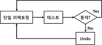
Refactoring의 사용
- 삼진 규칙
- 3번의 중복이나 같은 행위를 한다면 리팩토링 진행
- 기능을 추가할 때 리팩토링 진행
- 버그를 수정해야할 때 리팩토링
- 코드 검토(Code Review)시에 리팩토링
Widget build(BuildContext context) {
return ButtonTheme(
//버튼 모서리
shape: const RoundedRectangleBorder(
borderRadius: BorderRadius.all(
Radius.circular(4.0),
),
),
child: ElevatedButton(
style: ElevatedButton.styleFrom(backgroundColor: Colors.white),
onPressed: () {},
child: Row(
mainAxisAlignment: MainAxisAlignment.spaceEvenly,
children: <Widget>[
//이미지
Image.asset('assets/glogo.png'),
//텍스트
const Text(
'Login with Google',
style: TextStyle(color: Colors.black87, fontSize: 15.0),
),
//이미지
Opacity(
opacity: 0.0,
child: Image.asset('assets/glogo.png'),
),
],
),
),
);위의 코드에서 버튼을 구현하려 했을 때 이미지, 텍스트, 클릭 이벤트 등등 직접 하나하나 작성하였는데 코드 리펙토링을 진행하면
const MyButton(
{super.key,
required this.image,
required this.text,
required this.color,
required this.radius,
required this.onPressed});
final Widget image;
final Widget text;
final Color color;
final double radius;
final VoidCallback onPressed;
Widget build(BuildContext context) {
return ButtonTheme(
height: 50.0,
shape: RoundedRectangleBorder(
borderRadius: BorderRadius.all(
Radius.circular(radius),
),
),
child: ElevatedButton(
style: ElevatedButton.styleFrom(backgroundColor: color),
onPressed: onPressed,
child: Row(
mainAxisAlignment: MainAxisAlignment.spaceEvenly,
children: <Widget>[
image,
text,
Opacity(
opacity: 0.0,
child: image,
),
],
),
),
);이와 같이 리펙토링 코드만 만들어서 본 코드에서는
MyButton(
    image: Image.asset('assets/glogo.png'),
    text: const Text(
      'Login with Google',
      style: TextStyle(color: Colors.black87, fontSize: 15.0),
    ),
    color: Colors.white,
    radius: 4.0,
    onPressed: () {}),
필수 값만 채우면 자동으로 버튼이 생성된다.