
flutter의 row는 가로, column은 세로를 담당한다.
기본적으로 row, column 내부 요소 합의 크기가 가로, 세로 전체를 채우지 않아도 row는 가로 전체, column은 세로 전체를 차지한다.
1. Row, Column 기본 예제
Row 기본 예제 코드
class HomeScreen extends StatelessWidget {
Widget build(BuildContext context) {
return Scaffold(
body: SafeArea(
bottom: false,
child: Container(
color: Colors.black,
// Row
child: Row(
children: [
Container(
color: Colors.red,
width: 50.0,
height: 50.0,
),
Container(
color: Colors.yellow,
width: 50.0,
height: 50.0,
),
Container(
color: Colors.orange,
width: 50.0,
height: 50.0,
),
Container(
color: Colors.green,
width: 50.0,
height: 50.0,
),
],
),
),
),
);
}
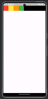
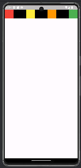
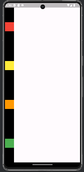
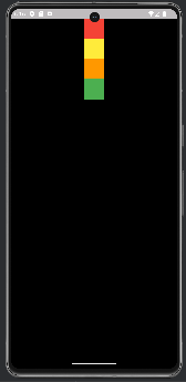
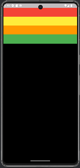
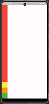
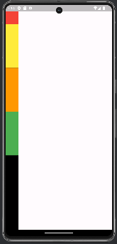
}아래 그림과 같이 Row 내부에 있는 container 요소 4개 크기의 합이 max width 보다 작다. 하지만 Row 영역(Colors.black)은 전체 가로 크기를 차지하는 모습을 볼 수 있다.
Row 실행 결과
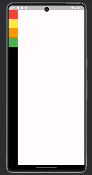
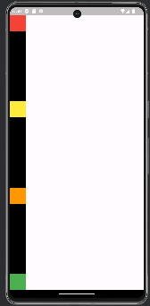
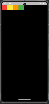
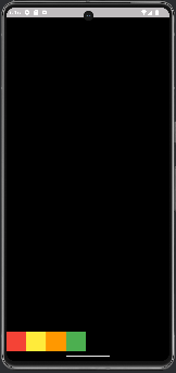
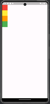
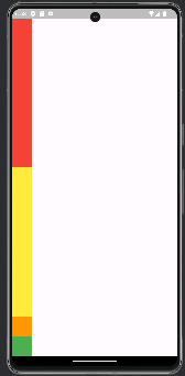
상단 코드에 주석처리된 Row를 Column으로 변경하면, 아래 그림과 같이 Column 내부에 있는 container 요소 4개 크기의 합이 max height 보다 작지만 전체 세로 크기를 차지하는 모습을 볼 수 있다.
Column 실행 결과
2. MainAxisAlignment
MainAxisAlignment는 주축이다.
Row에선 가로가 주축, Column에선 세로가 주축이다.
MainAxisAlignment는 총 6가지의 옵션이 존재한다.
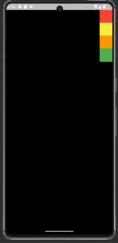
start
요소들이 row(가로 이하 생략), column(세로 이하 생략)의 시작부터 정렬된다. 상단 이미지와 같은 결과이므로 이미지는 생략한다.
center
요소들이 row, column의 중심으로 정렬된다.
| Row | Column |
|---|---|
 |  |
end
요소들이 row, column의 끝으로 정렬된다.
| Row | Column |
|---|---|
| |
spaceBetween
요소와 요소의 사이가 동일하게 배치된다.
| Row | Column |
|---|---|
 |  |
spaceEvenly
요소를 같은 간격으로 배치하지만 끝과 끝에도 빈 간격으로 시작한다.
| Row | Column |
|---|---|
 |  |
spaceAround
spaceEvenly와 같이 빈 간격으로 시작하며 같은 간격으로 배치하지만 끝과 끝의 간격은 spaceEvenly의 1/2이다.
| Row | Column |
|---|---|
 |  |
3. CrossAxisAlignment
CrossAxisAlignment는 반대축이다.
Row에선 세로가 반대축, Column에선 가로가 반대축이다.
MainAxisAlignment는 총 5가지의 옵션이 존재히지만, 그 중의 하나인 baseline은 글자를 배치할 때 사용하기 때문에 이번 예제에선 제외하겠다.
Row 기본 예제 추가 코드
class HomeScreen extends StatelessWidget {
Widget build(BuildContext context) {
return Scaffold(
body: SafeArea(
bottom: false,
child: Container(
color: Colors.black,
// width, height를 전체 width, height로 설정
width: MediaQuery.of(context).size.width,
height: MediaQuery.of(context).size.height,
child: Row(
// 이하 생략예제를 시작하기 전, 앞서 설명한 row, column은 주축의 전체 크기를 차지하지만, 반대축의 크기는 요소의 최대 크기만큼 차지하기 때문에 row는 height, column은 width를 더 크게 설정해주지 않으면 이번 예제에선 정렬된 모습이 보이지 않는다.
start
요소들이 row, column의 반대축 시작부터 정렬된다.
상단 코드를 적용하면 컨테이너가 가로, 세로 영역 전체 크기를 가지고 있어 배경이 전부 검은색인 것을 확인할 수 있다.
| Row | Column |
|---|---|
 |  |
center
요소들이 row, column의 반대축 가운데로 정렬된다.
| Row | Column |
|---|---|
 |  |
end
요소들이 rowm column의 반대축 끝으로 정렬된다.
| Row | Column |
|---|---|
 |  |
stretch
요소들이 rowm column의 반대축 크기만큼 최대한으로 늘려진다.
| Row | Column |
|---|---|
 |  |
👍 알아두면 좋은 지식
MainAxisAlignment의 default 값은 start지만, CrossAxisAlignment의 default 값은 center이다. 예제 코드에서 mainAxisAlignment와 crossAxisAlignment의 값을 지정하지 않으면 아래와 같은 결과가 나타난다.
| Row | Column |
|---|---|
| |
5. MainAxisSize
MainAxisSize는 주축의 사이즈 즉 row는 가로, column은 세로 크기를 결정한다.
총 2개의 옵션(min, max)가 존재한다.
default 값이 max이기 때문에 설정하지 않으면 앞선 예제와 같이 전체 크기를 차지한다.
Row 기본 예제 수정 코드
class HomeScreen extends StatelessWidget {
Widget build(BuildContext context) {
return Scaffold(
body: SafeArea(
bottom: false,
child: Container(
color: Colors.black,
child: Row(
mainAxisSize: MainAxisSize.max,
children: [
Container(
// 이하 생략예제 코드에서 width, height를 최대로 지정해준 코드를 다시 지운다. 그 후 mainAxisSize를 max, min으로 바꾼 실행 결과를 보자.
| Row max | Row min |
|---|---|
 |  |
이와 같이 min으로 설정했을 때 row의 가로 크기가 전체 크기를 차지하지 않고 요소의 크기만큼 차지하는 모습을 볼 수 있다. 아래 그림과 같이 Column의 경우에도 동일하다.
| Column max | Column min |
|---|---|
 |  |
6. Expanded & Flexible
Expanded와 Flexible은 row와 column widget의 children에서만 사용할 수 있다.
🔔중요 !!!
Expanded
기본 예제 코드에서 Row-> Column으로 변경하고, 첫번째 Container(Colors.red)를 Expanded로 감싸준다.기본 예제 수정 코드
class HomeScreen extends StatelessWidget {
Widget build(BuildContext context) {
return Scaffold(
body: SafeArea(
bottom: false,
child: Container(
color: Colors.black,
child: Column(
children: [
// expended로 감싸진 첫번째 Container
Expanded(
child: Container(
color: Colors.red,
width: 50.0,
height: 50.0,
),
),
Container(
// 이하 생략아래 그림과 같이 2,3,4번째 컨테이너의 크기를 제외한 나머지 영역을 모두 차지하는 결과를 확인할 수 있다.
실행 결과
2번째 컨테이너에도 Expanded를 추가하면, 3,4번째 컨테이너의 크기를 제외한 나머지 영역을 같은 비율로 나눠가지는 결과를 확인할 수 있다.
실행 결과
모든 컨테이너에 Expanded를 추가하면 모든 영역을 같은 비율로 나눠가지는 결과를 확인할 수 있다.
실행 결과
Flexible
첫번째 Container(Colors.red)를 Expanded -> Flexible로 변경한다.기본 예제 수정 코드
class HomeScreen extends StatelessWidget {
Widget build(BuildContext context) {
return Scaffold(
body: SafeArea(
bottom: false,
child: Container(
color: Colors.black,
child: Column(
children: [
Flexible(
child: Container(
color: Colors.red,
width: 50.0,
height: 50.0,
),
),
Expanded(
child: Container(
// 이하 생략아래 그림과 같이 첫번째 컨테이너의 기본 widget 크기 50x50을 제외한 남는 영역은 폐기 처리가 되어 column에 다시 귀속되어 하단 검정색으로 영역으로 나타난다.
하단 검정색 영역 + 첫번째 컨테이너(Colors.red) 영역과 나머지 컨테이너 영역의 비율은 각각 1:1:1:1이다.
실행 결과
기본 예제 수정 코드
Flexible의 default flex 값은 1인데, 이 값을 2로 바꿔주자.
class HomeScreen extends StatelessWidget {
Widget build(BuildContext context) {
return Scaffold(
body: SafeArea(
bottom: false,
child: Container(
color: Colors.black,
child: Column(
children: [
Flexible(
// flex 1 -> 2
flex: 2,
child: Container(
color: Colors.red,
width: 50.0,
height: 50.0,
),
),
Expanded(
child: Container(
// 이하 생략아래 그림과 같이 하단 검정색 영역 + 첫번째 컨테이너 영역과 나머지 컨테이너 비율이 2:1:1:1이 되어 검정색 영역이 더 커진다.
즉 flex 값은 비율이 된다. 이 공간은 아무리 Expanded를 사용해도 차지할 수 없다.
실행 결과
😎 마무리
Flexible은 생각보다 많이 사용하지 않지만, Expanded는 많이 사용한다고 한다.
앞서 학습한 내용 다양하게 활용한다면 여러가지의 배치들을 만들어내고, Flutter 앱에서 자유롭게 UI 배치를 할 수 있다 :)
