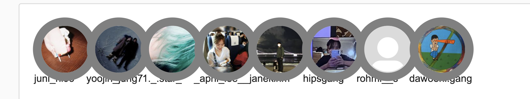
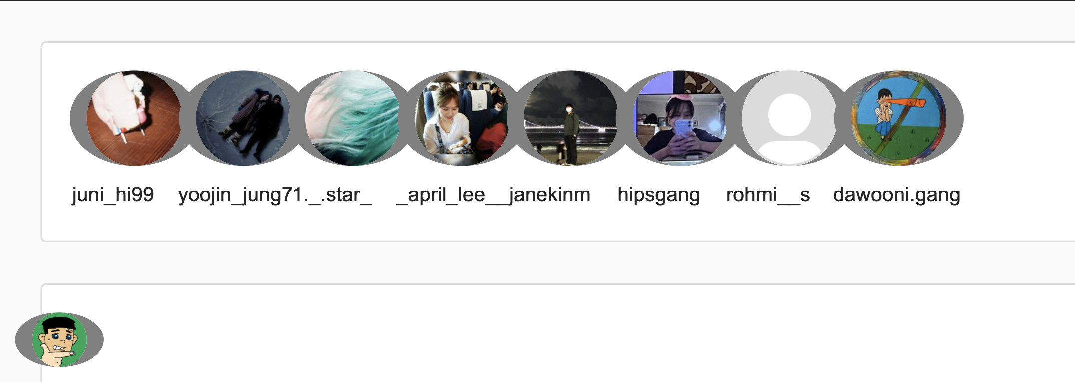
현재 인스타 클론 중, 이미지와 이미지 태그를 둘러싼 불투명한 테두리가 필요하다.
이를 위해 두 가지 조건이 필요하다.
1. 투명할 것
2. 내곽선이여야 할 것
처음에는 그냥 border를 적용했지만, border는 내곽선이 아니라 외곽선이었다. border가 일러스트레이터처럼 정교하게 구분되지는 않았다. (외곽선, 중앙, 내곽선)
border: 10px solid gray;한편 border-inline이라는 속성을 발견해서 적용했는데, 내가 생각한 inline은 아닌듯.
그리고 border-radius에 영향을 받는 것 같다. 조건이 하나 더 추가되었다.
3. 균일한 두께를 가진 테두리여야 할 것!
border-inline: 10px solid gray;box-shadow를 이용하면 투명도도 적용 가능하고 이미지 위에 테두리를 입히는 게 가능할 것 같아서 사용해봤지만 네 방향에 모두 적용되는게 아니라서 가능하게 하려면 (내가 잘 모르는) 다른 방법이 필요한 것 같았다.
그리하여.. 내가 사용한 방법은 아래와 같다.
html
<span class="others profile-image box">
      <img class="others profile-image" src="https://forexample.com"/>
      <div class="others profile-image border"></div>
</span>
css
.others.profile-image.box{
	position: absolute;
	width: 30px;
	height: 30px;
	top: 50%;
	left: 50%;
	transform: translate(-50%, -50%);
}
.others.profile-image{
	position: absolute;
	width: 30px;
	height: 30px;
}
.others.profile-image.border{
	position: absolute;
	width: 28px;
	height: 28px;
	border: 1px solid rgba(0,0,0,0.1);
}
꾸밈을 위해 따로 div 태그를 두고 싶진 않았는데 결국 두게 되었다.
컨테이너 역할의 others profile-image box 태그를 만들고
이미지 태그인 others profile-image,
border 역할을 할 others profile-image border를 만들었다.
border 역할의 태그는 너비 높이 값에 각각 border 1px * 2(상하, 좌우) 만큼 빼서 설정했다.
간단하지만 허탈하다.
허탈한 기분을 달래기 위해, ::after 가상 엘리먼트를 사용해서 더 간단히 만들었다.
html
<span class="others profile-image box">
      <img class="others profile-image" src="https://forexample.com"/>
      <!-- 삭제 <div class="others profile-image border"></div>-->
</span>
css
.others.profile-image.box{
	position: absolute;
	width: 30px;
	height: 30px;
	top: 50%;
	left: 50%;
	transform: translate(-50%, -50%);
}
.others.profile-image{
	position: absolute;
	width: 30px;
	height: 30px;
}
.others.profile-image::after{
	content: '';
	position: absolute;
	width: 28px;
	height: 28px;
	border: 1px solid rgba(0,0,0,0.1);
}
다행히 인스타그램에는 프로필 이미지가 많아서 가상엘리먼트만으로도 많은 태그들을 줄일 수 있었다. 휴