기존 애니메이션 분석
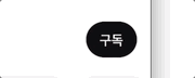
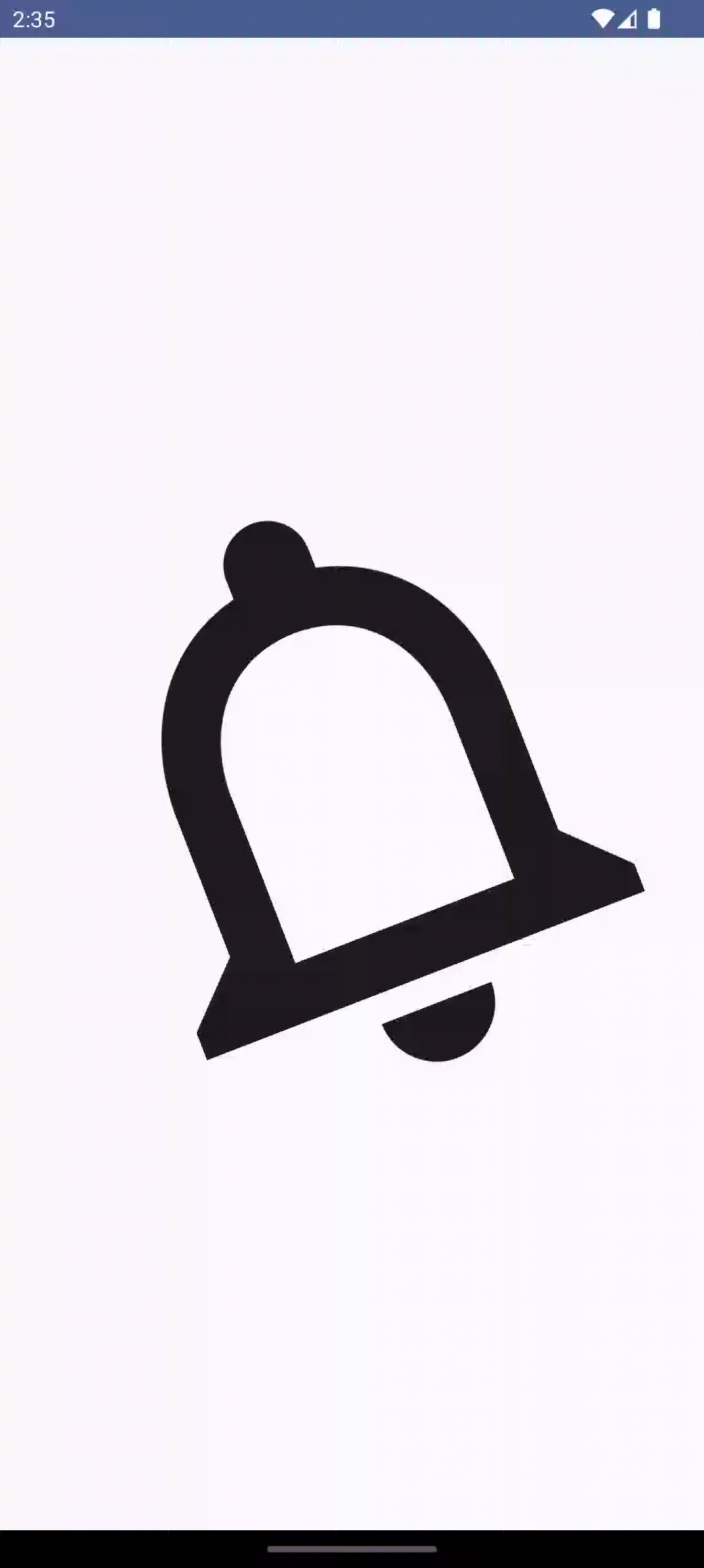
유튜브 구독 버튼을 눌렀을 때 알림 이미지가 좌우로 흔들리는 것 같은 애니메이션이 포함되어 있다.
좀 더 자세히 보면
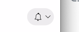
아래 화살표 옆에 있는 padding이 커지면서 왼쪽으로 밀리는 애니메이션이 있고
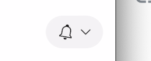
종 모양은 왼쪽으로 회전된 상태에서부터 흔들리기 시작한다.
전자운동 모션
좌우로 움직이기
LaunchedEffect(isHanging) {
    if (isHanging) {
        launch {
            animate(
                initialValue = angle,
                targetValue = 0f,
                animationSpec = keyframes {
                    durationMillis = 300
                    angle at 75 with LinearEasing
                    0f at 150 with LinearEasing
                    -angle at 225 with LinearEasing
                    0f at 300 with LinearEasing
                }
            ) { value, _ ->
                rotation = value
            }
        }
    }
}
angle에서 -angle로 계속 움직이는 애니메이션을 설정해주고
Icon(
    imageVector = Icons.Outlined.Notifications,
    contentDescription = null,
    modifier = Modifier
        .size(iconSize)
        .graphicsLayer {
            this.rotationZ = rotation
        }
)
rotationZ 속성에 적용해서 회전하도록 하였다.
이렇게 하면 뷰 한가운데 z축을 돌려서 쉐이킹 효과를 얻을 수 있다.
특정 점을 기준으로 흔들기
지금처럼 벨이 울리는 모션도 좋은데 실제 애니메이션처럼 상단 중앙 점을 기준으로 흔들리도록 하고 싶으니 기준이 되는 점을 뷰의 중앙에서 각도를 이용해서 옮겨준다.
Icon(
    imageVector = Icons.Outlined.Notifications,
    contentDescription = null,
    modifier = Modifier
        .size(iconSize)
        .graphicsLayer {
            val centerY = size.height / 2
            val angleRadians = Math.toRadians(rotation.toDouble())

            this.translationX = -radius * sin(angleRadians).toFloat()
            this.translationY = centerY - radius * cos(angleRadians).toFloat()
            this.rotationZ = rotation
        }
)
angle 줄이기
점점 좌우로 흔들리는 정도를 줄여서 멈추도록 하기 위해 한번 좌우로 움직이고 난 후에는 angle값을 줄여주도록 하였다.
LaunchedEffect(isHanging) {
    if (isHanging) {
        launch {
            while (angle >= 1f) {
                animate(
                    initialValue = angle,
                    targetValue = 0f,
                    animationSpec = keyframes {
                        durationMillis = 300
                        angle at 75 with LinearEasing
                        0f at 150 with LinearEasing
                        -angle at 225 with LinearEasing
                        0f at 300 with LinearEasing
                    },
                ) { value, _ ->
                    rotation = value
                }

                angle *= dampingFactor
            }
        }
    } else {
        angle = initialAngle
    }
}
animate 한 번 실행되고 나면 dampingFactor (< 1) 만큼 곱해서 angle을 줄여주고 angle이 1미만이 되면 멈춘다.
왼쪽으로 밀리는 효과
구독 버튼을 누른 후, 뷰가 왼쪽으로 밀린 후 좌우로 흔들리는 효과가 존재한다. 중간 과정 캡쳐본을 토대로 아래 화살표 오른쪽의 패딩값에 animation을 주어서 구현했다.
val endPaddingPx = with(density) {
    paddingValues.calculateEndPadding(LayoutDirection.Ltr).toPx()
}

var endPaddingDp by remember {
    mutableStateOf(0.dp)
}

LaunchedEffect(Unit) {
    animate(
        initialValue = 0f,
        targetValue = endPaddingPx,
        animationSpec = tween(durationMillis = 200)
    ) { value, _ ->
        endPaddingDp = with(density) {
            value.toDp()
        }
    }

    isStart = true
}
최종 코드
@Composable
fun PendulumEffectAnimation(
    modifier: Modifier = Modifier,
    initialAngle: Float = 20f,
    dampingFactor: Float = 0.6f,
    isHanging: Boolean,
    startFromInitialAngle: Boolean,
) {

    var rotation by remember {
        mutableFloatStateOf(if (startFromInitialAngle) initialAngle else 0f)
    }

    var angle by remember { mutableFloatStateOf(initialAngle) }

    var size by remember { mutableStateOf(IntSize.Zero) }

    LaunchedEffect(isHanging) {
        if (isHanging) {
            launch {
                while (angle >= 1f) {
                    if (startFromInitialAngle && angle == initialAngle) {
                        animate(
                            initialValue = angle,
                            targetValue = 0f,
                            animationSpec = keyframes {
                                durationMillis = 300
                                angle at 75 with LinearEasing
                                0f at 150 with LinearEasing
                                -angle at 225 with LinearEasing
                                0f at 300 with LinearEasing
                            },
                        ) { value, _ ->
                            rotation = value
                        }
                    } else {
                        animate(
                            initialValue = 0f,
                            targetValue = 0f,
                            animationSpec = keyframes {
                                durationMillis = 300
                                0f at 0 with LinearEasing
                                angle at 75 with LinearEasing
                                0f at 150 with LinearEasing
                                -angle at 225 with LinearEasing
                                0f at 300 with LinearEasing
                            },
                        ) { value, _ ->
                            rotation = value
                        }

                    }

                    angle *= dampingFactor
                }
                angle = initialAngle
            }
        } else {
            angle = initialAngle
        }
    }


    Box(
        modifier = modifier
            .fillMaxSize()
            .onGloballyPositioned {
                size = it.size
            },
        contentAlignment = Alignment.Center
    ) {
        val iconSize = with(LocalDensity.current) {
            minOf(size.width, size.height).toDp()
        }
        val radius = with(LocalDensity.current) {
            iconSize.toPx() / 2
        }

        Box(
            modifier = Modifier
                .size(iconSize)
        ) {
            Icon(
                imageVector = Icons.Outlined.Notifications,
                contentDescription = null,
                modifier = Modifier
                    .size(iconSize)
                    .graphicsLayer {

                        val centerY = size.height / 2
                        val angleRadians = Math.toRadians(rotation.toDouble())

                        this.translationX = -radius * sin(angleRadians).toFloat()
                        this.translationY = centerY - radius * cos(angleRadians).toFloat()

                        this.rotationZ = rotation
                    }
            )
        }
    }
}
깃헙 링크
Frontend Developer