서울시 범죄 데이터 분석(with seaborn)
seaborn
matplotlib같은 시각화 도구 라이브러리
import matplotlib.pyplot as plt
import seaborn as sns
%matplotlib inline
get_ipython().run_line_magic("matplotlib","inline")- seaborn은 import하는 것만으로도 효과가 있음
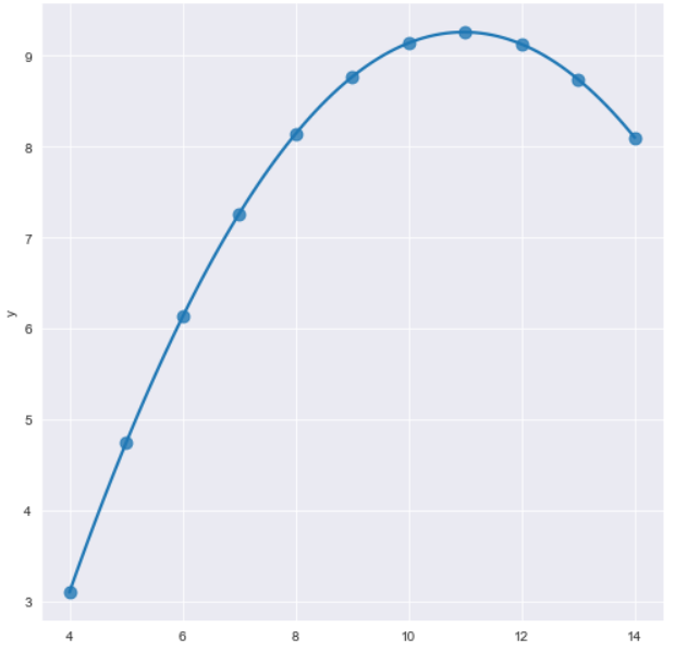
x = np.linspace(0, 14, 100)
y1 = np.sin(x)
y2= 2 * np.sin(x + 0.5)
y2= 3 * np.sin(x + 1.0)
y2= 4 * np.sin(x + 1.5)
plt.figure(figsize=(10, 6))
plt.plot(x, y1, x, y2, x, y3, x, y4)
plt.show()- set_style : 바탕색 지정
- despint(offest=size) : 왼쪽과 아래쪽 테두리만 생성, offset하면 왼쪽아래가 조금 떨어짐
sns.set_style("white")
plt.figure(figsize=(10, 6))
plt.plot(x, y1, x, y2, x, y3, x, y4)
sns.despine()
plt.show()- seaborn 에는 실습용 데이터 몇 개가 내장되어있다. tips, flights, iris 등..
- boxplot
tips = sns.load_dataset("tips")
plt.figure(figsize=(8, 6))
sns.boxplot(x=tips["total_bill"])
plt.show()
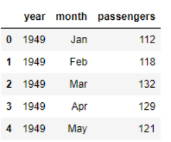
tips.head()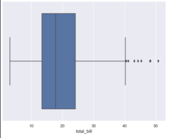
hue : 컬럼지정시 구분지어줌
palette : 색상
plt.figure(figsize=(8, 6))
sns.boxplot(x='day', y='total_bill', hue='smoker', data=tips, palette='Set3')
plt.show()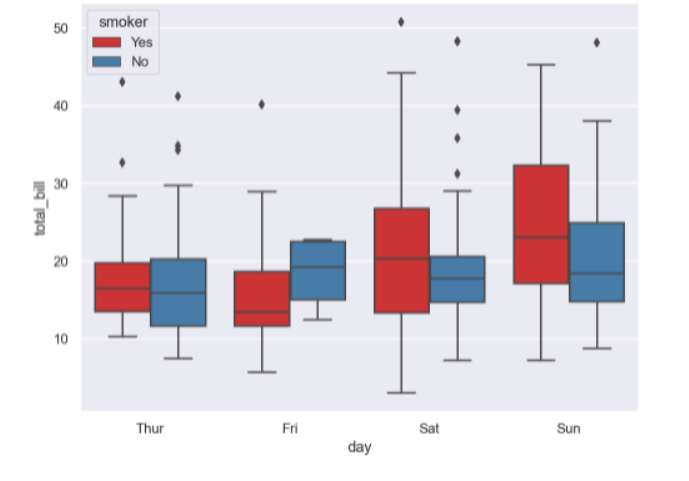
- swarmplot
# swarmplot
# color: 0~1 사이 검은색부터 흰색 사이 값을 조절
plt.figure(figsize=(8, 6))
sns.swarmplot(x="day", y="total_bill", data=tips, color="0.5")
plt.show()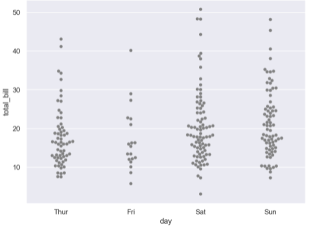
- lmplot : 직선으로 표현
# lmplot: total_bil과 tip 사이 관계 파악
sns.set_style("darkgrid")
sns.lmplot(x='total_bill',y="tip", data=tips, height=7)
plt.show()- hue 옵션을 준 직선 그래프
# hue option

sns.set_style("darkgrid")
sns.lmplot(x="total_bill", y="tip", data=tips, height=7, hue="smoker")
plt.show()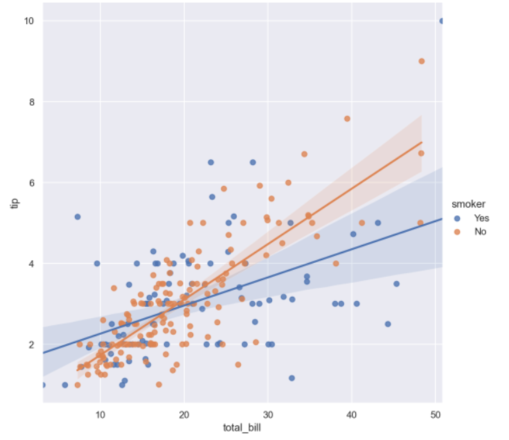
- heatmap을 이용하면 전체 경향을 알 수 있다
flights = sns.load_dataset("flights")
flights.head()
flights = sns.load_dataset("flights")
flights.head()
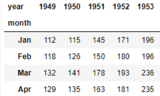
-
annot : 안에 내용 적어줌
-
fmt : d는 정수,f는 실수
# heatmap
plt.figure(figsize=(10, 8))
sns.heatmap(flights, annot=True, fmt="d", cmap="YlGnBu")
plt.show()- pariplot : 다수의 컬럼 비교
sns.set(style='ticks')   # 격자? 같은거 생성
iris = sns.load_dataset("iris")
sns.pariplot(iris)
plt.show()
# hue option
sns.pairplot(iris, hue="species")
plt.show()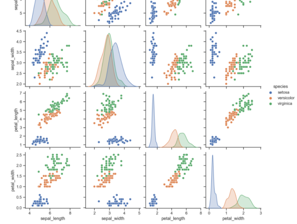
원하는 컬럼만 pariplot
# 원하는 컬럼만 pairplot
sns.pairplot(iris,
             x_vars=["sepal_width", "sepal_length"],
             y_vars=["petal_width", "petal_length"])
plt.show()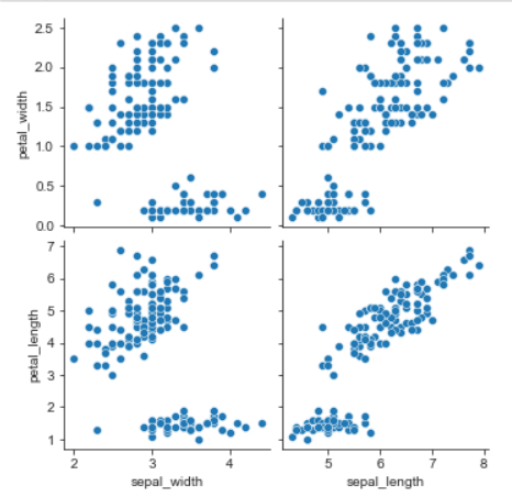
anscombe = sns.load_dataset("anscombe")
sns.set_style("darkgrid")
sns.lmplot(x='x', y='y', data=anscombe.query("dataset == 'I'"), ci=None, size=7)
plt.show()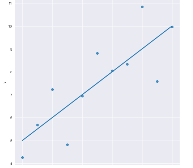
-
order : 점에 따라 함수order 바꿈
-
robust : 경향에서 많이 벗어난 아웃라이어는 무시
-
ci : 신뢰구간선택 옵션
anscombe = sns.load_dataset("anscombe")
sns.set_style("darkgrid")
sns.lmplot(x='x', y='y', data=anscombe.query("dataset == 'II'"), ci=None,scatter_kws={"s":80},order=2, robust = True, size=7)
plt.show()