리액트 프로젝트 진행 중 달력 컴포넌트가 필요한 상황이 되어 간단하게 달력 UI를 구현할 수 있는
Fullcalendar 라이브러리를 도입하였습니다.
오늘은 Fullcalendar를 React에서 사용하는 방법에 대해 알아보겠습니다.
1. FullCalendar 라이브러리란?
FullCalendar는 JavaScript로 작성된 오픈 소스 캘린더 라이브러리로, 이벤트 스케줄링 및 캘린더 관리 기능을 제공합니다. React와 함께 사용할 수 있는 React FullCalendar Wrapper도 제공되어 React 프로젝트에서 쉽게 통합할 수 있습니다.
2. FullCalendar의 기능 소개
- 다양한 날짜 및 시간 렌더링 옵션
- 월, 주, 일 뷰 지원
- 이벤트 추가, 편집, 삭제 기능
- 다국적 지원 및 시간대 관리
- 드래그 앤 드롭으로 이벤트 조정 가능
- 다양한 테마 및 사용자 정의 가능
3. FullCalendar 시작하기
React 프로젝트에서 FullCalendar를 시작하는 방법은 다음과 같습니다 :
1. 필요한 패키지 설치하기
npm install @fullcalendar/react @fullcalendar/daygrid2. FullCalendar 및 관련 모듈 import 하기:
import React from 'react';
import FullCalendar from '@fullcalendar/react';
import dayGridPlugin from '@fullcalendar/daygrid';
4. 기본적인 FullCalendar 예제
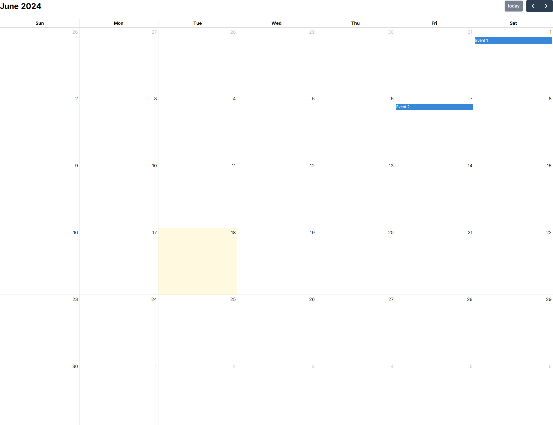
다음은 기본적인 FullCalendar 사용 예제입니다:
import React from 'react';
import FullCalendar from '@fullcalendar/react';
import dayGridPlugin from '@fullcalendar/daygrid';

const CalendarComponent = () => {
  return (
    <FullCalendar
      plugins={[ dayGridPlugin ]}
      initialView="dayGridMonth"
      events={[
        { title: 'Event 1', date: '2024-06-01' },
        { title: 'Event 2', date: '2024-06-07' }
      ]}
    />
  );
}

export default CalendarComponent;
위와 같이 작성 후 컴포넌트를 import하여 아래와 같은 화면이 나오면 성공입니다.
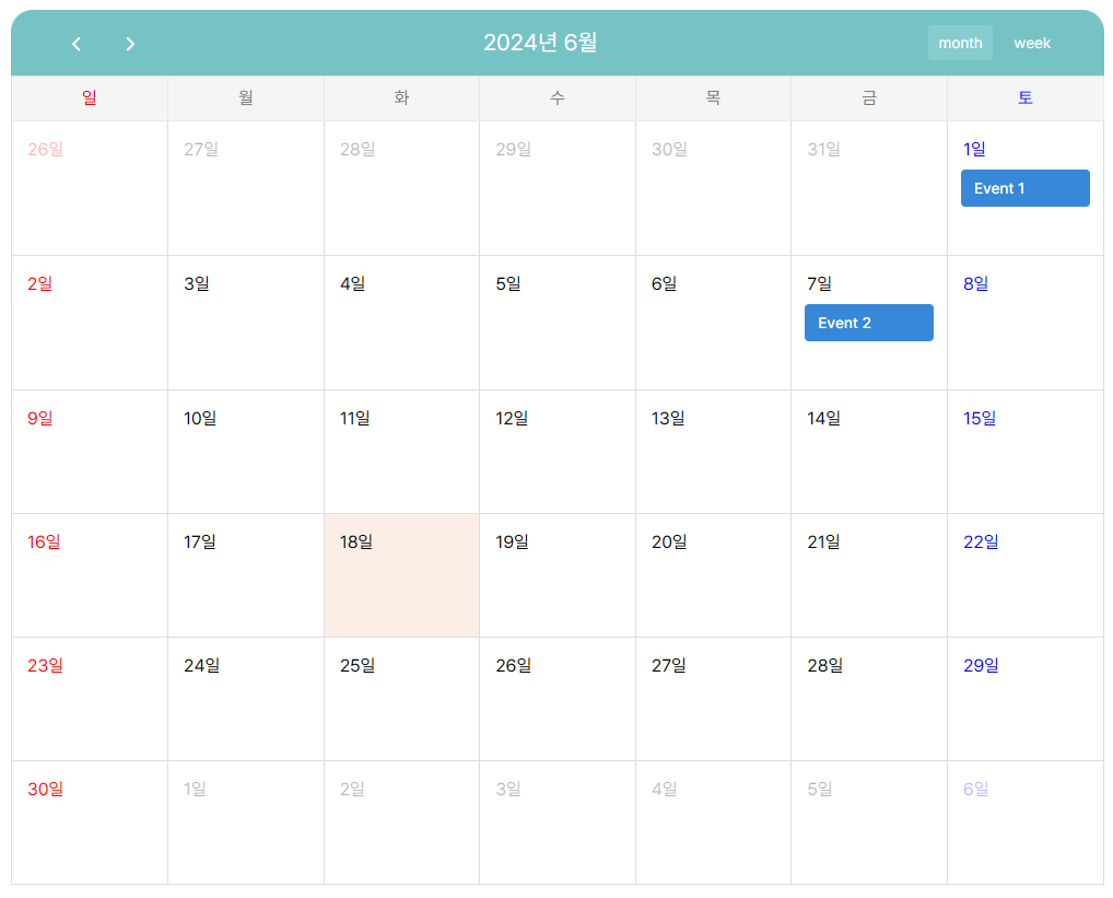
5. 커스텀 스타일
fullcalendar 사용을 선택한 이유로는 비교적 자유로운 커스텀 스타일이 가능하기 때문도 있습니다.
위의 캘린더는 조금 밋밋한 감이 있으니 css를 사용하여 스타일을 적용해 보겠습니다.
jsx
'use client';

import React from 'react';
import FullCalendar from '@fullcalendar/react';
import dayGridPlugin from '@fullcalendar/daygrid';

import "../styles/calendar.css"

function CalendarComponent () {

  return (
    <div id="calendar-container">
        <FullCalendar
          plugins={[ dayGridPlugin ]}
          initialView="dayGridMonth"
          height="auto"
          headerToolbar={{
            start: "prev next",
            center: "title",
            end: "dayGridMonth dayGridWeek",
          }}
          locale={'ko'}
          events={[
            { title: 'Event 1', date: '2024-06-01' },
            { title: 'Event 2', date: '2024-06-07' },
          ]}
        />
    </div>
  );
}

export default CalendarComponent;
css
@charset "utf-8";
#calendar-container {
width: 1000px;
margin: 50px auto;
}
/* 달력부분 */
/* 일요일 날짜: 빨간색 */
.fc .fc-day-sun a {
color: red;
}
/* 토요일 날짜: 파란색 */
.fc .fc-day-sat a {
color: blue;
}
/* 제목 볼드 빼기 */
.fc .fc-toolbar-title {
font-weight: normal;
}
/* 일정표 툴 바 */
.fc .fc-toolbar.fc-header-toolbar {
margin: 0;
padding: 0 40px;
background-color: #76c3c5;
height: 60px;
font-size: 12px;
line-height: 30px;
color: white;
border-radius: 20px 20px 0px 0px;
}
/* 툴바의 버튼 */
.fc .fc-toolbar-chunk .fc-button {
background-color: transparent;
border: none;
font-size: 14px;
}
/* 툴바 사용 불가 버튼 스타일 */
.fc .fc-toolbar-chunk .fc-button:disabled {
color: #e8e8e8;
}
/* 툴바 사용 불가 버튼 hover 시 스타일 주지 않기 */
.fc .fc-toolbar-chunk .fc-button:disabled:hover {
background-color: transparent;
}
/* 툴바 버튼 포커스 시 그림자 제거 */
.fc .fc-toolbar-chunk .fc-button:focus {
box-shadow: none;
}
/* 툴바 버튼 hover 시 배경색 변경 */
.fc .fc-toolbar-chunk .fc-button:hover {
background-color: #87cdcf;
}
/* 날짜변경 화살표 아이콘 */
.fc .fc-button-primary span {
font-weight: 500;
font-size: 28px;
}
/* 요일의 높이 */
.fc-theme-standard th {
height: 40px;
background: #f5f5f5;
border: 1px solid #e8e8e8;
font-weight: normal;
font-size: 16px;
line-height: 19px;
color: #7b7b7b;
vertical-align: middle;
}
/* Tody Cell에 배경색 주기 */
.fc .fc-daygrid-day.fc-day-today {
background-color: #e6895724;
}
/* 날짜 Cell 프레임 */
.fc .fc-daygrid-day-frame {
padding: 10px;
}
/* 월간,주간 view의 Cell이 시작하는 위치 */
.fc .fc-daygrid-day-top {
flex-direction: row;
height: 30px;
margin-bottom: 3px;
}
/* 날짜 숫자 z-index 초기화 */
.fc .fc-daygrid-day-number {
z-index: auto !important;
}
/* 이벤트 막대 스타일 */
.fc-event {
padding: 5px 10px;
margin-bottom: 5px;
border-radius: 4px;
font-weight: 500;
font-size: 14px;
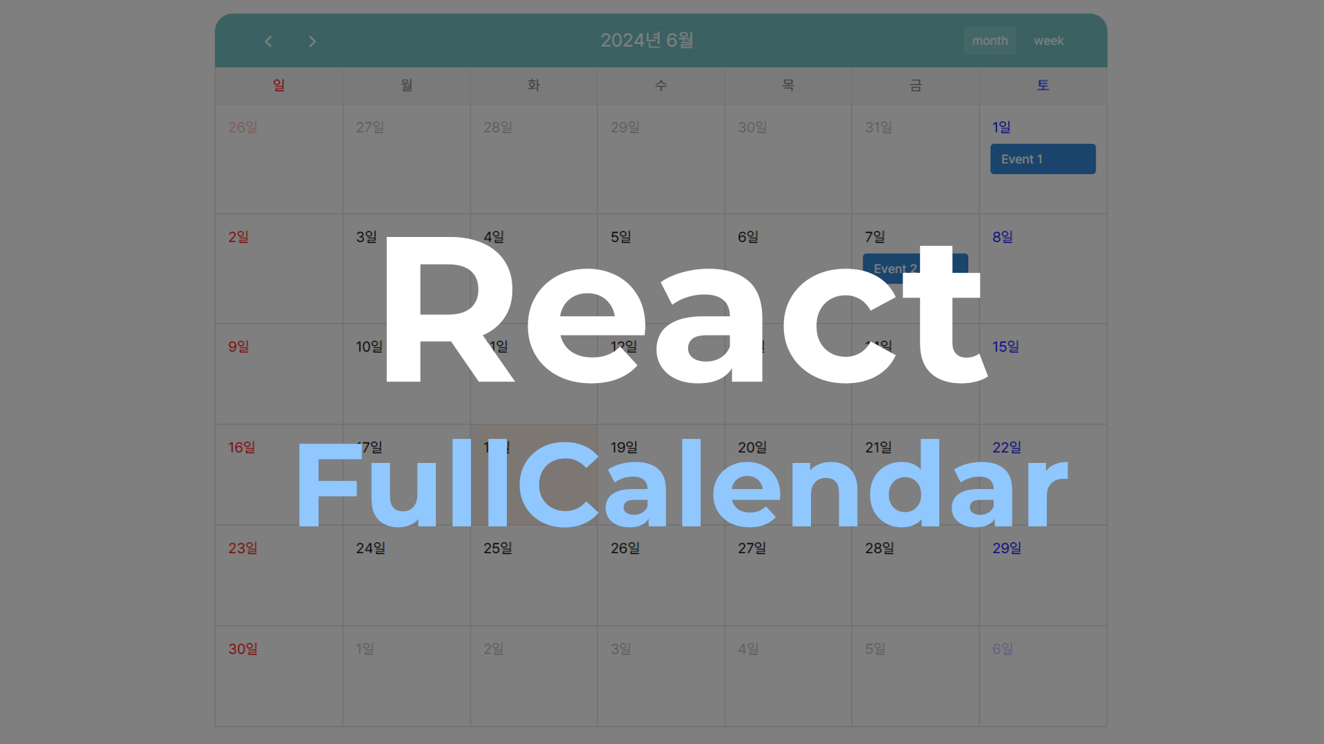
}Fullcalendar에서 기본적으로 제공하는 Props들도 함께 적용해 보았습니다.
headerToolbar : 캘린더 상단의 툴바에 표시될 버튼과 컨트롤을 설정합니다.
locale : 캘린더의 언어 및 지역 설정을 지정합니다.
*결과 화면
5. 마무리
지금까지 React에서 Fullcalendar를 사용하여 달력 UI 컴포넌트를 만드는 법에 대해 알아 보았습니다.
FullCalendar는 강력한 기능을 제공하며, React와의 통합도 간편하여 다양한 프로젝트에서 활용할 수 있습니다. 추가적으로 필요한 기능이나 세부 설정은 FullCalendar 공식 문서를 참고하시면 도움이 될 것 같습니다.
다음 포스팅에서는 fullcalendar가 제공하는 props에 대해 더욱 자세히 알아보도록 하겠습니다.

진짜 감사합니다