선형회귀 이해하기
머신러닝의 목적
- 머신러닝은 데이터의 알려진 속성들을 학습하여 예측 모델을 만드는 것
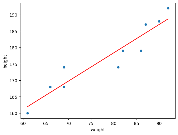
선형회귀 Linear Regression
- 데이터를 가장 잘 대변하는 최적의 선을 찾는 과정
- 선형회귀 식(: 가중치, b: 편향(Bias))
- (머신러닝에서 오차항은 명시적으로 다루지 않음)
가 주어졌을 때 선형회귀를 통해서 를 예측하는 것.
-> 그러려면 가중치()를 알아야 하는데, 데이터가 많다면 를 추정할 수 있다.
선형회귀 평가지표1 - MSE
- Mean Squared Error를 최소화해야 좋은 선형회귀 모델
- MSE - Mean Squared Erorr(MSE)라고 정의
MSE 정의
1. 에러 = 실제데이터 - 예측데이터
2. 에러를 제곱하여 모두 양수로 만든 후 더하기
3. 데이터만큼 나누기
선형회귀 평가지표 2 - R Square
- R Square : 전체 모형에서 회귀선으로 설명할 수 있는 정도
- 1에 가까울 수록 설명력이 좋다.
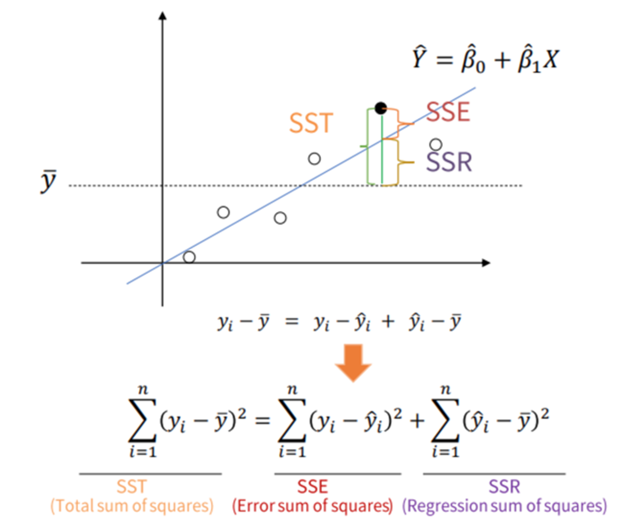
- : 특정 데이터의 실제 값
- : 평균 값
- : 예측, 추정한 값
선형회귀 실습하기
선형회귀 사용함수
- 라이브러리
scikit-learn: python 머신러닝 라이브러리- pandas, numpy, matplotlib, seaborn
- 선형회귀 메소드
sklearn.linear_model.LinearRegression: 선형회귀 모델 클래스coef_: 회귀계수, 가중치intercept: 편향(bias)fit: 데이터 학습preditct: 데이터 예측
선형회귀 실습
# 라이브러리 선언, 데이터 불러오기
import sklearn
import numpy as np
import pandas as pd
import seaborn as sns
import matplotlib.pyplot as plt

#seaborn 라이브러리의 tips 데이터 사용
tips_df = sns.load_dateset("tips")
tips_df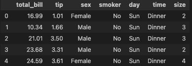
본격적인 분석 전, 산점도를 통해 상관성이 보이는지 확인해보기
# x, y 산점도 그래프 확인해보기
sns.scatterplot(data = tips_df, x='total_bill', y = 'tip')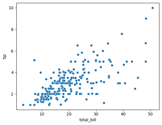
그래프 육안상 강하지는 않지만 조금의 선형은 보인다.
실제로 얼만큼의 상관관계를 갖는지 확인해보자.
# 선형회귀 클래스 불러오기
# 변수 정하기 (X : total_bill, y : tip)
# 모델 학습
from sklearn.linear_model import LinearRegression
model_lr = LinearRegresstion()
X = tips_df["total_bill"]
y = tips_df["tip"]
model_lr.fit(X, y) 
모델로 가중치 구해보기
# y(tip) = X(total_bill) * w1 + w0
w1 = model_lr.coef_[0][0]
w0 = model_lr.intercept_[0]
구한 가중치를 회귀식에 대입
print('y = {}X + {}', format(w1.round(2), w0.round(2))
-- y = 0.11x + 0.92
즉, total_bill이 1달러씩 상승할 때마다 tip은 0.11씩 상승한다.
회귀식을 구했으니 평가해보자.
평가 방법은 1) MSE, 2) R Sqaure
#예측값을 생성하여 실제 값과 비교함.
# total_bill이 변할 때 tipdml 예측값을 구함
1) MSE
y_true = tips_df['tip']
y_pred = model_lr.predict(tips_df[['total_bill']]

mean_squared_error(y_true, y_pred)
-- 1.036019442011377
# 2) R sqaure 확인
r2_score(y_true, y_pred)
-- 0.45661658635167657설명력이 0.45로 그렇게 높은 편은 아님.
예측값으로 선형회귀 그래프를 다시 그려보자.
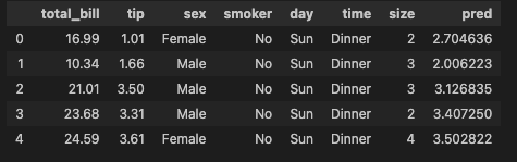
# tips_df에 구한 예측값 컬럼 넣어주기
tips_df['pred'] = y_pred
tips_df.head()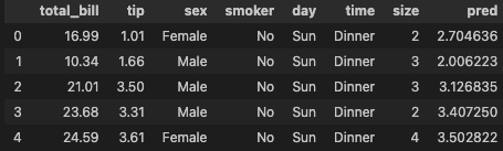
# 산점도, 선형그래프 그리기
sns.scatterplot(data = tips_df, x = 'total_bill', y = 'tip')
sns.lineplot(data = tips_df, x = 'total_bill', y = 'pred', color = 'red')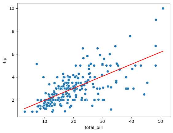
예상보다 total_bill과의 관계가 명확하지 않다.
total_bill외에 다른 변수도 함께 고려하고 싶다면?
-> x변수를 여러개 넣고 싶다면? 다중선형회귀
다중선형회귀
- 실제로 데이터는 비선형적 관계를 가지는 경우가 많으며, 이를 위해 X변수를 추가할 수도 변형할 수도 있음.
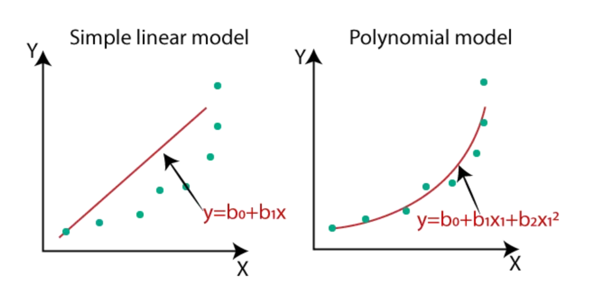
- 단순선형회귀 vs 다항회귀
수치형 데이터 vs 범주형 데이터
- 수치형 데이터
- 연속형 데이터 : 무한한 개수로 나누어진 데이터 (ex. 키, 몸무게 등)
- 이산형 데이터 : 유한한 개수로 나누어진 데이터 (ex. 주사위 눈, 나이 등)
- 범주형 데이터
- 순서형 자료 : 자료 순서에 의미가 있음 (ex. 학점, 등급 등)
- 명목형 자료 : 자료 순서에 의미가 없음 (ex. 혈액형, 성별 등)
범주형 데이터 다중선형회귀 실습
- X변수에 total_bill과 함께 성별도 영향을 미치는지 확인해보기
- 범주형 자료는 임의로 0, 1의 숫자로 바꾸는데 이를 Encoding이라고 함.
# 데이터 확인
tips_df.head()
성별 Encoding하기
# Female = 0, Male = 1
def get_sex(x) :
	if x = 'Female' :
    	return 0
    else :
    	return 1
함수 get_sex를 데이터에 추가해주기
#apply는 매 행에 특정한 함수를 적용하는 메소드
tips_df['sex_en'] = tips_df['sex'].apply(get_sex)
tips_df.head()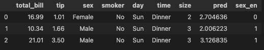
#다중선형회귀 모델 학습
model_lr2 = LinearRegression()
X = tips_df[['total_bill', 'sex_en']]
y = tips_df[['tip']]

#모델 학습
model_lr2.fit(X, y)

#예측값 구하기
y_ture = tips_df['tip']
y_pred2 = model_lr2.predict(X)
모델 평가하기
마찬가지로 1) MSE, 2) R Sqaure
#단순선형회귀 MSE : x변수 total_bill
#다중선형회귀 MSE : x변수 total_bill, sex_en
print('단순선형회귀', mean_squared_error(y_true, y_pred))
print('다중선형회귀', mean_squared_error(y_true, y_pred2))
---
단순선형회귀 1.036019442011377
다중선형회귀 1.0358604137213616
---
print('단순선형회귀', r2_score(y_true, y_pred))
print('다중선형회귀', r2_score(y_true, y_pred2))
---
단순선형회귀 0.45661658635167657
다중선형회귀 0.45669999534149963
x변수에 성별을 추가하여도 변화는 미미함
사전에 성별에 따른 tip 그래프를 그려보자면
sns.barplot(data = tips_df, x = 'sex', y = 'tip')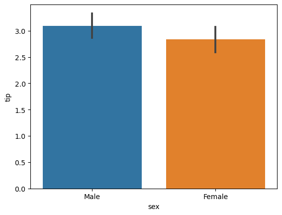

잘 하고 있는겨?