HTML
.home-left
.header
-- 로고
-- navigation 2개 (portfolio, contact)
.left-container
-- 웹사이트 주소
-- 더보기 버튼
.image-container
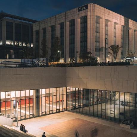
좌측 중간에 들어갈 이미지
.socials
우측에 위치할 sns 링크
  <div class="home-left">
    <header class="header">
      <div class="logo"><h1>WOOLEE_WEARE</h1></div>
      <nav>
        <a href="">PORTFOLIO</a>
        <a href="">CONTACT</a>
      </nav>
    </header>
    <div class="left-container">
      <h1 class="site">WWW.WEJAAN.DEV</h1>
      <div class="cta">
        SEE MORE
      </div>
    </div>
  </div>

  <div class="image-container">
    <div class="overlay"></div>
    <img src="./modernCover.jpg">
  </div>

  <div class="socials">
    <ul>
      <li class="link">FACEBOOK</li>
      <li class="link">LINKEDIN</li>
      <li class="link">GITHUB</li>
    </ul>
  </div>

  <script src="app.js"></script>
CSS
.header
width를 100%로 잡고, 구성요소로 .logo와 nav가 들어가는데,
nav가 width:50%로 절반 차지하도록, .logo는 left:18%;로 잡아서 우측으로 좀 밀어넣기
.home-left
왼쪽 페이지들을 왼쪽으로 밀어넣고(left:-55%)
animation으로 slide-perm 적용(하단에서 작성 에정)
.image-container
홈페이지 새로고침되면 열릴텐데, 60% 위치까지만 등장하도록 width:60%;로 제한 걸기.
.overlay는 뭐냐면,
홈페이지 새로고침하면 이미지가 왼쪽에서 오른쪽으로 등장할텐데 이미지가 단독으로 등장하는 것보다 먼저 검은색 레이아웃이 등장하고 그 다음 순차적으로 이미지가 등장하면 인터랙션이 보다 깊이감이 있어 보인다.
.socials
우측에 위치해야 하므로 left:80%;
.active
등장할 요소들을 active 클래스로 전부 관리
+-- .header
+-- .cta
+-- .site
+-- .link
화면이랑 이미지 겹쳐지는 화면 표현은 z-index로 구분하기
* {
  margin: 0;
  padding: 0;
  box-sizing: border-box;
  font-family: 'Poppins', sans-serif;
}

body, html {
  background-color: #0e0e10;
}

h1 {
  font-size: 1.5rem;
}

a {
  color: black;
  text-decoration: none;
}

.header {
  position: relative;
  top: 20px;
  width: 100%;
  height: 6rem;
  opacity: 0;
}

.logo {
  position: absolute;
  bottom: 0;
  left: 18%;
}

nav {
  position: absolute;
  right: 0;
  bottom: 0;
  display: flex;
  width: 50%;
  justify-content: space-around;
}

.home-left {
  position: relative;
  left: -55%;
  width: 55%;
  height: 100vh;
  background-color: #fff;
  animation: slide-perm 2s forwards;
}

.image-container {
  position: absolute;
  left: 10%;
  top: 20%;
  width: 60%;
  height: 500px;
  overflow: hidden;
  z-index: 2;
}

.image-container img {
  position: absolute;
  top: 0;
  left: -100%;
  width: 100%;
  filter: grayscale(60%);
}

.overlay {
  position: absolute;
  z-index: 4;
  top: 0;
  left: -100%;
  width: 100%;
  height: 600px;
  background-color: rgb(0,0,0);
  opacity: 1;
}

.left-container {
  position: absolute;
  z-index: 5;
  width: 100%;
  background-color: #fff;
  bottom: 0;
  height: 35%;
  padding-left: 18%;
  padding-top: 1rem;
}

.cta {
  position: relative;
  top: 20px;
  margin-top: 1rem;
  padding: 0.5rem;
  width: 8rem;
  text-align: center;
  background-color: #4a2b32;
  color: #fff;
  opacity: 0;
}

.site {
  position: relative;
  top: 20px;
  opacity: 0;
}

.socials {
  position: absolute;
  left: 80%;
  top: 50%;
  height: 15%;
  color: white;
}

.socials ul {
  height: 100%;
  display: flex;
  flex-direction: column;
  justify-content: space-around;
  list-style: none;
}

.link {
  position: relative;
  top: 20px;
  opacity: 0;
}

.socials ul li:hover {
  opacity: 0.6;
  cursor: pointer;
}

.active {
  position: relative;
  top: 0;
  opacity: 1;
  transition: 0.5s;
}

@keyframes slide {
  0% {
    left: -100%;
  }
  25% {
    left: -100%;
  }
  75% {
    left: 0;
  }
  100% {
    left: 100%;
  }
}

@keyframes slide-perm {
  0% {
    left: -100%;
  }
  25% {
    left: -100%;
  }
  75% {
    left: 0;
  }
  100% {
    left: 0%;
  }
}
JS
순서대로 구현하기 위해서 setTimeout을 활용
검은색 배경 >> 절반짜리 흰색 레이아웃 >> header 등장 >> 왼쪽에서 이미지 등장(검은색 레이아웃 먼저) >> 웹주소/더보기 버튼 등장 && 오른쪽 sns 링크 등장
let header = document.querySelector('.header');
let site = document.querySelector('.site');
let cta = document.querySelector('.cta');

let imageOverlay = document.querySelector('.image-container').children[0];
let mainImage = document.querySelector('.image-container').children[1];

let links = Array.from(document.querySelectorAll('.link'));

function animate() {

  setTimeout(() => {
    header.classList.add('active');
    imageOverlay.style.animation = 'slide 1s forwards';
    mainImage.style.animation = 'slide-perm 1s forwards';
  }, 2000);

  setTimeout(() => {
    site.classList.add('active');
    cta.classList.add('active');
  }, 3000);

  links.forEach((link,idx) => {
    setTimeout(() => {
      link.classList.add('active');
    }, (idx * 200) + 2500)
  });
}

animate();
참고