HTML
container에 이미지들이 쭉 삽입될 예정
<div class="container">
    <div class="box one"></div>
    <div class="box two"></div>
    <div class="box three"></div>
    <div class="box four"></div>
    <div class="box five"></div>
    <div class="box six"></div>
  </div>
CSS
vw(viewport width) & vh(viewport height)
높이값 기준 1vh면 높이의 100/1이다.
top: 20vh면, 상단 기준 20vh 떨어져서 위치잡기
이미지들을 가로로 쭉 나열할 예정이므로 width를 넉넉하게 잡기
transition 문법
=> transition: property timing-function duration delay | initial | inherit
property는 transition 적용시킬 속성
timing-function은 transition의 진행 속도
duration은 transition의 총 시간
delay는 transition의 시작 시간 얼마나 연기할지
initial은 기본값으로 설정
inherit은 부모 요소의 속성값 상속
.container의 position을 flxed로 잡음으로써 이미지 위치 고정하도록.
background-size는 cover로 이미지 꽉 채우기
* {
  margin: 0;
  padding: 0;
  box-sizing: border-box;
}

body,
html {
  background-color: #161616;
  height: 6000px;
}

.container {
  position: fixed;
  display: flex;
  justify-content: space-around;
  top: 20vh;
  width: 6000px;
  transition: transform 0.15s;
  will-change: transform;
  /* background-color: aqua; */
}

.box {
  position: relative;
  width: 500px;
  height: 480px;
  background-size: cover;
  background-position: center;
}

.one {
  background-image: url(./images/one.jpg);
}
.two {
  background-image: url(./images/two.jpg);
}
.three {
  background-image: url(./images/three.jpg);
}
.four {
  background-image: url(./images/four.jpg);
}
.five {
  background-image: url(./images/five.jpg);
}
.six {
  background-image: url(./images/six.jpg);
}
JS
window.onscroll 속성 이벤트에,
.container의 left 값에 window.scrollY 값을 넣어주면,
스크롤 했을 때 아래로 내려가는 게 아니라 옆으로 이동함으로써 이미지를 볼 수 있도록 한다.
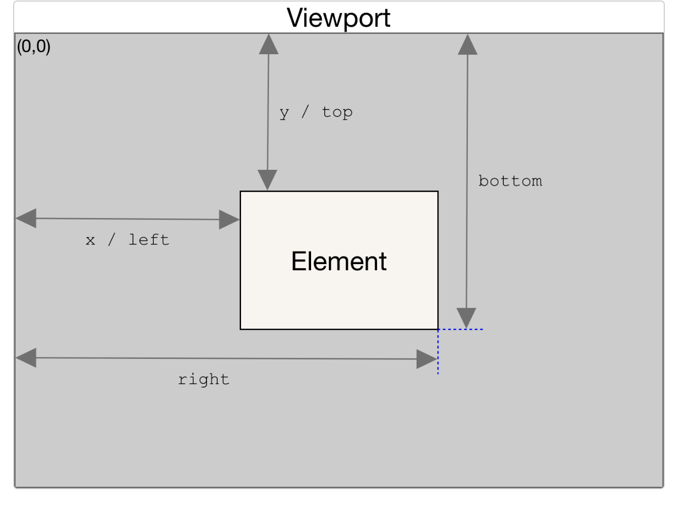
elem.getBoundingClientRect()는 padding, border-width를 포함해 전체 element가 들어 있는 가장 작은 사각형인 DOMRect 객체를 반환한다.
skew() : 요소 비틀 때 사용하는 css
transform : skew(X축 기울기 각도, Y축 기울기 각도)
transform : skewX(X축 기울기 각도)
transform : skewY(Y축 기울기 각도)
getBoundingClientRect().left의 이동거리에 비례해서 speed와 skewX 값을 줌으로써 화면을 스크롤할 때마다 비틀어지는 인터랙션 구현
requestAnimationFrame(callback)
인자로 콜백함수를 받아서, 애니메이션 효과가 부드럽게 되도록 도와준다. 브라우저는 리플루오, 리페인트 과정을 거쳐 리렌더링을 거치는데 이전 리렌더링이 끝나지도 않았는데 다음 애니메이션 로직을 명령하면 의도대로 애니메이션이 구현되지 않는 문제가 발생한다. requestAnimationFrame은 이런 문제를 해결해준다.
const container = document.querySelector('.container');

window.onscroll = () => {
  container.style.left = `${-window.scrollY}px`;
}

let currentPos = container.getBoundingClientRect().left;

const callDistort = () => {
  console.log('called');
  let newPos = container.getBoundingClientRect().left;
  let diff = newPos - currentPos;
  let speed = diff * 0.35;

  container.style.transform = `skewX(${speed}deg)`;

  currentPos = newPos;

  requestAnimationFrame(callDistort);
}
callDistort();
참고
Vanilla JavaScript: Creating A Horizontal Slider With Skew Effect