CSS
기본값
:root로 배경색 관리
크롬, 사파리 계열의 웹킷 엔진 스크롤바 관리
::-webkit-scrollbar
브라우저에서는 기본적으로 scroll chaining이 발생한다. 내부 스크롤이 끝나고도 스크롤을 하면, 외부 스크롤로 연결되는 걸 말한다. 그걸 막고 싶으면,
overscroll-behavior: none;
:root {
  --main-bg-color : #e8e8e1;
}

* {
  margin: 0;
  padding: 0;
  box-sizing: border-box;
  font-family: 'Playfair Display', serif;;
  text-decoration: none;
  list-style: none;
}

::-webkit-scrollbar {
  display: none;
}

a {
  color : #191919;
}

html,
body {
  width: 100%;
  background-color: var(--main-bg-color);
  overscroll-behavior: none;
}
우측 상단 메뉴 버튼
js로 active 클래스를 붙여서
버튼을 누르면 갤러리 그림들(main)이 아래로 사라지고, 좌측 하단 메뉴 링크(menu > link > menu-wrap)들이 위로 솟아오르는 인터랙션 구현
.menu-tog
position을 사용하면 좌표속성(top,bottom/left/right)을 사용할 수 있다.
fixed로 위치 우측 상단에 메뉴 버튼 고정(스크롤 되더라도 고정). 부모 요소 상관없이 뷰포트를 기준으로 좌표 속성을 통해 위치를 이동시키면 된다.
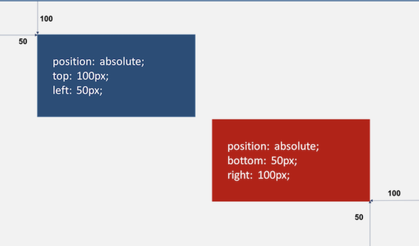
top/right을 통해 우측 상단에 위치 설정
flex-direction: column으로 작대기 2개를 세로로 배치.
mix-blend-mode: difference;으로 겹쳤을 때 배경 혼합색을 결정.
display는 해당 요소를 화면에 어떤 형태로 배치할 것인지를 표현. 기본적으로 요소들은 display 속성을 가지고 있다.
position은 해당 요소를 배치할 기준을 설정. 즉, 좌표 개념을 사용해서 절대 좌표로 배치할지, 상대 좌표로 배치할지 결정할 수 있다.
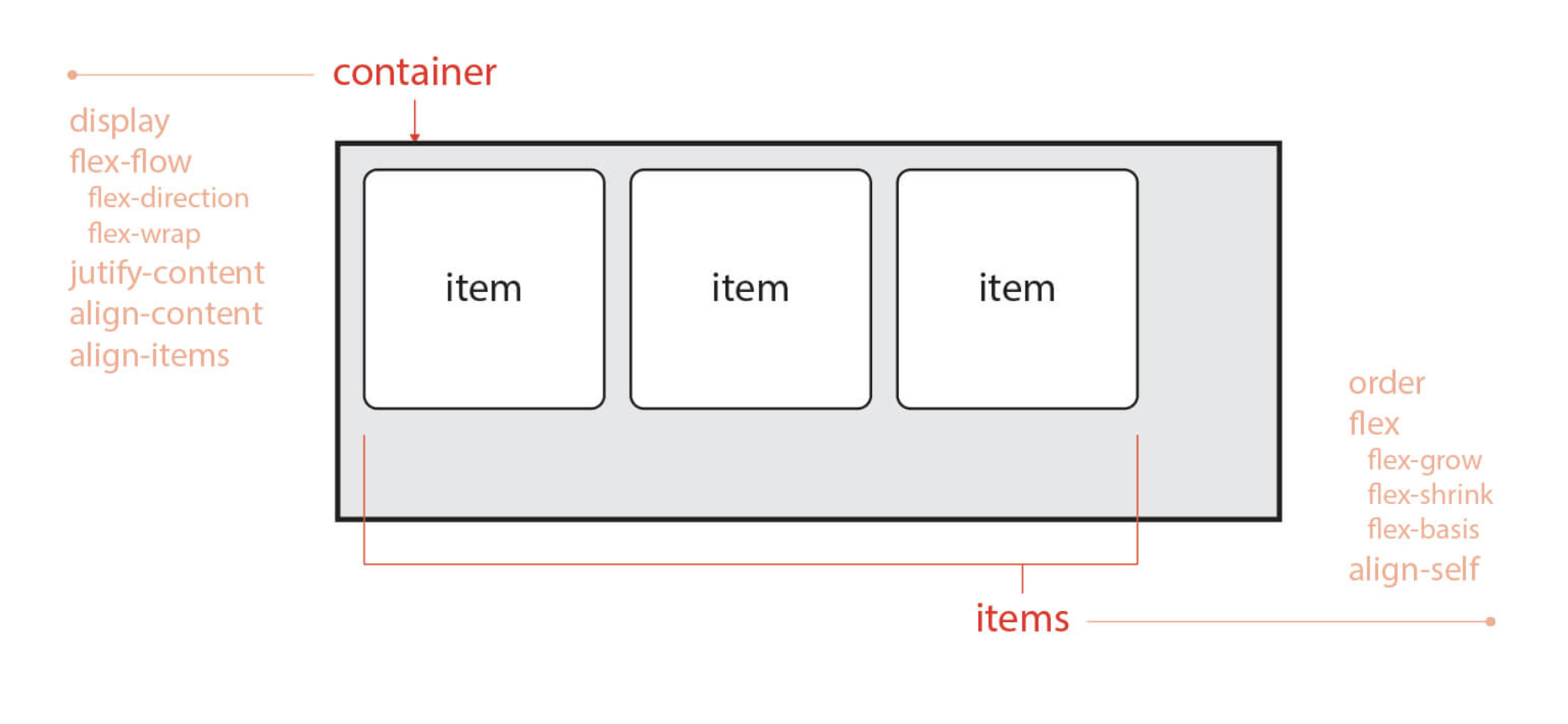
요소 정렬할 때 display: flex; 사용.
flex에는 부모에 적용하는 container 개념(display, flex-flow, justify-content ...)과, 자식에 적용하는 items 개념(order, flex-grow.., align-self...)이 있음.
.menu-tog span으로 작대기 스타일링
posr로 자기 자신을 기준으로 요소 배치. width은 부모 요소인 menu-tog에 맞게 꽉차도록 100%.
transform-origin: center; 로 가운데 축을 기준으로 동작하도록.
.menu-tog.active span:nth-child()
active 클래스 붙었을 때, 즉 클릭했을 때
posa로 부모 요소 기준 동작하되, rotate 적용
.menu-tog {
  position: fixed;
  top: 3%;
  right: 2%;
  width: 25px;
  height: 6px;
  display: flex;
  flex-direction: column;
  cursor: pointer;
  justify-content: space-between;
  z-index: 3;
  mix-blend-mode: difference;
}

.menu-tog span {
  position: relative;
  width: 100%;
  height: 2px;
  background-color: #ffffff;
  transition: 0.5s;
  transform-origin: center;
}

.menu-tog.active span:nth-child(1){
  position: absolute;
  transform: rotate(45deg);
}

.menu-tog.active span:nth-child(2){
  position: absolute;
  transform: rotate(-45deg);
}
좌측 상단 로고
마찬가지로 상단 고정 position: fixed;
text-transform: uppercase; 대문자 표시
letter-spacing 자간 설정
.header {
  position: fixed;
  top: 2%;
  left: 2%;
  width: 96%;
  z-index: 2;
  mix-blend-mode: difference;
  color: #ffffff;
  text-transform: uppercase;
}

h1 {
  font-weight: 400;
  font-size: 30px;
  line-height: 30px;
  letter-spacing: 0px;
}
main 부분
.info-text
갤러리 개별 이미지 설명 문구 스타일링 (글자 크기, 높이)
.wrap으로 인터랙션 구현.
좌측상단 버튼을 누르면 wrap 클래스로 감싸진 이미지, 우측상단 로그 모두 아래로 내려가도록 인터랙션 구현.
position : relative; 요소 자기 자신 기준으로 배치.
will-change 속성으로 요소의 변화를 미리 브라우저에 알려주기. 근데 오히려 will-change를 남발하면 역으로 페이지 속도 저하 일으킬 수 있다.
.active로 translateY(100%) => translateY(0)으로 변화를 줘서 아래로 내려가고, 위로 올라오도록 인터랙션 구현
.info-text {
  font-size: 15px;
  line-height: 20px;
}

.wrap {
  position: relative;
  display: block;
  line-height: auto;
  overflow: hidden;
  transition: 0.5s;
  will-change: transform;
}

.wrap h1,
.wrap .img {
  transform: translateY(100%);
  transition: 0.5s;
  will-change: transform;
}

.wrap.active h1,
.wrap.active .img {
  transform: translateY(0);
}main도 뷰포트 전체로 잡기 위해 (top:0, left:0, width:100%, height:100vh;)
하나의 섹션으로 div처럼 가로 전체를 차지하도록
.img-1,2,3
.proj-info-1,2,3
으로 갤러리 위치를 각각 다르게 배치함
따로 .img로 갤러리 이미지 자체 사이즈도 정해준다.
filter : grayscale() => 이미지에 회색조, sepia()로 웜톤 부여
main {
  position: fixed;
  top: 0;
  left: 0;
  width: 100%;
  height: 100vh;
  z-index: 0;
}

.scrollable {
  position: absolute;
  width: 100%;
  top: 0;
  left: 0;
  will-change: transform;
}

.content {
  position: relative;
  width: 100%;
}

section {
  position: relative;
  height: 50vh;
  /* border: 1px solid black; */
}

.img-1 {
  position: absolute;
  top: 5%;
  left: 2%;
  width: 40%;
  height: 90%;
}

.proj-info-1 {
  position: absolute;
  left: 44%;
  bottom: 5%;
  text-align: left;
}

.img-2 {
  position: absolute;
  top: 20%;
  right: 2%;
  width: 30%;
  height: 70%;
}

.proj-info-2 {
  position: absolute;
  right: 34%;
  bottom: 10%;
  text-align: right;
}

.img-3 {
  position: absolute;
  top: 10%;
  right: 2%;
  width: 20%;
  height: 80%;
}

.proj-info-3 {
  position: absolute;
  right: 24%;
  bottom: 10%;
  text-align: right;
}

.img {
  position: absolute;
  top: 0;
  left: 0;
  width: 100%;
  height: 100%;
  background-size: cover;
  background-position: center;
  filter: grayscale(20%) sepia(20%);
}
좌측 하단 메뉴 링크 부분
height 100%(부모 요소의 높이 100%)와 100vh(뷰포트 높이 100%)의 차이.
.menu 영역을 뷰포트 전체 너비로 잡아놓고 (top:0, left:0, height:100vh, width:100%)
opacity:0, pointer-events:none;으로 디폴트값을 지워놓는다.
(원래 opacity:0으로 만들어로 이벤트 자체는 응답하게 됨. 그것까지 막기 위해 pointer-events:none까지)
active가 붙으면 opacity:1로,
.links도 좌측 하단에 위치해놓고(기준을 부모인 .menu로 잡기 위해 posa)
마찬가지로 menu-wrap에 active가 붙으면 translateY(100% => 0)으로 위아래 인터랙션 구현.
근데, 여기서 .menu-wrap a에 block을 줘야만 아래에서 위로 올라오는 인터랙션이 구현됨. => 왜지!?!?
.menu {
  position: fixed;
  top: 0;
  left: 0;
  width: 100%;
  height: 100vh;
  background-color: var(--main-bg-color);
  z-index: 1;
  opacity: 0;
  pointer-events: none;
  transition: 0.5s;
}

.menu.active {
  pointer-events: all;
  opacity: 1;
}

.links {
  position: absolute;
  bottom: 2%;
  left: 2%;
  height: 200px;
}

.links ul {
  height: 100%;
  display: flex;
  flex-direction: column;
  justify-content: space-between;
}

.menu-wrap {
  position: relative;
  overflow: hidden;
}

.menu-wrap a {
  display: block;
  font-size: 40px;
  transform: translateY(100%);
  transition: 0.5s;
}

.menu-wrap.active a {
  transform: translateY(0);
}

.menu-wrap span {
  font-size: 12px;
}
참고
Vanilla JavaScript Project: Infinite Auto Scrolling Gallery With Clean Menu
CSS3 Flexible Box