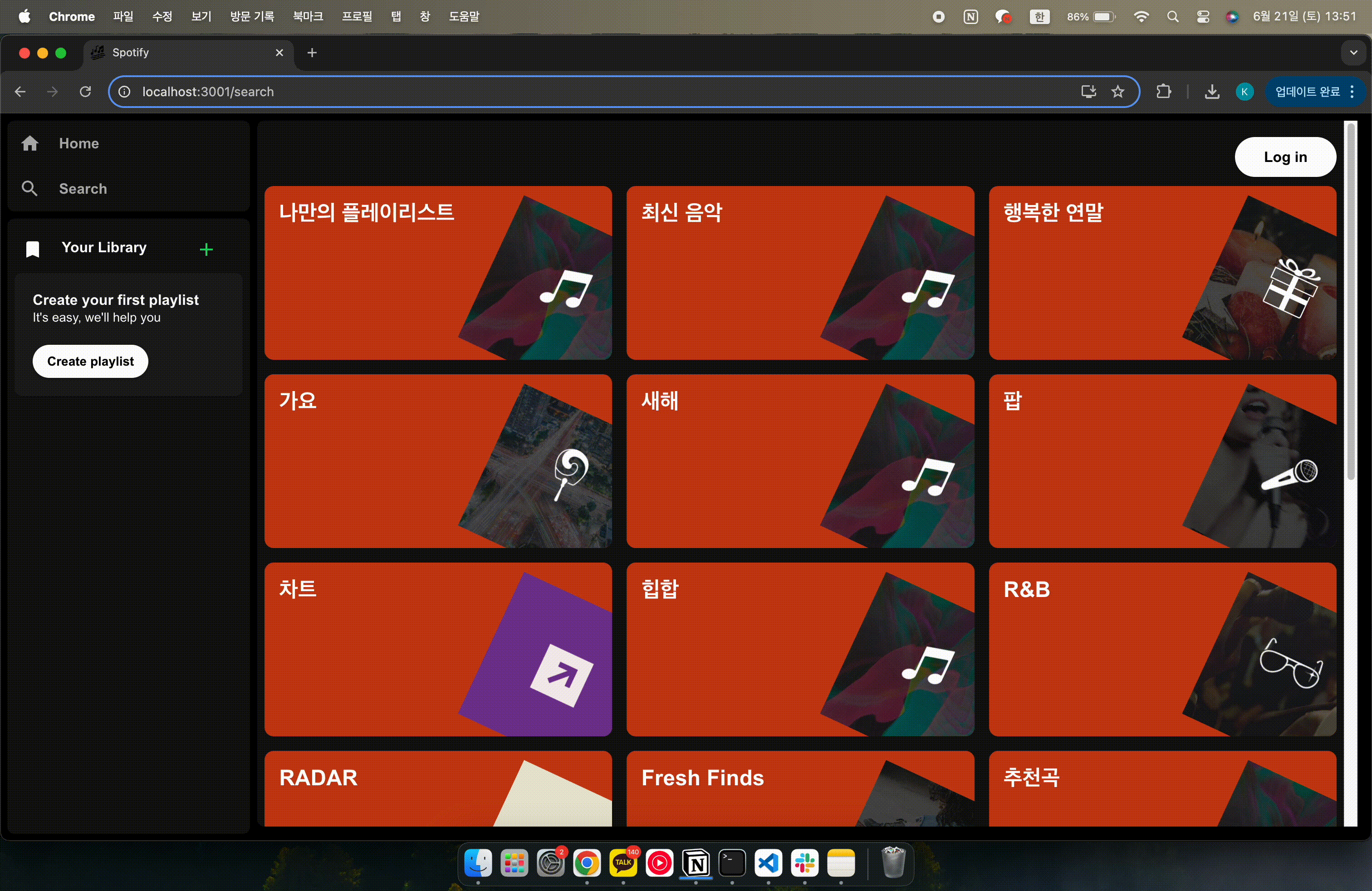
 return (
    <Container className="container">
      {data && data?.pages[0]?.categories?.items.length > 0 ? (
        <Grid container spacing={2}>
          {data?.pages[0]?.categories?.items.map((category: any, idx: number) => (
            <Content key={category.id} size={{ xs: 12, sm: 6, md: 4 }}>
              <Contentbox>
                <CategoryName variant="h1">{category.name}</CategoryName>
                <CategoryImg src={category.icons[0].url} />
              </Contentbox>
            </Content>
          ))}
        </Grid>
      ) : (
        <Typography variant="h2">No data</Typography>
      )}
    </Container>
  );

const Container = styled("div")({});
const Content = styled(Grid)({});
const Contentbox = styled(Box)({
  position: "relative",
  backgroundColor: "#D3ECCD",
  borderRadius: "10px",
  overflow: "hidden",
  aspectRatio: "2 / 1",
});
const CategoryName = styled(Typography)({
  padding: "1rem",
});
const CategoryImg = styled("img")({
  position: "absolute",
  width: "45%",
  bottom: "-10%",
  right: "-8%",
  transform: `rotate(25deg)`,
});
ContentBox: { position: "relative" },CategoryImg: { position: "absolute" }
ContentBox안 이미지 위치 조정 위해 사용ContentBox: { aspectRatio: "2 / 1" }
ContentBox반응형 비율 유지CategoryImg: { width: "45%" }
이미지 너비를 부모 요소 너비에 대해 45% 차지CategoryImg: { bottom: "-10%", right: "-8%" }
부모ContentBox의 높이/너비에 비례해 위치 설정 → 화면이 작아지면서 위치도 함께 비율로 줄어듬
→ 부모 높이의 10%만큼 아래로(밖으로) 내림, 부모 너비의 8%만큼 오른쪽으로(밖으로) 밀어냄
CategoryImg: { bottom: "-10%" }
→ 이거 안해주면 이미지 반응형 안됨, 그리고px로 고정하면 절대 위치이기 때문에 반응형 안됨
→ 결론 : 화면이 작아져도 위치는 그대로고, 이미지가 작아지면서 부모 영역 밖으로 밀려나거나 잘림
aspectRatio비율
비율 의미 형태 "1 / 1"가로:세로 = 1:1 정사각형 "4 / 3"가로:세로 = 4:3 가로가 약간 더 긴 직사각형 "16 / 9"가로:세로 = 16:9 와이드 "2 / 1"가로:세로 = 2:1 더 넓고 얇음 (세로 더 줄임) "1 / 0.5"가로:세로 = 1:0.5 세로가 가로의 절반 (짧음)
퍼센트 위치 계산
aspectRatio: "2 / 1" // 예를 들어 width: 400px, height: 200px
bottom: -10%→200px * 0.10 = 20px 아래로right: -8%→400px * 0.08 = 32px 오른쪽으로width: 45%→400px * 0.45 = 180px
