
웹 개발 쪽에 관심이 있고 처음에 조금이라도 html, css를 다뤄봤으면 무조건 마주하게 되는 CSS position에 대해서 글을 작성하려 합니다.
저의 경우는 솔직히 static은 기본 값, relative는 absolute 요소를 제어하기 위해 지정, absolute는 relative인 요소를 기준으로 자유롭게 배치, fixed 고정, sticky는 잘은 몰랐습니다.
CSS의 'position' 속성은 웹 페이지에서 요소의 위치를 제어하는데 사용됩니다. 문서 흐름에서 정상적인 위치와 관련하여 요소를 배치하는 방법을 지정할 수 있습니다. 'position' 속성에는 여러 값이 있으며 각각 고유한 동작이 있습니다.
5가지 속성
static : 기본값입니다. 일반 문서 흐름에 따라 배치됩니다. 'top', 'right', 'bottom', 'left' 및 'z-index' 값은 정적으로 배치된 요소에 영향을 주지 않습니다.
relative : relative인 요소는 문서 흐름에서 정상적인 위치를 기준으로 배치됩니다. 'top', 'right', 'bottom' 및 'left' 속성을 사용하여 static 위치에서 요소를 오프셋 할 수 있습니다.
absolute : 문서의 흐름과 상관없이 top', 'right', 'bottom', 'left' 속성을 사용하여 요소를 위치시키는 속성입니다. 이때 기준이 되는 요소는 가장 바로 위 상위 요소부터 차례대로 position 속성이 relative인 요소입니다.
fixed : fixed인 요소는 뷰포트(브라우저 창)를 기준으로 배치되며 사용자가 스크롤할때 움직이지 않습니다. 또한 position: absolute가 있는 요소와 유사하게 일반 문서 흐름에서 제외됩니다.
sticky : sticky가 있는 요소는 사용자가 특정 임계값까지 스크롤할 때까지 position: relative처럼 작동합니다. 이 시점에서 position: fixed가 되고 뷰포트 내의 지정된 위치에 고정됩니다.
style.css
body {
  font-family: sans-serif;
  text-align: center;
}

div {
  width: 300px;
  height: 100px;
  border: 3px solid black;
  display: inline-block;
}
.box1 {
  background-color: red;
}

.box2 {
  background-color: blue;
}
html
(편의상 div 태그만 작성)
 <div class="box1"></div>
 <div class="box2"></div>
- 위에 div나 box1 1, box2에 position 속성을 주지 않았지만 기본값을 나타내는 static 속성이라고 생각하면 되겠습니다.
- static은 일반 문서 흐름에 따라 배치되기 때문에 display: inline-block에 따라서 배치되어 있고 body에 text-align: center로 가운데 위치하였습니다.
relative 적용
style.css
body {
  font-family: sans-serif;
  text-align: center;
}

div {
  width: 300px;
  height: 100px;
  border: 3px solid black;
  display: inline-block;
}
.box1 {
  background-color: red;
}

 .box2 {
  background-color: blue;
  position: relative;
  top: 50px;
  right: 150px;
}
기존에 css 코드에서 파란색 박스인 box2에 position: relative 속성과 top: 50px, right: 150px을 적용하였습니다. 기존 static 값에 있었던 위치에서 top: 50px에 의해 위에서 50px,
right: 150px에 의해 우측에서 150px 이동한 것을 확인할 수 있습니다.

absolute 적용
약간 코드를 수정하겠습니다.
style.css
body {
  font-family: sans-serif;
  text-align: center;
}

.parent {
  width: 500px;
  height: 200px;
  border: 3px solid black;
  background: yellow;
  position: relative;
}
.box1 {
  width: 300px;
  height: 100px;
  border: 3px solid black;
  display: inline-block;
  background: red;
}

.box2 {
  width: 300px;
  height: 100px;
  border: 3px solid black;
  display: inline-block;
  background: blue;
   /* position: absolute;
  left: 250px;
  top: 100px; */
}
html
(편의상 div 태그만 작성)
<div class="parent">
    <div class="box1"></div>
    <div class="box2"></div>
</div>
box2 css에 아래부터 3가지 주석처리 전

box2 css에 아래부터 3가지 주석처리 후

변화가 보이시나요? 노란색 parent 박스에 position: relative를 적용시켰기 때문에 이 박스가 기준이 됩니다. 원래는 빨간색, 파란색 박스가 위아래로 놓여 있었지만 파란색 박스에 세 가지 속성 값을 준 결과 기준인 박스 좌측 상단 기준으로부터 위치가 놓여있는 것을 확인할 수 있습니다.
position: absolute;
left: 250px;
top: 100px;
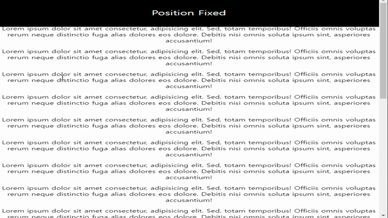
fixed 적용
아래를 보시면 아시겠지만 실제 position: fixed한 요소가 스크롤을 내려도 상단에 그대로 고정된채로 내려오지 않는 것을 확인하실수 있습니다.
style.css
body {
  font-family: sans-serif;
  text-align: center;
  margin: 0;
  padding: 0;
}

.header {
  position: fixed;
  top: 0;
  display: flex;
  justify-content: center;
  align-items: center;
  width: 100%;
  height: 100px;
  background-color: black;
  color: white;
  font-size: 24px;
}
html
(편의상 div 태그만 작성)
   <div class="header">Position Fixed</div>
    <p>
      Lorem ipsum dolor sit amet consectetur, adipisicing elit. Sed, totam
      temporibus! Officiis omnis voluptas rerum neque distinctio fuga alias
      dolores eos dolore. Debitis nisi omnis soluta ipsum sint, asperiores
      accusantium!
    </p>
    // p태그가 다수 존재하지만 편의상 생략
sticky 적용
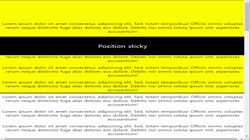
스크롤 시 부모 요 소안에서 relative처럼 동작하다가 부모 요소 임계점에 왔을 때 fixed처럼 달라붙는 게 보이시나요? 두 가지를 마치 혼합한 것 같습니다.
style.css
body {
  font-family: sans-serif;
  text-align: center;
  margin: 0;
  padding: 0;
}

.parent {
  width: 100%;
  height: 500px;
}
.header {
  position: sticky;
  top: 100px;
  display: flex;
  justify-content: center;
  align-items: center;
  width: 100%;
  height: 100px;
  background-color: black;
  color: white;
  font-size: 24px;
}
html
(편의상 div 태그만 작성)
	<div class="parent>
       <div class="header">Position Fixed</div>
        <p>
          Lorem ipsum dolor sit amet consectetur, adipisicing elit. Sed, totam
          temporibus! Officiis omnis voluptas rerum neque distinctio fuga alias
          dolores eos dolore. Debitis nisi omnis soluta ipsum sint, asperiores
          accusantium!
        </p>
      // p태그가 다수 존재하지만 편의상 생략
    </div>
sticky가 동작 안 할 수 있는 조건들이 있습니다.
- sticky 속성을 갖는 요소들은 자신의 부모 안에서만 적용된다.
- 부모 요소에 height 값이 설정되어야 한다.
- 부모 요소에 overflow: hidden, auto, scroll 속성이 적용되어 있으면 안 된다.
이상으로 position 5가지 속성에 대해서 알아보았습니다.

개발자로서 성장하는 데 큰 도움이 된 글이었습니다. 감사합니다.