오늘은 min, max 그리고 fit에 관련한 content 속성 값들에 대해 알아보겠습니다. 저는 css 속성에 가끔 가다가 min-content, max-content 등 속성을 접한 적이 있는데 그냥 최소 콘텐츠 내용보다 커지는 거겠지 최대가 content 크기라는 거겠지 하며 대수롭지 않게 넘어갔었습니다. 하지만 찾아본 결과 아예 이해를 잘못하고 있었습니다.
min-content
style.css
body,
html {
  font-family: sans-serif;
  margin: 0;
  padding: 0;
}

.container {
  width: 300px;
  background-color: lightgray;
  padding: 10px;
}

.min-content-box {
  width: min-content;
  background-color: lightblue;
  padding: 5px;
}
html
<div class="container">
<div class="min-content-box">
This is some content that might be longer.
</div>
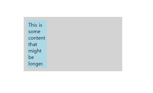
</div>아래 이미지를 보시는 것처럼 min-content 속성은 최소 너비는 해당 요소가 담고 있는 컨텐츠에 의해 좌우가 됩니다. 텍스트 컨텐츠의 경우 가장 긴 단어의 길이가 최소 너비를 결정합니다.
max-content
style.css
body,
html {
  font-family: sans-serif;
  margin: 0;
  padding: 0;
  display: flex;
  justify-content: center;
  align-items: center;
  height: 100vh;
}

.container {
  width: 300px;
  padding: 10px;
}

.item {
  width: max-content;
  background-color: #8ca0ff;
  padding: 5px;
  margin-bottom: 1em;
}
html
  <div class="container">
      <div class="item">item</div>
      <div class="item">long item long item long item long item long item</div>
  </div>
컨테츠에 맞게 길이가 늘어나지만 min-content와 다르게 안에 텍스트 컨텐츠들이 wrap 되지 않습니다. 적당히 길이에 컨텐츠 내용이 있고 여기에 맞게만 배경색을 준다거나 컨텐츠에 길이에 해당하는 width가 필요할때 사용하면 될 것 같습니다. 너무 길면 상위 div를 벗어납니다.

fit-content
style.css
body,
html {
  font-family: sans-serif;
  margin: 0;
  padding: 0;
  display: flex;
  justify-content: center;
  align-items: center;
  height: 100vh;
}

.container {
  width: 300px;
  padding: 10px;
  background-color: red;
}

.item {
  width: fit-content;
  background-color: #8ca0ff;
  padding: 5px;
  margin-bottom: 1em;
}
<div class="container">
<div class="item">fit-content</div>
<div class="item">fit-content fit-content fit-content fit-content</div>
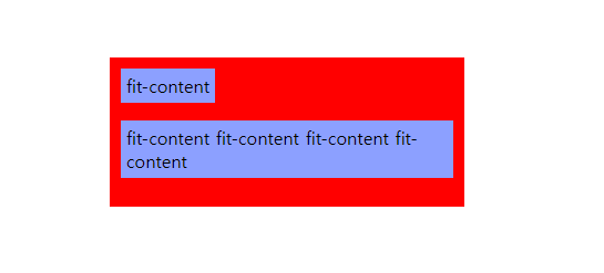
</div>fit-content는 min-content와 max-content를 합쳐 놓은 것이라고 생각하면 편할 것 같습니다. min-content처럼 가장 긴 문자로 기준을 잡지는 않지만 텍스트들이 감싸지고 max-content처럼 최대한 길이가 증가하게 됩니다.

포기란 없습니다.