< 수강분량 : EDA CCTV 1~5 >
✅ 1. 데이터 읽기
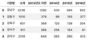
# CCTV 데이터 읽기
import pandas as pd
CCTV_Seoul = pd.read_csv("../data/01. Seoul_CCTV.csv", encoding="utf-8")
CCTV_Seoul.head()
# 기관명 컬럼 구별 컬럼으로 수정
CCTV_Seoul.rename(columns={CCTV_Seoul.columns[0]: "구별"}, inplace=True)
CCTV_Seoul.head()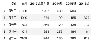
# 인구수 데이터 읽기
pop_Seoul = pd.read_excel(
    "../data/01. Seoul_Population.xls", header=2, usecols="B, D, G, J, N"
)

# 컬럼 이름 수정
pop_Seoul.rename(
    columns={
        pop_Seoul.columns[0]: "구별",
        pop_Seoul.columns[1]: "인구수",
        pop_Seoul.columns[2]: "한국인",
        pop_Seoul.columns[3]: "외국인",
        pop_Seoul.columns[4]: "고령자",
    },
    inplace=True,
)

pop_Seoul.head()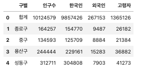
✅ 2. CCTV 데이터 훑어보기
# CCTV가 많은 구와 적은 구 살펴보기
CCTV_Seoul.head()
CCTV_Seoul.tail()
CCTV_Seoul.sort_values(by="소계", ascending=True).head(5)
CCTV_Seoul.sort_values(by="소계", ascending=False).head(5)

# 최근증가율 컬럼 생성
CCTV_Seoul["최근증가율"] = (
    (CCTV_Seoul["2016년"] + CCTV_Seoul["2015년"] + CCTV_Seoul["2014년"]) / CCTV_Seoul["2013년도 이전"] * 100
)
CCTV_Seoul.sort_values(by="최근증가율", ascending=False).head(5)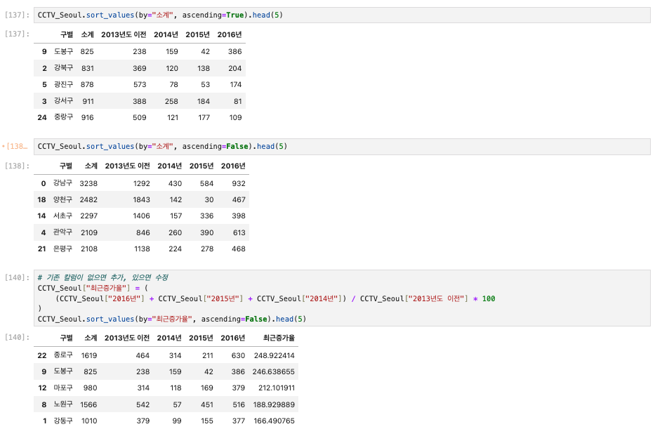
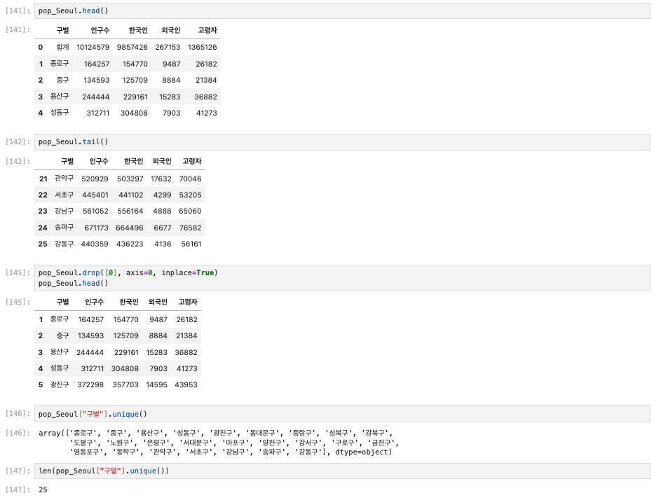
✅ 3. 인구현황 데이터 훑어보기
pop_Seoul.head()
pop_Seoul.tail()

pop_Seoul.drop([0], axis=0, inplace=True)
pop_Seoul.head()

pop_Seoul["구별"].unique()
len(pop_Seoul["구별"].unique())
# 외국인비율, 고령자비율 컬럼 생성
pop_Seoul["외국인비율"] = pop_Seoul["외국인"] / pop_Seoul["인구수"] * 100
pop_Seoul["고령자비율"] = pop_Seoul["고령자"] / pop_Seoul["인구수"] * 100
pop_Seoul.head()
pop_Seoul.sort_values(["인구수"], ascending=False).head(5)
pop_Seoul.sort_values(["외국인"], ascending=False).head(5)
pop_Seoul.sort_values(["외국인비율"], ascending=False).head()
pop_Seoul.sort_values(["고령자"], ascending=False).head()
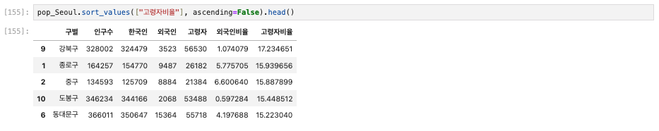
pop_Seoul.sort_values(["고령자비율"], ascending=False).head()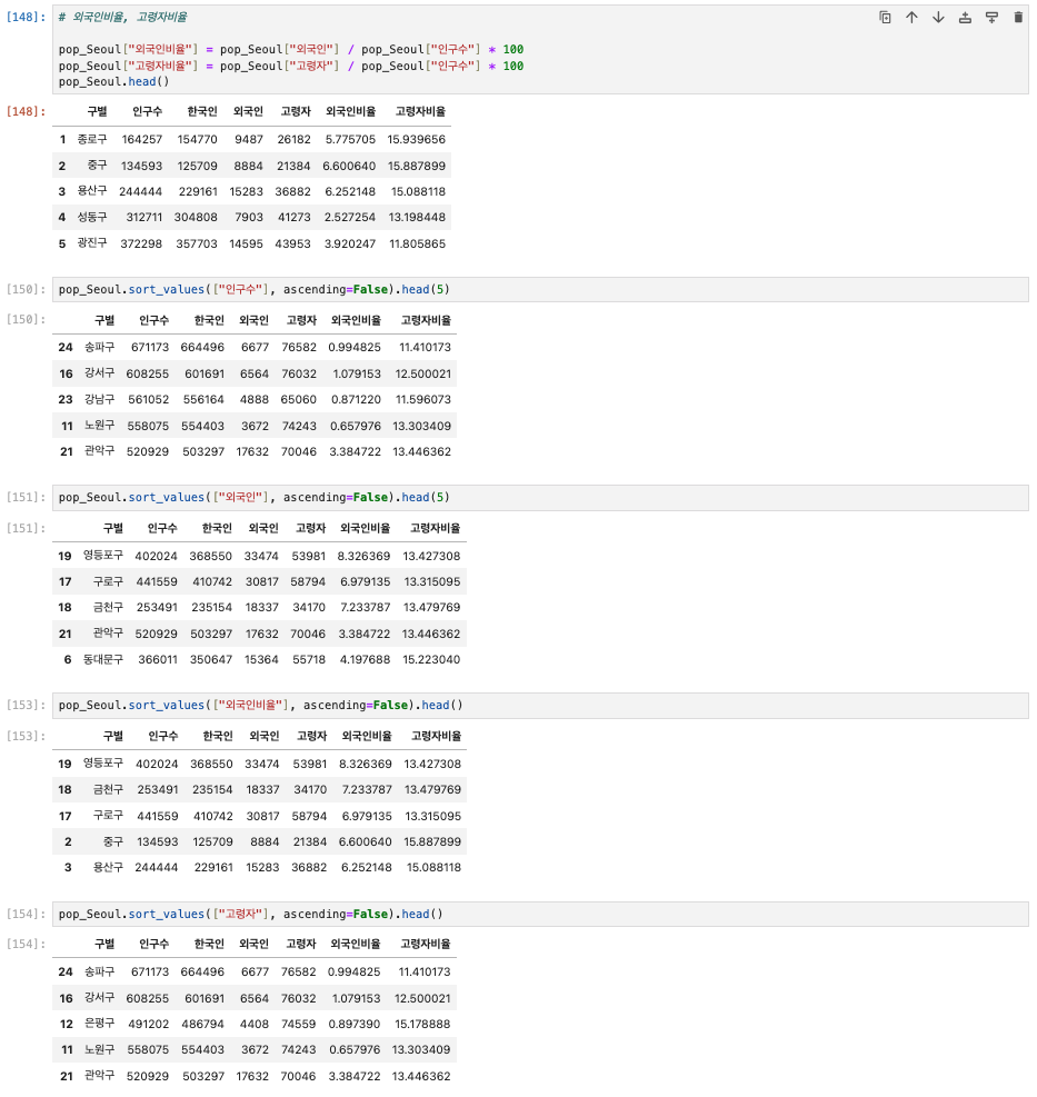
✅ 4. 두 데이터 합치기
data_result = pd.merge(CCTV_Seoul, pop_Seoul, on="구별")
data_result.head()

# 년도별 데이터 컬럼 삭제 (del, drop)
del data_result["2013년도 이전"]
del data_result["2014년"]
data_result.head()

data_result.drop(["2015년", "2016년"], axis=1, inplace=True)
data_result.head()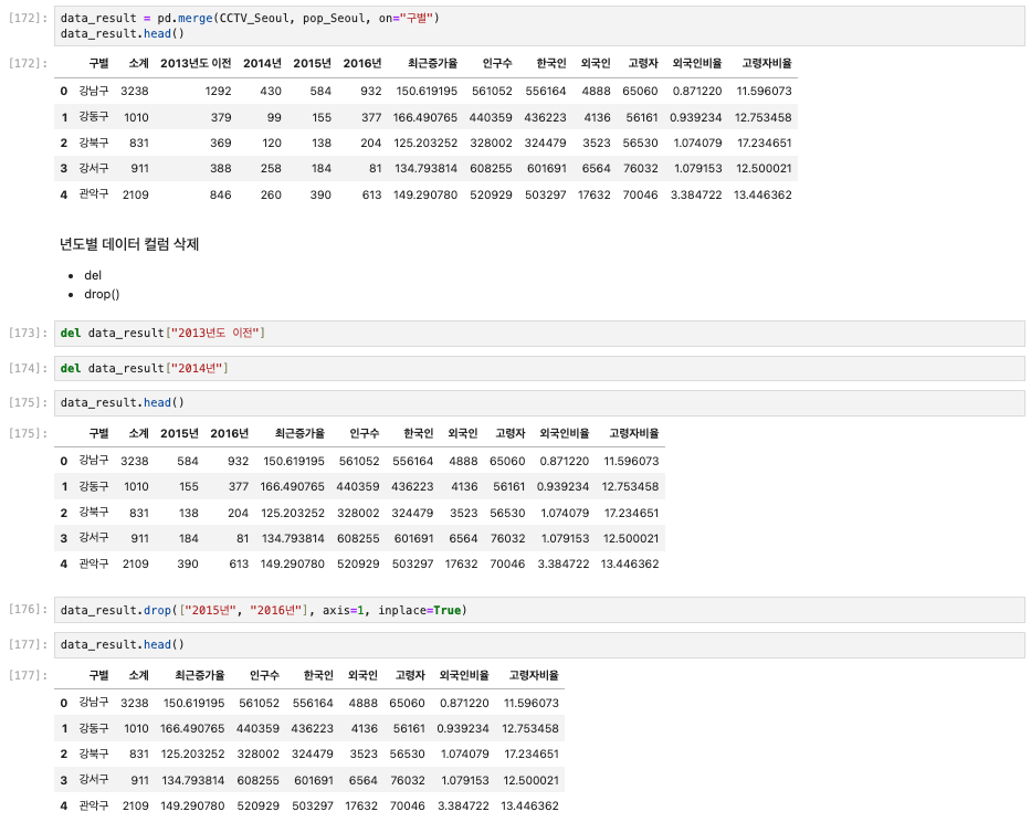
# 인덱스 변경
# set_index()

data_result.set_index("구별", inplace=True)
data_result.head()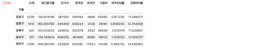
# 상관계수
# corr()

data_result.corr()
data_result.info()

data_result["CCTV비율"] = data_result["소계"] / data_result["인구수"]
data_result["CCTV비율"] = data_result["CCTV비율"] * 100

data_result.head()
data_result.sort_values(by="CCTV비율", ascending=False).head()
data_result.sort_values(by="CCTV비율", ascending=True).head()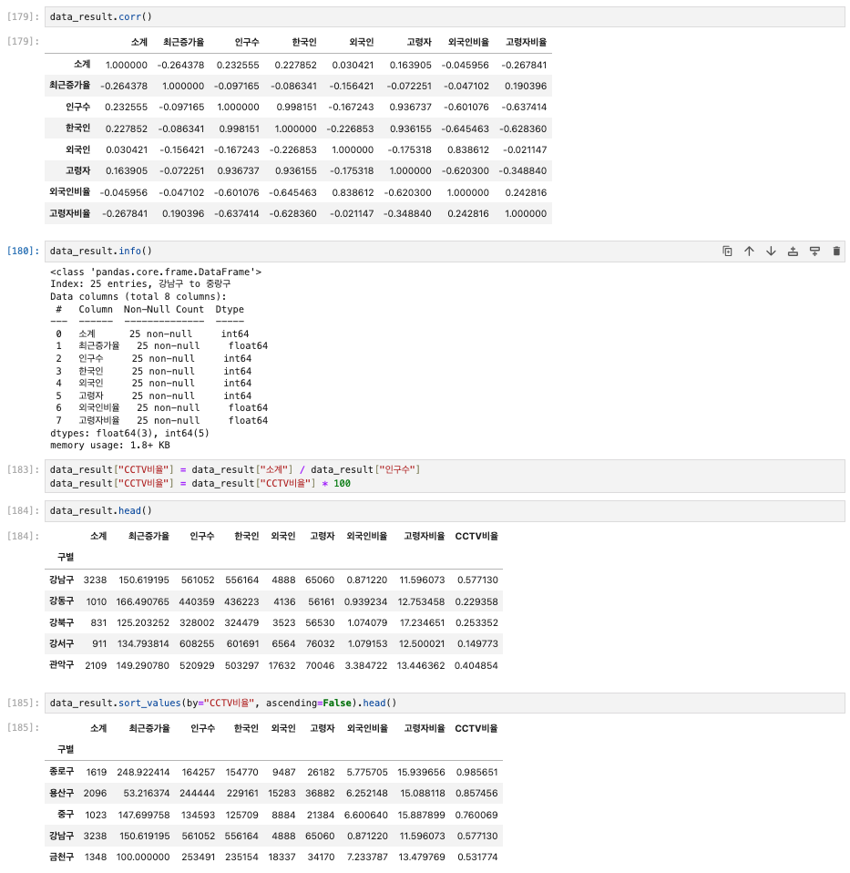
✅ 5. 데이터 시각화
import matplotlib.pyplot as plt
# import matplotlib as mpl

plt.rcParams["axes.unicode_minus"] = False # 마이너스 부호 때문에 한글이 깨질 수가 있어 주는 설정
rc("font", family="Arial Unicode Ms") # Windows: Malgun Gothic
# %matplotlib inline
get_ipython().run_line_magic("matplotlib", "inline")
# 소계 컬럼 시각화
data_result["소계"].plot(kind="barh", grid=True, figsize=(10, 10));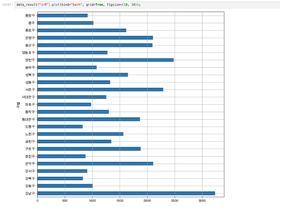
def drawGraph():
    data_result["소계"].sort_values().plot(
        kind="barh", grid=True, title="가장 CCTV가 많은 구", figsize=(10, 10));
drawGraph()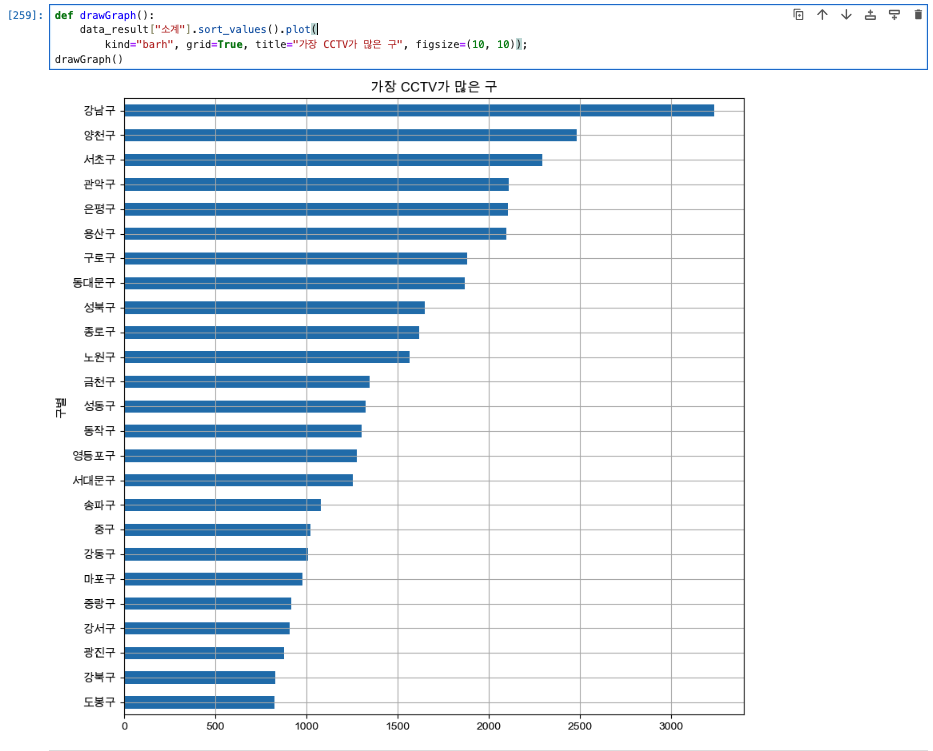
def drawGraph():
    data_result["CCTV비율"].sort_values().plot(
        kind="barh", grid=True, title="가장 CCTV 비율이 높은 구", figsize=(10, 10));
drawGraph()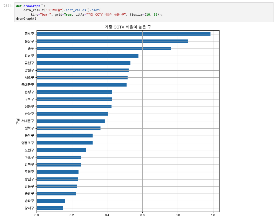
✅ 6. 데이터의 경향 표시
# 인구수와 소계 컬럼으로 scatter plot 그리기
def drawGraph():
    plt.figure(figsize=(14,10))
    plt.scatter(data_result["인구수"], data_result["소계"], s=50)
    plt.xlabel("인구수")
    plt.ylabel("CCTV")
    plt.grid()
    plt.show()
drawGraph()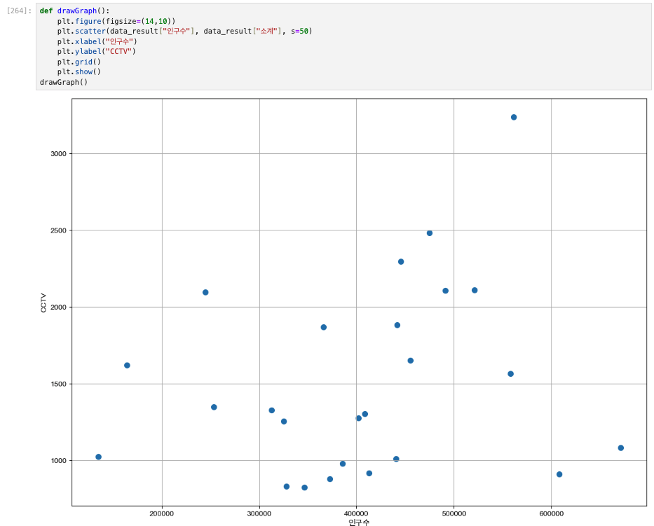
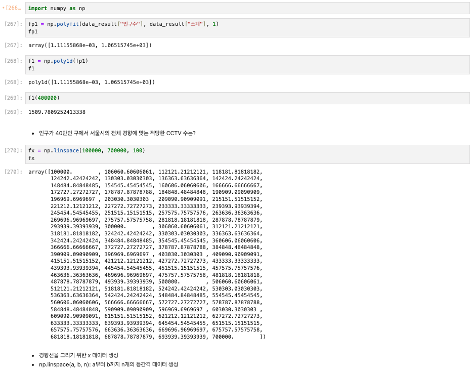
# Numpy를 이용한 1차 직선 만들기
# np.polyfit(): 직선을 구성하기 위한 계수를 계산
# np.poly1d(): polyfit으로 찾은 계수로 파이썬에서 사용할 수 있는 함수로 만들어주는 기능

import numpy as np
fp1 = np.polyfit(data_result["인구수"], data_result["소계"], 1)
fp1

f1 = np.poly1d(fp1)
f1

# 인구가 40만인 구에서 서울시의 전체 경향에 맞는 적당한 CCTV 수는?
f1(400000)

# 경향선을 그리기 위한 x 데이터 생성
# np.linspace(a, b, n) : a부터 b까지 n개의 등간격 데이터 생성
fx = np.linspace(100000, 700000, 100)
fx
def drawGraph():
    plt.figure(figsize=(14,10))
    plt.scatter(data_result["인구수"], data_result["소계"], s=50)
    plt.plot(fx, f1(fx), ls="dashed", lw=3, color="g")
    plt.xlabel("인구수")
    plt.ylabel("CCTV")
    plt.grid()
    plt.show()
drawGraph()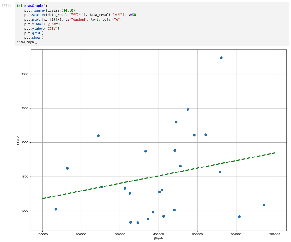
✅ 7. 강조하고 싶은 데이터 시각화해보기
그래프 다듬기
경향과의 오차 만들기
# 경향(trend)과의 오차를 만들자
# 경향은 f1 함수에 해당 인구를 입력
# f1(data_result["인구수"])

fp1 = np.polyfit(data_result["인구수"], data_result["소계"], 1)
f1 = np.poly1d(fp1)
fx = np.linspace(100000, 700000, 100)

data_result["오차"] = data_result["소계"] - f1(data_result["인구수"])

# 경향과 비교해서 데이터의 오차가 너무 나는 데이터를 계산
df_sort_f = data_result.sort_values(by="오차", ascending=False) #내림차순
df_sort_t = data_result.sort_values(by="오차", ascending=True) #오름차순
# 경향 대비 CCTV를 많이 가진 구
df_sort_f.head()

# 경향 대비 CCTV를 적게 가진 구
df_sort_f.tail()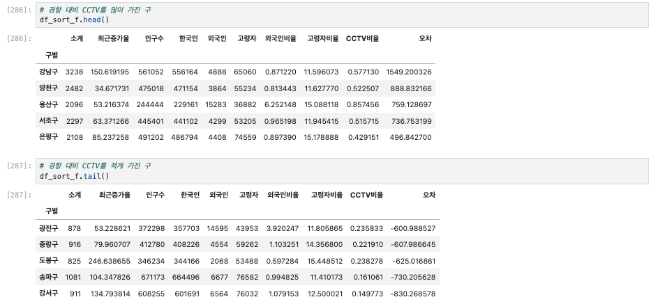
from matplotlib.colors import ListedColormap

# colormap 을 사용자 정의(user define)로 세팅
color_step = ["#e74c3c", "#2ecc71", "#95a9a6", "#2ecc71", "#3498db", "#3498db"]
my_cmap = ListedColormap(color_step)
def drawGraph():
plt.figure(figsize=(14,10))
plt.scatter(data_result["인구수"], data_result["소계"], s=50, c=data_result["오차"], cmap=my_cmap)
plt.plot(fx, f1(fx), ls="dashed", lw=3, color="g")
for n in range(5):
#상위 5개
plt.text(
df_sort_f["인구수"][n] * 1.02,
df_sort_f["소계"][n] * 0.98,
df_sort_f.index[n], #title
fontsize=15
)
#하위 5개
plt.text(
df_sort_t["인구수"][n] * 1.02,
df_sort_t["소계"][n] * 0.98,
df_sort_f.index[n], #title
fontsize=15
)
plt.xlabel("인구수")
plt.ylabel("CCTV")
plt.colorbar()
plt.grid()
plt.show()
drawGraph()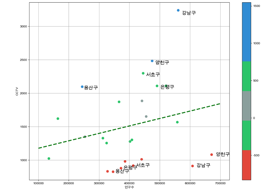
# csv 로 저장
data_result.to_csv("../data/01. CCTV_result.csv", sep=",", encoding="UTF-8")
"이 글은 제로베이스 데이터 취업 스쿨의 강의 자료 일부를 발췌하여 작성되었습니다."