게시글이나 블로그에서 주로 사용하는 태그기능을 구현해보았습니다.
태그 기능 구현은 생소하여 벨로퍼트님의 velog 글쓰기 부분을 찾아보았습니다.
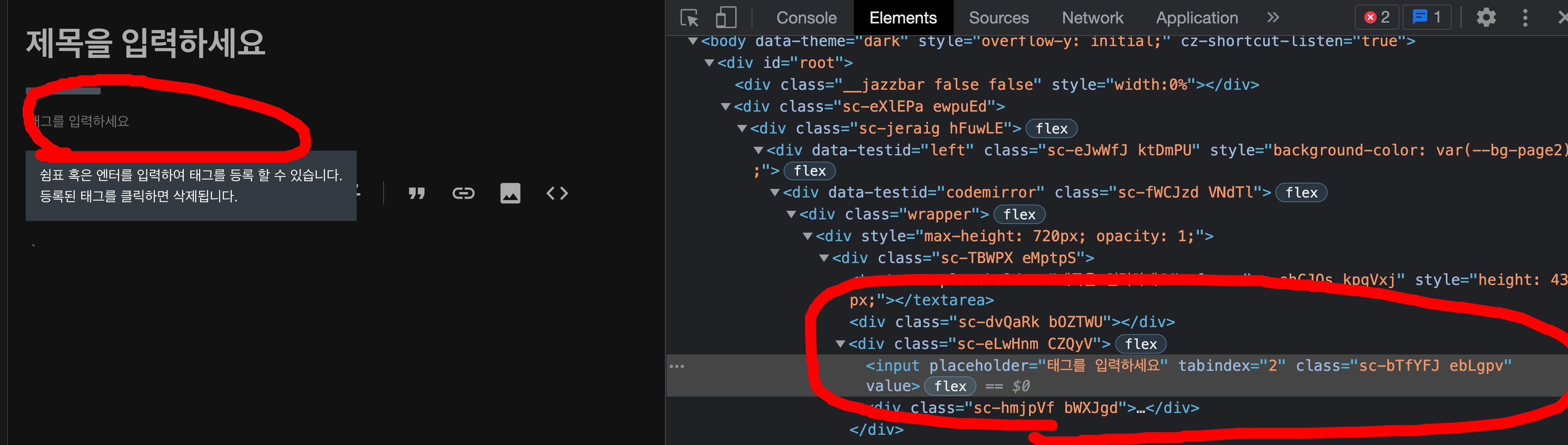
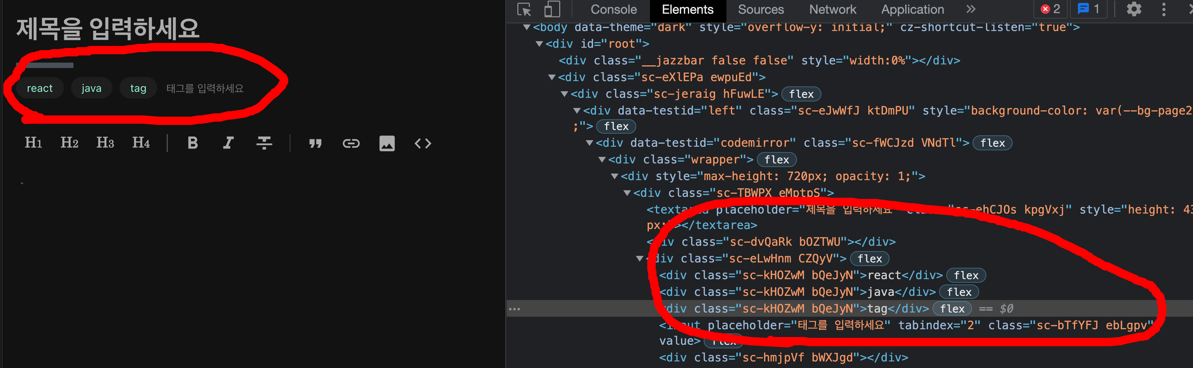
태그가 있을 때와 없을 때를 비교해보면 태그가 추가 될때마다 div태그가 1개씩 생성되는 걸 확인할 수 있습니다.
즉, 태그가 생성되면 태그를 담을 배열 state에 담겨지게 되고 그 배열state를 map으로 return 해주고 있다고 생각하면 됩니다.
먼저 태그를 전체를 저장 할 tags state(array)와 tags state에 넣을 tag state를 만들었습니다.
input Box 안에 tags를 map으로 보여주게 하고 input에서 원하는 값을 입력한 후
tag에 저장하고 엔터(onKeyPress)를 누르면 tags에 추가되도록 구현하였습니다.
(velog는 쉼표와 엔터 둘다 가능합니다...)
기능을 구현하고 나니 to-do-list와 구현방법이 비슷해 원리만 이해하면 어렵지 않게 구현이 가능했습니다.
제가 구현한 코드는 아래에 첨부하겠습니다.
function Tag() {
  const [tags, setTags] = useState(["javascript", "react"]);
  const [tag, setTag] = useState("");
  const removeTag = (i) => {
    const clonetags = tags.slice();
    clonetags.splice(i, 1);
    setTags(clonetags);
  };
  const addTag = (e) => {
    setTag(e.target.value);
  };
  const handleKeyPress = (e) => {
    if (e.key === "Enter") {
      handleClick();
    }
  };
  const handleClick = () => {
    setTags([...tags, tag]);
    setTag("");
  };

  return (
    <Wrapper>
      <Title>Tag</Title>
      <TagContainer>
        {tags.map((e, i) => (
          <Hash key={i}>
            <HashName>{e}</HashName>
            <HashBtn onClick={() => removeTag(i)}>x</HashBtn>
          </Hash>
        ))}

        <InputBox
          placeholder="Press enter to add tags"
          onChange={(e) => addTag(e)}
          onKeyPress={(e) => handleKeyPress(e)}
          value={tag}
        />
      </TagContainer>
    </Wrapper>
  );
}
const TagContainer = styled.div`
display: flex;
align-items: center;
border: 1px solid grey;
border-radius: 12px;
width: 60vw;
height: 60px;
`;
const Hash = styled.div`
display: flex;
justify-content: center;
align-items: center;
background-color: ${(props) => props.theme.blue};
border-radius: 12px;
padding: 0 10px;
margin: 10px;
height: 40px;
`;
const HashName = styled.h3`
color: ${(props) => props.theme.white.lighter};
margin-right: 10px;
`;
const HashBtn = styled.button`
border: none;
outline: 0;
border-radius: 50%;
width: 20px;
height: 20px;
background-color: ${(props) => props.theme.white.lighter};
cursor: pointer;
`;
const InputBox = styled.input`
border: none;
height: 30px;
font-size: 32px;
&:focus {
outline: none;
}
@media screen and (max-width: 820px) {
font-size: 20px;
}
`;
Front-end developer.