Storybook이란?
- UI 컴포넌트를 모아서 보여주고 문서화하는
오픈소스 툴 - UI 컴포넌트를 체계적이고 효율적으로 구축할 수 있는 개발 도구
설치
# 설치
npx storybook@latest init

# 스토리북 로컬 개발 서버 실행
npm run storybook
실행
스토리북을 설치하면 package.json에 다음과 같은 script가 존재할 것이다.
// package.json

"scripts": {
	// ...
  "storybook": "node script/generateSvgList.js & storybook dev -p [포트번호]",
  "build-storybook": "storybook build",
},
npm run storybook명령어를 통해 스토리북 로컬 개발 서버를 실행할 수 있다.chromatic을 통해 개발 서버를 배포할 수도 있다.- 이를 통해 스토리북을 동료 개발자 혹은 디자이너와 공유할 수 있다!
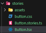
디렉토리 구조
.storybook- 설정 파일
stories- 스토리북 예제 컴퍼넌트 디렉토리
스토리북 설정
.storybook/main.ts
import type { StorybookConfig } from "@storybook/react-vite";

const config: StorybookConfig = {
	// 스토리북에 올라갈 컴포넌트 지정
  stories: [
    "../stories/**/*.mdx",
    "../stories/**/*.stories.@(js|jsx|mjs|ts|tsx)",
  ],
	// 추가할 addon (아래 4가지는 기본으로 설치되어 있다.)
  addons: [
    "@storybook/addon-links",
    "@storybook/addon-essentials",
    "@storybook/addon-onboarding",
    "@storybook/addon-interactions",
  ],
  framework: {
    name: "@storybook/react-vite",
    options: {},
  },
  docs: {
    autodocs: "tag",
  },
};
export default config;- Addon이란?
- 스토리북의 핵심기능을 확장하는
플러그인
- 스토리북의 핵심기능을 확장하는
스토리북 실행 시 화면
localhost:6006
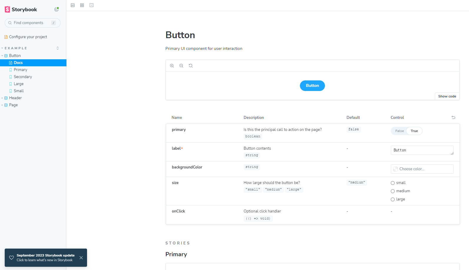
스토리북 컴포넌트 구성
- 다음과 같이 컴포넌트의 동일한 레벨에
[컴포넌트이름].stories.tsx라는 이름의 파일을 생성한다.
// Button.tsx
import React from "react";
import "./button.css";

interface ButtonProps {
  /** primay props */
  primary?: boolean;

  /** 배경색을 지정합니다. */
  backgroundColor?: string;
  /** How large should the button be? */
  size?: "small" | "medium" | "large";
  /** Button contents */
  label: string;
  /** Optional click handler */
  onClick?: () => void;
}

/**
 * Primary UI component for user interaction
 */
export const Button = ({ primary = false, size = "medium", backgroundColor, label, ...props }: ButtonProps) => {
  const mode = primary ? "storybook-button--primary" : "storybook-button--secondary";
  return (
    <button
      type="button"
      className={["storybook-button", `storybook-button--${size}`, mode].join(" ")}
      style={{ backgroundColor }}
      {...props}
    >
      {label}
    </button>
  );
};
// Button.stories.tsx
import type { Meta, StoryObj } from '@storybook/react';
import { Button } from './Button';
const meta = {
title: 'Example/Button',
component: Button,
parameters: {
layout: 'centered',
},
tags: ['autodocs'],
argTypes: {
backgroundColor: { control: 'color' },
},
} satisfies Meta<typeof Button>;
export default meta;
export const FirstStory: Story = {
args: {
//👇 The args you need here will depend on your component
},
};title- 스토리북 사이드바에 표시될 컴포넌트의 경로
component- 컴포넌트
parameters- 스토리에 대한 정적 메타 데이터
tagstags: ['autodocs']로 설정해놓으면 별도의 설정 없이 해당 파일을 기반으로 docs를 자동 생성한다.
argTypes-
각 스토리 args의 행동 방식을 설정한다.
-
예시 코드
argTypes: { $size: { defaultValue: "small", options: ["xsmall", "small", "medium"], // control: { type: "select" }, description: "뱃지입니다." }, }, -
defaultValue- props에 대한 기본값을 정의한다.
-
options- props가 가질수 있는 값을 배열로 정의한다.
-
control- 스토리북에서 props의 입력 방식을 지정한다. (예시는 select 방식 선택)
- 설정하지 않을 시 해당 props가 가진 타입의 방식으로 입력한다.
- 설정 가능한 값 :
select,radio,number,text,color등등…
args- Story에 기본적으로 전달될 props

기록하는 공간