Google Colab을 활용한 EDA
python으로 데이터 살펴보기
- Google Drive 내에 Directory 만들기
- CSV 데이터셋 업로드하기
- Colab – ipynb 파일 생성
EDA (Exploratory Data Analysis)
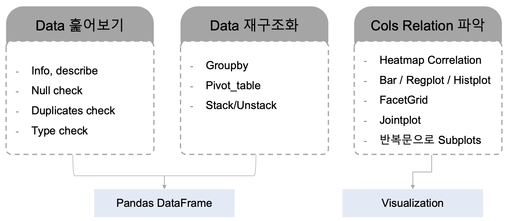
Data Quick Glance
-
Pandas 불러오기
import pandas as pd -
기본 정보 체크
df.columns: colum이름을 확인하거나 몇개인지 확인
df.info(): 행, 열 갯수,컬럼이름, null값 유무, 데이터타입
df.duplicated().sum(): 중복값 개수
df.describe():통계값 (Outlier 확인)
ㄴdf.describe().round(0).T: row의 수가 많을 때 column과 row를 바꿔서 봄
ㄴ 표준편차가 큰 값 확인, 숫자가 아닌 값도 include 옵션을 통해 볼 수 있으나 잘 쓰진 않음
ㄴ mean(평균값)은 이상치에 크게 영향 받고 median(중앙값)은 크게 영향 받지 않는다는 차이점이 있음 -
원하는 정보만 data frame 만들어 보기
# Data info
pd.DataFrame({
    'Unique': df.nunique(),
    'Null': df.isna().sum(),
    'Type': df.dtypes
}).sort_values(by='Unique', ascending=False)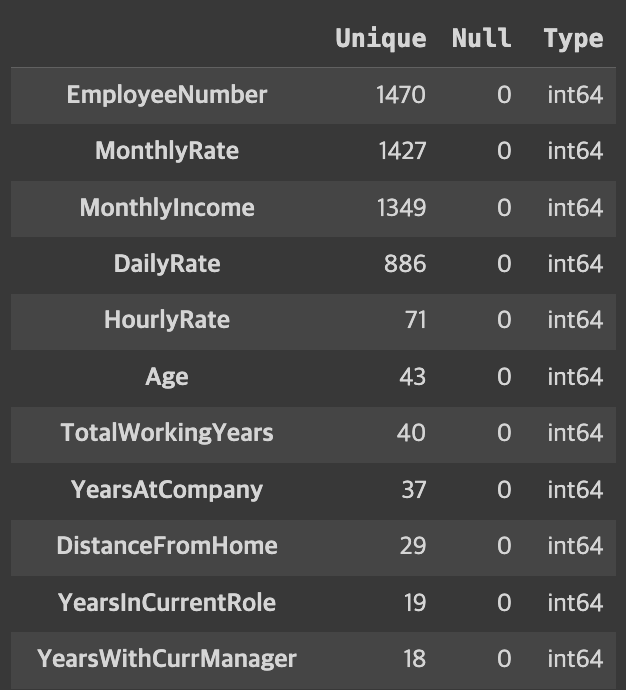
- 위의 값 중 모든 데이터가 하나의 값을 가지는 컬럼이 발견되어 삭제
df.drop(['StandardHours','Over18','EmployeeCount'],axis=1,inplace=True)
사내 조직 파악하기 (Team, Role 등)
몇가지 컬럼 가져와서 살펴보기
- Group by / pivot_table 활용
tmp0 = df[['Department','EducationField', 'JobRole', 'JobLevel', 'Attrition']].copy()
tmp0.groupby('Department').size()
# tmp0.groupby('Department')['(이자리)'].count() -- (이자리) 부분에는 아무 값이나 넣어도 위와 결과가 같음
# 왜냐하면 Null값이 없었기 때문

######## 결과 ##########
Department
Human Resources            63
Research & Development    961
Sales                     446
dtype: int64tmp0.groupby(['Department','JobRole','JobLevel','EducationField']).size().sort_values(ascending=False).reset_index(name='Emp Count')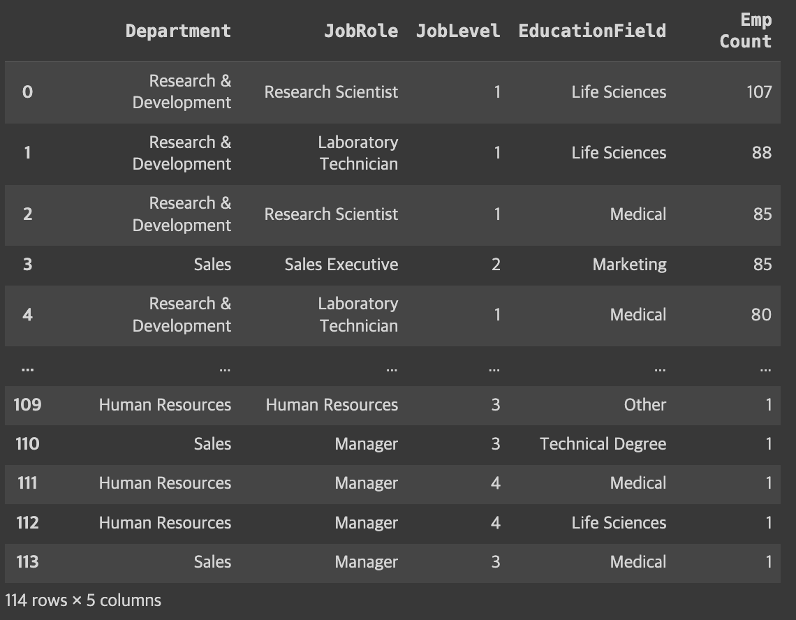
- 여러기준으로 그룹핑 가능
- sort_value를 통해 정렬
reset_index사용하면 데이터 프레임 형태로 출력
tmp1 = df[['Department','JobRole', 'JobLevel', 'Age','Attrition']].copy()
tmp1.groupby(['Department','JobRole'])['Age'].agg(['count','max','min'])- agg를 통해 여러계산을 한번에도 가능
pt2 = pd.pivot_table(tmp1,
               index=['Attrition','Department','JobRole'],
               columns='JobLevel',
               values='Age',
               aggfunc='count',
               fill_value=''    -- Null값을 채워줄 형태
               )
pt2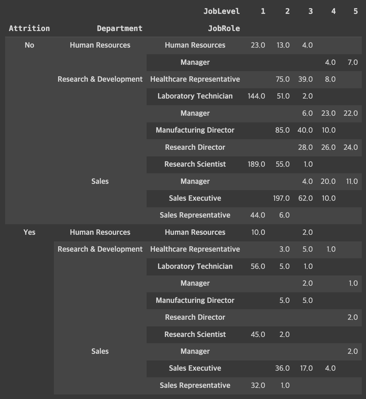
-
현재 위의 데이터 프레임에서 인덱스는 3개 :
'Attrition', 'Department', 'JobRole'0 : 'Attrition', 1 : 'Department', 2 : 'JobRole'- -1은 맨뒤 차례의 인덱스 임으로
'JobRole'임
-
unstack,stack은 멀티인덱스를 가지고 있는 프레임의 형태를 변형할 때 유용# unstack / stack : default level = -1# unstack : index -> column# stack : column -> index
-
pt2.unstack(level=0):level=0즉 인덱스'Attrition'을 열의 위치로 옮기겠다는 의미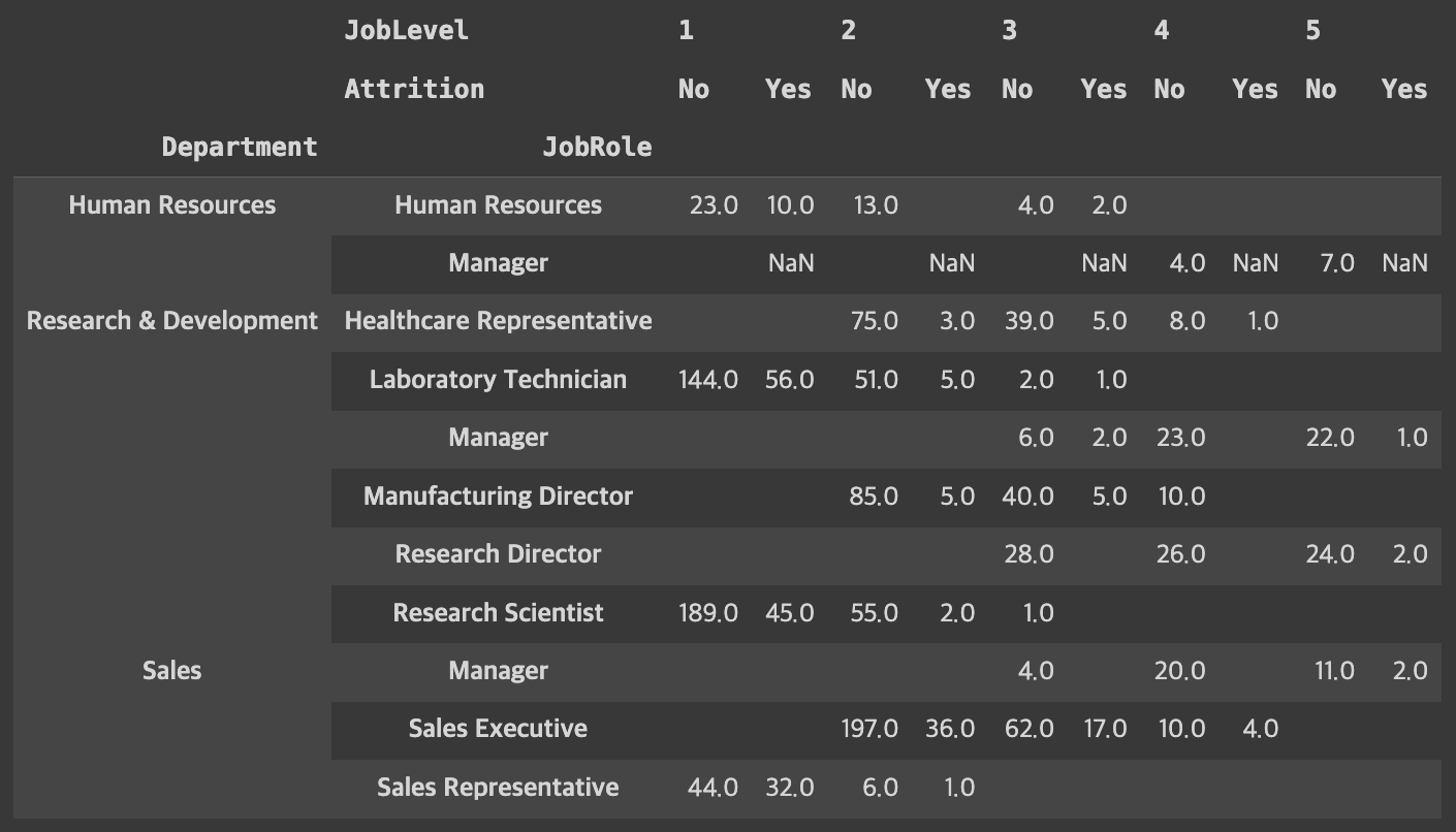
-
pt2.unstack(level=0).stack(level=0)stack은 반대로 열에 있는 걸 행으로 바꿔줌'JobLevel'을 행으로 옮기겠다는 의미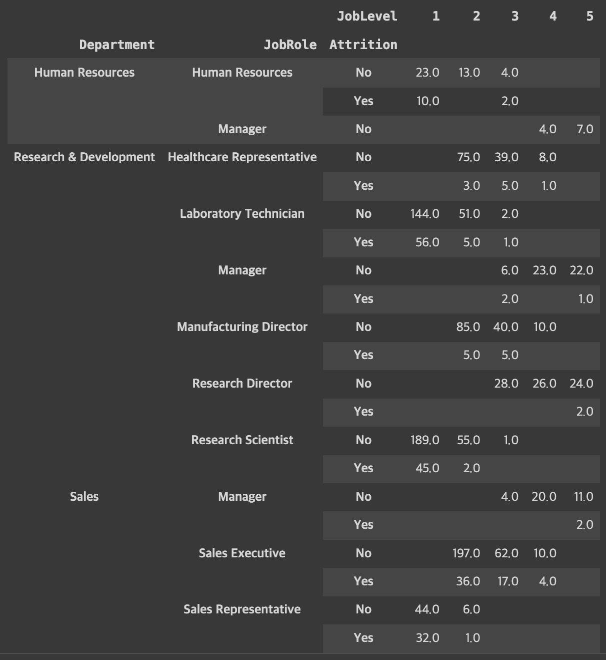
Visualization
Matplotlib
- Python 대표 시각화 Library
- 기본적 그래프부터 통계, Image 처리까지
- Documentation과 Cheatsheet 참고!
Seaborn
- Matplotlib 기반의 Adds-on 성격의 Library
- 간단한 메서드로 다양한 통계 그래픽
히트맵
plt.figure(figsize=(15,10))
sns.heatmap(cor_df.corr()
            , annot=True     # 숫자 표기
            , fmt='.1f'      # 소수점 표기
            , linewidth=0.5  # 라인 두께
            , cmap='YlGnBu'  # 색상 color map
)

plt.show()
top8_cols = df.select_dtypes(include='int64').corr().sum().sort_values(ascending=False)[:8].index.tolist()
cor_df2 = df[top8_cols].corr()
sns.heatmap(cor_df2, annot=True, fmt='.1f', cmap='Blues')
# 삼각형 Mask 씌워서 Heatmap 깔끔하게 그려보기
import numpy as np
mask = np.zeros_like(cor_df2, dtype=bool)
mask[np.triu_indices_from(mask)] = True
sns.heatmap(cor_df2, annot=True, fmt='.1f', cmap='Blues', mask=mask)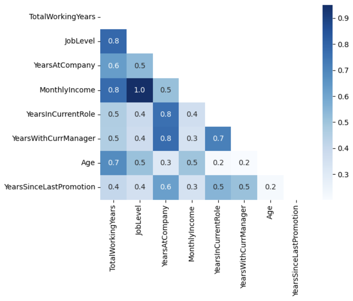
Simple Bar Graph - Matplotlib
plt.title('Simple Bar plot - Income by JobLevel')
plt.bar(df['JobLevel'], df['MonthlyIncome']) #plt.bar(x, y)
plt.xlabel('JobLevel')
plt.ylabel('Monthly Income')
plt.show()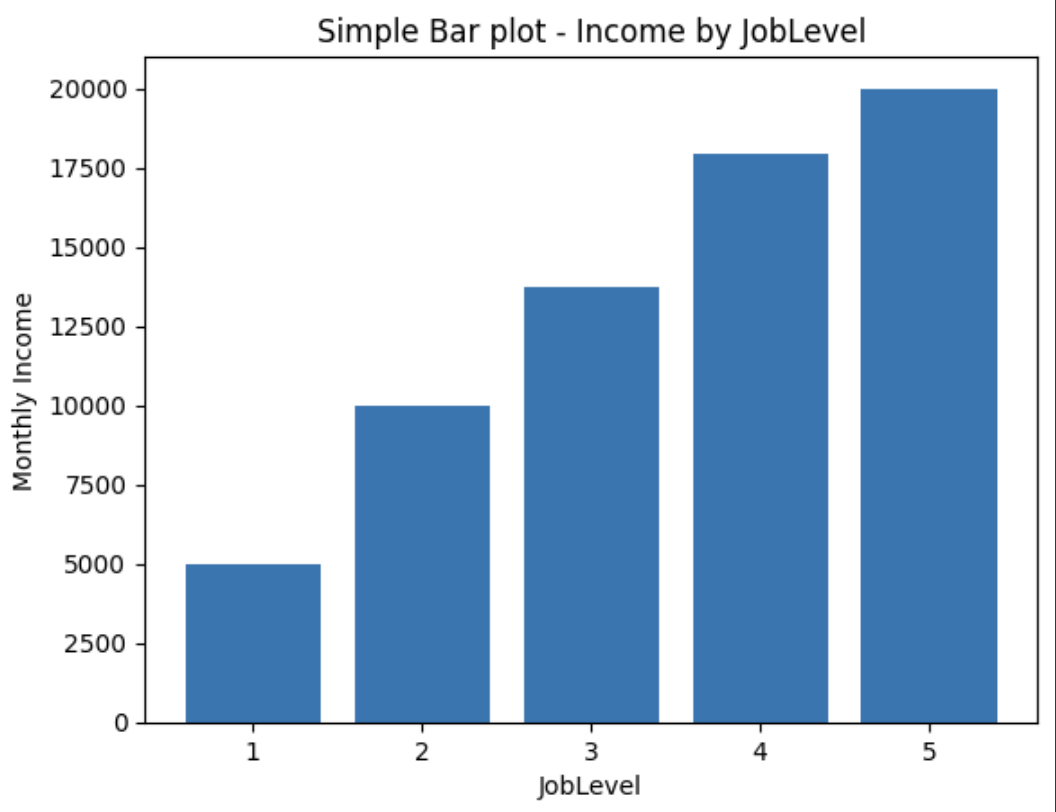
Bar Graph with FacetGrid
facet = sns.FacetGrid(df, col='Department', height=6)
facet.map_dataframe(sns.barplot, x='TotalWorkingYears', y='MonthlyIncome')

facet = facet.fig.subplots_adjust(wspace=.4, hspace=.2)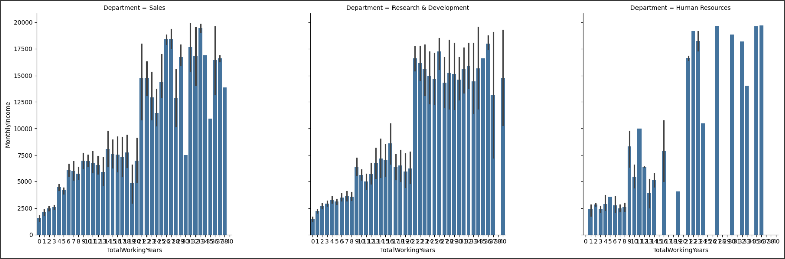
Regplot - scatter format / Hue (legend 범례 추가)
facet = sns.FacetGrid(df, col='EducationField', row='Gender', hue='Attrition', height=5, palette={'Yes':'red', 'No':'gray'})
facet = facet.map_dataframe(sns.regplot, x='Age', y='MonthlyIncome') -- `fit_reg=False` 옵션 추가하면 회귀선 안보이게 설정 가능
facet = facet.add_legend()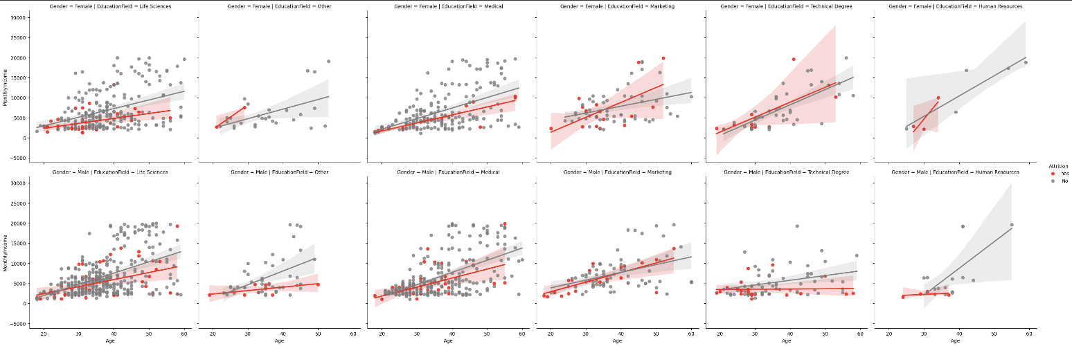
r&d 팀은 연봉의 차이가 퇴사에 영향을 주는 것으로 보이지만 마케팅 팀 같은 경우는 별로 영향이 없는것으로 보임.
워라벨과 직업만족도는 큰 연관성을 보이지 않는다.
Histplot + Enumerate 반복문
hist = ['Age', 'DistanceFromHome', 'JobSatisfaction', 'WorkLifeBalance','MonthlyIncome','YearsAtCompany']

plt.figure(figsize=(10,20))
for i,col in enumerate(hist):
    axes = plt.subplot(6,3,i+1)
    sns.histplot(x=df[col], hue=df['Attrition'])
plt.tight_layout()
plt.show()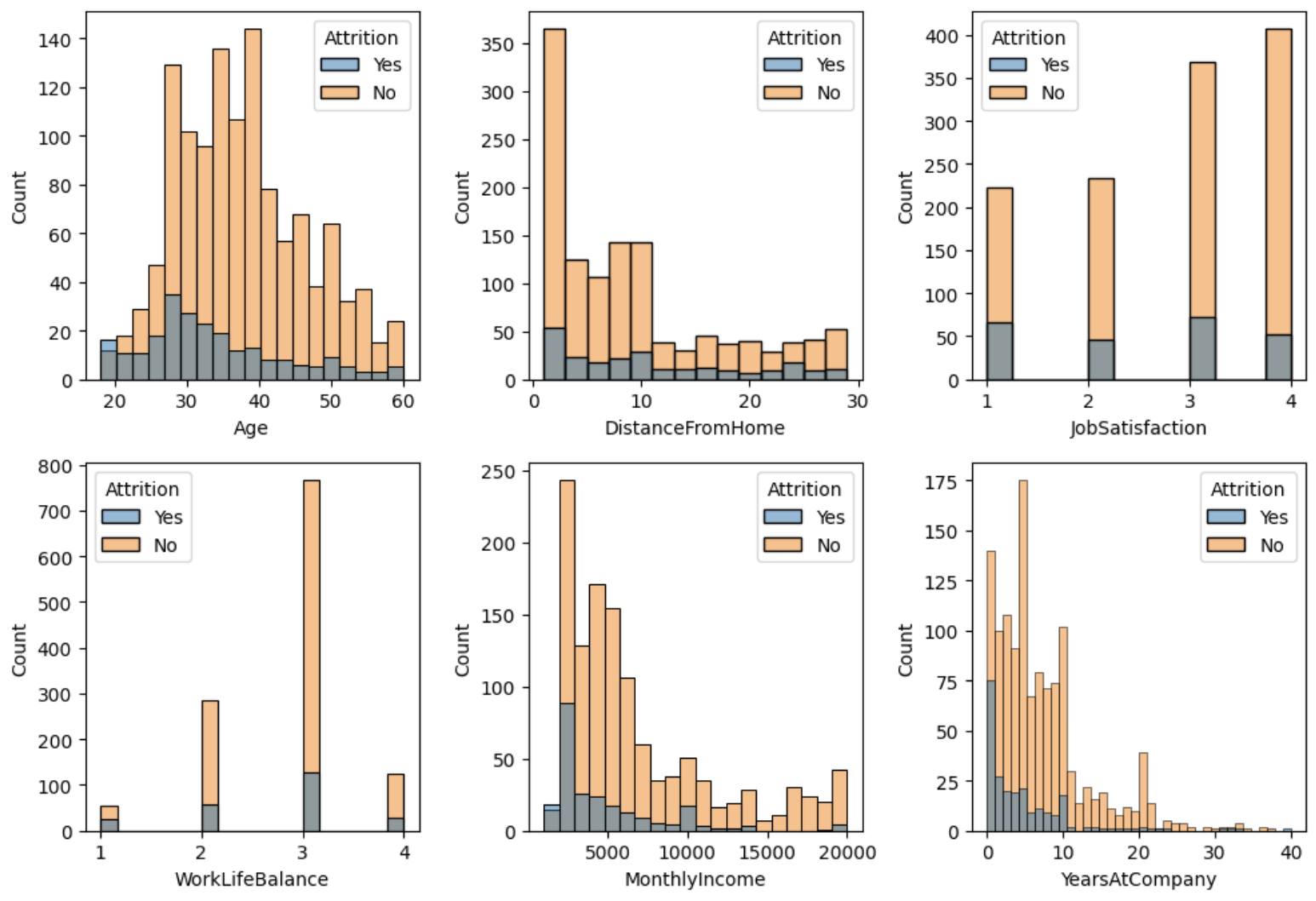
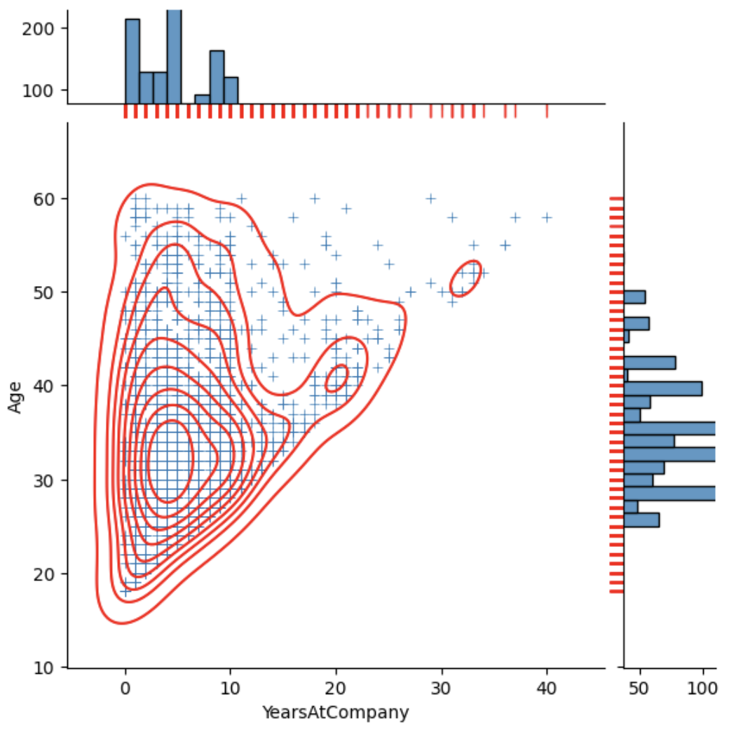
Jointplot
sns.jointplot(df, x='Age', y='YearsAtCompany', hue='Gender')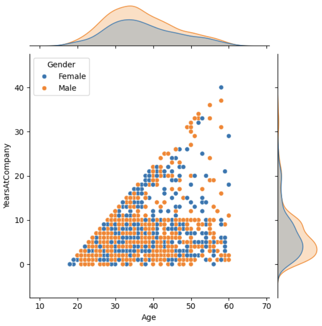
j = sns.jointplot(df, x='YearsAtCompany', y='Age'
                , marker='+'
                , marginal_ticks=True
                , marginal_kws=dict(bins=30, rug=True)
                  )
j.plot_joint(sns.kdeplot, color='r')
j.plot_marginals(sns.rugplot, color='r',height=-.15, clip_on=False)