[5월 27일]
1) 학습한 내용
1.Bootstrap
웹 사이트나 웹 응용 프로그램을 작성하기 위해 사용하는 무료 소프트웨어 도구 모음
① 기본
<!doctype html>
<html lang="en">
  <head>
    <meta charset="utf-8">
    <meta name="viewport" content="width=device-width, initial-scale=1">
    <title>Bootstrap demo</title>
    <link href="https://cdn.jsdelivr.net/npm/bootstrap@5.2.0-beta1/dist/css/bootstrap.min.css" rel="stylesheet" integrity="sha384-0evHe/X+R7YkIZDRvuzKMRqM+OrBnVFBL6DOitfPri4tjfHxaWutUpFmBp4vmVor" crossorigin="anonymous">
  </head>
  <body>
    <h1>Hello, world!</h1>
    <script src="https://cdn.jsdelivr.net/npm/bootstrap@5.2.0-beta1/dist/js/bootstrap.bundle.min.js" integrity="sha384-pprn3073KE6tl6bjs2QrFaJGz5/SUsLqktiwsUTF55Jfv3qYSDhgCecCxMW52nD2" crossorigin="anonymous"></script>
  </body>
</html>
② CSS,JS파일 다운로드
<!doctype html>
<html lang="en">
  <head>
    <meta charset="utf-8">
    <meta name="viewport" content="width=device-width, initial-scale=1">
    <title>Bootstrap demo</title>
    <link rel="stylesheet" href="./css/bootstrap.min.css">
  </head>
  <body>
    <h1>Hello, world!</h1>
    <script src="./js/bootstrap.bundle.js.map"></script>
  </body>
</html>
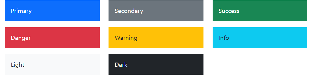
③ color
2. Bootstrap layout
(1) Container
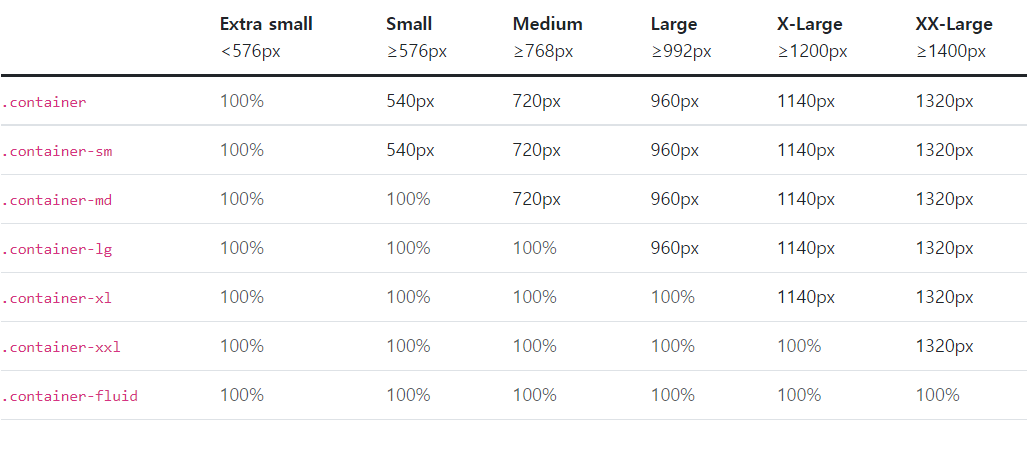
<div class="container-sm">100% wide until small breakpoint</div>
<div class="container-md">100% wide until medium breakpoint</div>
<div class="container-lg">100% wide until large breakpoint</div>
<div class="container-xl">100% wide until extra large breakpoint</div>
<div class="container-xxl">100% wide until extra extra large breakpoint</div>
(2)Grid
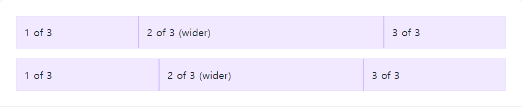
<div class="container">
  <div class="row"> <!-- 12칸을 3 / 6 / 3으로 나눔 -->
    <div class="col">
      1 of 3
    </div>
    <div class="col-6">
      2 of 3 (wider)
    </div>
    <div class="col">
      3 of 3
    </div>
  </div>
  <div class="row"> <!-- 12칸을 3.5 / 5 / 3.5으로 나눔 -->
    <div class="col">
      1 of 3
    </div>
    <div class="col-5">
      2 of 3 (wider)
    </div>
    <div class="col">
      3 of 3
    </div>
  </div>
</div>
(3)Columns
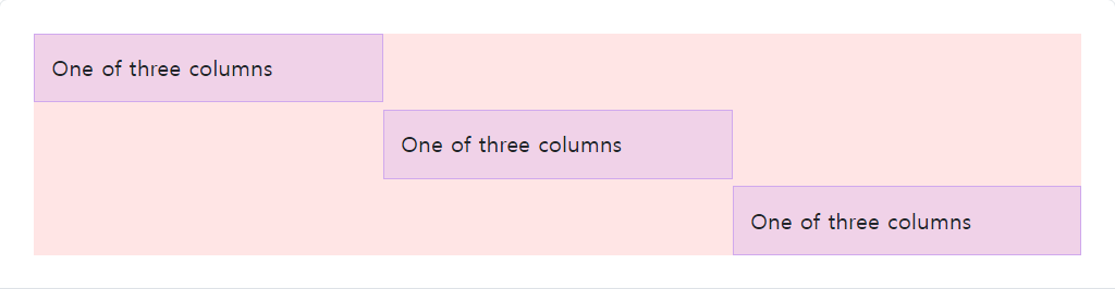
<div class="container">
  <div class="row">
    <div class="col align-self-start">
      One of three columns
    </div>
    <div class="col align-self-center">
      One of three columns
    </div>
    <div class="col align-self-end">
      One of three columns
    </div>
  </div>
</div>
3.bootstrap을 이용해 웹페이지 만들기
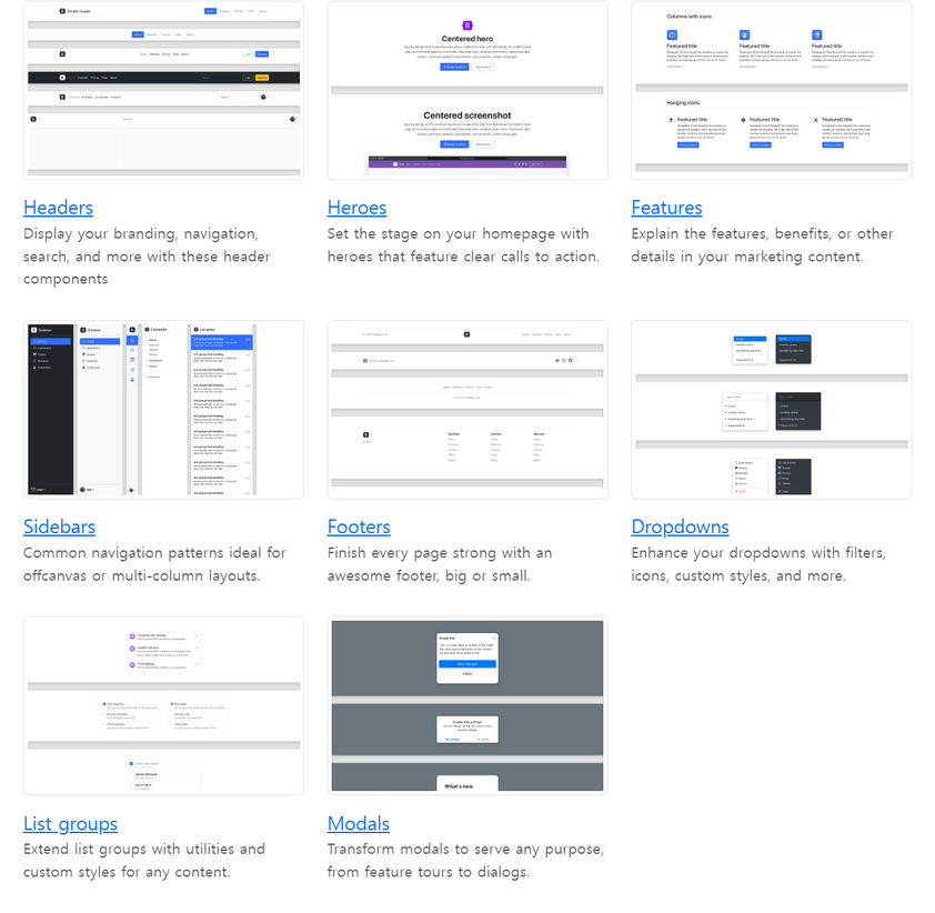
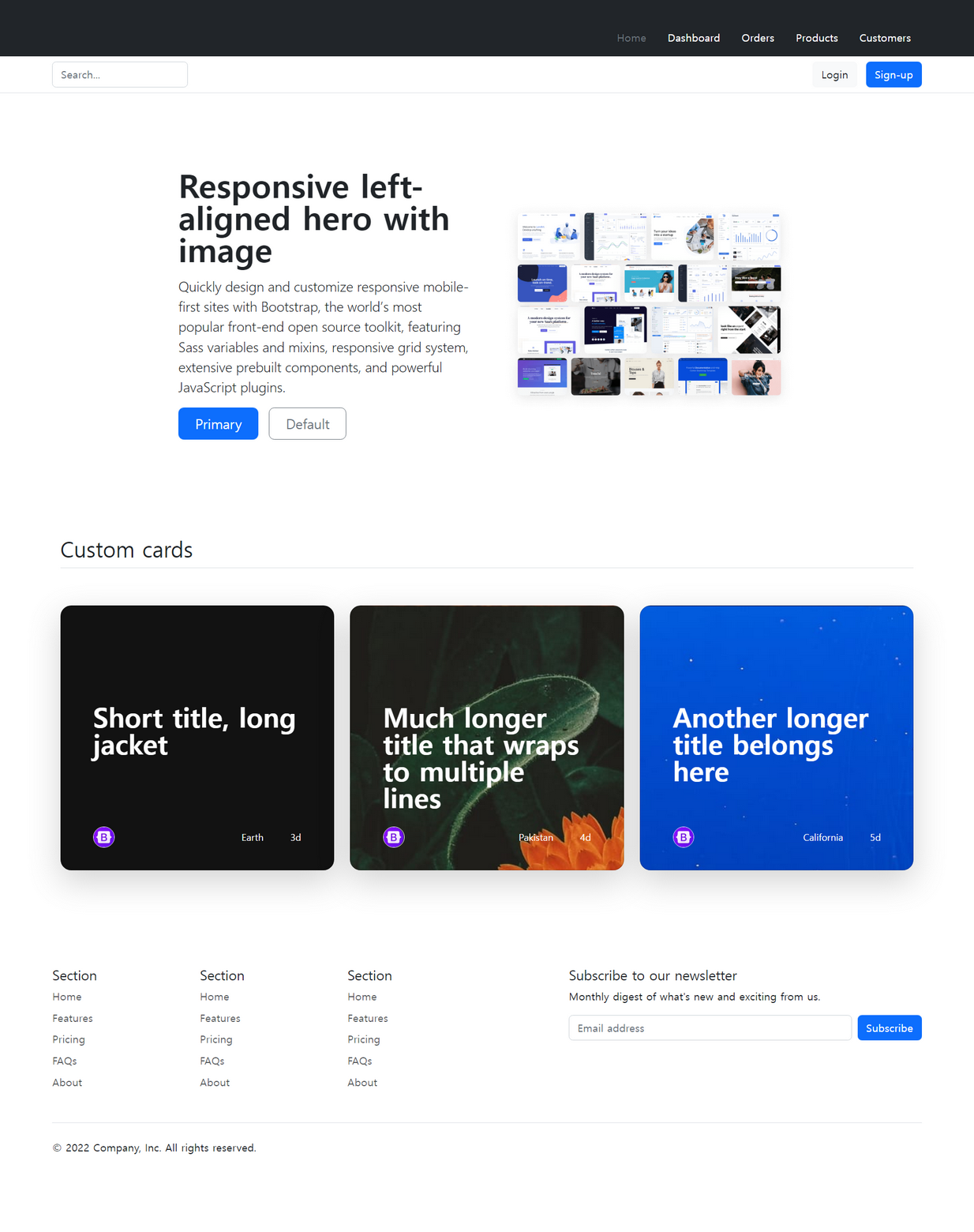
-여러가지 예시들 중에서 마음에 드는 디자인의 코드를 html파일로 작성
-이미지는 예제가 있는 페이지 주소를 복사해서 붙여넣기 해야한다.
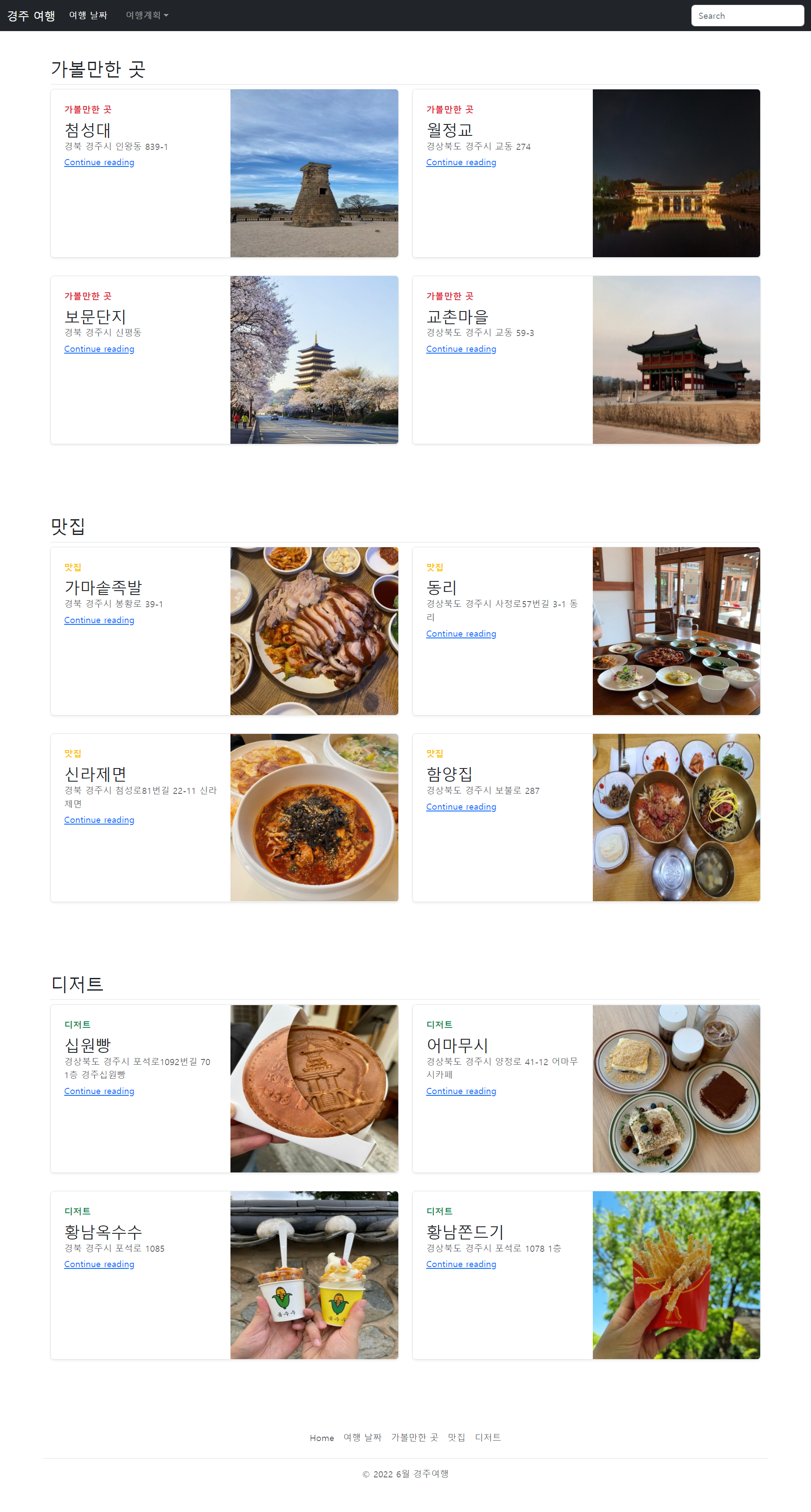
4.(과제) bootstrap을 이용해 나만의 웹페이지 만들기
2) 학습내용 중 어려웠던 점
웹페이지 만들기를 할 때 강의속도가 빨라 따라가기 힘들었다
3) 해결방법
강의를 다시 보면서 부트스트랩 홈페이지에 나와있는 예시들을 참고하여 해결하였다.
4) 학습소감
부트스트랩을 통해 웹페이지를 만들어 보니 훨씬 빠르고 재밌었다.
사다리타기를 통해 이주의 교육생으로 되어 도서를 받게 되었다. 첫주에 바로 참고도서를 받게 되다니 신기하고 기분이 좋았다.